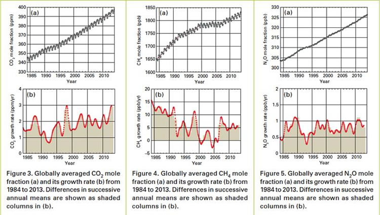
Here’s a topical story from the BBC website about a new report by the World Meteorological Organization (WMO), which alerts readers to a record level of greenhouse gases in the atmosphere in oceans (see the charts below). What interested me more than the story itself, however, was an interesting exchange in the comments section. Here’s the exchange:
780.
Artemesia 9TH SEPTEMBER 2014 – 17:18
767.AndyC555 -” Whatever happened to that hole in the ozone layer that environmentalists told us was going to kill us all with radiation from space back in the 1980s and 90s?”
It was closed, thanks to the Montreal Protocol 1987 and international co-operation. CFCs were banned
What organizers are calling the “largest climate march in history” is set to descend upon New York City in less than two weeks’ time (September 21). The event is meant to coincide with a key UN Climate Summit, which UN Secretary-General Ban Ki-moon has organized to not only give global leaders in business, politics, and civil society a chance to discuss this important topic, but also to build momentum in advance of the crucial 2015 Paris 21st COP to the UNFCCC. (Don’t worry, by the end of the semester you’ll know exactly what these acronyms mean.) Amongst the projected crowd of tens-of-thousands of protesters will be the current leader (and Member of Parliament) of the Green Party of Canada, Elizabeth May. “Taking it to the streets” in the hopes of hastening socio-political change is something with which May agrees, if her Twitter account is any indication:
Here is part of the Green Party of Canada press release announcing the climate march and encouraging other Canadians to join May in New York City:
On September 21, tens of thousands of concerned citizens from around the world will gather in New York City for the People’s Climate March. They will be marching to show the world leaders assembled there for the 2014 UN Climate Summit that our planet cannot wait for more negotiations – we need climate action now.
At the Climate Summit, Canada will stand out as having the worst climate policy record in the industrialized world.
From their dismantling of environmental regulations to their rush to expand Canada’s pipeline capacity, no government on earth has worked harder than the Harper Conservatives to speed up catastrophic climate change.
Maybe someday we can get the Honourable Member for Saanich–Gulf Islands to tell us what she really thinks about the Harper government’s climate policies.
Is Canadian government climate policy really the industrialized world’s worst? Worse than the USA and/or China? Will you also be increasing your carbon footprint to join the march in New York City?
For this week’s seminar, we read and discussed (amongst other things) a general (i.e., non-academic) article–in The Guardiannewspaper-–regarding the recent so-called hiatus in global warming. (Here’s another look at the same issue from The Economist.) The issue arises from recent global surface temperature data. To wit:
BETWEEN 1998 and 2013, the Earth’s surface temperature rose at a rate of 0.04°C a decade, far slower than the 0.18°C increase in the 1990s. Meanwhile, emissions of carbon dioxide (which would be expected to push temperatures up) rose uninterruptedly. This pause in warming has raised doubts in the public mind about climate change. A few sceptics say flatly that global warming has stopped. Others argue that scientists’ understanding of the climate is so flawed that their judgments about it cannot be accepted with any confidence. (From The Economist)
As the article quoted above goes on to note, there are many compelling scientific accounts for why global surface temperatures have not risen as quickly as in the past, though the author argues that they, in combination, explain too much. To understand what that means, please read the article yourself.
We viewed a video by climate scientist Matt England, in which he explained one plausible reason for this ‘hiatus’–the changing trade winds in the Pacific Ocean.
After having viewed Professor England’s explanation–more heat than normal was being trapped in deeper layers of the western Pacific Ocean–some students wondered when that extra trapped heat might once again rise to the surface. Not being a climate scientist, I did not know the answer. I now know, however, that some scientists predict this to occur by about 2030.
The Atlantic Ocean has masked global warming this century by soaking up vast amounts of heat from the atmosphere in a shift likely to reverse from around 2030 and spur fast temperature rises, scientists said.
The theory is the latest explanation for a slowdown in the pace of warming at the Earth’s surface since about 1998 that has puzzled experts because it conflicts with rising greenhouse gas emissions, especially from emerging economies led by China.
But, if you read the linked article carefully, you’ll notice that these study and explanation cited has nothing to do with the Pacific Ocean. Indeed, the study is by a group of scientists based at the University of Washington:
“We’re pointing to the Atlantic as the driver of the hiatus,” Ka-Kit Tung, of the University of Washington in Seattle and a co-author of Thursday’s study in the journal Science, told Reuters
The study said an Atlantic current carrying water north from the tropics sped up this century and sucked more warm surface waters down to 1,500 metres (5,000 feet), part of a natural shift for the ocean that typically lasts about three decades.
It said a return to a warmer period, releasing more heat stored in the ocean, was likely to start around 2030. When it does, “another episode of accelerated global warming should ensue”, the authors wrote.
So, what do we take from these two different studies. Is the article in The Economist correct that the current warming hiatus is ‘over-explained’? Is this just another example of scientists blindly whacking away at a pinata, hoping to hit upon an explanation? Or, is this another episode of how science is done in the real world. Theory and data combine to make predictions, which may be more or less true. When anomalies occur (that is, predictions are not quite accurate), scientists go about finding new data, and developing new theories to improve upon existing theories and knowledge. Or, is this just a loosely-linked cabal of money-seeking scientists trying to make off like bandits with our tax (i.e., research) money and blithely destroying our freedom while they’re at it?
Before heading off into the Vancouver evening last week, we watched the first half of the PBS documentary, Climate of Doubt, which examined the manner in which a coalition of powerful moneyed interests, in alliance with like-minded citizens’ groups and (mostly) Republican politicians was able to successfully stymie US congressional efforts to address some of the potential negative consequences of a warming planet.
The documentary takes us through a case of public opinion formation that fits Charles Lindblom’s definition of circularity perfectly. According to Lindblom, government policies that reflect the will of the general public may nonetheless be considered undemocratic if those opinions are formed as the result of undue influence by powerful interest groups and large corporations (read: Exxon Mobil). I have embedded the documentary below, so please watch the remainder. I’ll also use my first post of the semester to provide an example of the what a suitable QIP might look like (after the fold).
For those of you who are writing on the influence of Islam on the prospects for democratization in predominantly Muslim countries, here is an interesting video, which asks Muslim women about their views on the compatibility of Islam with women’s rights and democracy. This is a nice complement to the Fish article that we read two weeks ago. Here is an illuminating quote from one of the women interviewed in the film:
“First of all I didn’t understand why my brother didn’t have to do housework and I have to do housework…as a little girl it did not make sense to me. Just because he’s a boy he doesn’t have to do housework?!? So for me the questioning was from the family, but the family never used religion to justify why [boys didn’t have to do housework], so I always knew it was culture and tradition.”
“We wanted to break the monopoly, that only the lama, only the religious authorities, have the right to talk about Islam and define what is Islam and what is not Islam.”
Zainah Anwar
Co-founder, Sisters in Islam
Kuala Lumpur, Malaysia
Here is the very interesting video, which is about 26 minutes long. Throughout this film many of the concepts that we have learned this semester are brought into play.
In IS210 today, we viewed a short clip from this interesting lecture by Professor Joseph Chan given at Cornell University. Professor Chan of the University of Hong Kong talks about the shared moral basis of contemporary Chinese society. With Leninism/Marxism/Maoism being discredited amongst most Chinese, the search begins for a new moral basis/foundation for society.
As Professor Dick Miller says in his introductory remarks:
In China, as in the United States, people feel a great need for an adequate, shared, ethical basis for public life. There, as here, people don’t think that freedom to get as rich as you can is an adequate basis.
So, what is that basis, if the official ruling ideology of the political regime no longer seems legitimate. Liberal democracy? Confucianism. There are adherents in China of both of these as the proper ethical foundation. What does Professor Chan have to say about the compatibility of Confucian ideals with democracy? Watch and find out. It’s a very informative lecture.
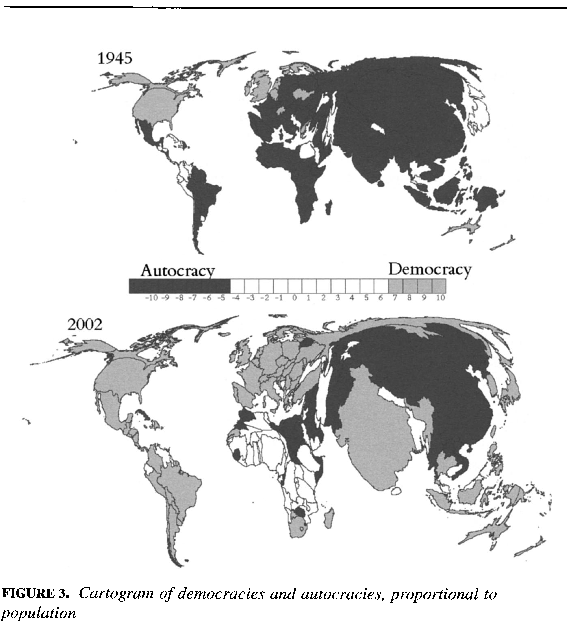
One of the empirical facts of the post-WWII era has been the inexorable rise not only in the number of democratic states, but also in the number of the world’s denizens who reside in democracies. We’ve probably all seen the Freedom House world Maps of Freedom, which are published on an annual basis.
That’s great for providing a quick visual idea of how many of the world’s states have democratic regimes. But, it doesn’t tell us how many of the world’s inhabitants live in democracies. This clever cartogram by Gleditsch and Ward does this. Cartograms bend and mis-shape world maps on the basis of the values of the underlying variable–in this case, population. What do you think? The map below shows a dramatic rise since 1945 in both the number of states and the number of the world’s citizens who live in democracies. You’ll note that this map is from 2002 data, and there have been some important changes, notably Russia’s slide back toward autocracy in the last decade or so. Also, look at how massive India and China are (population-wise)!
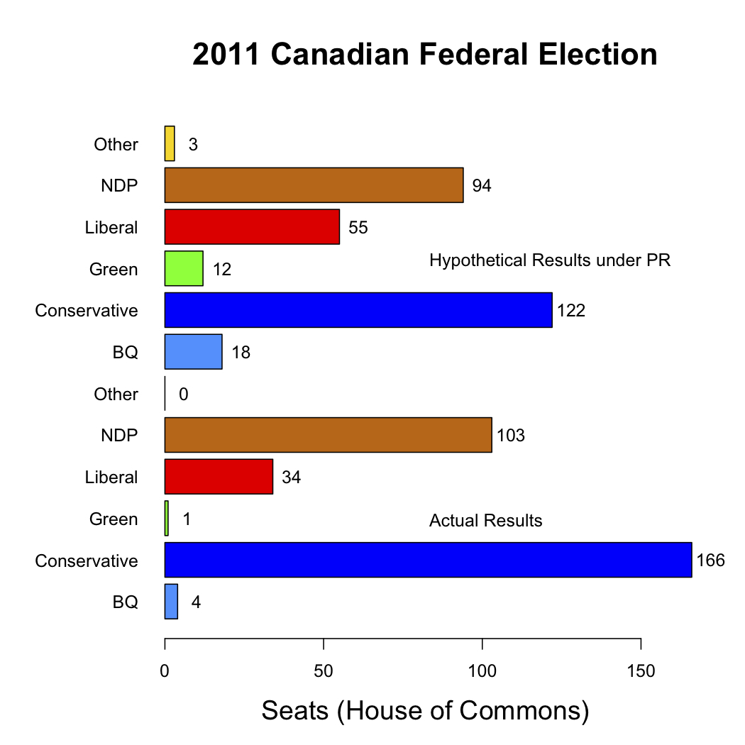
In IS210 we will discuss the relative merits of the two most frequently instituted electoral systems–proportional representation and plurality (also called majority or “first-past-the-post” electoral systems.
In advance, here is a chart that I’ve created, which shows the electoral results (in terms of number of seats won in the House of Commons) of the 2011 Canadian Federal election. The bottom of the chart contains the actual number of seats won, while the top lists the hypothetical number of seats each party would have won if Canada’s electoral system were one of proportional representation. So, Canada’s electoral system is working as it should, correct?
In conjunction with this week’s readings on democracy and democratization, here is an informative video of a lecture given by Ellen Lust of Yale University. In her lecture, Professor Lust discuses new research that comparative analyzes the respective obstacles to democratization of Libya, Tunisia, and Egypt. For those of you in my IS240 class, it will demonstrate to you how survey analysis can help scholars find answers to the questions they seek. For those in IS210, this is a useful demonstration in comparing across countries. [If the “start at” command wasn’t successful, you should forward the video to the 9:00 mark; that’s where Lust begins her lecture.]
Pie charts have been justifiably criticized for one very important reason (and many less important reasons: pie charts are bad at “the one thing they’re ostensibly designed to do,”and that is to show the relationship of parts of the whole. Check out this site for some egregious examples of failing to represent one’s data clearly.
A student of mine in IS240 (Intro to Research Methods in Intl. Studies) may have unknowingly redeemed the besmirched reputation of the pie chart. The upshot, though, is that she was using the pie chart (along with some clever colour manipulation) to compare results across pie charts, not within.
Here are three pie charts, depicting the answers to a question in the World Values Survey that taps into the concept of homophobia. The potential response set for this question was ordinal in nature, ranging from 0 to 10, with 1 representing the most homophobic response, and 10 the least. Using a colour ramp, this student produced the pie charts you can see below. Essentially, the charts are easy to compare across countries: the more red you see, the more homophobic the responses to that question!
Very nicely done! The R-code to produce these is below. You’ll need v202 and v2 of the World Values Surveys in a data frame (which we have called four.df):
Here is the R code to produce three separate PDF files, one with each chart:
piecolor<-colorRampPalette(c("red","white"))
names<-c("canada","italy","thailand")
Cnames<-c("Canada","Italy","Thailand")

for (i in 1:3) {
+pdf(file=Cnames[i].pdf)
+ pie(table(factor(four.df$v202[four.df$v2==names[i]])),col=piecolor(10), main=Cnames[i])
+ dev.off()
+ }


767.AndyC555 -” Whatever happened to that hole in the ozone layer that environmentalists told us was going to kill us all with radiation from space back in the 1980s and 90s?”
It was closed, thanks to the Montreal Protocol 1987 and international co-operation. CFCs were banned
http://news.nationalgeographic.com/news/2010/05/100505-science-environment-ozone-hole-25-years/