In post #21 of this series, I examined the relationship between electricity prices across European Union (EU) countries and the market penetration of renewable (solar and wind) energy sources. There’s been some discussion amongst the defenders of the continued uninterrupted burning of fossil fuels of a finding that allegedly shows the higher the market penetration of renewables, the higher electricity prices. I demonstrated in the previous post that this is a spurious relationship and a more plausible reason for the empirical relationship is that market penetration is highly correlated with how rich (and expensive) a country is. Indeed, I showed that controlling for cost-of-living in a particular country, the relationship between market penetration of renewables and cost of electricity was not statistically significant.
I noted at the end of that post that I would show the results of a simple multiple linear regression of the before-tax price of electricity and market penetration of renewables across these countries.
But, first here is a chart of the results of the predicted price of before-tax electricity in a country given the cost-of-living, holding the market penetration of renewables constant. We see a strong positive relationship—the higher the cost-of-living in a country, the more expensive the before-tax cost of electricity.
Created by: Josip Dasović
Here’s the chart based on the results of a multiple regression analysis using before-tax electricity price as the dependent variable, with renewables market penetration as the main dependent variable, holding the cost-of-living constant. The relationship is obviously negative, but it is not statistically significant. Still, there is NOT a positive relationship between the market penetration of renewables and the before-tax price of electricity across EU countries.
In my previous post I noted that I would provide python code for the chart that is in the post. The chart was created using R statistical software, and the code for the python version can be found at the end of this post.
I find python a bit less intuitive than R but that’s most likely because I’ve been using R for a very long time and python for less long. There are reasons, I suppose, to favour one over the other, but for statistical analysis and data analysis I don’t necessarily see an advantage of one over the other. That being said, it is my sense that R does a better job of standardizing across various operating systems, which can be very helpful when you are a Linux user, as am I.
import numpy as np
import matplotlib.pyplot as plt
import networkx as nx
from matplotlib.animation import FuncAnimation
plt.style.use('ggplot') # this is to make the plot look like an R ggplot

# a roulette array
roulette = np.append(np.array([0, 0]),np.arange(1, 37))
spins1000 = np.array(np.random.choice(roulette, size=(1000)))

# Define a cumulative mean function
def cum_mean(arr):
    cum_sum = np.cumsum(arr)
    return cum_sum / (np.arange(1, cum_sum.shape[0] + 1))     # as far as I can tell, matplotlib doesn't have a cumulative mean function; so I created one.


fig = plt.figure()
ax1 = fig.add_subplot(2, 1, 2)
ax2 = fig.add_subplot(2, 1, 1)
fig.tight_layout(pad=3.0)
fig.suptitle('Short-term Randomness versus Long-term Predictability', fontsize=14)
ax2.set_xlabel('$n^th$ spin of roulette wheel')
ax2.set_ylabel('Value of $n^{th}$ spin')
ax2.set_xlim(0, 1000)
ax2.set_ylim(0, 37)

ax1.set_xlabel('$n^{th}$ spin of the roulette wheel')
ax1.set_ylabel('Cumulative mean of n spins')
ax1.set_xlim(0, 1000)
ax1.set_ylim(0, 37)

line, = ax1.plot([], [], lw=1.5)
scat, = ax2.plot([], [], 'o', markersize=2)

def init():
    line.set_data([], [])
    scat.set_data([], [])
    return line, scat,

def animate(i):
    x = np.linspace(0, 250, 250)
    y1 = cum_mean(spins1000)
    y2 = spins1000
    line.set_data(x[:i], y1[:i])
    scat.set_data(x[:i], y2[:i])
    return line, scat,

anim = FuncAnimation(fig, animate, init_func=init, frames=1000, interval=10, blit=True, save_count=1000)

plt.show()

anim.save('roullete_python.mp4') # saving as .mp4 because python creates massive gif files.
In the most recent post in my data visualization series I made an analogy between climate, weather and the spins of a roulette wheel that demonstrated that short-term randomness does not mean we can’t make accurate long-term predictions.
Towards the end of the post I appended an animation of 1000 random spins of a roulette wheel. In that post, I plotted the 1000 individual outcomes of these random spins of the roulette wheel. I chose to show only one outcome at a time as the animation cycled through all 1000 spins. In this post, I wanted to show you how to keep all of the outcomes from disappearing. Rather than having the value of each spin appear, and then disappear, I will change the code slightly to have every spin’s outcome stay on the plot, but faded so that the focus remains on the next spin value. Here’s what I mean.:
Created by Josip Dasović
Here is the R code for the image above:
## These are the packages needed to draw, and animate, the plots.
library(ggplot2)
library(gganimate)
library(dplyr)  # needed for cummean function

## Set up a data frame for the 1000 random spins of the roulette wheel

mywheel <-c(rep(0,2),1:36)  # a vector with the 38 wheel values
wheel.df<-data.frame("x"=1:1000,"y"=sample(mywheel,1000,rep=T))

## Plot, then animate the result of 1000 random spins of the wheel

## the code to plot
gg.roul.1000.point<- ggplot(wheel.df,aes(x, y, colour = "firebrick4")) +
  geom_point(show.legend = FALSE, size=2) +
  theme_gray() +
  labs(title = "1000 Random Spins of a Roulette Wheel",
       x = expression("the"~n^th~"roll of the wheel"),
       y = 'Value of a single spin') +
  theme(plot.title = element_text(hjust = 0.5, size = 14, color = "black")) +
  scale_y_continuous(expand = c(0, 0)) +
  transition_time(wheel.df$x) +
  shadow_mark(past = T, future=F, alpha=0.2)

## the code to animate
gg.roul.anim.point <- animate(gg.roul.1000.point, nframes=500, fps=25, width=500, height=280, renderer=gifski_renderer("gg_roulette_1000.gif"))

## No plot and animate a line chart that depicts the cumulative mean from spin 1 to spin 1000.

gg.roul.1000.line <- ggplot(wheel.df, aes(x, y = cummean(y))) +
  geom_line(show.legend = FALSE, size=1, colour="firebrick4") +
  theme_gray() +
  ggtitle("Cumulative Mean of Roulette Wheel Spins is Stable over Time") +
  theme(plot.title = element_text(hjust = 0.5, size = 14, color = "black")) +
  labs(x = expression("the"~n^th~"roll of the wheel"),
       y = 'Running (i.e., cumulative) Mean of all Rolls at Roll n') +
  scale_y_continuous(expand=c(0,0), limits=c(0,36)) +
  transition_reveal(wheel.df$x) +
  ease_aes('linear')

gg.roul.anim.line <- animate(gg.roul.1000.line, nframes=500, fps=25, width=500, height=280, renderer=gifski_renderer("cummean_roulette_1000.gif"))

## Now combine the plots into one figure, using the magick library

library(magick)

a_mgif <- image_read(gg.roul.anim.point)
b_mgif <- image_read(gg.roul.anim.line)

roul_gif <- image_append(c(a_mgif[1], b_mgif[1]),stack=TRUE)
for(i in 2:500){
  combined <- image_append(c(a_mgif[i], b_mgif[i]),stack=TRUE)
  roul_gif <- c(roul_gif, combined)
}

## Save the final file as a .gif file

image_write(roul_gif, "roulette_stacked_point_line_500.gif")
If you are at all familiar with the politics and communication surrounding the global warming issue you’ll almost certainly have come across one of the most popular talking points among those who dismiss (“deny”) contemporary anthropogenic (human-caused) climate change (I’ll call them “climate deniers” henceforth). The claim goes something like this:
“If scientists can’t predict the weather a week from now, how in the world can climate scientists predict what the ‘weather’ [sic!] is going to be like 10, 20, or 50 years from now?”
Notably, the statement does possess a prima facie (i.e., “commonsensical”) claim to plausibility–most people would agree that it is easier (other things being equal) to make predictions about things are closer in time to the present than things that happen well into the future. We have a fairly good idea of the chances that the Vancouver Canucks will win at least half of their games for the remainder of the month of March 2021. We have much less knowledge of how likely the Canucks will be to win at least half their games in February 2022, February 2025, or February 2040.
Notwithstanding the preceding, the problem with this denialist argument is that it relies on a fundamental misunderstanding of the difference between climate and weather. Here is an extended excerpt from the US NOAA:
We hear about weather and climate all of the time. Most of us check the local weather forecast to plan our days. And climate change is certainly a “hot” topic in the news. There is, however, still a lot of confusion over the difference between the two.
Think about it this way: Climate is what you expect, weather is what you get.
Weather is what you see outside on any particular day. So, for example, it may be 75° degrees and sunny or it could be 20° degrees with heavy snow. That’s the weather.
Climate is the average of that weather. For example, you can expect snow in the Northeast [USA] in January or for it to be hot and humid in the Southeast [USA] in July. This is climate. The climate record also includes extreme values such as record high temperatures or record amounts of rainfall. If you’ve ever heard your local weather person say “today we hit a record high for this day,” she is talking about climate records.
So when we are talking about climate change, we are talking about changes in long-term averages of daily weather. In most places, weather can change from minute-to-minute, hour-to-hour, day-to-day, and season-to-season. Climate, however, is the average of weather over time and space.
The important message to take from this is that while the weather can be very unpredictable, even at time-horizons of only hours, or minutes, the climate (long-term averages of weather) is remarkably stable over time (assuming the absence of important exogenous events like major volcanic eruptions, for example).
Although weather forecasting has become more accurate over time with the advance of meteorological science, there is still a massive amount of randomness that affects weather models. The difference between a major snowstorm, or clear blue skies with sun, could literally be a slight difference in air pressure, or wind direction/speed, etc. But, once these daily, or hourly, deviations from the expected are averaged out over the course of a year, the global mean annual temperature is remarkably stable from year-to-year. And it is an unprecedentedly rapid increase in mean annual global temperatures over the last 250 years or so that is the source of climate scientists’ claims that the earth’s temperature is rising and, indeed, is currently higher than at any point since the beginning of human civilization some 10,000 years ago.
Although the temperature at any point and place on earth in a typical year can vary from as high as the mid-50s degrees Celsius to as low as the -80s degrees Celsius (a range of some 130 degrees Celsius) the difference in the global mean annual temperature between 2018 and 2019 was only 0.14 degrees Celsius. That incorporates all of the polar vortexes, droughts, etc., over the course of a year. That is remarkably stable. And it’s not a surprise that global mean annual temperatures tend to be stable, given the nature of the earth’s energy system, and the concept of earth’s energy budget.
In the same way that earth’s mean annual temperatures tend to be very stable (accompanied by dramatic inter-temporal and inter-spatial variation), we can see that the collective result of many repeated spins of a roulette wheel is analogously stable (with similarly dramatic between-spin variation).
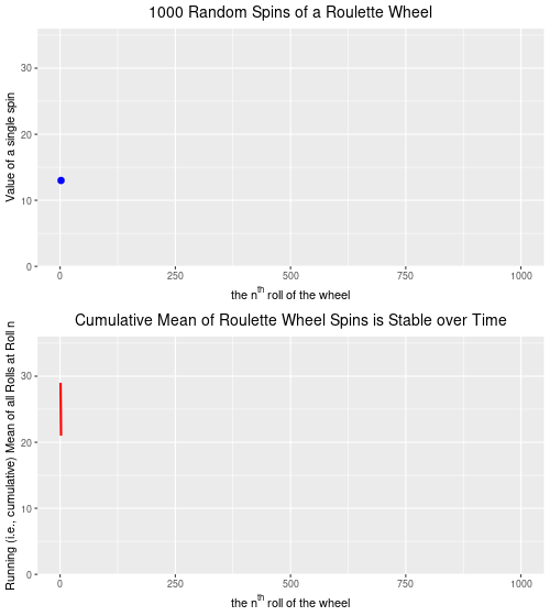
A roulette wheel has 38 numbered slots–36 of which are split evenly between red slots and black slots–numbered from 1 through 36–and (in North America) two green slots which are numbered 0, and 00. It is impossible to determine with any level of accuracy the precise number that will turn up on any given spin of the roulette wheel. But, we know that for a standard North American roulette wheel, over time the number of black slots that turn up will be equal to the number of red slots that turn up, with the green slots turning up about 1/9 as often as either red or black. Thus, while we have no way of knowing exactly what the next spin of the roulette wheel will be (which is a good thing for the casino’s owners), we can accurately predict the “mean outcome” of thousands of spins, and get quite close to the actual results (which is also a good thing for the casino owners and the reason that they continue to offer the game to their clients).
Below are two plots–the upper plot is an animated plot of each of 1000 simulated random spins of a roulette wheel. We can see that the value of each of the individual spins varies considerably–from a low of 0 to a high of 36. It is impossible to predict what the value of the next spin will be.
The lower plot, on the other hand is an animated plot, the line of which represents the cumulative (i.e. “running”) mean of 1000 random spins of a roulette wheel. We see that for the first few random rolls of the roulette wheel the cumulative mean is relatively unstable, but as the number of rolls increases the cumulative mean eventually settles down to a value that is very close to the ‘expected value’ (on a North Amercian roulette wheel) of 17.526. The expected value* is simply the sum of all of the individual values 0,0, 1 through 36 divided by the total number of slots, which is 38. Over time, as we spin and spin the roulette wheel, the values from spin-to-spin may be dramatically different. Over time, though, the mean value of these spins will converge on the expected value of 17.526. From the chart below, we see that this is the case.
Created by Josip Dasović
Completing the analogy to weather (and climate) prediction, on any given spin our ability to predict what the next spin of the roulette wheel will be is very low. [The analogy isn’t perfect because we are a bit more confident in our weather predictions given that the process is not completely random–it will be more likely to be cold and to snow in the winter, for example.] But, over time, we can predict with a high degree of accuracy that the mean of all spins will be very close to 17.526. So, our inability to predict short-term events accurately does not mean that we are not able to predict long-term events accurately. We can, and we do. In roulette, and for the climate as well.
TLDR: Just because a science can’t predict something short-term does not mean that it isn’t a science. Google quantum physics and randomness and you’ll understand what Einstein was referring to when he quipped that “God does not play dice.” Maybe she’s a roulette player instead?
Note: This is not the same as the expected dollar value of a bet given that casinos generate pay-off matrixes that are advantageous to themselves.
We used the last session of IS450 as a chance to hold a mock United Nations climate conference simulation. The participants brought forward many intriguing and instructive topics, and I applaud them for putting in the time and energy to make the simulation as successful as I, at least, judged it to be. At some point during the proceedings, there was majority agreement (finally!) on one small element of the overall framework resolution. Interestingly, though, immediately upon the successful passing of that small piece of the framework a couple of delegates put forward a motion to make the obligations legally binding. A heated discussion ensued debating the merits and disadvantages of such an approach.
In the current round of UNFCCC climate negotiations, behind held in Lima, Peru, Nicholas Stern (author of the well-known Stern Review Report on the Economics of Climate Change) has argued against making international climate treaty obligations legally binding. What is Lord Stern’s rationale for this?
“Some may fear that commitments that are not internationally legally-binding may lack credibility,” he said.
“That, in my view, is a serious mistake. The sanctions available under the Kyoto Protocol, for example, were notionally legally-binding but were simply not credible and failed to guarantee domestic implementation of commitments.”
In Lima, negotiators are trying to hammer out the format that mitigation efforts should take. By the end of March next year countries have to declare their hands, but they have yet to formalize what will be included in these commitments and what will not.
Lord Stern believes that grounding the process in the laws and promises that countries undertake by themselves is a better model for a deal than a top-down process like Kyoto.
“It will be enforceable and deliverable through the arrangements and laws in the countries themselves.
“That way you will get stronger ambition as countries won’t be tempted to be hesitant about some type of international sanction.”
What do you think about Lord Stern argument? Would you support voluntary obligations over mandatory ones?
Here is an interview with Lord Stern from earlier this week in Lima, wherein he speaks on the link between economic growth, development, and better climate responsibility?
This blog is back from an end-of-semester-induced slumber with some important posts. Here is post, the first:
Here’s an intriguing map, posted on the spatialities.com web site. It shows what Vancouver would look like with an expected 80-meter sea-level rise, which is what the United States Geological Survey predicts would happen were the Antarctic and Greenland ice sheets to melt completely (remember that these are land-based ice sheets).
Most of the current global land ice mass is located in the Antarctic and Greenland ice sheets (table 1). Complete melting of these ice sheets could lead to a sea-level rise of about 80 meters, whereas melting of all other glaciers could lead to a sea-level rise of only one-half meter.
Don’t go and sell your Fairview condo just yet, however, as this scenario is not projected to complete for between 1,000 and 10,000 years. Of course, this is a process that develops incrementally (though not linearly) over time and the city would be deeply affected adversely with only a fraction of that projected rise in sea levels.
For those who may doubt that the world’s glaciers are melting, here is video of the largest glacier ‘calving’ event ever caught on film. The end of the clip demonstrates the extent of change in the rate of melting and glacial retreat over the last century. Just watch!
Last week we discussed the role of domestic politics–institutions, electoral systems, partisanship, etc.,–on national political leaders’ attitudes towards and policies on climate change. We noted that the Canadian federal governments stance toward mitigation and adaptation changed dramatically upon the ascension of the Conservatives to power in 2006 (a minority government). The majority government that Harper was able to win in 2011 signalled the death knell for Canada’s involvement in the Kyoto process as Harper’s government reneged on Canada’s obligations quickly thereafter.
The United States, meanwhile, enters the final week of the biennial “midterm elections”, with most candidates (and the public) focused on issues other than climate change. When climate change is mentioned, however, the candidates responses are not reassuring. Have a look at this video for an impressive compilation of candidates’ responses to whether they believe in the existence of anthropogenic climate change. Incidentally, for a comprehensive debunking of Representative Steve Pearce’s claim that 31,000 scientists signed a petition claiming that there was no global warming, click here.
So, if you’re not convinced by the ethical perspectives on climate change, then maybe you’ll be convinced to take it seriously if you are told that it could make state less secure going forward. In a new report from the US Department of Defence (i.e., “The Pentagon”), climate change is seen as a “threat multiplier.” In the language of Homer-Dixon, this means that climate change is viewed not as an exogenous cause of conflict, but as a factor that could negatively influence hypothesized exogenous causes of both civil and inter-state conflict. This is how Bloomberg News responded to the release of the report:
Global warming will worsen many of the challenges the U.S. military already is grappling with, the department said in areport yesterday.
“We refer to climate change as a ‘threat multiplier’ because it has the potential to exacerbate many of the challenges we are dealing with today -– from infectious disease to terrorism,” Secretary of Defense Chuck Hagel said in a blog post. “While scientists are converging toward consensus on future climate projections, uncertainty remains. But this cannot be an excuse for delaying action.”
Here is the report in its entirely. I am also providing a video excerpt of an MSNBC story on the release of the report, which has the added virtue of including an interview with the author of one of the readings that I think at least 2 of you read for Wednesday’s seminar! The author is Chris Parenti, who has written an interesting book called Climate of Chaos.
We have spoken repeatedly about the difference between climate science scepticism and climate science denial. Scepticism is at the heart of the scientific enterprise; a sceptical approach to knowledge claims is consistent with the contingent, or provisional, nature of scientific knowledge.
Climate scientists are themselves sceptical about climate science in that they know that while they have learned a great deal about how our climate works, there is much that is either unknown or that can be known better. With that in mind, I provide for your enlightenment a skceptic’s guide to climate science published by the Berkeleyearth.org. It’s interesting that the Professor of Physics Richard Muller, the founder and scientific director, is a self-admitted ‘converted sceptic’. Indeed, he once believed that the gaps in the scientific knowledge of climate change were so large that he doubted the very existence of global warming. In this op-ed in the New York Times, Muller writes:
Three years ago I identified problems in previous climate studies that, in my mind, threw doubt on the very existence of global warming. Last year, following an intensive research effort involving a dozen scientists, I concluded that global warming was real and that the prior estimates of the rate of warming were correct. I’m now going a step further: Humans are almost entirely the cause.
My total turnaround, in such a short time, is the result of careful and objective analysis by the Berkeley Earth Surface Temperature project, which I founded with my daughter Elizabeth. Our results show that the average temperature of the earth’s land has risen by two and a half degrees Fahrenheit over the past 250 years, including an increase of one and a half degrees over the most recent 50 years. Moreover, it appears likely that essentially all of this increase results from the human emission of greenhouse gases.
These findings are stronger than those of the Intergovernmental Panel on Climate Change, the United Nations group that defines the scientific and diplomatic consensus on global warming.
Although there is strong scientific evidence of human-induced global warming, there are still many issues that are scientifically not settled. Read the following short, but instructive document to learn how to become an informed climate science sceptic. The alternative is to look as uninformed as this guy:
Here’s an article profiling one of the leaders of the September 2014 Climate March. Bill McKibben is a journalist and environmental activist whose career spans more than three decades.
Bill McKibben wrote the first big book about global warming, a work he hoped would startle the world like a fire alarm. But the planet just kept on hurtling toward an overheated doom, he noticed. So twenty-five years later, he’s come up with a shriller, more literal strategy for reform: actual alarms.
McKibben is also the creator of the 350.org website, which is must reading for anybody interested in environmental news and activism. (The 350 stands for the levels of atmospheric CO2 gas (measured in parts-per-million (ppm)) aove which climate scientists believe puts the global climate in serious peril. Another good resource is McKibben’s personal website.
Finally, here’s an interview with Bill Moyers, in which McKibben urges US President Barack Obama (the leader of the world’s greatest historical emitter of GHGs) to “say no to big oil.”


You must be logged in to post a comment.