Pie charts have been justifiably criticized for one very important reason (and many less important reasons: pie charts are bad at “the one thing they’re ostensibly designed to do,”and that is to show the relationship of parts of the whole. Check out this site for some egregious examples of failing to represent one’s data clearly.
A student of mine in IS240 (Intro to Research Methods in Intl. Studies) may have unknowingly redeemed the besmirched reputation of the pie chart. The upshot, though, is that she was using the pie chart (along with some clever colour manipulation) to compare results across pie charts, not within.
Here are three pie charts, depicting the answers to a question in the World Values Survey that taps into the concept of homophobia. The potential response set for this question was ordinal in nature, ranging from 0 to 10, with 1 representing the most homophobic response, and 10 the least. Using a colour ramp, this student produced the pie charts you can see below. Essentially, the charts are easy to compare across countries: the more red you see, the more homophobic the responses to that question!
Very nicely done! The R-code to produce these is below. You’ll need v202 and v2 of the World Values Surveys in a data frame (which we have called four.df):
Here is the R code to produce three separate PDF files, one with each chart:
piecolor<-colorRampPalette(c("red","white"))
names<-c("canada","italy","thailand")
Cnames<-c("Canada","Italy","Thailand")

for (i in 1:3) {
+pdf(file=Cnames[i].pdf)
+ pie(table(factor(four.df$v202[four.df$v2==names[i]])),col=piecolor(10), main=Cnames[i])
+ dev.off()
+ }
In a recent working paper by Hanson and Sigman, of the Maxwell School of Citizenship and Public Affairs at Syracuse University, the authors explore the concept(s) of state capacity. The paper title–Leviathan’s Latent Dimensions: Measuring State Capacity for Comparative Political Research, complies with my tongue-in-cheek rule about the names of social scientific papers. Hanson and Sigman use statistical methods (specifically, latent variable analysis) to tease out the important dimensions of state capacity. Using a series of indexes created by a variety of scholars, organizations, and think tanks, the authors conclude that there are three distinct dimensions of state capacity, which they label i) extractive, ii) coercive, and iii) administrative state capacity.
Here is an excerpt:
The meaning of state capacity varies considerably across political science research. Further complications arise from an abundance of terms that refer to closely related attributes of states: state strength or power, state fragility or failure, infrastructural power, institutional capacity, political capacity, quality of government or governance, and the rule of law. In practice, even when there is clear distinction at the conceptual level, data limitations frequently lead researchers to use the same
empirical measures for differing concepts.
For both theoretical and practical reasons we argue that a minimalist approach to capture the essence of the concept is the most effective way to define and measure state capacity for use in a wide range of research. As a starting point, we define state capacity broadly as the ability of state institutions to effectively implement official goals (Sikkink, 1991). This definition avoids normative conceptions about what the state ought to do or how it ought to do it. Instead, we adhere to the notion that capable states may regulate economic and social life in different ways, and may achieve these goals through varying relationships with social groups…
…We thus concentrate on three dimensions of state capacity that are minimally necessary to carry out the functions of contemporary states: extractive capacity, coercive capacity, and administrative capacity. These three dimensions, described in more detail below,accord with what Skocpol identifies as providing the “general underpinnings of state capacities” (1985: 16): plentiful resources, administrative-military control of a territory, and loyal and skilled officials.
Here is a chart that measures a slew of countries on the extractive capacity dimension in
I have just graded and returned the second lab assignment for my introductory research methods class in International Studies (IS240). The lab required the students to answer questions using the help of the R statistical program (which, you may not know, is every pirate’s favourite statistical program).
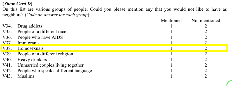
The final homework problem asked students to find a question in the World Values Survey (WVS) that tapped into homophobic sentiment and determine which of four countries under study–Canada, Egypt, Italy, Thailand–could be considered to be the most homophobic, based only on that single question.
More than a handful of you used the code below to try and determine how the respondents in each country answered question v38. First, here is a screenshot from the WVS codebook:
Students (rightfully, I think) argued that those who mentioned “Homosexuals” amongst the groups of people they would not want as neighbours can be considered to be more homophobic than those who didn’t mention homosexuals in their responses. (Of course, this may not be the case if there are different levels of social desirability bias across countries.) Moreover, students hypothesized that the higher the proportion of mentions of homosexuals, the more homophobic is that country.
But, when it came time to find these proportions some students made a mistake. Let’s assume that the student wanted to know the proportion of Canadian respondents who mentioned (and didn’t mention) homosexuals as persons they wouldn’t want to have as neighbours.
Here is the code they used (four.df is the data frame name, v38 is the variable in question, and country is the country variable):
Thus, these students concluded that almost 63% of Canadian respondents mentioned homosexuals as persons they did not want to have as neighbours. That’s downright un-neighbourly of us allegedly tolerant Canadians, don’tcha think?. Indeed, when compared with the other two countries (Egyptians weren’t asked this question), Canadians come off as more homophobic than either the Italians or the Thais.
So, is it true that Canadians are really more homophobic than either Italians or Thais? This may be a simple homework assignment but these kinds of mistakes do happen in the real academic world, and fame (and sometimes even fortune–yes, even in academia a precious few can make a relative fortune) is often the result as these seemingly unconventional findings often cause others to notice. There is an inherent publishing bias towards results that seem to run contrary to conventional wisdom (or bias). The finding that Canadians (widely seen as amongst the most tolerant of God’s children) are really quite homophobic (I mean, close to 2/3 of us allegedly don’t want homosexuals, or any LGBT persons, as neighbours) is radical and a researcher touting these findings would be able to locate a willing publisher in no time!
But, what is really going on here? Well, the problem is a single incorrect symbol that changes the findings dramatically. Let’s go back to the code:
The culprit is the | (“or”) character. What these students are asking R to do is to search their data and find the proportion of all responses for which the respondent either mentioned that they wouldn’t want homosexuals as neighbours OR the respondent is from Canada. Oh, oh! They should have used the & symbol instead of the | symbol to get the proportion of Canadian who mentioned homosexuals in v38.
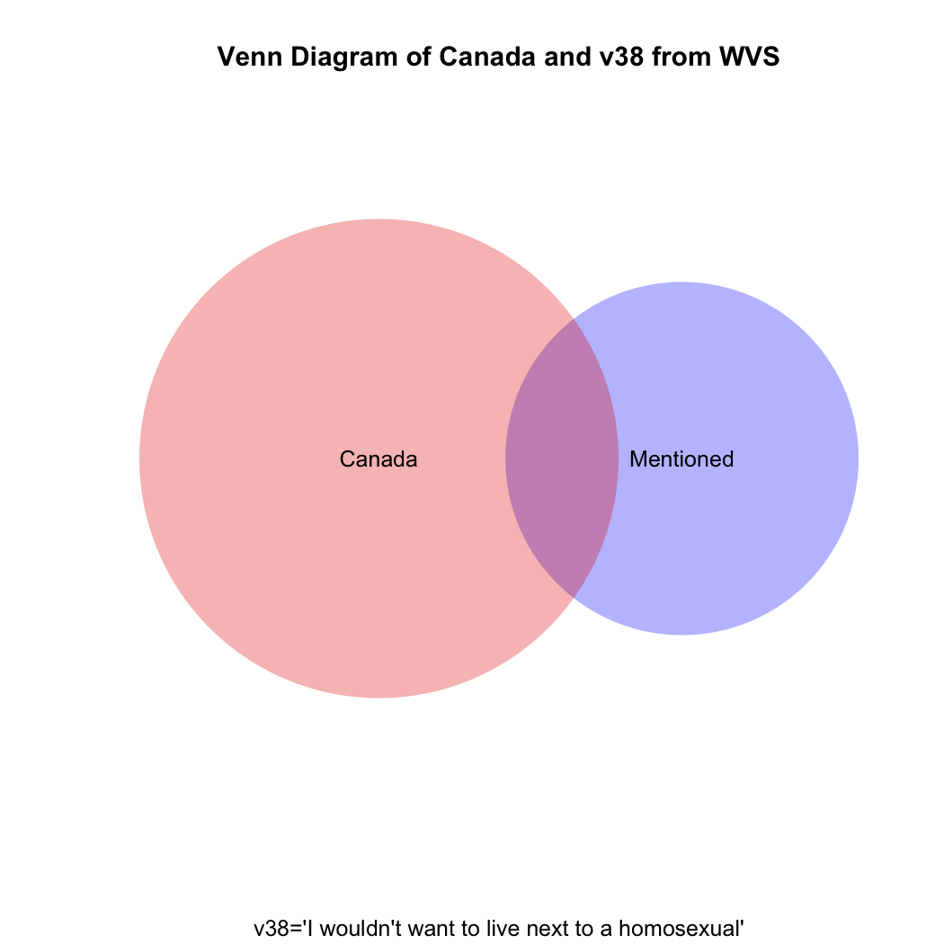
To understand visually what’s happening let’s take a look at the following venn diagram (see the attached video above for Ali G’s clever use of what he calls “zenn” diagrams to find the perfect target market for his “ice cream glove” idea; the code for how to create this diagram in R is at the end of this post). What we want is the intersection of the blue and red areas (the purple area). What the students’ coding has given us is the sum of (all of!) the blue and (all of!) the red areas.
To get the raw number of Canadians who answered “mentioned” to v38 we need the following code:
But what if you then created a proportional table out of this? You still wouldn’t get the correct answer, which should be the proportion that the purple area on the venn diagram comprises of the total red area.
Just eyeballing the venn diagram we can be sure that the proportion of homophobic Canadians is larger than 3.9%. What we need is the proportion of Canadian respondents only(!) who mentioned homosexuals in v38. The code for that is:
prop.table(table(four.df$v38[four.df$v2=="canada"]))

mentioned not mentioned
0.1404806     0.8595194
So, only about 14% of Canadians can be considered to have given a homophobic response, not the 62% our students had calculated. What are the comparative results for Italy and Thailand, respectively?
prop.table(table(four.df$v38[four.df$v2=="italy"]))

mentioned not mentioned
0.235546      0.764454

prop.table(table(four.df$v38[four.df$v2=="thailand"]))

mentioned not mentioned
0.3372781     0.6627219
The moral of the story: if you mistakenly find something in your data that runs against conventional wisdom and it gets published, but someone comes along after publication and demonstrates that you’ve made a mistake, just blame it on a poorly-paid research assistant’s coding mistake.
Here’s a way to do the above using what is called a for loop:
four<-c("canada","egypt","italy","thailand")
for (i in 1:length(four)) {
+ print(prop.table(table(four.df$v38[four.df$v2==four[i]])))
+ print(four[i])
+ }

mentioned not mentioned
0.1404806     0.8595194
[1] "canada"

mentioned not mentioned

[1] "egypt"

mentioned not mentioned
0.235546      0.764454
[1] "italy"

mentioned not mentioned
0.3372781     0.6627219
[1] "thailand"
Here’s the R code to draw the venn diagram above:
install.packages("venneuler")

library(venneuler}

v1<-venneuler(c("Mentioned"=sum(four.df$v38=="mentioned",na.rm=T),"Canada"=sum(four.df$v2=="canada",na.rm=T),"Mentioned&Canada"=sum(four.df$v2=="canada" & four.df$v38=="mentioned",na.rm=T)))

plot(v1,main="Venn Diagram of Canada and v38 from WVS", sub="v38='I wouldn't want to live next to a homosexual'", col=c("blue","red"))
50-foot Jesus statue in front of an abortion clinic
In IS240 on Monday we looked at some of the characteristics of qualitative research methods. such as i) it is inductive, ii) normally interpretivist, and iii) qualitative researchers view constructionist ontological viewpoints. A final characteristic of most qualitative research is that its approach is naturalistic. As the textbook notes:
…qualitative researchers try to minimize the disturbance they cause to the social worlds they study.
We can see the nature of this quality implicitly teased out by Lori Freedman, who discusses some of the research she did for her Master’s degree. Freedman writes about the relationship between abortion and religion (it’s not what you’re expecting) and the time she spent observing in a hospital that performed abortions. Here’s the part related to her research methods:
Claudia [a deeply religious Catholic woman who was having an abortion–JD] told me this story 13 years ago, while I was conducting ethnographic research as a participant-observer in a hospital-based abortion service. I spent considerable time there helping, observing, and intermittently conducting as many interviews as I could with counselors, doctors, and nurses, in order to gain a rich view of abortion clinic life. This study became my master’s thesis, but nothing else. I feared publication might amount to a gratuitous exposé of people I respected dearly. I couldn’t think of any policy or academic imperative that necessitated revealing the intimate dynamics of this particular social world—certainly nothing that could make the potential feelings of betrayal worthwhile. Ultimately, I just tucked it away.
Those of you in my IS210 class may find the Polity IV data to be of use when writing your paper. Click on the image below to take you to the website, where (if you scroll down to the bottom) you can see the regime scores (between -10 and +10) for each country over many years. See the example at the bottom of this post.
Political Regime Types–Polity IV Dataset
Here’s an exampe of the history of movements in regime for El Salvador from 1946 until 2010. How many changes in regime does El Salvador seem to have experienced in the post-WWII period? What happened in the early 1980s?
In Chapter 8 of Bryman, Beel, and Teevan, the authors discuss qualitative research methods and how to do qualitative research. In a subsection entitled Alternative Criteria for Evaluating Qualitative Research, the authors reference Lincoln and Guba’s thoughts on how to assess the reliability, validity, and objectivity of qualitative research. Lincoln and Guba argue that these well-known criteria (which developed from the need to evaluate quantitative research) do not transfer well to qualitative research. Instead, they argue for evaluative criteria such as credibility, transferability, and objectivity.
Saharan Caravan Routes–The dotted red lines in the above map are caravan routes connecting the various countries of North Africa including Egypt, Libya, Algeria, Morocco, Mali, Niger and Chad. Many of the main desert pistes and tracks of today were originally camel caravan routes. (What do the green, yellow, and brown represent?)
Transferability is the extent to which qualitative research ‘holds in some other context’ (the quants reading this will immediately realize that this is analogous to the concept of the ‘generalizability of results’ in the quantitative realm). The authors argue that whether qualitative research fulfills this criterion is not a theoretical, but an empirical issue. Moreover, they argue that rather than worrying about transferability, qualitative researchers should produce ‘thick descriptions’ of phenomena. The term thick description is most closely associated with the anthropologist Clifford Geertz (and his work in Bali). Thick description can be defined as:
the detailed accounts of a social setting or people’s experiences that can form the basis for general statements about a culture and its significance (meaning) in people’s lives.
Compare this account (thick description) by Geertz of the caravan trades in Morocco at the turn of the 20th century to how a quantitative researcher may explain the same institution:
In the narrow sense, a zettata (from the Berber TAZETTAT, ‘a small piece of cloth’) is a passage toll, a sum paid to a local power…for protection when crossing localities where he is such a power. But in fact it is, or more properly was, rather more than a mere payment. It was part of a whole complex of moral rituals, customs with the force of law and the weight of sanctity—centering around the guest-host, client-patron, petitioner-petitioned, exile-protector, suppliant-divinity relations—all of which are somehow of a package in rural Morocco. Entering the tribal world physically, the outreaching trader (or at least his agents) had also to enter it culturally.
Despite the vast variety of particular forms through which they manifest themselves, the characteristics of protection in tbe Berber societies of the High and Middle Atlas are clear and constant. Protection is personal, unqualified, explicit, and conceived of as the dressing of one man in the reputation of another. The reputation may be political, moral, spiritual, or even idiosyncratic, or, often enough, all four at once. But the essential transaction is that a man who counts ‘stands up and says’ (quam wa qal, as the classical tag bas it) to those to whom he counts: ‘this man is mine; harm him and you insult me; insult me and you will answer for it.’ Benediction (the famous baraka),hospitality, sanctuary, and safe passage are alike in this: they rest on the perhaps somewhat paradoxical notion that though personal identity is radically individual in both its roots and its expressions, it is not incapable of being stamped onto tbe self of someone else. (Quoted in North (1991) Journal of Economic Perspectives, 5:1 p. 104.
For IS240 next week, (Intro to Research Methods in International Studies) we will be discussing qualitative research methods. We’ll address components of qualitative research and review issues related to reliability and validity and use these as the basis for an in-class activity.
The activity will require students to have viewed the following short video clips, all of which introduce the viewer to contemporary Myanmar. Some of you may know already that Myanmar (Burma) has been transitioning from rule by military dictatorship to democracy. Here are three aspects of Myanmar society and politics. Please watch as we won’t have time in class to watch all three clips. The clips themselves are not long (just over 3,5,and 8 minutes long, respectively).
The first clip shows the impact of heroin on the Kachin people of northern Myanmar:
The next clip is a short interview with a Buddhist monk on social relations in contemporary Myanmar:
The final video clip is of the potential impact (good and bad) of increased international tourism to Myanmar’s most sacred sites, one of which is Bagan.
In IS210, we will be reading about domestic political economy next week. Understanding the role of state and market, politics and economics, we can learn about what causes some countries’s economies to grow quite rapidly and other countries’ economies to grow more slowly. We’ll look at the role of domestic institutions and policy choices as key root causes in economic development. [How does this contrast with Inglehart’s arguments, or Weber’s idea of the ‘Protestant work ethic?’] Increasingly, though, our ever more globalized and interdependent world economy provides domestic economies with opportunities and threats that didn’t exist to nearly this extent even 50 years ago. We’ll look at economist N. Gregory Mankiw’s New York Times editorial piece on the “trilemma of international finance.”
Have a look at this Frontline excerpt on the Asian financial crisis of 1997 and the role that fixed exchange rates played:
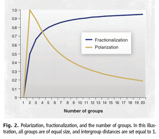
In a series of recent articles, civil conflict researchers Esteban, Mayoral, and Ray (see this paper for an example) have tried to answer that question. Is it economic inequality, or cultural differences? Or maybe there is a political cause at its root. I encourage you to read the paper and to have a look at the video below. Here are a couple of images from the linked paper, which you’ll see remind you of concepts that we’ve covered in IS210 this semester. The first image is only part of the “Model of Civil Conflict.” Take a look at the paper if you want to see the “punchline.”
Here is the relationship between fractionalization and polarization. What does each of these measures of diversity measure?
And here’s a nice youtube video wherein the authors explain their theory.


You must be logged in to post a comment.