Data Visualization #20—”Lying” with statistics

In teaching research methods courses in the past, a tool that I’ve used to help students understand the nuances of policy analysis is to ask them to assess a claim such as:

In the last 12 months, statistics show that the government of Upper Slovobia’s policy measures have contributed to limiting the infollcillation of ramakidine to 34%.

The point of this exercise is two-fold: 1) to teach them that the concepts we use in social science are almost always socially constructed, and we should first understand the concept—how it is defined, measured, and used—before moving on to the next step of policy analysis. When the concepts used—in this case, infollcillation and ramakidine—are ones nobody has every heard of (because I invented them), step 1 becomes obvious. How are we to assess whether a policy was responsible for something when we have zero idea what that something even means? Often, though, because the concept is a familar one—homelessness, polarization, violence—we often skip right past this step and focus on the next step (assessing the data).

2) The second point of the exercise is to help students understand that assessing the data (in this case, the 34% number) can not be done adequately without context. Is 34% an outcome that was expected? How does that number compare to previous years and the situation under previous governments, or the situation with similar governments in neighbouring countries? (The final step in the policy analysis would be to set up an adequate research design that would determine the extent to which the outcome was attributable to policies implemented by the South Slovobian government.)

If there is a “takeaway” message from the above, it is that whenever one hears a numerical claim being made, first ask yourself questions about the claim that fill in the context, and only then proceed to evaluate the claim.

Let’s have a look at how this works, using a real-life example. During a recent episode of Real Time, host Bill Maher used his New Rules segment to admonish the public (especially its more left-wing members) for overestimating the danger to US society of the COVID-19 virus. He punctuated his point by using the following statistical claim:

Maher not only claims that the statistical fact that 78% of COVID-19-caused fatalities in the USA have been from those who were assessed to have been “overweight” means that the virus is not nearly as dangerous to the general USA public as has been portrayed, but he also believes that political correctness run amok is the reason that raising this issue (which Americans are dying, and why) in public is verboten. We’ll leave aside the latter claim and focus on the statistic—78% of those who died from COVID-19 were overweight.

Does the fact that more than 3-in-4 COVID-19 deaths in the USA were individuals assessed to have been overweight mean that the danger to the general public from the virus has been overhyped? Maher wants you to believe that the answer to this question is an emphatic ‘yes!’ But is it?

Whenever you are presented with such a claim follow the steps above. In this case, that means 1) understand what is meant by “overweight” and 2) compare the statistical claim to some sort of baseline.

The first is relatively easy—the US CDC has a standard definition for “overweight”, which can be found here: https://www.cdc.gov/obesity/adult/defining.html. Assuming that the definition is applied consistently across the whole of the USA, we can move on to step 2. The first question you should ask yourself is “is 78% low, or high, or in-between?” Maher wants us to believe that the number is “high”, but is it really? Let’s look for some baseline data with which to compare the 78% statistic. The obvious comparison is the incidence of “overweight” in the general US population. Only when we find this data point will we be able to assess whether 78% is a high (or low) number. What do we find? Let’s go back to the US CDC website and we find this: “Percent of adults aged 20 and over with overweight, including obesity: 73.6% (2017-2018).”

So, what can we conclude? The proportion of USA adults dying from COVID-19 who are “overweight” (78%) is almost the same proportion of the USA adult population that is “overweight (73.6%).” Put another way, the likelihood of randomly selecting a USA adult who is overweight versus randomly selecting one who is not overweight is 73.6/26.4≈3.29. If one were to randomly select an adult who died from COVID-19, one would be 78/22≈3.55 times more likely to select an overweight person than a non-overweight person. Ultimately, in the USA at least, as of the end of April overweight adults are dying from COVID-19 at a rate that is about equal to their proportion in the general adult US population.

We can show this graphically via a pie chart. For many reasons, the use of pie charts is generally frowned upon. But, in this case, where there are only two categories—overweight, and non-overweight—pie charts are a useful visualization tool, which allows for easy visual comparison. Here are the pie charts, and the R code that produced them below:

Created by: Josip Dasović

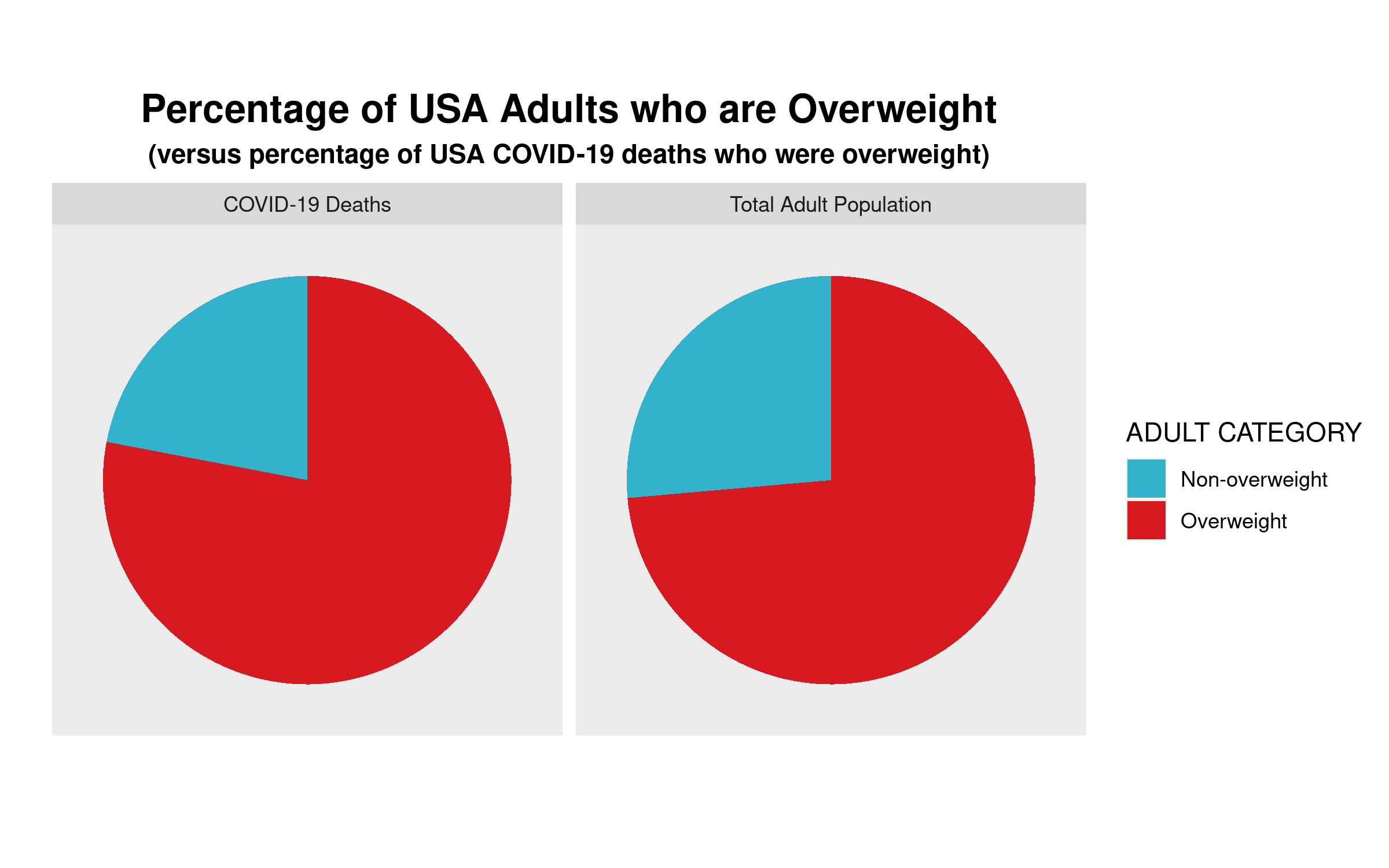
We can clearly see that the proportion of COVID-19 deaths from each cohort—overweight, non-overweight—is almost the same as the proportion of each cohort in the general USA adult population. So, a bit of critical analysis of Maher’s claim shows that he is not making the strong case that he believes he is.

# Here is the required data frame
covid.df <- data.frame("ADULT"=rep(c("Overweight", "Non-overweight"),2), 
                       "Percentage"=c(0.736,0.264,0.78,0.22),
                       "Type"=rep(c("Total Adult Population","COVID-19 Deaths"),each=2))

library(ggplot2)

# Now the code for side-by-side pie charts:

ggpie.covid <- ggplot(covid.df, aes(x="", y=Percentage, group=ADULT, fill=ADULT, )) +
  geom_bar(width = 1, stat = "identity") +
  scale_fill_manual(values=c("#33B2CC","#D71920"),name ="ADULT CATEGORY") + 
  labs(x="", y="", title="Percentage of USA Adults who are Overweight",
       subtitle="(versus percentage of USA COVID-19 deaths who were overweight)") + 
  coord_polar("y", start=0) + facet_wrap(~ Type) +
  theme(axis.text = element_blank(),
        axis.ticks = element_blank(),
        panel.grid  = element_blank(),
        plot.title = element_text(hjust = 0.5, size=16, face="bold"),
        plot.subtitle = element_text(hjust=0.5, face="bold"))

ggsave(filename="covid19overweight.png", plot=ggpie.covid, height=5, width=8)


Data Visualiztion #10–Visual Data and Causality

Researchers and analysts use data visualizations mostly to describe phenomena of interest. That is, they are used mostly to answer “who”, “what”, “where”, and “when” questions. Sometimes, however, data visualizations are meant to explain a phenomenon of interest. In social science, when we “explain” we are answering “how” and/or “why” questions. In essence, we are discussing causality. While social scientists are taught that a simple data visualization is never enough to settle claims of causality, in the real world, we often see simple charts passed off as evidence of the existence of a causal relationship between our phenomena of interest. Here’s an example that I’ve seen on social media that has been used to argue that government policies regarding the wearing of face masks and limiting the operations of businesses have no impact on the spread of the COVID-19 virus. Here’s the chart:

What are we meant to infer from the data contained in this chart? In two (of the 50 + DC) US states, the trajectory of infections seems to be very similar over the past 10 months or so, despite the fact that in one of the states–South Dakota–there have been no restrictions on businesses and no mask mandates, while these have both been part of the policy repertoire in neighbouring North Dakota. While this chart may seem compelling, it can not be used to argue that mask mandates and business restrictions have no effect on the spread of COVID-19.

The main problem with these types of charts is that they depict simple bivariate (two variables) relationships. In this case, we presumably see “data” (I’ll address the quality of this data in the next paragraph) on mask and business policies, and on infection rates. We are then encouraged to causally link these two variables. Unfortunately, that’s not at all how social science (or any science) is done. The social world is complex and rarely is it the case that one thing is caused only by one other thing, and nothing else. This is what we call the ceteris paribus (all other things being equal) criterion. In other words,. there may be a host of factors that contribute to COVID-19 infection rates other than mask and business policies. How do we know that one, or more, of these other things is not having an impact on the infection rates? Based on this chart, we don’t. That being said, by comparing two very similar states, the creators of this chart are seemingly aware of the ceteris paribus condition. In other words, choosing states with similar demographic, economic, geographic, etc., profiles (as is often done in comparative analysis) does indeed mitigate to some extent the need to “control for” the many other factors (beside mask and business policy) that are known to affect COVID-19 infection rates. But, we still can’t be sure that something else is actually causing the variation in infection rates that we see in the chart.

There are many other issues with the chart, but I will briefly address one more before closing with what I view as the most problematic issue.

First, we address the “operationalization” of the main explanatory (or independent) variable–the mask and business policies. In the chart, these are operationalized dichotomously–that is, each state is deemed to either have them (green checks) or not have them (red crosses). But it should be blindingly obvious that this is a far from adequate measure. Here are just a couple of questions that come up: 1) How many regulations have been put in place? 2) How have they been enforced? 3) When were they enacted (this is a key issue)? 4) Are residents obeying the regulations? (There is ample evidence to suggest that even where there are mask mandates, these are not being enforced, for example).

Now we deal with what, in this case, I believe to be the major issue. The measurement of the dependent variable–the rate of infection. Unless we know that we have measured this variable correctly, any further analysis is useless. And there is strong evidence to suggest that the measurement of this variable is biased, thereby undermining the analysis.

The incidence rate used here is a measure of the number of positive tests divided by the population of each state. It should be obvious that the number of positive tests is affected to a large extent by the number of overall tests. Unless the testing rate across the two states is similar, we can’t use the number of positive tests as an indicator of the infection rate in the two states. And, lo and behold, the testing rate is far from similar: Indeed, South Dakota is testing at a far lower rate than is North Dakota.

Here we see that the rate of COVID-19 positives in the population seems to be very similar–about 12,000 per 100,000 population. However, North Dakota has conducted four times as many tests as has South Dakota. Assuming the incidence of COVID-19 positivity is the similar across all of the tested population, the data are severely undercounting the incidence rate of COVID-19 in South Dakota. Indeed, had South Dakota tested as many residents as has North Dakota, the measured COVID-19 infection rate in South Dakota would be considerably higher. If the positivity rate for the whole of the state is similar to the first 44,903 tested, there would be a total of more than 46,000 positive tests, which would equate to a infection rate of 46930/(173987/100000), or about 27,000 per 100,000 population, which is more than double the rate in North Dakota. Not only can we not prove (based on the data that is in the chart above) whether masks and businesses policies are having an effect on the dependent variable–the positive rate of COVID-19–we can see that the measurement of the dependent variable is flawed. We have to first account (or “control”) for the number of COVID-19 tests given in each state, before calculating the positivity rate per 100,000 residents. Once we do that we see that the implied premise of the first chart (that the Dakotas have relatively similar infection rates) does not stand. The infection rate in South Dakota is at least 2X the infection rate in North Dakota.

‘Thick Description’ and Qualitative Research Analysis

In Chapter 8 of Bryman, Beel, and Teevan, the authors discuss qualitative research methods and how to do qualitative research. In a subsection entitled Alternative Criteria for Evaluating Qualitative Research, the authors reference Lincoln and Guba’s thoughts on how to assess the reliability, validity, and objectivity of qualitative research. Lincoln and Guba argue that these well-known criteria (which developed from the need to evaluate quantitative research) do not transfer well to qualitative research. Instead, they argue for evaluative criteria such as credibility, transferability, and objectivity.

Saharan Caravan Routes
Saharan Caravan Routes–The dotted red lines in the above map are caravan routes connecting the various countries of North Africa including Egypt, Libya, Algeria, Morocco, Mali, Niger and Chad. Many of the main desert pistes and tracks of today were originally camel caravan routes. (What do the green, yellow, and brown represent?)

Transferability is the extent to which qualitative research ‘holds in some other context’ (the quants reading this will immediately realize that this is analogous to the concept of the ‘generalizability of results’ in the quantitative realm). The authors argue that whether qualitative research fulfills this criterion is not a theoretical, but an empirical issue. Moreover, they argue that rather than worrying about transferability, qualitative researchers should produce ‘thick descriptions’ of phenomena. The term thick description is most closely associated with the anthropologist Clifford Geertz (and his work in Bali). Thick description can be defined as:

the detailed accounts of a social setting or people’s experiences that can form the basis for general statements about a culture and its significance (meaning) in people’s lives.

Compare this account (thick description) by Geertz of the caravan trades in Morocco at the turn of the 20th century to how a quantitative researcher may explain the same institution:

In the narrow sense, a zettata (from the Berber TAZETTAT, ‘a small piece of cloth’) is a passage toll, a sum paid to a local power…for protection when crossing localities where he is such a power. But in fact it is, or more properly was, rather more than a mere payment. It was part of a whole complex of moral rituals, customs with the force of law and the weight of sanctity—centering around the guest-host, client-patron, petitioner-petitioned, exile-protector, suppliant-divinity relations—all of which are somehow of a package in rural Morocco. Entering the tribal world physically, the outreaching trader (or at least his agents) had also to enter it culturally.

Despite the vast variety of particular forms through which they manifest themselves, the characteristics of protection in tbe Berber societies of the High and Middle Atlas are clear and constant. Protection is personal, unqualified, explicit, and conceived of as the dressing of one man in the reputation of another. The reputation may be political, moral, spiritual, or even idiosyncratic, or, often enough, all four at once. But the essential transaction is that a man who counts ‘stands up and says’ (quam wa qal, as the classical tag bas it) to those to whom he counts: ‘this man is mine; harm him and you insult me; insult me and you will answer for it.’ Benediction (the famous baraka),hospitality, sanctuary, and safe passage are alike in this: they rest on the perhaps somewhat paradoxical notion that though personal identity is radically individual in both its roots and its expressions, it is not incapable of being stamped onto tbe self of someone else. (Quoted in North (1991) Journal of Economic Perspectives, 5:1 p. 104.

What causes civil conflict?

In a series of recent articles, civil conflict researchers Esteban, Mayoral, and Ray (see this paper for an example) have tried to answer that question. Is it economic inequality, or cultural differences? Or maybe there is a political cause at its root. I encourage you to read the paper and to have a look at the video below. Here are a couple of images from the linked paper, which you’ll see remind you of concepts that we’ve covered in IS210 this semester. The first image is only part of the “Model of Civil Conflict.” Take a look at the paper if you want to see the “punchline.”

Screen shot 2014-02-07 at 1.54.26 AM

Here is the relationship between fractionalization and polarization. What does each of these measures of diversity measure?

Screen shot 2014-02-07 at 1.56.50 AM

And here’s a nice youtube video wherein the authors explain their theory.

Does Segregation lead to interethnic violence or interethnic peace?

That’s an important question, because it not only gives us an indication of the potential to stem inter-ethnic violence in places like Iraq, Myanmar, and South Sudan, but it also provides clues as to where the next “hot spots” of inter-ethnic violence may be. For decades now, scholars have debated the answer to the question. There is empirical evidence to support bot the “yes” and “no” sides. For example, in a recent article in the American Journal of Political Science [which is pay-walled, so access it on campus or through your library’s proxy] Bhavnani et al. list some of this contradictory evidence:

How to create peace between Protestants and Catholics in Belfast? Erect 18-ft high "peace lines"
How to create peace between Protestants and Catholics in Belfast? Erect 18-ft high “peace lines”

Evidence supporting the claim that ethnic rivals should be kept apart:

  • Los Angeles riots of 1992, ethnic diversity was closely associated with rioting (DiPasquale and Glaeser 1998),
  • That same year, Indian cities in Maharashtra, Uttar Pradesh, and Bihar, each of whichhad a history of communal riots, experienced violence principally in locales where the Muslim minority was integrated. In Mumbai, where over a thousand Mus-
    lims were killed in predominantly Hindu localities, the Muslim-dominated neighborhoods of Mahim, Bandra,
    Mohammad Ali Road, and Bhindi Bazaar remained free of violence (Kawaja 2002).
  • Violence between Hindus and Muslims in Ahmedabad in 2002 was found to be significantly higher in ethnically mixed as opposed to segregated neighborhoods (Field et al. 2008).
  • In Baghdad during the mid-2000s, the majority displaced by sectarian fighting resided in neighborhoods where members of the Shi’a and Sunni communities lived in close proximity, such as those on the western side of the city (Bollens2008).

Evidence in support of the view that inter-mixing is good for peace:

  • Race riots in the British cities of Bradford, Oldham, and Burnley during the summer of 2001 were attributed to high levels of segregation (Peach 2007).
  • In Nairobi, residential segregation along racial (K’Akumu and Olima 2007) and class lines (Kingoriah 1980) recurrently produced violence.
  • In cities across Kenya’s Rift Valley, survey evidence points to a correlation between ethnically segregated residential patterns, low levels of trust, and the primacy of ethnic over national identities and violence (Kasara 2012).
  • In Cape Town, following the forced integration of blacks and coloreds by means of allocated public housing in low-income neighborhoods, a “tolerant multiculturalism” emerged (Muyeba and Seekings 2011).
  • Across neighborhoods in Oakland, diversity was negatively associated with violent injury (Berezin 2010).

Scholars have advanced many theories about the link between segregation and inter-ethnic violence (which I won’t discuss right now), but none of them appears to account for all of this empirical evidence. Of course, one might be inclined to argue that segregation is not the real cause of inter-ethnic violence, or that it is but one of many causes and that the role played by segregration in the complex causal structure of inter-ethnic violence has yet to be adequately specified.

How much does political culture explain?

For decades now, comparativists have debated the usefulness of cultural explanations of political phenomena. In their path-breaking book, The Civic Culture, Almond and Verba argued that there was a relationship between, what they called, a country’s political culture and the nature and quality of democracy. (In fact, the relationship is a bit more complex in that the believed that a country’s political culture mediated the link between individual attitudes and the political system.) Moreover, the political culture was itself a product of underlying and enduring socially cultural factors, such as either an emphasis on the family, bias towards individualism, etc. Although Almond and Verba studied only five countries–the United States, West Germany, Mexico, Italy, and the United Kingdom–they suggested that the results could be generalized to (all) other countries.

How much, however, does culture explain? Can it explain why some countries have strong economies? Or why some countries have strong democracies? We know that cultural traits and values are relatively enduring, so how can we account for change? We know that a constant can not explain a variable.

The 1963 Cover of Almond and Verba's classic work.

In a recent op-ed piece in the New York Times, Professor Stephen L. Sass asks whether China can innovate its way to technological and economic dominance over the United States. There is much consternation in the United States over recent standardized test scores showing US students doing poorly, relative to their global peers, on science exams. (How have Canadian students been faring?)

Professor Sass answers his own question in the negative. Why, in his estimation, will China not innovate to the top? In a word (well, actually two words)–political culture:

Free societies encourage people to be skeptical and ask critical questions. When I was teaching at a university in Beijing in 2009, my students acknowledged that I frequently asked if they had any questions — and that they rarely did. After my last lecture, at their insistence, we discussed the reasons for their reticence.

Several students pointed out that, from childhood, they were not encouraged to ask questions. I knew that the Cultural Revolution had upturned higher education — and intellectual inquiry generally — during their parents’ lifetimes, but as a guest I didn’t want to get into a political discussion. Instead, I gently pointed out to my students that they were planning to be scientists, and that skepticism and critical questioning were essential for separating the wheat from the chaff in all scholarly endeavors.

Although Sass admits that there are institutional and other reasons that will also serve to limit China’s future technological innovation, he ends up affirming the primacy of political culture:

Perhaps I’m wrong that political freedom is critical for scientific innovation. As a scientist, I have to be skeptical of my own conclusions. But sometime in this still-new century, we will see the results of this unfolding experiment. At the moment, I’d still bet on America.

Do you agree? What other important political phenomena can be explained by political culture?

Nomothetic Explanations and Fear of Unfamiliar Things

Bringing two concepts together, in Research Methods today we discussed the MTV show 16 and Pregnant as part of our effort to look at cause-and-effect relationships in the social sciences. The authors of a new study on the aforementioned television program demonstrate a strong link between viewership and pregnancy awareness (including declining pregnancy rates) amongst teenagers.

We used this information, along with a hypothesized link between playing video games and violent behaviour. I then asked students to think about another putatively causal relationship that was similar to these two, from which we could derive a more general, law-like hypothesis or theory.

The computer lab presented us with another opportunity to think about moving from more specific and contextual causal claims to more general ones. Upon completion of the lab, one of the students remarked that learning how to use the R statistical program wasn’t too painful and that he had feared having to learn it. “I guess I’m afraid of technology,” he remarked. Then he corrected himself to say that this wasn’t true, since he didn’t fear the iphone, or his Mac laptop, etc. So, we agreed that he only feared technology with which he was unfamiliar. I then prodded him and others to use this observation to make a broader claim about social life. And the claim was “we fear that with which we are unfamiliar.” That is generalizing beyond the data that we’ve just used to extrapolate to other areas of social life.

Our finishing hypothesis, then, was extended to include not only technology, but people, countries, foods, etc.

P.S. Apropos of the attached TED talk, do we fear cannibals because we are unfamiliar with them?

Television makes us do crazy things…or does it?

During our second lecture in Research Methods, when asked to provide an example of a relational statement, one student offered the following:

Playing violent video games leads to more violent inter-personal behaviour by these game-playing individuals.

That’s a great example, and we used this in class for a discussion of how we could go about testing whether this statement is true. We then surmised that watching violence on television may have similar effects, though watching is more passive than “playing”, so there may not be as great an effect.

If television viewing can cause changes in our behaviour that are not socially productive, can it also lead viewers to change their behaviour in a positive manner? There’s evidence to suggest that this may be true. In a recent study, 

there is evidence to suggest that watching MTV’s 16 and Pregnant show is associated with lower rates of teen pregnancy. What do you think about the research study?

My Intro to IR Class is full of Realists

Last Tuesday in POLI 1140, the students completed an class oil-market exercise in which pairs of students engaged in a strategic situation that required them to sell oil at specific prices. Many students were able to understand relatively quickly that the “Oil Game” was an example of the classic prisoner’s dilemma (PD). As Mingst and Arreguin-Toft note on page 78, the crucial point about the prisoner’s dilemma:

Neither prisoner knows how the other will respond; the cost of not confessing if the other confesses is extraordinarily high. So both will confess, leading to a less-than-optimal outcome for both.

From a theoretical perspective (and empirical tests have generally confirmed this) there will likely be very little cooperation in one-shot prisoner’s dilemma-type situations. Over repeated interaction, however, learning can contribute to higher levels of cooperation. With respect to IR theories, specifically, it is argued that realists are more likely to defect in PD situations as they are concerned with relative gains. Liberals, on the other hand, who value absolute gains more highly, are more likely to cooperate and create socially more optimal outcomes. What were the results in our class?

The graph above plots the level of cooperation across all six years (stages) of the exercise. There were seven groups and what the probabilities demonstrate is that in each year there was only one group for which the interaction was cooperative. In year 2, there was not a single instance of cooperation. Moreover, it was the same group that cooperated. Therefore, one of the groups cooperated 5 out of 6 years, while none of the other six groups cooperated a single time over the course of the sex years!! What a bunch of realists!!

If you were involved in this exercise, please let me know your reactions to what happened.

How to read tables of statistical regression results

Next week–January 21st–we’ll be looking at the debate between cultural and rationalist approaches to the analysis of political phenomena. As Whitefield and Evans note in the abstract of their 1999 article in the British Journal of Political Science:

There has been considerable disagreement among political scientists over the relative merits of political culture versus rational choice explanations of democratic and liberal norms and commitments. However, empirical tests of their relative explanatory power using quantitative evidence have been in short supply.

Their analysis of the political attitudes of Czech and Slovak residents is relatively rare in that the research is explicitly designed to assess the relative explanatory purchase of cultural and rationalist approaches to the study of political phenomena. Whitefield and Evans compile evidence (observational data) by means of a survey questionnaire given to random samples of Czech and Slovak residents. In order to assess the strengths of rationalist versus cultural accounts, Whitefield and Evans use statistical regression analysis. Some of you may be unfamiliar with statistical regression analysis, This blog post will explain what you need to know to understand the regression analysis results summarised in Tables 7 through 9 in the text.

Let’s take a look at Table 7. Here the authors are trying to “explain” the level of “democratic commitment”–that is, the level of commitment to democratic principles–of Czech and Slovak residents. Thus, democratic commitment is the dependent variable. The independent, or explanatory, variables can be found in the left-most column. These are factors that the authors hypothesize to have causal influence on the level of democratic commitment of the survey respondents. Some of these are nationality–Slovaks, Hungarians, political experience and evaluations–past and future–of the country’s and family’s well-being.

Each of the three remaining columns–Models 1 through 3–represents the results of a single statistical regression analysis (or model). Let’s take a closer look at the first model–ethnic and country dummy variables. In this model, the only independent variables analysed are one’s country and/or ethnic origin. The contrast category is Czechs, which means that the results are interpreted relative to how those of Czech residence/ethnicity answered. We see that the sign for the result of each of the two explanatory variables–Slovaks and Hungarians–is negative. What this means is that relative to Czechs, Slovaks and Hungarians demonstrated less democratic commitment. The two ** to the right of the numerical results (-0.18 and -0.07, respectively) indicate that this result is unlikely to be due to chance and is considered to be statistically significant. This would suggest that deep-seated cultural traditions–ethnicity/country or residence–have a strong causal (or correlational, at least) effect on the commitment of newly democratic citizens to democracy. Does this interpretation of the data still stand when we add other potential causal variables, as in Models 2 and 3? What do you think?