
In conjunction with this week’s readings on democracy and democratization, here is an informative video of a lecture given by Ellen Lust of Yale University. In her lecture, Professor Lust discuses new research that comparative analyzes the respective obstacles to democratization of Libya, Tunisia, and Egypt. For those of you in my IS240 class, it will demonstrate to you how survey analysis can help scholars find answers to the questions they seek. For those in IS210, this is a useful demonstration in comparing across countries. [If the “start at” command wasn’t successful, you should forward the video to the 9:00 mark; that’s where Lust begins her lecture.]
Category: IS 240
Research Results, R coding, and mistakes you can blame on your research assistant
I have just graded and returned the second lab assignment for my introductory research methods class in International Studies (IS240). The lab required the students to answer questions using the help of the R statistical program (which, you may not know, is every pirate’s favourite statistical program).
The final homework problem asked students to find a question in the World Values Survey (WVS) that tapped into homophobic sentiment and determine which of four countries under study–Canada, Egypt, Italy, Thailand–could be considered to be the most homophobic, based only on that single question.
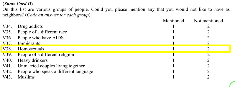
More than a handful of you used the code below to try and determine how the respondents in each country answered question v38. First, here is a screenshot from the WVS codebook:
 Students (rightfully, I think) argued that those who mentioned “Homosexuals” amongst the groups of people they would not want as neighbours can be considered to be more homophobic than those who didn’t mention homosexuals in their responses. (Of course, this may not be the case if there are different levels of social desirability bias across countries.) Moreover, students hypothesized that the higher the proportion of mentions of homosexuals, the more homophobic is that country.
But, when it came time to find these proportions some students made a mistake. Let’s assume that the student wanted to know the proportion of Canadian respondents who mentioned (and didn’t mention) homosexuals as persons they wouldn’t want to have as neighbours.
Here is the code they used (four.df is the data frame name, v38 is the variable in question, and country is the country variable):
prop.table(table(four.df$v38=="mentioned" | four.df$country=="canada"))

FALSE     TRUE
0.372808 0.627192
Thus, these students concluded that almost 63% of Canadian respondents mentioned homosexuals as persons they did not want to have as neighbours. That’s downright un-neighbourly of us allegedly tolerant Canadians, don’tcha think?. Indeed, when compared with the other two countries (Egyptians weren’t asked this question), Canadians come off as more homophobic than either the Italians or the Thais.
prop.table(table(four.df$v38=="mentioned" | four.df$country=="italy"))

FALSE      TRUE
0.6106025 0.3893975

prop.table(table(four.df$v38=="mentioned" | four.df$country=="thailand"))

FALSE      TRUE
0.5556995 0.4443005
So, is it true that Canadians are really more homophobic than either Italians or Thais? This may be a simple homework assignment but these kinds of mistakes do happen in the real academic world, and fame (and sometimes even fortune–yes, even in academia a precious few can make a relative fortune) is often the result as these seemingly unconventional findings often cause others to notice. There is an inherent publishing bias towards results that seem to run contrary to conventional wisdom (or bias). The finding that Canadians (widely seen as amongst the most tolerant of God’s children) are really quite homophobic (I mean, close to 2/3 of us allegedly don’t want homosexuals, or any LGBT persons, as neighbours) is radical and a researcher touting these findings would be able to locate a willing publisher in no time!
But, what is really going on here? Well, the problem is a single incorrect symbol that changes the findings dramatically. Let’s go back to the code:
prop.table(table(four.df$v38=="mentioned" | four.df$country=="canada"))
The culprit is the | (“or”) character. What these students are asking R to do is to search their data and find the proportion of all responses for which the respondent either mentioned that they wouldn’t want homosexuals as neighbours OR the respondent is from Canada. Oh, oh! They should have used the & symbol instead of the | symbol to get the proportion of Canadian who mentioned homosexuals in v38.
To understand visually what’s happening let’s take a look at the following venn diagram (see the attached video above for Ali G’s clever use of what he calls “zenn” diagrams to find the perfect target market for his “ice cream glove” idea; the code for how to create this diagram in R is at the end of this post). What we want is the intersection of the blue and red areas (the purple area). What the students’ coding has given us is the sum of (all of!) the blue and (all of!) the red areas.
To get the raw number of Canadians who answered “mentioned” to v38 we need the following code:
table(four.df$v38=="mentioned" & four.df$v2=="canada")

FALSE  TRUE
7457   304
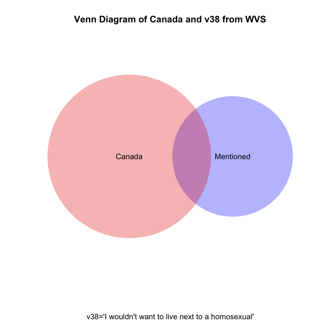
But what if you then created a proportional table out of this? You still wouldn’t get the correct answer, which should be the proportion that the purple area on the venn diagram comprises of the total red area.
prop.table(table(four.df$v38=="mentioned" & four.df$v2=="canada"))

FALSE       TRUE
0.96082979 0.03917021
Just eyeballing the venn diagram we can be sure that the proportion of homophobic Canadians is larger than 3.9%. What we need is the proportion of Canadian respondents only(!) who mentioned homosexuals in v38. The code for that is:
prop.table(table(four.df$v38[four.df$v2=="canada"]))

mentioned not mentioned
0.1404806     0.8595194
So, only about 14% of Canadians can be considered to have given a homophobic response, not the 62% our students had calculated. What are the comparative results for Italy and Thailand, respectively?
prop.table(table(four.df$v38[four.df$v2=="italy"]))

mentioned not mentioned
0.235546      0.764454

prop.table(table(four.df$v38[four.df$v2=="thailand"]))

mentioned not mentioned
0.3372781     0.6627219
The moral of the story: if you mistakenly find something in your data that runs against conventional wisdom and it gets published, but someone comes along after publication and demonstrates that you’ve made a mistake, just blame it on a poorly-paid research assistant’s coding mistake.
Here’s a way to do the above using what is called a for loop:
four<-c("canada","egypt","italy","thailand")
for (i in 1:length(four)) {
+ print(prop.table(table(four.df$v38[four.df$v2==four[i]])))
+ print(four[i])
+ }

mentioned not mentioned
0.1404806     0.8595194
[1] "canada"

mentioned not mentioned

[1] "egypt"

mentioned not mentioned
0.235546      0.764454
[1] "italy"

mentioned not mentioned
0.3372781     0.6627219
[1] "thailand"
Here’s the R code to draw the venn diagram above:
install.packages("venneuler")

library(venneuler}

v1<-venneuler(c("Mentioned"=sum(four.df$v38=="mentioned",na.rm=T),"Canada"=sum(four.df$v2=="canada",na.rm=T),"Mentioned&Canada"=sum(four.df$v2=="canada" & four.df$v38=="mentioned",na.rm=T)))

plot(v1,main="Venn Diagram of Canada and v38 from WVS", sub="v38='I wouldn't want to live next to a homosexual'", col=c("blue","red"))
‘Thick Description’ and Qualitative Research Analysis
In Chapter 8 of Bryman, Beel, and Teevan, the authors discuss qualitative research methods and how to do qualitative research. In a subsection entitled Alternative Criteria for Evaluating Qualitative Research, the authors reference Lincoln and Guba’s thoughts on how to assess the reliability, validity, and objectivity of qualitative research. Lincoln and Guba argue that these well-known criteria (which developed from the need to evaluate quantitative research) do not transfer well to qualitative research. Instead, they argue for evaluative criteria such as credibility, transferability, and objectivity.

Transferability is the extent to which qualitative research ‘holds in some other context’ (the quants reading this will immediately realize that this is analogous to the concept of the ‘generalizability of results’ in the quantitative realm). The authors argue that whether qualitative research fulfills this criterion is not a theoretical, but an empirical issue. Moreover, they argue that rather than worrying about transferability, qualitative researchers should produce ‘thick descriptions’ of phenomena. The term thick description is most closely associated with the anthropologist Clifford Geertz (and his work in Bali). Thick description can be defined as:
the detailed accounts of a social setting or people’s experiences that can form the basis for general statements about a culture and its significance (meaning) in people’s lives.
Compare this account (thick description) by Geertz of the caravan trades in Morocco at the turn of the 20th century to how a quantitative researcher may explain the same institution:
In the narrow sense, a zettata (from the Berber TAZETTAT, ‘a small piece of cloth’) is a passage toll, a sum paid to a local power…for protection when crossing localities where he is such a power. But in fact it is, or more properly was, rather more than a mere payment. It was part of a whole complex of moral rituals, customs with the force of law and the weight of sanctity—centering around the guest-host, client-patron, petitioner-petitioned, exile-protector, suppliant-divinity relations—all of which are somehow of a package in rural Morocco. Entering the tribal world physically, the outreaching trader (or at least his agents) had also to enter it culturally.
Despite the vast variety of particular forms through which they manifest themselves, the characteristics of protection in tbe Berber societies of the High and Middle Atlas are clear and constant. Protection is personal, unqualified, explicit, and conceived of as the dressing of one man in the reputation of another. The reputation may be political, moral, spiritual, or even idiosyncratic, or, often enough, all four at once. But the essential transaction is that a man who counts ‘stands up and says’ (quam wa qal, as the classical tag bas it) to those to whom he counts: ‘this man is mine; harm him and you insult me; insult me and you will answer for it.’ Benediction (the famous baraka),hospitality, sanctuary, and safe passage are alike in this: they rest on the perhaps somewhat paradoxical notion that though personal identity is radically individual in both its roots and its expressions, it is not incapable of being stamped onto tbe self of someone else. (Quoted in North (1991) Journal of Economic Perspectives, 5:1 p. 104.
A Virtual Trip to Myanmar for my Research Methods Class
For IS240 next week, (Intro to Research Methods in International Studies) we will be discussing qualitative research methods. We’ll address components of qualitative research and review issues related to reliability and validity and use these as the basis for an in-class activity.
The activity will require students to have viewed the following short video clips, all of which introduce the viewer to contemporary Myanmar. Some of you may know already that Myanmar (Burma) has been transitioning from rule by military dictatorship to democracy. Here are three aspects of Myanmar society and politics. Please watch as we won’t have time in class to watch all three clips. The clips themselves are not long (just over 3,5,and 8 minutes long, respectively).
The first clip shows the impact of heroin on the Kachin people of northern Myanmar:
The next clip is a short interview with a Buddhist monk on social relations in contemporary Myanmar:
The final video clip is of the potential impact (good and bad) of increased international tourism to Myanmar’s most sacred sites, one of which is Bagan.
Indicators and The Failed States Index
The Failed State Index is created and updated by the Fund for Peace. For the most recent year (2013), the Index finds the same cast of “failed” characters as previous years. There is some movement, the “top” 10 has not changed much over the last few years.
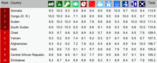
Notice the columns in the image above. Each of these columns is a different indicator of “state-failedness”. If you go to the link above, you can hover over each of the thumbnails to find out what each indicator measures. For, example, the column with what looks like a 3-member family is the score for “Mounting Demographic Pressures”, etc. What is most interesting about the individual indicator scores is how similar they are for each state. In other words, if you know Country X’s score on Mounting Demographic Pressures, you would be able to predict the scores of the other 11 indicators with high accuracy. How high? We’ll just run a simple regression analysis, which we’ll do in IS240 later this semester.
For now, though, I was curious as to how closely each indicator was correlated with the total score. Rather than run regression analyses, I chose (for now) to simply plot the associations. [To be fair, one would want to plot each indicator not against the total but against the total less that indicator, since each indicator comprises a portion (1/12, I suppose) of the total score. In the end, the general results are similar,if not exactly the same.]
So, what does this look like? See the image below (the R code is provided below, for those of you in IS240 who would like to replicate this.)

Here are two questions that you should ponder:
- If you didn’t have the resources and had to choose only one indicator as a measure of “failed-stateness”, which indicator would you choose? Which would you definitely not choose?
- Would you go to the trouble and expense of collecting all of these indicators? Why or why not?
R-code:
install.packages("gdata") #This package must be installed to import .xls file

library(gdata) #If you find error message--"required package missing", it means that you must install the dependent package as well, using the same procedure.

fsi.df<-read.xls("http://ffp.statesindex.org/library/cfsis1301-fsi-spreadsheet178-public-06a.xls")  #importing the data into R, and creating a data frame named fsi.df

pstack.1<-stack(fsi.df[4:15]) #Stacking the indicator variables in a single variable

pstack.df<-data.frame(fsi.df[3],pstack.1) #setting up the data correctly

names(pstack.df)<-c("Total","Score","Indicator") #Changing names of Variables for presentation

install.packages("lattice")  #to be able to create lattice plots

library(lattice) #to load the lattice package

xyplot(pstack.df$Total~pstack.df$Score|pstack.df$Indicator,  groups=pstack.df$Indicator, layout=c(4,3),xlab="FSI Individual Indicator Score", ylab="FSI Index Total")
Does Segregation lead to interethnic violence or interethnic peace?
That’s an important question, because it not only gives us an indication of the potential to stem inter-ethnic violence in places like Iraq, Myanmar, and South Sudan, but it also provides clues as to where the next “hot spots” of inter-ethnic violence may be. For decades now, scholars have debated the answer to the question. There is empirical evidence to support bot the “yes” and “no” sides. For example, in a recent article in the American Journal of Political Science [which is pay-walled, so access it on campus or through your library’s proxy] Bhavnani et al. list some of this contradictory evidence:

Evidence supporting the claim that ethnic rivals should be kept apart:
- Los Angeles riots of 1992, ethnic diversity was closely associated with rioting (DiPasquale and Glaeser 1998),
- That same year, Indian cities in Maharashtra, Uttar Pradesh, and Bihar, each of whichhad a history of communal riots, experienced violence principally in locales where the Muslim minority was integrated. In Mumbai, where over a thousand Mus-
lims were killed in predominantly Hindu localities, the Muslim-dominated neighborhoods of Mahim, Bandra,Mohammad Ali Road, and Bhindi Bazaar remained free of violence (Kawaja 2002).
- Violence between Hindus and Muslims in Ahmedabad in 2002 was found to be significantly higher in ethnically mixed as opposed to segregated neighborhoods (Field et al. 2008).
- In Baghdad during the mid-2000s, the majority displaced by sectarian fighting resided in neighborhoods where members of the Shi’a and Sunni communities lived in close proximity, such as those on the western side of the city (Bollens2008).
Evidence in support of the view that inter-mixing is good for peace:
- Race riots in the British cities of Bradford, Oldham, and Burnley during the summer of 2001 were attributed to high levels of segregation (Peach 2007).
- In Nairobi, residential segregation along racial (K’Akumu and Olima 2007) and class lines (Kingoriah 1980) recurrently produced violence.
- In cities across Kenya’s Rift Valley, survey evidence points to a correlation between ethnically segregated residential patterns, low levels of trust, and the primacy of ethnic over national identities and violence (Kasara 2012).
- In Cape Town, following the forced integration of blacks and coloreds by means of allocated public housing in low-income neighborhoods, a “tolerant multiculturalism” emerged (Muyeba and Seekings 2011).
- Across neighborhoods in Oakland, diversity was negatively associated with violent injury (Berezin 2010).
Scholars have advanced many theories about the link between segregation and inter-ethnic violence (which I won’t discuss right now), but none of them appears to account for all of this empirical evidence. Of course, one might be inclined to argue that segregation is not the real cause of inter-ethnic violence, or that it is but one of many causes and that the role played by segregration in the complex causal structure of inter-ethnic violence has yet to be adequately specified.
Statistics, GDP, HDI, and the Social Progress Index
That’s quite a comprehensive title to this post, isn’t it? A more serious social scientist would have prefaced the title with some cryptic phrase ending with a colon, and then added the information-possessing title. So, why don’t I do that. What about “Nibbling on Figs in an Octopus’ Garden: Explanation, Statistics, GDP, Democracy, and the Social Progress Index?” That sounds social ‘sciencey’ enough, I think.
Now, to get to the point of this post: one of the most important research topics in international studies is human welfare, or well-being. Before we can compare human welfare cross-nationally, we have to begin with a definition (which will guide the data-collecting process). What is human welfare? There is obviously some global consensus as to what that means, but there are differences of opinion as to how exactly human welfare should be measured. (In IS210, we’ll examine these issues right after the reading break.) For much of the last seven decades or so, social scientists have used economic data (particularly Gross Domestic Product (GDP) per capita as a measure of a country’s overall level of human welfare. But GDP measures have been supplemented by other factors over the years with the view that they leave out important components of human welfare. The UN’s Human Development Index is a noteworthy example. A more recent contribution to this endeavour is the Social Progress Index (SPI) produced by the Social Progress Imperative.

How much better, though, are these measures than GDP alone? Wait until my next post for answer. But, in the meantime, we’ll look at how “different” the HDI and the SPI are. First, what are the components of the HDI?
“The Human Development Index (HDI) measures the average achievements in a country in three basic dimensions of human development: a long and healthy life, access to knowledge and a decent standard of living.”
So, you can see that it goes beyond simple GDP, but don’t you have the sense that many of the indicators–such as a long and healthy life–are associated with GDP? And there’s the problem of endogeneity–what causes what?
The SPI is a recent attempt to look at human welfare even more comprehensively, Here is a screenshot showing the various components of that index:
 We can see that there are some components–personal rights, equity and inclusion, access to basic knowledge, etc.,–that are absent from the HDI. Is this a better measure of human well-being than the HDI, or GDP alone? What do you think?
Nomothetic Explanations and Fear of Unfamiliar Things
Bringing two concepts together, in Research Methods today we discussed the MTV show 16 and Pregnant as part of our effort to look at cause-and-effect relationships in the social sciences. The authors of a new study on the aforementioned television program demonstrate a strong link between viewership and pregnancy awareness (including declining pregnancy rates) amongst teenagers.
We used this information, along with a hypothesized link between playing video games and violent behaviour. I then asked students to think about another putatively causal relationship that was similar to these two, from which we could derive a more general, law-like hypothesis or theory.
The computer lab presented us with another opportunity to think about moving from more specific and contextual causal claims to more general ones. Upon completion of the lab, one of the students remarked that learning how to use the R statistical program wasn’t too painful and that he had feared having to learn it. “I guess I’m afraid of technology,” he remarked. Then he corrected himself to say that this wasn’t true, since he didn’t fear the iphone, or his Mac laptop, etc. So, we agreed that he only feared technology with which he was unfamiliar. I then prodded him and others to use this observation to make a broader claim about social life. And the claim was “we fear that with which we are unfamiliar.” That is generalizing beyond the data that we’ve just used to extrapolate to other areas of social life.
Our finishing hypothesis, then, was extended to include not only technology, but people, countries, foods, etc.
P.S. Apropos of the attached TED talk, do we fear cannibals because we are unfamiliar with them?
Television makes us do crazy things…or does it?
During our second lecture in Research Methods, when asked to provide an example of a relational statement, one student offered the following:
Playing violent video games leads to more violent inter-personal behaviour by these game-playing individuals.
That’s a great example, and we used this in class for a discussion of how we could go about testing whether this statement is true. We then surmised that watching violence on television may have similar effects, though watching is more passive than “playing”, so there may not be as great an effect.
If television viewing can cause changes in our behaviour that are not socially productive, can it also lead viewers to change their behaviour in a positive manner? There’s evidence to suggest that this may be true. In a recent study,
there is evidence to suggest that watching MTV’s 16 and Pregnant show is associated with lower rates of teen pregnancy. What do you think about the research study?
More on Milgram’s Methods of Research
In a previous post, I introduced Stanley Milgram’s experiments on obedience and authority. We watched a short video clip in class and students responded to questions about Milgram’s research methods. Upon realizing that the unwitting test subjects were all males, one student wondered whether that would have biased the results in a particular direction. The students hypothesized that women may have been much less likely to defer to authority and continue to inflict increasing doses of pain on the test-takers. While there are good reasons to believe either that women would be more or less deferential than are men, what I wanted to emphasize is the broader point about evidence and theory as it relates to research method and research ethics.

In the video clip, Milgram states candidly that his inspiration for his famous experiments was the Nazi regime’s treatment of Europe’s Jews, both before and during World War II. He wanted to understand (explain) why seemingly decent people in their everyday lives could have committed and/or allowed such atrocities to occur. Are we all capable of being perpetrators of, or passive accomplices to, severe brutality towards our fellow human beings?
Milgram’s answer to this question is obviously “yes!” But Milgram’s methods of research, his way of collecting the evidence to test his hypothesis, was biased in favour of confirming his predetermined position on the matter. His choice of lab participants is but one example. This is not good social science, however. The philosopher of science, Carl Hempel, long ago (1966) laid out the correct approach to producing good (social) science:
- Have a clear model (of the phenomenon under study), or process, that one hypothesizes to be at work.
- Test out the deductive implications of that model, looking at particularly the implications that seem to be least plausible,
- Test these least plausible implications against empirical reality.
If even these least plausible implications turn out to be confirmed by the model, then you have srong evidence to suggest that you’ve got a good model of the phenomenon/phenomena of interest. As the physicist Richard Feynman (1965) once wrote,
…[through our experiments] we are trying to prove ourselves wrong as quickly as possible, because only in that way can we find progress.
Did the manner in which Milgram set up his experiment give him the best chance to “prove himself wrong as quickly as possible” or did he stack the deck in favour of finding evidence that would confirm his hypothesis?

You must be logged in to post a comment.