
Researchers and analysts use data visualizations mostly to describe phenomena of interest. That is, they are used mostly to answer “who”, “what”, “where”, and “when” questions. Sometimes, however, data visualizations are meant to explain a phenomenon of interest. In social science, when we “explain” we are answering “how” and/or “why” questions. In essence, we are discussing causality. While social scientists are taught that a simple data visualization is never enough to settle claims of causality, in the real world, we often see simple charts passed off as evidence of the existence of a causal relationship between our phenomena of interest. Here’s an example that I’ve seen on social media that has been used to argue that government policies regarding the wearing of face masks and limiting the operations of businesses have no impact on the spread of the COVID-19 virus. Here’s the chart:

What are we meant to infer from the data contained in this chart? In two (of the 50 + DC) US states, the trajectory of infections seems to be very similar over the past 10 months or so, despite the fact that in one of the states–South Dakota–there have been no restrictions on businesses and no mask mandates, while these have both been part of the policy repertoire in neighbouring North Dakota. While this chart may seem compelling, it can not be used to argue that mask mandates and business restrictions have no effect on the spread of COVID-19.
The main problem with these types of charts is that they depict simple bivariate (two variables) relationships. In this case, we presumably see “data” (I’ll address the quality of this data in the next paragraph) on mask and business policies, and on infection rates. We are then encouraged to causally link these two variables. Unfortunately, that’s not at all how social science (or any science) is done. The social world is complex and rarely is it the case that one thing is caused only by one other thing, and nothing else. This is what we call the ceteris paribus (all other things being equal) criterion. In other words,. there may be a host of factors that contribute to COVID-19 infection rates other than mask and business policies. How do we know that one, or more, of these other things is not having an impact on the infection rates? Based on this chart, we don’t. That being said, by comparing two very similar states, the creators of this chart are seemingly aware of the ceteris paribus condition. In other words, choosing states with similar demographic, economic, geographic, etc., profiles (as is often done in comparative analysis) does indeed mitigate to some extent the need to “control for” the many other factors (beside mask and business policy) that are known to affect COVID-19 infection rates. But, we still can’t be sure that something else is actually causing the variation in infection rates that we see in the chart.
There are many other issues with the chart, but I will briefly address one more before closing with what I view as the most problematic issue.
First, we address the “operationalization” of the main explanatory (or independent) variable–the mask and business policies. In the chart, these are operationalized dichotomously–that is, each state is deemed to either have them (green checks) or not have them (red crosses). But it should be blindingly obvious that this is a far from adequate measure. Here are just a couple of questions that come up: 1) How many regulations have been put in place? 2) How have they been enforced? 3) When were they enacted (this is a key issue)? 4) Are residents obeying the regulations? (There is ample evidence to suggest that even where there are mask mandates, these are not being enforced, for example).
Now we deal with what, in this case, I believe to be the major issue. The measurement of the dependent variable–the rate of infection. Unless we know that we have measured this variable correctly, any further analysis is useless. And there is strong evidence to suggest that the measurement of this variable is biased, thereby undermining the analysis.
The incidence rate used here is a measure of the number of positive tests divided by the population of each state. It should be obvious that the number of positive tests is affected to a large extent by the number of overall tests. Unless the testing rate across the two states is similar, we can’t use the number of positive tests as an indicator of the infection rate in the two states. And, lo and behold, the testing rate is far from similar: Indeed, South Dakota is testing at a far lower rate than is North Dakota.
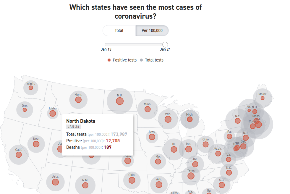

Here we see that the rate of COVID-19 positives in the population seems to be very similar–about 12,000 per 100,000 population. However, North Dakota has conducted four times as many tests as has South Dakota. Assuming the incidence of COVID-19 positivity is the similar across all of the tested population, the data are severely undercounting the incidence rate of COVID-19 in South Dakota. Indeed, had South Dakota tested as many residents as has North Dakota, the measured COVID-19 infection rate in South Dakota would be considerably higher. If the positivity rate for the whole of the state is similar to the first 44,903 tested, there would be a total of more than 46,000 positive tests, which would equate to a infection rate of 46930/(173987/100000), or about 27,000 per 100,000 population, which is more than double the rate in North Dakota. Not only can we not prove (based on the data that is in the chart above) whether masks and businesses policies are having an effect on the dependent variable–the positive rate of COVID-19–we can see that the measurement of the dependent variable is flawed. We have to first account (or “control”) for the number of COVID-19 tests given in each state, before calculating the positivity rate per 100,000 residents. Once we do that we see that the implied premise of the first chart (that the Dakotas have relatively similar infection rates) does not stand. The infection rate in South Dakota is at least 2X the infection rate in North Dakota.


You must be logged in to post a comment.