
Stacked bar plots (charts) are a very useful data visualization type…when used correctly. In an otherwise excellent report on the “Escalating Terrorism Problem in the United States” from the Center for Strategic and International Studies, there is a problematic stacked bar chart (actually, a stacked percentage chart) that should have been replaced by a grouped bar chart (or something else). Here is the, in my opinion, problematic chart:
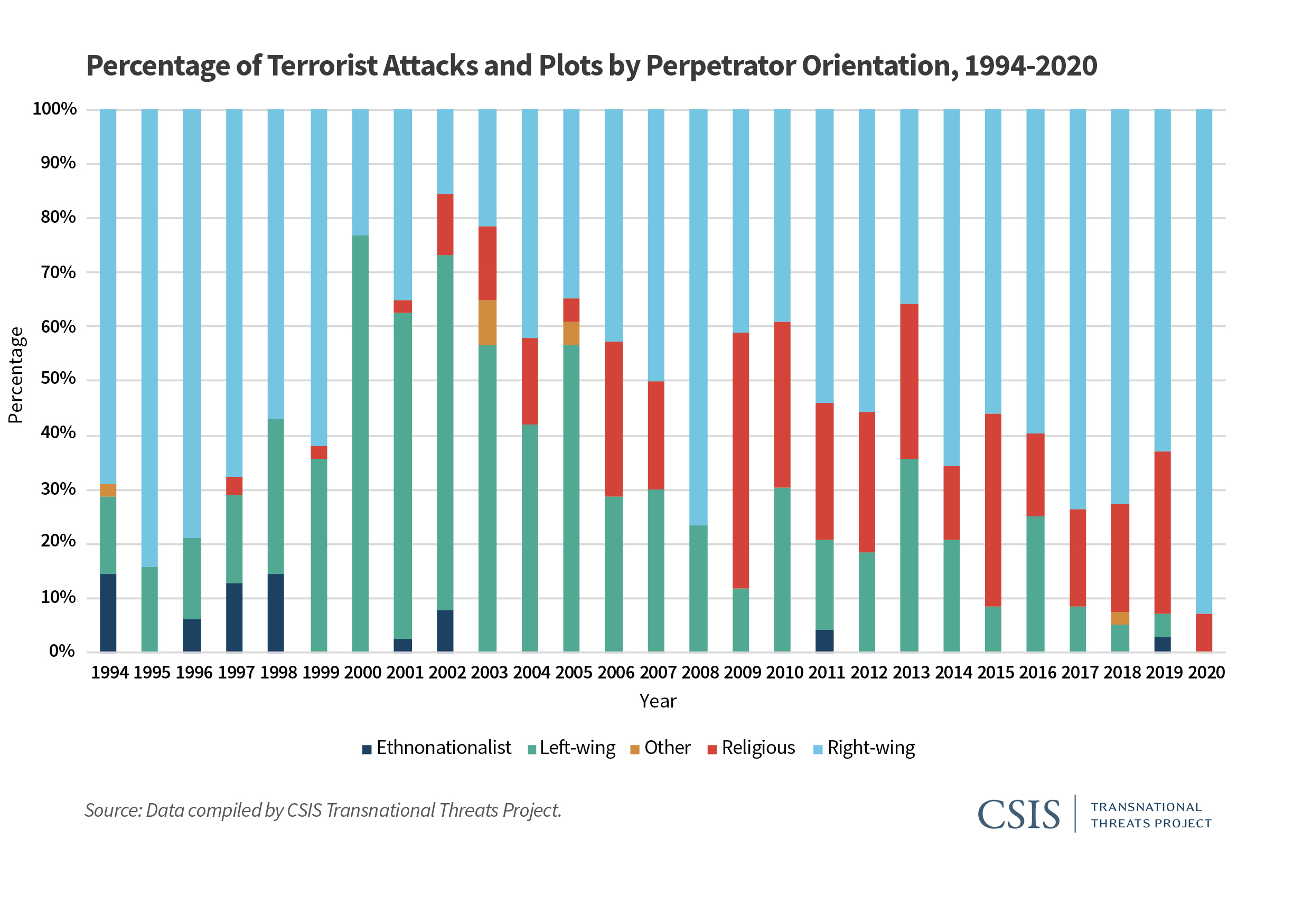
The reason I believe this chart is problematic is because the chart could potentially obscure the nature (and trend) of the underlying data. The chart above is consistent with any number of underlying data patterns. Just as an example, let’s look at 2019 and 2020. We have the following percentage breakdown over the two years:
| Type of Violence | 2019 | 2020 |
| Ethnonationalist | 3% | 0% |
| Left-wing | 4% | 0% |
| Other | 0% | 0% |
| Religious | 30% | 7% |
| Right-wing | 63% | 93% |
While it is obvious that ethnonationalist, and left-wing, violence have decreased (they are 0% in 2020), it is not clear whether right-wing and religious violence have increased, or decreased absolutely. Does right-wing violence in 2020 comprise 93% of 14 acts of terrorist violence? Or is it 93% of 200 acts of terrorist violence? We don’t know. To be fair to the authors of the report, they do provide a breakdown in absolute numbers later in the report. Still, I believe that a more appropriate use of a stacked bar/percentage chart is when the absolute number of instances is (relatively) static over the time/area of comparison.
Here’s an example from college football. The Pacific-12 conference has two divisions–North, and South. Every year each of the 6 teams in each division plays against 4 of the teams in the other division, for a total of 24 inter-divisional games every year. In addition, there is a PAC12 Championship Game, which pits the winner of each of the two divisions against each other at the end of the year. Therefore, there are 25 total inter-divisional PAC12 football games every year. A stacked percentage chart can be used to gauge the relative winning percentages of the two divisions against each other since the establishment of the PAC12 conference in 2011 (when Utah and Colorado were added).

Here, each of the years refers to a total of 25 inter-divisional games. We can easily see the nature of the quality of the respective divisions by comparing the percentage of games won by each (over the other) between the years 2011 and 2019. We see that the North (which, by the way produced 8 of the 9 PAC12 champions during this period) has generally been stronger. In 6 of the 9 years, the North won a greater percentage of the inter-divisional games than did the South. And even in those years where the South won a greater percentage of the inter-divisional games, it wasn’t a much greater percentage.
So, use stacked percentage charts only when it is appropriate.

You must be logged in to post a comment.