
A quick addendum to my last post using treemaps to begin the new year. As a reminder, I drew a couple of treemaps that showed the distribution of votes across US counties during the 2016 Presidential Election(s). There are more than 3,200 counties in the USA, and the vast majority of them have low populations. In fact, under 200 counties (or less than 7%) contain more than half of the population. That means that the other 3,000 counties comprise about 50% of the population. In short,, the distribution of people (and, therefore, of voters) is highly skewed. In fact, here’s a bonus chart–a histogram of US counties by population.
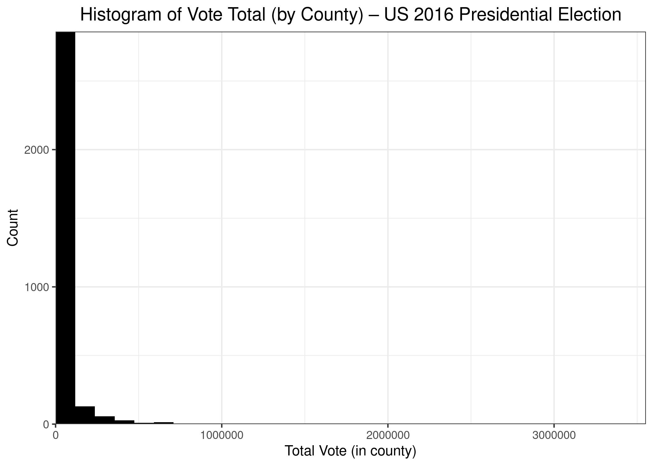
As we can see, the vast majority of counties have small populations, while a few counties have very large populations, including Los Angeles County, in which almost 3.5 million persons voted. The counties with large populations are so few in number that we can’t even see them on the chart. A count of 1 on the chart (y-axis) is a vertical distance that isn’t even 1 pixel in size, so it doesn’t show up on the graph.
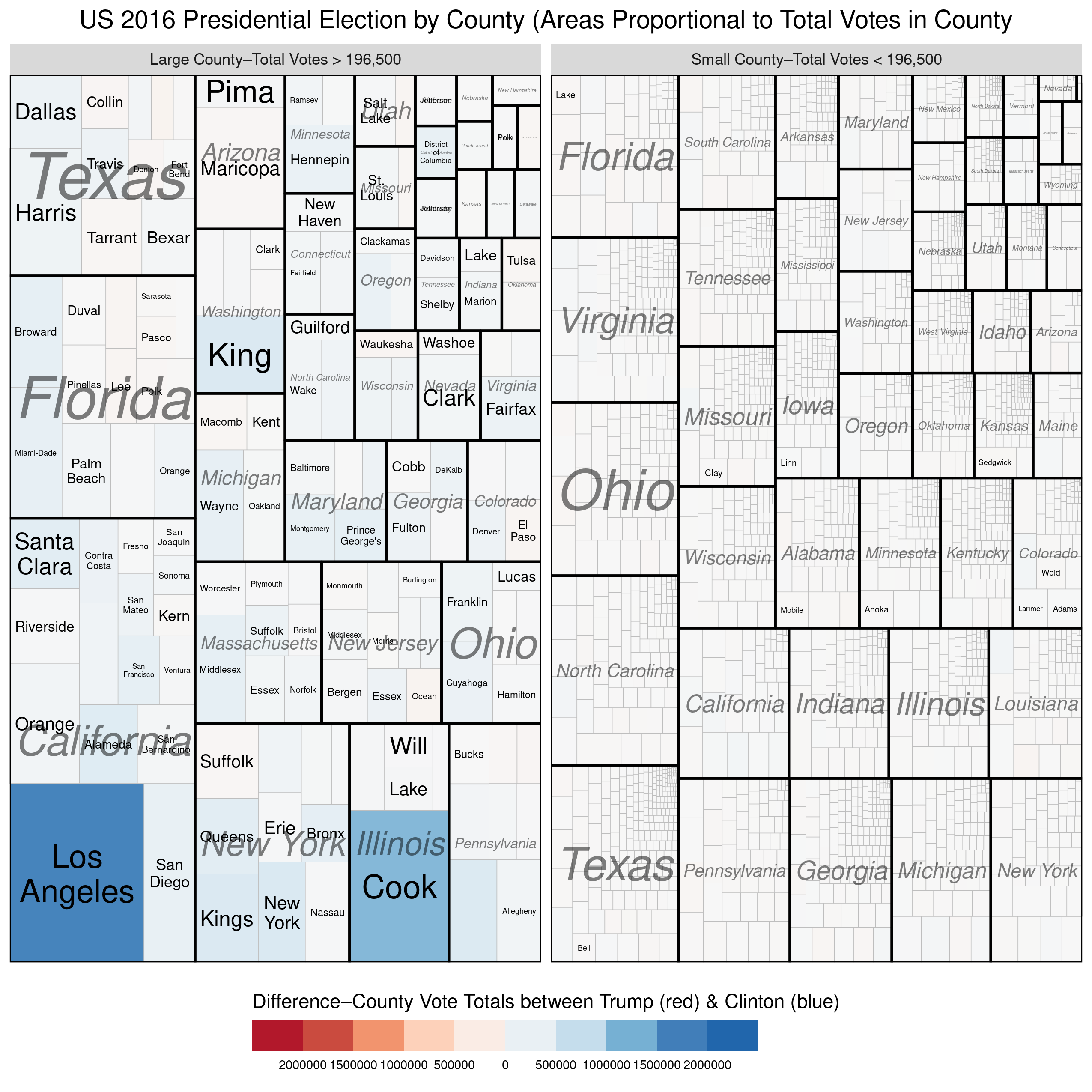
I’ve updated one of the treemaps from my previous post slightly to help reinforce the disparity in population size between the largest counties and the rest. In the treemap below, I’ve divided the counties into two groups–the largest counties versus the rest so that each group comprises 50% of the total votes cast. We see again, that a small number of counties (154 to be exact) combined to produce as many votes as the remaining ~3000 counties. Once again, we see that the counties won by Trump were, on average, so small that they there is not even a hint of red on the map. Here’s the treemap, with the R code below:
gg.tree.tot.facet <- ggplot(us_df_final_facet[us_df_final_facet$State.Name!="Hawaii",],
        aes(area = totalvote, fill = vote_win_diff, label=NAME, subgroup=State.Name)) +
        geom_treemap() +
        geom_treemap_subgroup_border(colour="black", size=2) +
        geom_treemap_subgroup_text(place = "centre", grow=F, alpha = 0.5, colour =
                                           "black", fontface = "italic", min.size = 0) +
        geom_treemap_text(colour = "black", place = "center", reflow = T) +
        scale_fill_distiller(type = "div", palette=5, direction=1, guide="coloursteps", limits=c(-2000000,2000000), breaks=seq(-2000000,2000000, by=500000),
        labels=c("2000000","1500000","1000000","500000","0","500000","1000000","1500000","2000000")) +
        labs(title = "US 2016 Presidential Election by County (Areas Proportional to Total Votes in County",
             fill="Difference\u2013County Vote Totals between Trump (red) & Clinton (blue)") +
        theme(legend.key.height = unit(0.6, 'cm'),
              legend.key.width = unit(2,"cm"),
              legend.text = element_text(size=7),
              plot.title = element_text(hjust = 0.5, size=14, vjust=1),
              legend.position = "bottom") +
        guides(fill = guide_coloursteps(title.position="top", title.hjust = 0.5),
               size = guide_legend(title.position="top", title.hjust = 0.5))  +
        facet_wrap( ~ countysize, scales = "free")

You must be logged in to post a comment.