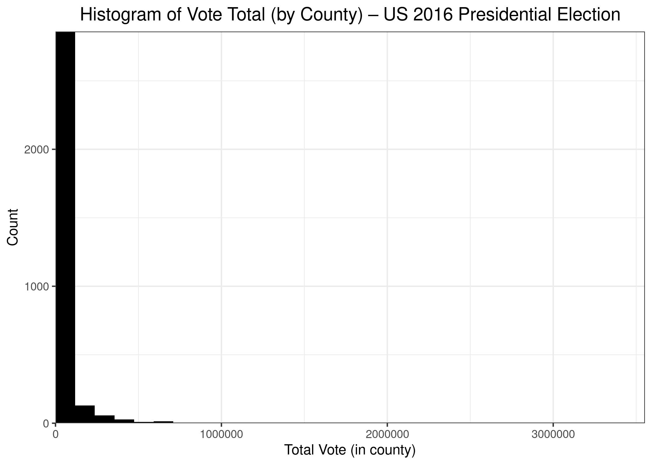
A quick addendum to my last post using treemaps to begin the new year. As a reminder, I drew a couple of treemaps that showed the distribution of votes across US counties during the 2016 Presidential Election(s). There are more than 3,200 counties in the USA, and the vast majority of them have low populations. In fact, under 200 counties (or less than 7%) contain more than half of the population. That means that the other 3,000 counties comprise about 50% of the population. In short,, the distribution of people (and, therefore, of voters) is highly skewed. In fact, here’s a bonus chart–a histogram of US counties by population.
As we can see, the vast majority of counties have small populations, while a few counties have very large populations, including Los Angeles County, in which almost 3.5 million persons voted. The counties with large populations are so few in number that we can’t even see them on the chart. A count of 1 on the chart (y-axis) is a vertical distance that isn’t even 1 pixel in size, so it doesn’t show up on the graph.
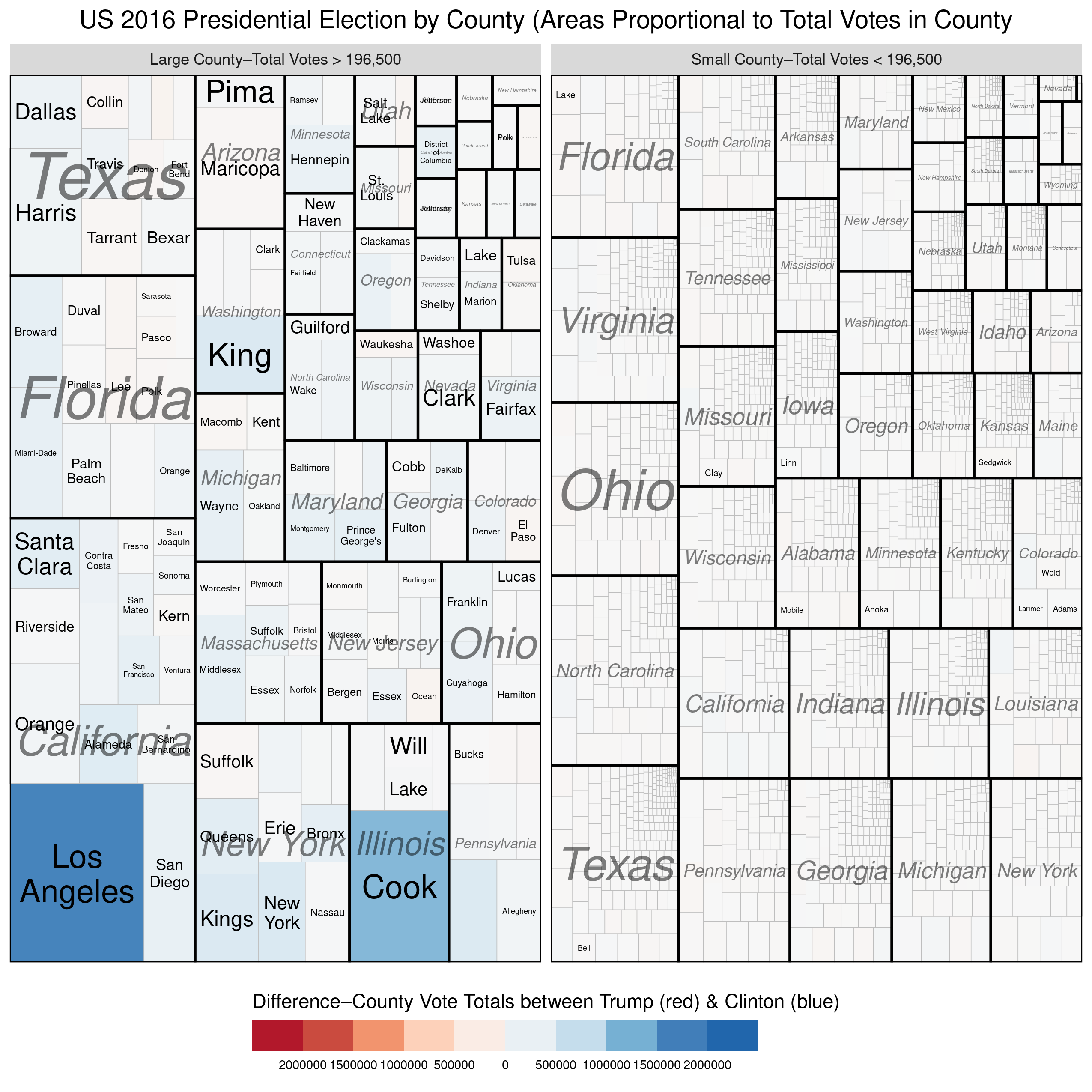
I’ve updated one of the treemaps from my previous post slightly to help reinforce the disparity in population size between the largest counties and the rest. In the treemap below, I’ve divided the counties into two groups–the largest counties versus the rest so that each group comprises 50% of the total votes cast. We see again, that a small number of counties (154 to be exact) combined to produce as many votes as the remaining ~3000 counties. Once again, we see that the counties won by Trump were, on average, so small that they there is not even a hint of red on the map. Here’s the treemap, with the R code below:
While we’re still waiting on the availability of official county-level results 2020 the 2020 US Presidential Elections*, I thought I’d create a treemap of the county-level results from the 2016 election. You may be thinking to yourself, “What is a treemap?”
Treemaps are ideal for displaying large amounts of hierarchically structured (tree-structured) data. The space in the visualization is split up into rectangles that are sized and ordered by a quantitative variable.
Treemaps, therefore, can help us visualize the relationships within our quantitative data in a unique, visually-pleasing, and meaningfully effective manner. Let’s see how with the example of the US 2016 Presidential Election.
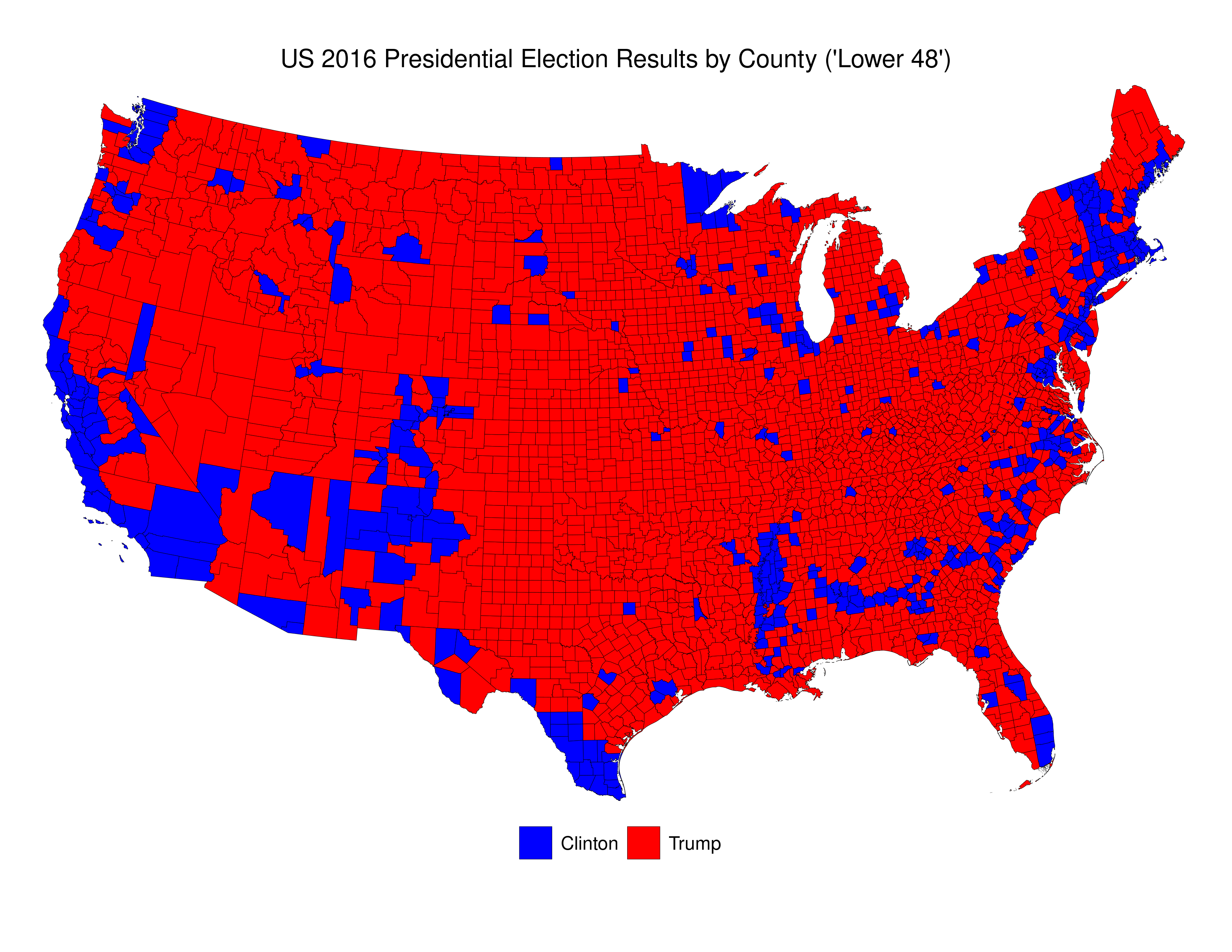
Here’s a picture of then newly-elected President Donald Trump looking at a map given to him by his advisers depicting the results of the 2016 election. This specific depiction of the results overstates the extent of the support across the USA for Trump in the 2016 election. As those in the know often say “land mass does not vote.” Indeed, if one were ignorant about US politics, and US political demography, looking at that map one would be most likely be perplexed were one told that the “blue” candidate actually won 3 million more votes than did the “red” candidate.
Here is my reproduction of these data\2013using publicly-available data from MIT Election Data and Science Lab, 2018, “County Presidential Election Returns 2000-2016”, https://doi.org/10.7910/DVN/VOQCHQ, Harvard Dataverse, V6, UNF:6:ZZe1xuZ5H2l4NUiSRcRf8Q== [fileUNF]. I’ve added the R-code at the end of this post.
We can see that the vast majority of counties are small, and that voters in these counties were more likely to have voted for Trump than for Clinton. Indeed, Clinton win fewer than 16% of all counties.
The problem with this map is that it essentially dichotomizes quantitative data into qualitative data. To be precise, the decision whether to colour a county blue or red is made simply on the basis of whether, of those who voted, more voted for Trump, or for Clinton. If a county voted 51-50 for Trump, it gets a red colour. If a county voted 1,000,000-100,000 for Clinton it gets coloured blue. And, to make things even more confusing, the total of red that each county receives is related ONLY to country land area, and doesn’t take account of the number of voters.
As is the case in many parts of the world today, the US is increasingly split demographically\u2013with those living in rural areas (and suburbs/exurbs) voting for the conservative parties (Republican) and those in the urban areas voting for liberal parties (Democratic). We see this clearly in the map above. The problem with US counties is that they are not uniform either in terms of their land area, or their population. There are apartment buildings in New York City and Los Angeles that have more residents than some counties.
We can use treemaps to more “accurately” depict electoral outcomes. By accurately, I mean that the visual representation of the data more closely reflects how many voted for each candidate (party).
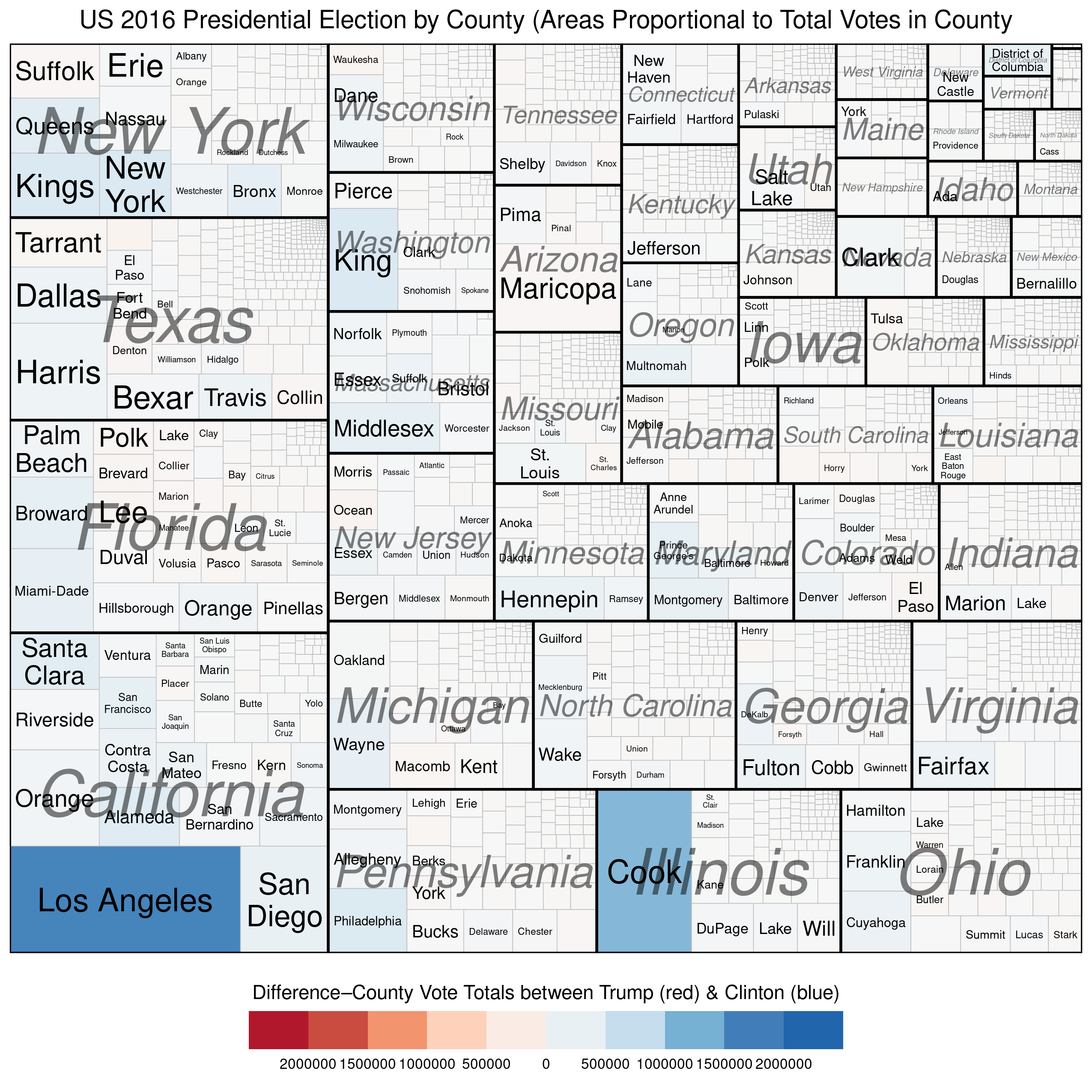
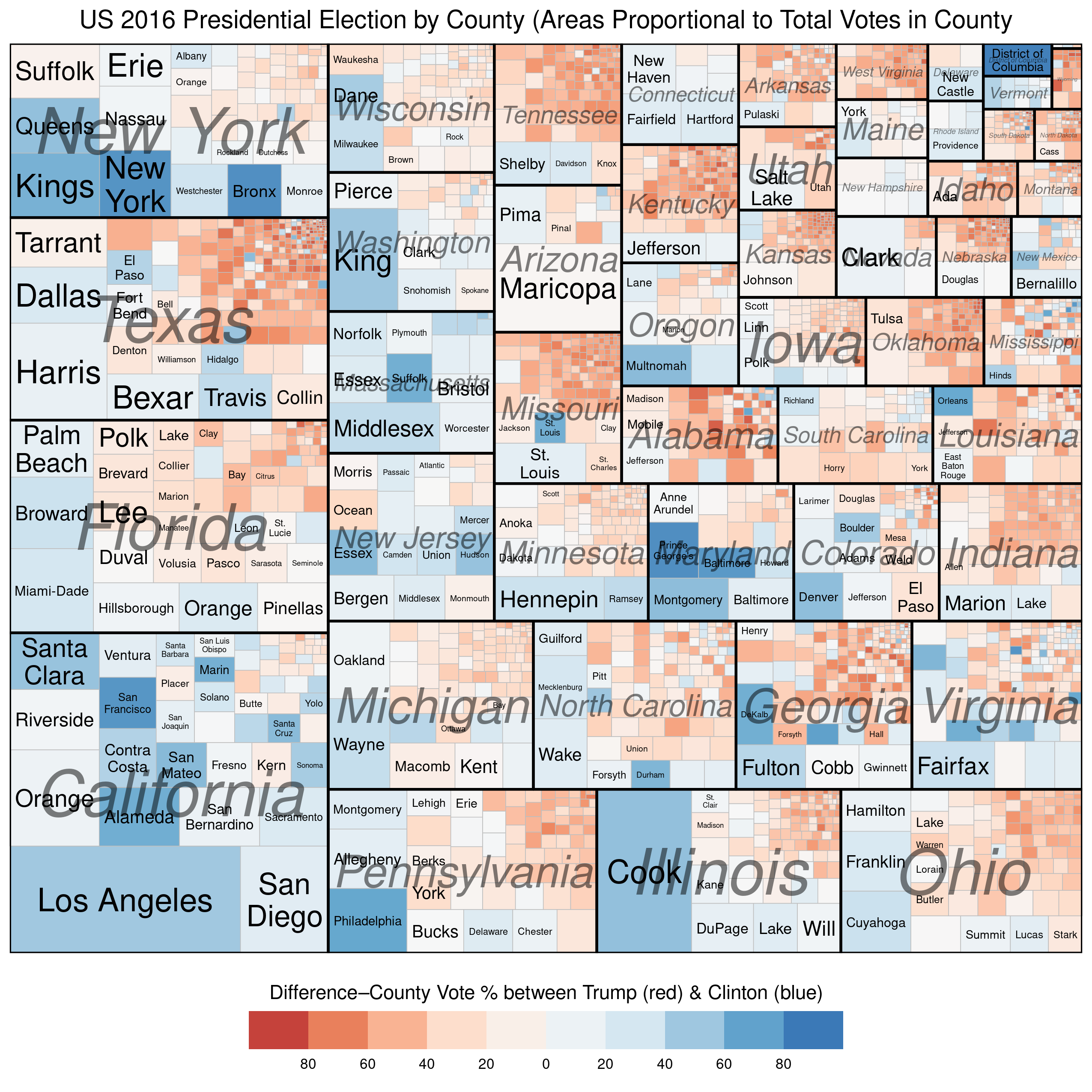
The first example below represents the vote at the county level and describes two quantitative variables. The size of each rectangle represents the total number of voters in each county\u2013the larger the rectangle the greater the numbers of voters in that county. The second variable, which is mapped using the colour scale, represents the difference\u2013in raw vote totals between the two candidates. Reddish shades denote a county that was won by Trump, while bluish shades represent counties won by Clinton.
There are a couple of things to notice. First, the wide disparity in the total number of voters across the counties. Second, we see that most of the counties have shades that are only very lightly blue (or red) and look mostly white. This is because the range on the variable must be so expansive in order to include outliers like Los Angeles and Cook Counties. Thus, in the vast majority of US counties the raw vote total differences between Trump’s totals and Clinton’s totals are in the 1000s range. This is why Trump was able to win more than 84% of US counties and still lose the popular vote by more than 3 million.
Our next (and final) treemap is similar to the one above except that the scale for the colouring is not the raw vote difference between Trump and Clinton in each county, but the percentage-point differential in vote between the two candidates.
We see much more red and blue in this map because the scale is confined to 100% Trump win to 100% Clinton win. Notice the striking disparity in where the blue and red colours, respectively, are found. The reddish shades dominate in small-population counties (in the top-right corner of each state subgroup), while the bluish shades dominate in large-population counties (in the bottom-left corners of each state subgroup). Finally, the larger (greater population) counties tend be be much smaller geographically than the less-populous counties, which is why the map on Trump’s desk looks like it does.
R Code for treemaps: (this is vote the “total vote” variable. Replace that variable with a “percentage-vote” variable–with appropriate limits and breaks (-100,100) because you are now working with percentages).
* The electoral process that determines who becomes president of the United States is complicated. In effect, it is a series of elections that are run by individual states, and not a single federally-run election like it is in most presidential systems.


You must be logged in to post a comment.