
The Human Security Report Project is no longer active, and most of the content produced by the employees and staff has disappeared. There are some materials archived in the “wayback machine.” The 2010 report–titled the Shrinking Costs of War–is not available online. I am, therefore, making this copy, on which I was the chief quantitative research officer, available to the public.
Addendum to Data Visualization posts #21 and #22
In data visualization posts #21 and #22, I referred to the results of simple multivariate linear regressions where I examined the statistical relationships between the cost of electricity across European Union countries and the market penetration of renewable energy sources, and a cost-of-living index. Here are the regression results that form the source data for the predictive plots in those blog posts.
First, with the price of electricity as the dependent variable (DV):
## Here is the R code for the linear regression (using the generalized linear models (glm) framework:
glm.1<-glm(Elec_Price~COL_Index+Pct_Share_Total,data=eu.RENEW.only,family="gaussian")  # Electricity Price is DV


MODEL INFO:
Observations: 28
Dependent Variable: Price of Household Electricity (in Euro cents)
Type: Linear regression

MODEL FIT:
χ²(2) = 306.82, p = 0.00
Pseudo-R² (Cragg-Uhler) = 0.40
Pseudo-R² (McFadden) = 0.08
AIC = 166.04, BIC = 171.37

Standard errors: MLE
-------------------------------------------------------------
                                 Est.   S.E.   t val.      p
------------------------------ ------ ------ -------- ------
(Intercept)                     4.10   3.59     1.14   0.26
Cost-of-Living Index            0.22   0.06     3.59   0.00
Renewables (% share of total)   0.03   0.04     0.74   0.46
-------------------------------------------------------------
We can see that the cost-of-living index is positively correlated with the price of household electricity, and it is statistically significant at conventional (p=0.05) levels. The market penetration of renewables (on the other hand) is not statistically significant (once controlling for cost-of-living.
Now, we use the pre-tax price of electricity (there are large differences in levels of taxation of household electricity across EU countries) as the DV. Here are the regression code (R) and the model results of the multivariate linear regression.
## Here is the R code for the linear regression (using the generalized linear models (glm) framework:

glm.2<-glm(Elec_Price_NoTax~COL_Index+Pct_Share_Total,data=eu.RENEW.only,family="gaussian")  # Elec Price LESS taxes/levies is DV


MODEL INFO:
Observations: 28
Dependent Variable: Pre-tax price of Household Electricity (Euro cents)
Type: Linear regression

MODEL FIT:
χ²(2) = 100.13, p = 0.00
Pseudo-R² (Cragg-Uhler) = 0.44
Pseudo-R² (McFadden) = 0.12
AIC = 130.11, BIC = 135.43

Standard errors: MLE
-------------------------------------------------------------
                                 Est.   S.E.   t val.      p
-----------------------------  ------- ------ -------- ------
(Intercept)                      5.20   1.89     2.75   0.01
Cost-of-Living Index             0.14   0.03     4.41   0.00
Renewables (% share of total)   -0.03   0.02    -1.44   0.16
-------------------------------------------------------------
Here, we see an even stronger relationship between the cost-of-living and the pre-tax price of household electricity, while there is (once the cost-of-living is controlled for) a negative (though not quite statistically significant) relationship between the pre-tax cost of electricity and the market penetration of renewables across EU countries.
Data Visualization #22—EU Electricity Prices (Part II)
In post #21 of this series, I examined the relationship between electricity prices across European Union (EU) countries and the market penetration of renewable (solar and wind) energy sources. There’s been some discussion amongst the defenders of the continued uninterrupted burning of fossil fuels of a finding that allegedly shows the higher the market penetration of renewables, the higher electricity prices. I demonstrated in the previous post that this is a spurious relationship and a more plausible reason for the empirical relationship is that market penetration is highly correlated with how rich (and expensive) a country is. Indeed, I showed that controlling for cost-of-living in a particular country, the relationship between market penetration of renewables and cost of electricity was not statistically significant.
I noted at the end of that post that I would show the results of a simple multiple linear regression of the before-tax price of electricity and market penetration of renewables across these countries.
But, first here is a chart of the results of the predicted price of before-tax electricity in a country given the cost-of-living, holding the market penetration of renewables constant. We see a strong positive relationship—the higher the cost-of-living in a country, the more expensive the before-tax cost of electricity.

Here’s the chart based on the results of a multiple regression analysis using before-tax electricity price as the dependent variable, with renewables market penetration as the main dependent variable, holding the cost-of-living constant. The relationship is obviously negative, but it is not statistically significant. Still, there is NOT a positive relationship between the market penetration of renewables and the before-tax price of electricity across EU countries.

Data Visualization #21—You can’t use bivariate relationships to support a causal claim
One of the first things that is (or should be) taught in a quantitative methods course is that “correlation is not causation.” That is, just because we establish that a correlation between two numeric variables exists, that doesn’t mean that one of these variables in causing the other, or vice versa. And to step back ever further in our analytical process, even when we find a correlation between two numerical variables, that correlation may not be “real.” That is, it may be spurious (caused by some third variable) or an anomaly of random processes.
I’ve seen the chart below (in one form or another) for many years now and it’s been used by opponents of renewable energy to support their argument that renewable energy sources are poor substitutes for other sources (such as fossil fuels) because, amongst other things, they are more expensive for households.
In this example, the creators of the chart seem to show that there is a positive (and non-linear) relationship between the percentage of a European country’s energy that is supplied by renewables and the household price of electricity in that country. In short, the more a country’s energy grid relies on renewables, the more expensive it is for households to purchase electricity. And, of course, we are supposed to conclude that we should eschew renewables if we want cheap energy. But is this true?

No. To reiterate, a bivariate (two variables) relationship is not only not conclusive evidence of a statistical relationship truly existing between these variables, but we don’t have enough evidence to support the implied causal story–more renewbles equals higher electricity prices.
Even a casual glance at the chart above shows that countries with higher electricity prices are also countries where the standard (and thus, cost) of living is higher. Lower cost-of-living countries seem to have lower electricity prices. So, how do we adjudicate? How do we determine which variables–cost-of-living, or renewables penetration–is actually the culprit for increased electricity prices?
In statistics, we have a tool called multiple regression analysis. It is a numerical method, in which competing variables “fight it out” to see which has more impact (numerically) on the variation in the dependent (in this case, cost of electricity) variable. I won’t get into the details of how this works, as it’s complicated. But it is a standard statistical method.
So, what do we notice when we perform a multivariate linear regression analysis (note: a non-linear method actually strongly the case below even more strongly, but we’ll stick to linear regression for ease of interpretation and analysis) where we “control for” each of the two independent variables–cost-of-living and renewables penetration)?
The image below shows (contrary to the implied claim in the chart above) that once we a country’s cost of living, there is little influence on the price of household electricity of renewables penetration in a country Moreover, the impact is not “statistically significant (see table at the end of the post).” That is, based on the data it is highly likely that the weak relationship we do see is simply due to random chance. We see this weak relationship in the chart below, which is the predicted cost of electricity in each country based on different levels of renewables penetration, holding the cost-of-living constant.
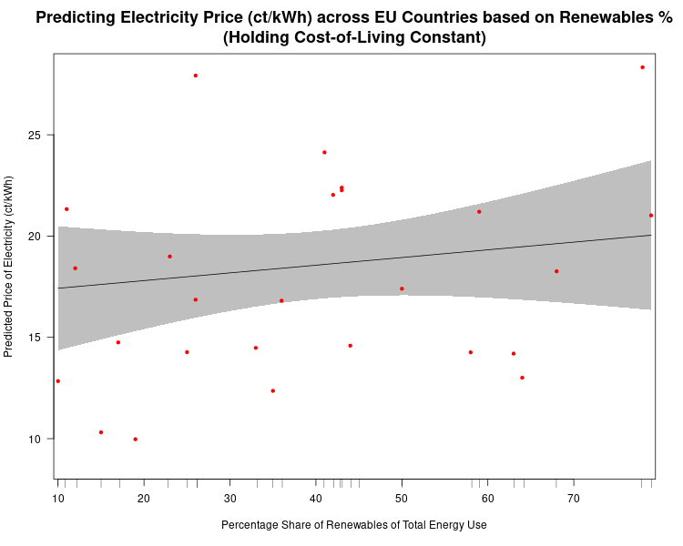
At only 10% of renewable penetration in a country the predicted price of electricity is about 17.5 ct/kWh (the shaded grey areas are 95% confidence bands, so we see that even though our best estimate of the price of electricity for a country that gets only 10% of its energy from renewables is 17.5 ct/kWh, we would expect the actual result to be between 14.5 ct/kWh and 20.5 ct/kWh 95% of the time. Our best estimate of the predicted cost of electricity in a country that gets 80% of its energy from renewables is expected to be about 19.5 ct/kWh. So, an 800% increase in renewables penetration leads only to only a 14.5% increase in the predicted price of electricity.
Now, what if we plot the predicted price of household electricity based on the cost-of-living after controlling for renewables penetration in a country? We see that, in this case, there is a much stronger relationship, which is statistically significant (highly unlikely for these data to produce this result randomly).

There are two things to note in the chart above. First, the 95% confidence bands are much closer together indicating much more certainty that there is a true statistical relationship between the “Cost-of-Living Index (COL)” and the predicted price of household electricity. And, we see that a 100% increase in the COL leads to a ((15.5-9.3)/9.3)*100%, or 67% increase in the predicted price of electricity in any EU country. (Note: I haven’t addressed the fact that electricity prices are a component of the COL, but they are so insignificant as to not undermine the results found here.
Stay tuned for the next post, where I’ll show that once we take out taxes and levies the relationship between the predicted price of household electricity and the penetration of renewables in an EU country is actually negative.
Here is the R code for the regression analyses, the prediction plots, and the table of regression results.
## This is the linear regression.
reg1<-lm(Elec_Price~COL_Index+Pct_Share_Total,data=eu.RENEW.only)

library(stargazer)  # needed for prediction cplots

## Here is the code for the two prediction plots.
## First plot
cplot(reg1,"COL_Index", what="prediction", main="Cost-of-Living Predicts Electricity Price (ct/kWh) across EU Countries\n(Holding Share of Renewables Constant)", ylab="Predicted Price of Electricity (ct/kWh)", xlab="Cost-of-Living Index")

## Second plot
cplot(reg1,"Pct_Share_Total", what="prediction", main="Share of Renewables doesn't Predict Electricity Price (ct/kWh) across EU Countries\n(Holding Cost-of-Living Constant)", ylab="Predicted Price of Electricity (ct/kWh)", xlab="Percentage Share of Renewables of Total Energy Use")
The table below was created in LaTeX using the fantastic stargazer (v.5.2.2) package created for R by Marek Hlavac, Harvard University. E-mail: hlavac at fas.harvard.edu

Data Visualization #20—”Lying” with statistics
In teaching research methods courses in the past, a tool that I’ve used to help students understand the nuances of policy analysis is to ask them to assess a claim such as:
In the last 12 months, statistics show that the government of Upper Slovobia’s policy measures have contributed to limiting the infollcillation of ramakidine to 34%.
The point of this exercise is two-fold: 1) to teach them that the concepts we use in social science are almost always socially constructed, and we should first understand the concept—how it is defined, measured, and used—before moving on to the next step of policy analysis. When the concepts used—in this case, infollcillation and ramakidine—are ones nobody has every heard of (because I invented them), step 1 becomes obvious. How are we to assess whether a policy was responsible for something when we have zero idea what that something even means? Often, though, because the concept is a familar one—homelessness, polarization, violence—we often skip right past this step and focus on the next step (assessing the data).
2) The second point of the exercise is to help students understand that assessing the data (in this case, the 34% number) can not be done adequately without context. Is 34% an outcome that was expected? How does that number compare to previous years and the situation under previous governments, or the situation with similar governments in neighbouring countries? (The final step in the policy analysis would be to set up an adequate research design that would determine the extent to which the outcome was attributable to policies implemented by the South Slovobian government.)
If there is a “takeaway” message from the above, it is that whenever one hears a numerical claim being made, first ask yourself questions about the claim that fill in the context, and only then proceed to evaluate the claim.
Let’s have a look at how this works, using a real-life example. During a recent episode of Real Time, host Bill Maher used his New Rules segment to admonish the public (especially its more left-wing members) for overestimating the danger to US society of the COVID-19 virus. He punctuated his point by using the following statistical claim:
Maher not only claims that the statistical fact that 78% of COVID-19-caused fatalities in the USA have been from those who were assessed to have been “overweight” means that the virus is not nearly as dangerous to the general USA public as has been portrayed, but he also believes that political correctness run amok is the reason that raising this issue (which Americans are dying, and why) in public is verboten. We’ll leave aside the latter claim and focus on the statistic—78% of those who died from COVID-19 were overweight.
Does the fact that more than 3-in-4 COVID-19 deaths in the USA were individuals assessed to have been overweight mean that the danger to the general public from the virus has been overhyped? Maher wants you to believe that the answer to this question is an emphatic ‘yes!’ But is it?
Whenever you are presented with such a claim follow the steps above. In this case, that means 1) understand what is meant by “overweight” and 2) compare the statistical claim to some sort of baseline.
The first is relatively easy—the US CDC has a standard definition for “overweight”, which can be found here: https://www.cdc.gov/obesity/adult/defining.html. Assuming that the definition is applied consistently across the whole of the USA, we can move on to step 2. The first question you should ask yourself is “is 78% low, or high, or in-between?” Maher wants us to believe that the number is “high”, but is it really? Let’s look for some baseline data with which to compare the 78% statistic. The obvious comparison is the incidence of “overweight” in the general US population. Only when we find this data point will we be able to assess whether 78% is a high (or low) number. What do we find? Let’s go back to the US CDC website and we find this: “Percent of adults aged 20 and over with overweight, including obesity: 73.6% (2017-2018).”
So, what can we conclude? The proportion of USA adults dying from COVID-19 who are “overweight” (78%) is almost the same proportion of the USA adult population that is “overweight (73.6%).” Put another way, the likelihood of randomly selecting a USA adult who is overweight versus randomly selecting one who is not overweight is 73.6/26.4≈3.29. If one were to randomly select an adult who died from COVID-19, one would be 78/22≈3.55 times more likely to select an overweight person than a non-overweight person. Ultimately, in the USA at least, as of the end of April overweight adults are dying from COVID-19 at a rate that is about equal to their proportion in the general adult US population.
We can show this graphically via a pie chart. For many reasons, the use of pie charts is generally frowned upon. But, in this case, where there are only two categories—overweight, and non-overweight—pie charts are a useful visualization tool, which allows for easy visual comparison. Here are the pie charts, and the R code that produced them below:
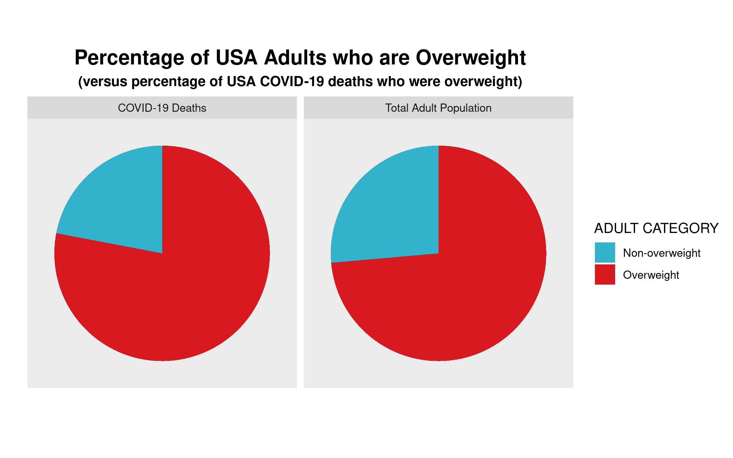
We can clearly see that the proportion of COVID-19 deaths from each cohort—overweight, non-overweight—is almost the same as the proportion of each cohort in the general USA adult population. So, a bit of critical analysis of Maher’s claim shows that he is not making the strong case that he believes he is.
# Here is the required data frame
covid.df <- data.frame("ADULT"=rep(c("Overweight", "Non-overweight"),2),
                       "Percentage"=c(0.736,0.264,0.78,0.22),
                       "Type"=rep(c("Total Adult Population","COVID-19 Deaths"),each=2))

library(ggplot2)

# Now the code for side-by-side pie charts:

ggpie.covid <- ggplot(covid.df, aes(x="", y=Percentage, group=ADULT, fill=ADULT, )) +
  geom_bar(width = 1, stat = "identity") +
  scale_fill_manual(values=c("#33B2CC","#D71920"),name ="ADULT CATEGORY") +
  labs(x="", y="", title="Percentage of USA Adults who are Overweight",
       subtitle="(versus percentage of USA COVID-19 deaths who were overweight)") +
  coord_polar("y", start=0) + facet_wrap(~ Type) +
  theme(axis.text = element_blank(),
        axis.ticks = element_blank(),
        panel.grid  = element_blank(),
        plot.title = element_text(hjust = 0.5, size=16, face="bold"),
        plot.subtitle = element_text(hjust=0.5, face="bold"))

ggsave(filename="covid19overweight.png", plot=ggpie.covid, height=5, width=8)
Data Visualization #19—Using panelView in R to produce TSCS (time-series cross-section) plots
As part of a project to assess the influence, or impact, of Canadian provincial government ruling ideologies on provincial economic performance I have created a time-series cross-section summary of my party ideology variable across provinces over time. A time-series cross-section research design is one in which there is variation across space (cross-section) and also over time. The time units can literally be anything although in comparative politics they are often years. The cross-section part can be countries, cities, individuals, states, or (in my case) provinces. Here is the snippet of the data structure in my dataset (data frame in R):
canparty.df[1:20,c(2:4,23)]

Year                    Region                      Pol.Party party.ideology
1981                   Alberta Progressive Conservative Party              1
1981          British Columbia            Social Credit Party              1
1981                  Manitoba Progressive Conservative Party              1
1981             New Brunswick Progressive Conservative Party              1
1981 Newfoundland and Labrador Progressive Conservative Party              1
1981               Nova Scotia Progressive Conservative Party              1
1981                   Ontario Progressive Conservative Party              1
1981      Prince Edward Island Progressive Conservative Party              1
1981                    Quebec                Parti Quebecois              0
1981              Saskatchewan           New Democratic Party             -1
1982                   Alberta Progressive Conservative Party              1
1982          British Columbia            Social Credit Party              1
1982                  Manitoba           New Democratic Party             -1
1982             New Brunswick Progressive Conservative Party              1
1982 Newfoundland and Labrador Progressive Conservative Party              1
1982               Nova Scotia Progressive Conservative Party              1
1982                   Ontario Progressive Conservative Party              1
1982      Prince Edward Island Progressive Conservative Party              1
1982                    Quebec                Parti Quebecois              0
1982              Saskatchewan Progressive Conservative Party              1
To get the plot picture below, we use the R code at the bottom of this post. But a couple of notes: first, the year data are not in true date format. Rather, they are in periods, which I have conveniently labelled years. In other words, what is important for the analysis that I will do (generalized synthetic control method) is to periodize the data. Second, because elections occur at any point during the year, I have had to make a decision as to which party is coded as having been in government that year.
Since my main goal is to assess economic performance, and because economic policies take time to be passed, and to implement, I made the decision to use June 30th as a cutoff point. If a party was elected prior to that date, it is coded as having governed the province in that whole year. If the election was held on July 1st (or after), then the incumbent party is coded as having governed the province the year of the election and the new government is coded as having started its mandate the following year.
Here’s the plot, and the R code below:

library(gsynth)
library(panelView)
library(ggplot2)

ggpanel1 <- panelView(Prop.seats.gov ~ party.ideology + Prov.GDP.Cap, data = canparty.df,
          index = c("Region", "Year"), main = "Provincial Ruling Party Ideology",
          legend.labs = c("Left", "Centre", "Right"), col=c("orange", "red", "blue"),
          axis.lab.gap = c(2,0), xlab="", ylab="")
## I've used Prop.seats.gov and Prov.GDP.Cap b/c they are two
## of my IVs, but any other IVs could have been used to
## create the plot. The important part is the party.ideology
## variable and the two index variables--Region (province)  ## and Year.

## Save the plot as a .png file

ggsave(filename="ProvRulingParty.png", plot=ggpanel1, height=8,width=7)
Data Visualization #18—Maps with Inset Maps
There are many different ways to make use of inset maps. The general motivation behind their use is to focus in on an area of a larger map in order to expose more detail about a particular area. Here, I am using the patchwork package in R to place a series of inset maps of major Canadian cities on the map that I created in my previous post. Here is the map and a snippet of the R code below:

You can see that a small land area contains just under 50% of Canada’s electoral districts. Once again, in a democracy, citizens vote. Land doesn’t.
In order to use the patchwork package, it is helpful to first create each of the city plots individually and store those as ggplot objects. Here are examples for Vancouver and Calgary.
## My main map (sf) object is named can_sf. Here I'm created a plot using only
## districts in the Vancouver, then Calgary areas, respectively. I also limit the
## districts to those that comprise the "red" (see map) 50% population group.

library(ggplot2)
library(sf)

yvr.plot <- ggplot(can_sf[can_sf$prov.region=="Vancouver and Northern Lower Mainland" &
                             can_sf$Land.50.Pop.2016==1 | can_sf$prov.region=="Fraser Valley and Southern Lower Mainland" &
                             can_sf$Land.50.Pop.2016==1,]) +
  geom_sf(aes(fill = Land.50.Pop.2016), col="black", lwd=0.05) +
  scale_fill_manual(values=c("red")) +
  theme(axis.text.x=element_blank(),
        axis.text.y=element_blank(),
        axis.ticks.x = element_blank(),
        axis.ticks.y = element_blank(),
        legend.position = "none",
        plot.margin=unit(c(0,0,0,0), "mm"))

yyc.plot <- ggplot(can_sf[can_sf$prov.region=="Calgary" &
                            can_sf$Land.50.Pop.2016==1,]) +
  geom_sf(aes(fill = Land.50.Pop.2016), col="black", lwd=0.05) +
  scale_fill_manual(values=c("red")) +
  theme(axis.text.x=element_blank(),
        axis.text.y=element_blank(),
        axis.ticks.x = element_blank(),
        axis.ticks.y = element_blank(),
        legend.position = "none",
        plot.margin=unit(c(0,0,0,0), "mm"))
I have created a separate ggplot2 object for each of the cities that are inset onto the main Canada map above. The final R code looks like this:
## Add patchwork library
library(patchwork)

## Note: gg50 is the original map used in the previous post.

gg.50.insets <- gg.50 + inset_element(yvr.plot, left = -0.175, bottom = 0.25,
                            right = 0, top = 0.45, on_top=TRUE, align_to = "plot",
                            clip=TRUE) +
  labs(title="VANCOUVER") +
  theme(plot.title = element_text(hjust = 0.5, size=9, vjust=-1, face="bold"),
        panel.border = element_rect(colour = "black", fill=NA, size=1)) +
  inset_element(yeg.plot, left = -0.175, bottom = 0,
                right = -0.025, top = 0.2, on_top=TRUE, align_to = "plot",
                clip=TRUE) +
  labs(title="EDMONTON") +
  theme(plot.title = element_text(hjust = 0.5, size=9, vjust=-1, face="bold"),
        panel.border = element_rect(colour = "black", fill=NA, size=1)) +
  inset_element(yyc.plot, left = -0.1, bottom = 0,
                right = 0.20, top = 0.25, on_top=TRUE, align_to = "plot",
                clip=TRUE) +
  labs(title="CALGARY") +
  theme(plot.title = element_text(hjust = 0.5, size=9, vjust=-1, face="bold"),
        panel.border = element_rect(colour = "black", fill=NA, size=1)) +
  inset_element(yxe.plot, left = 0.125, bottom = 0,
                right = 0.275, top = 0.15, on_top=TRUE, align_to = "plot",
                clip=TRUE) +
  labs(title="SASKATOON") +
  theme(plot.title = element_text(hjust = 0.5, size=9, vjust=-1, face="bold"),
        panel.border = element_rect(colour = "black", fill=NA, size=1)) +
  inset_element(yqr.plot, left = 0.225, bottom = 0,
                right = 0.45, top = 0.175, on_top=TRUE, align_to = "plot",
                clip=TRUE) +
  labs(title="REGINA") +
  theme(plot.title = element_text(hjust = 0.5, size=9, vjust=-1, face="bold"),
        panel.border = element_rect(colour = "black", fill=NA, size=1)) +
  inset_element(ywg.plot, left = 0.375, bottom = 0,
                right = 0.55, top = 0.175, on_top=TRUE, align_to = "plot",
                clip=TRUE) +
  labs(title="WINNIPEG") +
  theme(plot.title = element_text(hjust = 0.5, size=9, vjust=-1, face="bold"),
        panel.border = element_rect(colour = "black", fill=NA, size=1)) +
  inset_element(yyz.yhm.plot, left = 0.725, bottom = 0,
                right = 1.15, top = 0.25, on_top=TRUE, align_to = "plot",
                clip=TRUE) +
  labs(title="TORONTO/\nHAMILTON") +
  theme(plot.title = element_text(hjust = 0.5, size=9, vjust=-1, face="bold"),
        panel.border = element_rect(colour = "black", fill=NA, size=1)) +
  inset_element(yul.plot, left = 1, bottom = 0,
                right = 1.175, top = 0.175, on_top=TRUE, align_to = "plot",
                clip=TRUE) +
  labs(title="MONTREAL") +
  theme(plot.title = element_text(hjust = 0.5, size=9, vjust=-1, face="bold"),
        panel.border = element_rect(colour = "black", fill=NA, size=1)) +
  inset_element(yqb.plot, left = 0.95, bottom = 0.175,
                right = 1.2, top = 0.375, on_top=TRUE, align_to = "plot",
                clip=TRUE) +
  labs(title="QUEBEC\nCITY") +
  theme(plot.title = element_text(hjust = 0.5, size=9, vjust=-1, face="bold"),
  panel.border = element_rect(colour = "black", fill=NA, size=1))

ggsave(filename="can_2019_50_pct_population_insets.png", plot=gg.50.insets, height=10, width=13)
Data Visualization #17—Land Doesn’t Vote, Citizens Do
As I have noted in previous versions of this data visualization series, standard electoral-result area maps often obfuscate and mislead/misrepresent rather than clarify and illuminate. This is especially the case in electoral systems that are based on single-member electoral districts in which there is a single winner in every district (as known as ‘first-past-the-post’). Below you can see an example of a typical map used by the media (and others) to represent an electoral outcome. The map below is a representation of the results of the 2019 Canadian Federal Election, after which the incumbent Liberal Party (with Justin Trudeau as Prime Minister) was able to salvage a minority government (they had won a resounding majority government in the 2015 election).
There are two key guiding constitutional principles of representation regarding Canada’s lower house of parliament—the House of Commons: i) territorial representation, and ii) the principle of one citizen-one vote. As of the 2019 election these principles, combined with other elements of Canadian constitutionalism (like federalism) and the course of political history, have created the current situation in which the 338 federal electoral districts vary not only in land area, but also in population size, and often quite dramatically (for a concise treatment on this topic, click here).
Because a) “land doesn’t vote,” and b) we only know the winner of each electoral district (based on the colour) and not how much of the vote this candidate received) the map below misrepresents the relative political support of parties across the country. As of 2016, more than 2/3 of the Canadian population lived within 100 kilometres of the US border, a total land mass that represents only 4% of Canada’s total.

I’ve created a map that splits Canada in two—each colour represents 50% of the total Canadian population. You can see how geographically-concentrated Canada’s population really is.
The electoral ridings in red account for half of Canada’s population, while those in light grey account for the other half. Keep this in mind whenever you see traditional electoral maps of Canada’s elections.

## This is code for the first map above. This assumes you
## have crated an sf object named can_sf, which has these
## properties:

```
Simple feature collection with 6 features and 64 fields
Geometry type: MULTIPOLYGON
Dimension:     XY
Bounding box:  xmin: 7609465 ymin: 1890707 xmax: 9015737 ymax: 2986430
Projected CRS: PCS_Lambert_Conformal_Conic
```

library(ggplot2)
library(sf)
library(tidyverse)

gg.can <- ggplot(data = can_sf) +
  geom_sf(aes(fill = partywinner_2019), col="black", lwd=0.025) +
  scale_fill_manual(values=c("#33B2CC","#1A4782","#3D9B35","#D71920","#F37021","#2B2D2F"),name ="Party (2019)") +
  labs(title = "Canadian Federal Election Results \u2013 October 2019",
       subtitle = "(by Political Party and Electoral District)") +
  theme_void() +
  theme(legend.title=element_blank(),
        legend.text = element_text(size = 16),
        plot.title = element_text(hjust = 0.5, size=20, vjust=2, face="bold"),
        plot.subtitle = element_text(hjust=0.5, size=18, vjust=2, face="bold"),
        legend.position = "bottom",
        plot.margin = margin(0.5, 0.5, 0.5, 0.5, "cm"),
        legend.box.margin = margin(0,0,30,0),
        legend.key.size = unit(0.65, "cm"))

ggsave(filename="can_2019_all.png", plot=gg.can, height=10, width=13)
Here is the code for the 50/50 map above:
#### 50% population Map
gg.50 <- ggplot(data = can_sf) +
  geom_sf(aes(fill = Land.50.Pop.2016), col="black", lwd=0.035) +
  scale_fill_manual(values=c("#d3d3d3", "red"),
        labels =c("Electoral Districts with combined 50% of Canada's Population",
                "Electoral Districts with combined other 50% of Canada's Population")) +
  labs(title = "Most of Canada's Land Mass in Uninhabited") +
  theme_void() +
  theme(legend.title=element_blank(),
        legend.text = element_text(size = 11),
        plot.title = element_text(hjust = 0.5, size=16, vjust=2, face="bold"),
        legend.position = "bottom", #legend.spacing.x = unit(0, 'cm'),
        legend.direction = "vertical",
        plot.margin = margin(0.5, 0.5, 0.5, 0.5, "cm"),
        legend.box.margin = margin(0,0,0,0),
        legend.key.size = unit(0.5, "cm"))
#       panel.border = element_rect(colour = "black", fill=NA, size=1.5))

ggsave(filename="can_2019_50_pct_population.png", plot=gg.50, height=10, width=13)
Data Visualization #16—Canadian Federal Equalization Payments per capita
My most recent post in this series analyzed data related to the federal equalization program in Canada using a lollipop plot made with ggplot2 in R. The data that I chose to visualize—annual nominal dollar receipts by province—give the reader the impression that over the last five-plus decades the province of Quebec (QC) is the main recipient (by far) of these federal transfer funds. While this may be true, the plot also misrepresents the nature of these financial flows from the federal government to the provinces. The data does not take into account the wide variation in populations amongst the 10 provinces. For example, Prince Edward Island (PEI) as of 2019 has a population of about 156,000 residents, while Quebec has a population of approximately 8.5 million, or about 55 times as much as PEI. That is to say a better way of representing the provincial receipt of equalization funds is to calculate the annual per capita (i.e., for every resident) value, rather than a provincial total.
For the lollipop chart below, I’ve not only calculated an annual per-capita measure of the amount of money received by province, I’ve also controlled for inflation, understanding that a dollar in 1960 was worth a lot more (and could be used to buy many more resources) in 1960 than today. Using Canadian GDP deflator data compiled by the St. Louis Federal Reserve, I’ve created plotting variable—annual real per-capita federal equalization receipts by province, with a base year of 2014. Here, we see that the message of the plot is no longer Quebec’s dominance but a story in which Canadians (regardless of where they live) are treated relatively equally. Of course, every year, Canadian in some provinces receive no equalization receipts.
Here’s the plot, and the R code below it:

require(ggplot2)
require(gganimate)

gg.anim.lol3 <- ggplot(eq.pop.df[eq.pop.df$Year!="2019-20",], aes(x=province, y=real.value.per.cap, label=real.value.per.cap.amt)) +
  geom_point(stat='identity', size=14, aes(col=as.factor(zero.dummy))) +  #, fill="white"
  scale_color_manual(name="zero.dummy",
                     #      labels = c("Above", "Below"),
                     values = c("0"="#000000", "1"="red")) +
  labs(title="Per Capita Federal Equalization Entitlements (by Province): {closest_state}",
       subtitle="(Real $ CAD—2014 Base Year)",
       x=" ", y="$ CAD (Real—2014 Base Year)") +
  geom_segment(aes(y = 0,
                   x = province,
                   yend = real.value.per.cap,
                   xend = province),
               color = "red",
               size=1.5) +
  scale_y_continuous(breaks=seq(0,3000,500)) +
  theme(legend.position="none",
        plot.title =element_text(hjust = 0.5, size=23),
        plot.subtitle =element_text(hjust = 0.5, size=19),
        axis.title.x = element_text(size = 16),
        axis.title.y = element_text(size = 16),
        axis.text.y =element_text(size = 14),
        axis.text.x=element_text(vjust=0.5,size=16, colour="black")) +
  geom_text(color="white", size=4) +
  transition_states(
    Year,
    transition_length = 1,
    state_length = 9
  ) +
  enter_fade() +
  exit_fade()

animate(gg.anim.lol3, nframes = 610, fps = 10, width=800, height=680, renderer=gifski_renderer("equal_real_per_cap_lollipop.gif"))
Data Visualization #15—Canadian Federal Equalization Payments over time using an animated lollipop graph
There is likely no federal-provincial political issue that stokes more anger amongst Albertans (and is so misunderstood) as equalization payments (entitlements) from the Canadian federal to the country’s 10 provinces. Although some form of equalization has always been a part of the federal government’s policy arsenal, the current equalization program was initiated in the late 1950s, with the goal of providing, or at least helping achieve an equal playing field across the country in terms of basic levels of public services. As Professor Trevor Tombe notes:
Regardless of where you live, we are committed (indeed, constitutionally committed) to ensure everyone has access to “reasonably comparable levels of public services at reasonably comparable levels of taxation.”
Finances of the Nation, Trevor Tombe
For more information about the equalization program read Tombe’s article and links he provides to other information. The most basic misunderstanding of the program is that while some provinces receive payments from the federal government (the ‘have-nots’) the other, more prosperous, provinces (the ‘haves’) are the source of these payments. You often hear the phrase “Alberta sends X $billion to Quebec every year!” That’s not the case. The funds are generated and distributed from federal revenues (mostly income tax) and disbursed from this same fund of resources. The ‘have’ provinces don’t “send money” to other provinces. The federal government collects tax revenue from all individuals and if a province has a higher proportion of high-earning workers than another, it will generally receive less back in money from the federal government than its workers send to Ottawa. (To reiterate, read Tombe for more about the particulars.)
Using data provided by the Government of Canada, I have decided to show the federal equalization outlays over time using what is called a lollipop chart. I could have used a bar chart, but I like the way the lollipop chart looks. Here’s the chart and the R code below:

The data source is here: https://open.canada.ca/data/en/dataset/4eee1558-45b7-4484-9336-e692897d393f, and I am using the table called Equalization Entitlements.
N.B.: The original data, for some reason, had Alberta abbreviated as AL, so I had to edit the my final data frame and the gif.
## You'll need these two libraries
require(ggplot2)
require(gganimate)

gg.anim.lol1 <- ggplot(melt.eq.df, aes(x=variable, y=value, label=amount)) +
  geom_point(stat='identity', size=14, aes(col=as.factor(zero.dummy))) +  #, fill="white"
  scale_color_manual(name="zero.dummy",
                     values = c("0"="#000000", "1"="red")) +
  labs(title="Canada—Federal Equalization Entitlements (by Province): {closest_state}",
       x=" ", y="Millions of nominal $ (CAD)") +
  geom_segment(aes(y = 0,
                   x = variable,
                   yend = value,
                   xend = variable),
               color = "red",
               size=1.5) +
  scale_y_continuous(breaks=seq(0,15000,2500)) +
  theme(legend.position="none",
        plot.title =element_text(hjust = 0.5, size=23),
        axis.title.x = element_text(size = 16),
        axis.title.y = element_text(size = 16),
        axis.text.y =element_text(size = 14),
        axis.text.x=element_text(vjust=0.5,size=16, colour="black")) +
  geom_text(color="white", size=4) +
    transition_states(
  Year,
  transition_length = 2,
  state_length = 8
) +
  enter_fade() +
  exit_fade()

animate(gg.anim.lol1, nframes = 630, fps = 10, width=800, height=680, renderer=gifski_renderer("equal.lollipop.gif"))

You must be logged in to post a comment.