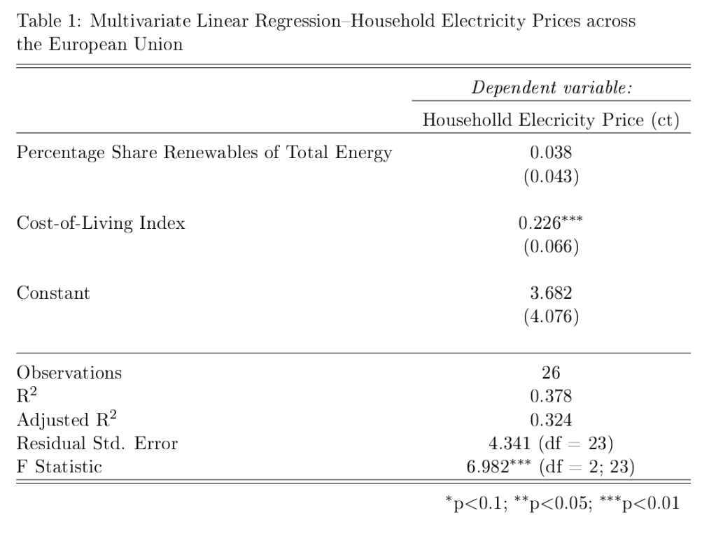
In data visualization posts #21 and #22, I referred to the results of simple multivariate linear regressions where I examined the statistical relationships between the cost of electricity across European Union countries and the market penetration of renewable energy sources, and a cost-of-living index. Here are the regression results that form the source data for the predictive plots in those blog posts.
First, with the price of electricity as the dependent variable (DV):
## Here is the R code for the linear regression (using the generalized linear models (glm) framework:
glm.1<-glm(Elec_Price~COL_Index+Pct_Share_Total,data=eu.RENEW.only,family="gaussian") # Electricity Price is DV
MODEL INFO:
Observations: 28
Dependent Variable: Price of Household Electricity (in Euro cents)
Type: Linear regression
MODEL FIT:
χ²(2) = 306.82, p = 0.00
Pseudo-R² (Cragg-Uhler) = 0.40
Pseudo-R² (McFadden) = 0.08
AIC = 166.04, BIC = 171.37
Standard errors: MLE
-------------------------------------------------------------
Est. S.E. t val. p
------------------------------ ------ ------ -------- ------
(Intercept) 4.10 3.59 1.14 0.26
Cost-of-Living Index 0.22 0.06 3.59 0.00
Renewables (% share of total) 0.03 0.04 0.74 0.46
-------------------------------------------------------------
We can see that the cost-of-living index is positively correlated with the price of household electricity, and it is statistically significant at conventional (p=0.05) levels. The market penetration of renewables (on the other hand) is not statistically significant (once controlling for cost-of-living.
Now, we use the pre-tax price of electricity (there are large differences in levels of taxation of household electricity across EU countries) as the DV. Here are the regression code (R) and the model results of the multivariate linear regression.
## Here is the R code for the linear regression (using the generalized linear models (glm) framework:
glm.2<-glm(Elec_Price_NoTax~COL_Index+Pct_Share_Total,data=eu.RENEW.only,family="gaussian") # Elec Price LESS taxes/levies is DV
MODEL INFO:
Observations: 28
Dependent Variable: Pre-tax price of Household Electricity (Euro cents)
Type: Linear regression
MODEL FIT:
χ²(2) = 100.13, p = 0.00
Pseudo-R² (Cragg-Uhler) = 0.44
Pseudo-R² (McFadden) = 0.12
AIC = 130.11, BIC = 135.43
Standard errors: MLE
-------------------------------------------------------------
Est. S.E. t val. p
----------------------------- ------- ------ -------- ------
(Intercept) 5.20 1.89 2.75 0.01
Cost-of-Living Index 0.14 0.03 4.41 0.00
Renewables (% share of total) -0.03 0.02 -1.44 0.16
-------------------------------------------------------------
Here, we see an even stronger relationship between the cost-of-living and the pre-tax price of household electricity, while there is (once the cost-of-living is controlled for) a negative (though not quite statistically significant) relationship between the pre-tax cost of electricity and the market penetration of renewables across EU countries.
One of the first things that is (or should be) taught in a quantitative methods course is that “correlation is not causation.” That is, just because we establish that a correlation between two numeric variables exists, that doesn’t mean that one of these variables in causing the other, or vice versa. And to step back ever further in our analytical process, even when we find a correlation between two numerical variables, that correlation may not be “real.” That is, it may be spurious (caused by some third variable) or an anomaly of random processes.
I’ve seen the chart below (in one form or another) for many years now and it’s been used by opponents of renewable energy to support their argument that renewable energy sources are poor substitutes for other sources (such as fossil fuels) because, amongst other things, they are more expensive for households.
In this example, the creators of the chart seem to show that there is a positive (and non-linear) relationship between the percentage of a European country’s energy that is supplied by renewables and the household price of electricity in that country. In short, the more a country’s energy grid relies on renewables, the more expensive it is for households to purchase electricity. And, of course, we are supposed to conclude that we should eschew renewables if we want cheap energy. But is this true?
No. To reiterate, a bivariate (two variables) relationship is not only not conclusive evidence of a statistical relationship truly existing between these variables, but we don’t have enough evidence to support the implied causal story–more renewbles equals higher electricity prices.
Even a casual glance at the chart above shows that countries with higher electricity prices are also countries where the standard (and thus, cost) of living is higher. Lower cost-of-living countries seem to have lower electricity prices. So, how do we adjudicate? How do we determine which variables–cost-of-living, or renewables penetration–is actually the culprit for increased electricity prices?
In statistics, we have a tool called multiple regression analysis. It is a numerical method, in which competing variables “fight it out” to see which has more impact (numerically) on the variation in the dependent (in this case, cost of electricity) variable. I won’t get into the details of how this works, as it’s complicated. But it is a standard statistical method.
So, what do we notice when we perform a multivariate linear regression analysis (note: a non-linear method actually strongly the case below even more strongly, but we’ll stick to linear regression for ease of interpretation and analysis) where we “control for” each of the two independent variables–cost-of-living and renewables penetration)?
The image below shows (contrary to the implied claim in the chart above) that once we a country’s cost of living, there is little influence on the price of household electricity of renewables penetration in a country Moreover, the impact is not “statistically significant (see table at the end of the post).” That is, based on the data it is highly likely that the weak relationship we do see is simply due to random chance. We see this weak relationship in the chart below, which is the predicted cost of electricity in each country based on different levels of renewables penetration, holding the cost-of-living constant.
Created by: Josip Dasović
At only 10% of renewable penetration in a country the predicted price of electricity is about 17.5 ct/kWh (the shaded grey areas are 95% confidence bands, so we see that even though our best estimate of the price of electricity for a country that gets only 10% of its energy from renewables is 17.5 ct/kWh, we would expect the actual result to be between 14.5 ct/kWh and 20.5 ct/kWh 95% of the time. Our best estimate of the predicted cost of electricity in a country that gets 80% of its energy from renewables is expected to be about 19.5 ct/kWh. So, an 800% increase in renewables penetration leads only to only a 14.5% increase in the predicted price of electricity.
Now, what if we plot the predicted price of household electricity based on the cost-of-living after controlling for renewables penetration in a country? We see that, in this case, there is a much stronger relationship, which is statistically significant (highly unlikely for these data to produce this result randomly).
There are two things to note in the chart above. First, the 95% confidence bands are much closer together indicating much more certainty that there is a true statistical relationship between the “Cost-of-Living Index (COL)” and the predicted price of household electricity. And, we see that a 100% increase in the COL leads to a ((15.5-9.3)/9.3)*100%, or 67% increase in the predicted price of electricity in any EU country. (Note: I haven’t addressed the fact that electricity prices are a component of the COL, but they are so insignificant as to not undermine the results found here.
Stay tuned for the next post, where I’ll show that once we take out taxes and levies the relationship between the predicted price of household electricity and the penetration of renewables in an EU country is actually negative.
Here is the R code for the regression analyses, the prediction plots, and the table of regression results.
## This is the linear regression.
reg1<-lm(Elec_Price~COL_Index+Pct_Share_Total,data=eu.RENEW.only)
library(stargazer) # needed for prediction cplots
## Here is the code for the two prediction plots.
## First plot
cplot(reg1,"COL_Index", what="prediction", main="Cost-of-Living Predicts Electricity Price (ct/kWh) across EU Countries\n(Holding Share of Renewables Constant)", ylab="Predicted Price of Electricity (ct/kWh)", xlab="Cost-of-Living Index")
## Second plot
cplot(reg1,"Pct_Share_Total", what="prediction", main="Share of Renewables doesn't Predict Electricity Price (ct/kWh) across EU Countries\n(Holding Cost-of-Living Constant)", ylab="Predicted Price of Electricity (ct/kWh)", xlab="Percentage Share of Renewables of Total Energy Use")
The table below was created in LaTeX using the fantastic stargazer (v.5.2.2) package created for R by Marek Hlavac, Harvard University. E-mail: hlavac at fas.harvard.edu
Here’s an example of a good post for the POLI 1100 blog assignment for this week. This took about 20-25 minutes to complete.
As noted in Chapter 2 of the Dyck textbook, the number of democracies worldwide has risen dramatically over the last couple of decades, to the point that currently a majority of the world’s population lives in more-or-less democratic states. More-or-less since democracies vary in character from one to the next. Some democracies fully respect human rights, whereas others are less stringent in this regard.
In a recent article in Foreign Policy magazine, Christian Caryl claims that “2012 could be a great year for democracy.” In all, almost 1/3 of the world’s countries will be heading to the polls this year to elect leaders at the national, regional, and local levels.* As for whether this is a sign of deepening democratization, Caryl is more equivocal:
That may be true. But it hardly means that the triumph of democracy is ensured. If history has taught us anything, it is that nothing in human affairs is inevitable. Most people undoubtedly yearn for freedom. In our imperfect world, however, the political choices actually facing most citizens are messy, risky, or morally fraught. There is no straight line to an open society.
Egypt is illustrative. What happens there, in the largest Arab country, is likely to have broad repercussions for the other countries of the Middle East. Yet Egyptians face many obstacles as they strive to assert their political rights. The military stubbornly refuses to yield power. The weakness of the economy, if allowed to continue, could easily sow doubt about the desirability of representative government. Then there is the possibility of sectarian or factional conflict. Already the two Islamist parties that have emerged victorious from the country’s first post-Mubarak parliamentary elections have begun feuding among themselves. And that’s not even to mention the lingering disquiet among Egypt’s large Christian population after last year’s pogroms.
Elections are a vital prerequisite of democracy. Yet, as many examples this year will remind us, elections alone do not a democracy make.
I think that the bolded part above (my emphasis) is the key part of the story here. We can think about this in terms of necessary and sufficient conditions. While having elections is necessary for a political system to be considered a democracy, elections are not sufficient for democracy. Other institutions, such as a free press, respect for human and civil rights, the freedom of assembly, etc., are needed as well.
For a list of countries that will be holding elections this year, this page is maintained by the Consortium for Elections and Political Process Strengthening. We see that Finland will be the first to have elections this year–Sunday, January 22–with the first round of Presidential elections. (is Sami Salo running?)
Here is an interview with Croatia’s new Foreign Affairs Minister, Vesna Pusic, with EUObserver.com about the upcoming referendum in Croatia on whether to join the European Union. (In the interview, which was held in early December 2011, Minister Pusic speculates that the referendum would take place in February 2012. In fact, the elections will be held this Sunday, 22 January 2012.
*N.B.: Just as an aside. Is it really striking (statistically, that is) that in any given year 1/3 of the world’s countries will have citizens go to election polls to elect representatives?
In intro to comparative, in a few weeks time, we’ll cover developments in the post-communist world of Eastern Europe. Here is an interesting report from one of my home towns (I lived and studied in Budapest for a year in the late 1990s) that looks at the effects of economic growth on first lowering and now raising levels of pollution in the majestic Hungarian capital.
Budapest, Hungary – Climb into the Buda Hills and look back at the flatlands of Pest and the pollution is obvious: a yellow-gray cloud that blankets the Hungarian capital much of the time.
Indeed, 19 years after the collapse of communism, Budapest’s air quality has become a problem again. Pollution exceeded recommended levels 115 days last year, 80 days more than permitted under European Union (EU) guidelines. [of which Hungary is a member.] In late December and early January, the capital experienced one of its most prolonged smog events in a decade.
When communism imploded in 1989, Budapest’s air was atrocious. With their two-cycle engines, fleets of Trabant automobiles spewed black clouds of lead-laden exhaust, while city busses and industrial facilities pumped eye-stinging emissions into the air. During the 1990s the air cleared as factories installed pollution controls, leaded gasoline was banned, and newer, cleaner Western cars replaced dirty Soviet ones.
But in recent years, those gains have been reversed as many Hungarians now drive to work from increasingly far-flung suburban areas. Lead and sulfur dioxide have been replaced by dangerous concentrations of tiny exhaust particles.
“We’ve exchanged [Victorian-era] London-type smog for Los Angles-type smog,” laments Janos Zlinszky of the Regional Environmental Center for Central and Eastern Europe. “The nature of our environmental problems is shifting.”
Across east-central Europe, a region once blighted by Communist-era pollution, economic development is bringing on a new set of environmental problems and, in some cases, bringing back old ones.
Here is an animated short film by Bruno Bozzetto, which shows the putative differences between Italians and Europeans (notice the not-so-subtle “othering” that is implicit in the title). Have you ever been to Italy? Are these differences real, and if so, can political culture account for them? What underlying differences in political attitudes would help explain the divergence in behaviors demonstrated in the video? It’s interesting that Italy was one of the original six members of the European Union (which was then called the European Coal and Steel Community (ECSC). This was quite monumental as the other five members were on the other side of the Alps. Have a look at Bozzetto’s animated short:
P.S. This could easily be titled “Europe and Croatia!”
China’s rising economic and military power has caused some concern in the United States and in Europe. Just like China in the 1980s, China’s economic policies–particularly as it relates to the values of its currency and the effect that has had on China’s foreign trade and current accounts–have irked politicians and pundits (hello, Lou Dobbs) here in the US. They will not be heartened by the news that China’s trade surplus has reached a record $262 billion. Interestingly, however, the EU replaced the US as China’s largest export market.
China’s trade surplus rose by nearly 50 per cent to a record $262bn in 2007, but import growth exceeded export growth in each of the final three months of the year, suggesting that the country’s controversial trade imbalance may be peaking.
In another first, the European Union also replaced the US as China’s largest export market. Sales to the expanded EU grew by 29.2 per cent in 2007, compared to just 14 per cent to the US.
You must be logged in to post a comment.