Data Visualization #21—You can’t use bivariate relationships to support a causal claim

One of the first things that is (or should be) taught in a quantitative methods course is that “correlation is not causation.” That is, just because we establish that a correlation between two numeric variables exists, that doesn’t mean that one of these variables in causing the other, or vice versa. And to step back ever further in our analytical process, even when we find a correlation between two numerical variables, that correlation may not be “real.” That is, it may be spurious (caused by some third variable) or an anomaly of random processes.

I’ve seen the chart below (in one form or another) for many years now and it’s been used by opponents of renewable energy to support their argument that renewable energy sources are poor substitutes for other sources (such as fossil fuels) because, amongst other things, they are more expensive for households.

In this example, the creators of the chart seem to show that there is a positive (and non-linear) relationship between the percentage of a European country’s energy that is supplied by renewables and the household price of electricity in that country. In short, the more a country’s energy grid relies on renewables, the more expensive it is for households to purchase electricity. And, of course, we are supposed to conclude that we should eschew renewables if we want cheap energy. But is this true?

No. To reiterate, a bivariate (two variables) relationship is not only not conclusive evidence of a statistical relationship truly existing between these variables, but we don’t have enough evidence to support the implied causal story–more renewbles equals higher electricity prices.

Even a casual glance at the chart above shows that countries with higher electricity prices are also countries where the standard (and thus, cost) of living is higher. Lower cost-of-living countries seem to have lower electricity prices. So, how do we adjudicate? How do we determine which variables–cost-of-living, or renewables penetration–is actually the culprit for increased electricity prices?

In statistics, we have a tool called multiple regression analysis. It is a numerical method, in which competing variables “fight it out” to see which has more impact (numerically) on the variation in the dependent (in this case, cost of electricity) variable. I won’t get into the details of how this works, as it’s complicated. But it is a standard statistical method.

So, what do we notice when we perform a multivariate linear regression analysis (note: a non-linear method actually strongly the case below even more strongly, but we’ll stick to linear regression for ease of interpretation and analysis) where we “control for” each of the two independent variables–cost-of-living and renewables penetration)?

The image below shows (contrary to the implied claim in the chart above) that once we a country’s cost of living, there is little influence on the price of household electricity of renewables penetration in a country Moreover, the impact is not “statistically significant (see table at the end of the post).” That is, based on the data it is highly likely that the weak relationship we do see is simply due to random chance. We see this weak relationship in the chart below, which is the predicted cost of electricity in each country based on different levels of renewables penetration, holding the cost-of-living constant.

Created by: Josip Dasović

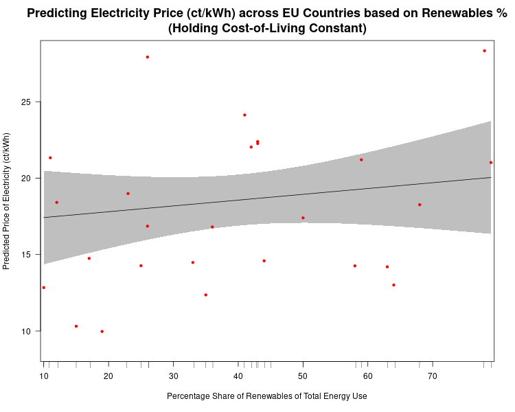
At only 10% of renewable penetration in a country the predicted price of electricity is about 17.5 ct/kWh (the shaded grey areas are 95% confidence bands, so we see that even though our best estimate of the price of electricity for a country that gets only 10% of its energy from renewables is 17.5 ct/kWh, we would expect the actual result to be between 14.5 ct/kWh and 20.5 ct/kWh 95% of the time. Our best estimate of the predicted cost of electricity in a country that gets 80% of its energy from renewables is expected to be about 19.5 ct/kWh. So, an 800% increase in renewables penetration leads only to only a 14.5% increase in the predicted price of electricity.

Now, what if we plot the predicted price of household electricity based on the cost-of-living after controlling for renewables penetration in a country? We see that, in this case, there is a much stronger relationship, which is statistically significant (highly unlikely for these data to produce this result randomly).

There are two things to note in the chart above. First, the 95% confidence bands are much closer together indicating much more certainty that there is a true statistical relationship between the “Cost-of-Living Index (COL)” and the predicted price of household electricity. And, we see that a 100% increase in the COL leads to a ((15.5-9.3)/9.3)*100%, or 67% increase in the predicted price of electricity in any EU country. (Note: I haven’t addressed the fact that electricity prices are a component of the COL, but they are so insignificant as to not undermine the results found here.

Stay tuned for the next post, where I’ll show that once we take out taxes and levies the relationship between the predicted price of household electricity and the penetration of renewables in an EU country is actually negative.

Here is the R code for the regression analyses, the prediction plots, and the table of regression results.

## This is the linear regression.
reg1<-lm(Elec_Price~COL_Index+Pct_Share_Total,data=eu.RENEW.only)

library(stargazer)  # needed for prediction cplots

## Here is the code for the two prediction plots.
## First plot
cplot(reg1,"COL_Index", what="prediction", main="Cost-of-Living Predicts Electricity Price (ct/kWh) across EU Countries\n(Holding Share of Renewables Constant)", ylab="Predicted Price of Electricity (ct/kWh)", xlab="Cost-of-Living Index")

## Second plot
cplot(reg1,"Pct_Share_Total", what="prediction", main="Share of Renewables doesn't Predict Electricity Price (ct/kWh) across EU Countries\n(Holding Cost-of-Living Constant)", ylab="Predicted Price of Electricity (ct/kWh)", xlab="Percentage Share of Renewables of Total Energy Use")

The table below was created in LaTeX using the fantastic stargazer (v.5.2.2) package created for R by Marek Hlavac, Harvard University. E-mail: hlavac at fas.harvard.edu

Data Visualization #20—”Lying” with statistics

In teaching research methods courses in the past, a tool that I’ve used to help students understand the nuances of policy analysis is to ask them to assess a claim such as:

In the last 12 months, statistics show that the government of Upper Slovobia’s policy measures have contributed to limiting the infollcillation of ramakidine to 34%.

The point of this exercise is two-fold: 1) to teach them that the concepts we use in social science are almost always socially constructed, and we should first understand the concept—how it is defined, measured, and used—before moving on to the next step of policy analysis. When the concepts used—in this case, infollcillation and ramakidine—are ones nobody has every heard of (because I invented them), step 1 becomes obvious. How are we to assess whether a policy was responsible for something when we have zero idea what that something even means? Often, though, because the concept is a familar one—homelessness, polarization, violence—we often skip right past this step and focus on the next step (assessing the data).

2) The second point of the exercise is to help students understand that assessing the data (in this case, the 34% number) can not be done adequately without context. Is 34% an outcome that was expected? How does that number compare to previous years and the situation under previous governments, or the situation with similar governments in neighbouring countries? (The final step in the policy analysis would be to set up an adequate research design that would determine the extent to which the outcome was attributable to policies implemented by the South Slovobian government.)

If there is a “takeaway” message from the above, it is that whenever one hears a numerical claim being made, first ask yourself questions about the claim that fill in the context, and only then proceed to evaluate the claim.

Let’s have a look at how this works, using a real-life example. During a recent episode of Real Time, host Bill Maher used his New Rules segment to admonish the public (especially its more left-wing members) for overestimating the danger to US society of the COVID-19 virus. He punctuated his point by using the following statistical claim:

Maher not only claims that the statistical fact that 78% of COVID-19-caused fatalities in the USA have been from those who were assessed to have been “overweight” means that the virus is not nearly as dangerous to the general USA public as has been portrayed, but he also believes that political correctness run amok is the reason that raising this issue (which Americans are dying, and why) in public is verboten. We’ll leave aside the latter claim and focus on the statistic—78% of those who died from COVID-19 were overweight.

Does the fact that more than 3-in-4 COVID-19 deaths in the USA were individuals assessed to have been overweight mean that the danger to the general public from the virus has been overhyped? Maher wants you to believe that the answer to this question is an emphatic ‘yes!’ But is it?

Whenever you are presented with such a claim follow the steps above. In this case, that means 1) understand what is meant by “overweight” and 2) compare the statistical claim to some sort of baseline.

The first is relatively easy—the US CDC has a standard definition for “overweight”, which can be found here: https://www.cdc.gov/obesity/adult/defining.html. Assuming that the definition is applied consistently across the whole of the USA, we can move on to step 2. The first question you should ask yourself is “is 78% low, or high, or in-between?” Maher wants us to believe that the number is “high”, but is it really? Let’s look for some baseline data with which to compare the 78% statistic. The obvious comparison is the incidence of “overweight” in the general US population. Only when we find this data point will we be able to assess whether 78% is a high (or low) number. What do we find? Let’s go back to the US CDC website and we find this: “Percent of adults aged 20 and over with overweight, including obesity: 73.6% (2017-2018).”

So, what can we conclude? The proportion of USA adults dying from COVID-19 who are “overweight” (78%) is almost the same proportion of the USA adult population that is “overweight (73.6%).” Put another way, the likelihood of randomly selecting a USA adult who is overweight versus randomly selecting one who is not overweight is 73.6/26.4≈3.29. If one were to randomly select an adult who died from COVID-19, one would be 78/22≈3.55 times more likely to select an overweight person than a non-overweight person. Ultimately, in the USA at least, as of the end of April overweight adults are dying from COVID-19 at a rate that is about equal to their proportion in the general adult US population.

We can show this graphically via a pie chart. For many reasons, the use of pie charts is generally frowned upon. But, in this case, where there are only two categories—overweight, and non-overweight—pie charts are a useful visualization tool, which allows for easy visual comparison. Here are the pie charts, and the R code that produced them below:

Created by: Josip Dasović

We can clearly see that the proportion of COVID-19 deaths from each cohort—overweight, non-overweight—is almost the same as the proportion of each cohort in the general USA adult population. So, a bit of critical analysis of Maher’s claim shows that he is not making the strong case that he believes he is.

# Here is the required data frame
covid.df <- data.frame("ADULT"=rep(c("Overweight", "Non-overweight"),2), 
                       "Percentage"=c(0.736,0.264,0.78,0.22),
                       "Type"=rep(c("Total Adult Population","COVID-19 Deaths"),each=2))

library(ggplot2)

# Now the code for side-by-side pie charts:

ggpie.covid <- ggplot(covid.df, aes(x="", y=Percentage, group=ADULT, fill=ADULT, )) +
  geom_bar(width = 1, stat = "identity") +
  scale_fill_manual(values=c("#33B2CC","#D71920"),name ="ADULT CATEGORY") + 
  labs(x="", y="", title="Percentage of USA Adults who are Overweight",
       subtitle="(versus percentage of USA COVID-19 deaths who were overweight)") + 
  coord_polar("y", start=0) + facet_wrap(~ Type) +
  theme(axis.text = element_blank(),
        axis.ticks = element_blank(),
        panel.grid  = element_blank(),
        plot.title = element_text(hjust = 0.5, size=16, face="bold"),
        plot.subtitle = element_text(hjust=0.5, face="bold"))

ggsave(filename="covid19overweight.png", plot=ggpie.covid, height=5, width=8)


Data Visualization # 12—Using Roulette to Deconstruct the ‘Climate is not the Weather’ response to climate “deniers”

If you are at all familiar with the politics and communication surrounding the global warming issue you’ll almost certainly have come across one of the most popular talking points among those who dismiss (“deny”) contemporary anthropogenic (human-caused) climate change (I’ll call them “climate deniers” henceforth). The claim goes something like this:

“If scientists can’t predict the weather a week from now, how in the world can climate scientists predict what the ‘weather’ [sic!] is going to be like 10, 20, or 50 years from now?”

Notably, the statement does possess a prima facie (i.e., “commonsensical”) claim to plausibility–most people would agree that it is easier (other things being equal) to make predictions about things are closer in time to the present than things that happen well into the future. We have a fairly good idea of the chances that the Vancouver Canucks will win at least half of their games for the remainder of the month of March 2021. We have much less knowledge of how likely the Canucks will be to win at least half their games in February 2022, February 2025, or February 2040.

Notwithstanding the preceding, the problem with this denialist argument is that it relies on a fundamental misunderstanding of the difference between climate and weather. Here is an extended excerpt from the US NOAA:

We hear about weather and climate all of the time. Most of us check the local weather forecast to plan our days. And climate change is certainly a “hot” topic in the news. There is, however, still a lot of confusion over the difference between the two.

Think about it this way: Climate is what you expect, weather is what you get.

Weather is what you see outside on any particular day. So, for example, it may be 75° degrees and sunny or it could be 20° degrees with heavy snow. That’s the weather.

Climate is the average of that weather. For example, you can expect snow in the Northeast [USA] in January or for it to be hot and humid in the Southeast [USA] in July. This is climate. The climate record also includes extreme values such as record high temperatures or record amounts of rainfall. If you’ve ever heard your local weather person say “today we hit a record high for this day,” she is talking about climate records.

So when we are talking about climate change, we are talking about changes in long-term averages of daily weather. In most places, weather can change from minute-to-minute, hour-to-hour, day-to-day, and season-to-season. Climate, however, is the average of weather over time and space.

The important message to take from this is that while the weather can be very unpredictable, even at time-horizons of only hours, or minutes, the climate (long-term averages of weather) is remarkably stable over time (assuming the absence of important exogenous events like major volcanic eruptions, for example).

Although weather forecasting has become more accurate over time with the advance of meteorological science, there is still a massive amount of randomness that affects weather models. The difference between a major snowstorm, or clear blue skies with sun, could literally be a slight difference in air pressure, or wind direction/speed, etc. But, once these daily, or hourly, deviations from the expected are averaged out over the course of a year, the global mean annual temperature is remarkably stable from year-to-year. And it is an unprecedentedly rapid increase in mean annual global temperatures over the last 250 years or so that is the source of climate scientists’ claims that the earth’s temperature is rising and, indeed, is currently higher than at any point since the beginning of human civilization some 10,000 years ago.

Although the temperature at any point and place on earth in a typical year can vary from as high as the mid-50s degrees Celsius to as low as the -80s degrees Celsius (a range of some 130 degrees Celsius) the difference in the global mean annual temperature between 2018 and 2019 was only 0.14 degrees Celsius. That incorporates all of the polar vortexes, droughts, etc., over the course of a year. That is remarkably stable. And it’s not a surprise that global mean annual temperatures tend to be stable, given the nature of the earth’s energy system, and the concept of earth’s energy budget.

In the same way that earth’s mean annual temperatures tend to be very stable (accompanied by dramatic inter-temporal and inter-spatial variation), we can see that the collective result of many repeated spins of a roulette wheel is analogously stable (with similarly dramatic between-spin variation).

A roulette wheel has 38 numbered slots–36 of which are split evenly between red slots and black slots–numbered from 1 through 36–and (in North America) two green slots which are numbered 0, and 00. It is impossible to determine with any level of accuracy the precise number that will turn up on any given spin of the roulette wheel. But, we know that for a standard North American roulette wheel, over time the number of black slots that turn up will be equal to the number of red slots that turn up, with the green slots turning up about 1/9 as often as either red or black. Thus, while we have no way of knowing exactly what the next spin of the roulette wheel will be (which is a good thing for the casino’s owners), we can accurately predict the “mean outcome” of thousands of spins, and get quite close to the actual results (which is also a good thing for the casino owners and the reason that they continue to offer the game to their clients).

Below are two plots–the upper plot is an animated plot of each of 1000 simulated random spins of a roulette wheel. We can see that the value of each of the individual spins varies considerably–from a low of 0 to a high of 36. It is impossible to predict what the value of the next spin will be.

The lower plot, on the other hand is an animated plot, the line of which represents the cumulative (i.e. “running”) mean of 1000 random spins of a roulette wheel. We see that for the first few random rolls of the roulette wheel the cumulative mean is relatively unstable, but as the number of rolls increases the cumulative mean eventually settles down to a value that is very close to the ‘expected value’ (on a North Amercian roulette wheel) of 17.526. The expected value* is simply the sum of all of the individual values 0,0, 1 through 36 divided by the total number of slots, which is 38. Over time, as we spin and spin the roulette wheel, the values from spin-to-spin may be dramatically different. Over time, though, the mean value of these spins will converge on the expected value of 17.526. From the chart below, we see that this is the case.

Created by Josip Dasović

Completing the analogy to weather (and climate) prediction, on any given spin our ability to predict what the next spin of the roulette wheel will be is very low. [The analogy isn’t perfect because we are a bit more confident in our weather predictions given that the process is not completely random–it will be more likely to be cold and to snow in the winter, for example.] But, over time, we can predict with a high degree of accuracy that the mean of all spins will be very close to 17.526. So, our inability to predict short-term events accurately does not mean that we are not able to predict long-term events accurately. We can, and we do. In roulette, and for the climate as well.

TLDR: Just because a science can’t predict something short-term does not mean that it isn’t a science. Google quantum physics and randomness and you’ll understand what Einstein was referring to when he quipped that “God does not play dice.” Maybe she’s a roulette player instead?

  • Note: This is not the same as the expected dollar value of a bet given that casinos generate pay-off matrixes that are advantageous to themselves.

The Economist Intelligence Unit’s Global “Livability” Survey Omits Cost-of-Living

Before we can say anything definitive about the concepts and ideas that we’re studying, it is imperative that we have some understanding about whether the data that we observe and collect are actually “tapping into” the concept of interest.

For example, if my desire were to collect data that are meant to represent how democratic a country is, it would probably not be beneficial to that enterprise to collect measures of annual rainfall. [Though, in some predominantly agricultural countries, that might be an instrument for economic growth.] Presumably, I would want to collect data like whether elections were regularly held, free, and fair, whether the judiciary was independent of elected leaders, etc. That seems quite obvious to most.

The Economist’s Intelligence Unit puts out an annual  “Global Livability Report” , which claims to comparatively assess “livability” in about 140 cities worldwide. The EIU uses many different indicators (across five broad categories) to arrive at a single index value that allegedly reflects the level of livability of each city in the survey.  Have a look at the indicators below. Do you notice that the cost-of-living is not include? Why might that be?

livability_top_bottom_teneconomist_livability_1economist_livability_2


How to lie with Statistics

In class last week, we were introduced to recent research on the effect of same-sex parenting on children’s welfare, specifically on high school graduation rates. We discussed how easy it can be to manipulate data in order to present a distorted view of reality.

I’ll use a fictitious example to make the point. Let’s assume you had two schools–Sir Charles Tupper and William Gladstone. Assume further that the graduation rates of the two schools are 98% and 94% for Tupper and Gladstone, respectively. Is one school substantially better at graduating its students than the other? Not really. In fact, the graduation rate at Tupper is about 4.3% higher than at Gladstone. So, Tupper is marginally better at graduating students than is Gladstone.

But, what if we compared non-graduation rates instead? Well, the non-graduation rate at Tupper is 2%, while the non-graduation rate at Gladstone is 6%. Thus, the following accurate statistical claim can legitimately be made: “Gladstone’s drop-out [non-graduation] rate is 300% greater than is Tupper’s.” Or, “Tupper non-graduation rate is 33% of Gladstone’s!” Would parents’ reactions be the same if the data were presented in this manner?

Another way to lie with statistics using graphs.

‘Thick Description’ and Qualitative Research Analysis

In Chapter 8 of Bryman, Beel, and Teevan, the authors discuss qualitative research methods and how to do qualitative research. In a subsection entitled Alternative Criteria for Evaluating Qualitative Research, the authors reference Lincoln and Guba’s thoughts on how to assess the reliability, validity, and objectivity of qualitative research. Lincoln and Guba argue that these well-known criteria (which developed from the need to evaluate quantitative research) do not transfer well to qualitative research. Instead, they argue for evaluative criteria such as credibility, transferability, and objectivity.

Saharan Caravan Routes
Saharan Caravan Routes–The dotted red lines in the above map are caravan routes connecting the various countries of North Africa including Egypt, Libya, Algeria, Morocco, Mali, Niger and Chad. Many of the main desert pistes and tracks of today were originally camel caravan routes. (What do the green, yellow, and brown represent?)

Transferability is the extent to which qualitative research ‘holds in some other context’ (the quants reading this will immediately realize that this is analogous to the concept of the ‘generalizability of results’ in the quantitative realm). The authors argue that whether qualitative research fulfills this criterion is not a theoretical, but an empirical issue. Moreover, they argue that rather than worrying about transferability, qualitative researchers should produce ‘thick descriptions’ of phenomena. The term thick description is most closely associated with the anthropologist Clifford Geertz (and his work in Bali). Thick description can be defined as:

the detailed accounts of a social setting or people’s experiences that can form the basis for general statements about a culture and its significance (meaning) in people’s lives.

Compare this account (thick description) by Geertz of the caravan trades in Morocco at the turn of the 20th century to how a quantitative researcher may explain the same institution:

In the narrow sense, a zettata (from the Berber TAZETTAT, ‘a small piece of cloth’) is a passage toll, a sum paid to a local power…for protection when crossing localities where he is such a power. But in fact it is, or more properly was, rather more than a mere payment. It was part of a whole complex of moral rituals, customs with the force of law and the weight of sanctity—centering around the guest-host, client-patron, petitioner-petitioned, exile-protector, suppliant-divinity relations—all of which are somehow of a package in rural Morocco. Entering the tribal world physically, the outreaching trader (or at least his agents) had also to enter it culturally.

Despite the vast variety of particular forms through which they manifest themselves, the characteristics of protection in tbe Berber societies of the High and Middle Atlas are clear and constant. Protection is personal, unqualified, explicit, and conceived of as the dressing of one man in the reputation of another. The reputation may be political, moral, spiritual, or even idiosyncratic, or, often enough, all four at once. But the essential transaction is that a man who counts ‘stands up and says’ (quam wa qal, as the classical tag bas it) to those to whom he counts: ‘this man is mine; harm him and you insult me; insult me and you will answer for it.’ Benediction (the famous baraka),hospitality, sanctuary, and safe passage are alike in this: they rest on the perhaps somewhat paradoxical notion that though personal identity is radically individual in both its roots and its expressions, it is not incapable of being stamped onto tbe self of someone else. (Quoted in North (1991) Journal of Economic Perspectives, 5:1 p. 104.

What causes civil conflict?

In a series of recent articles, civil conflict researchers Esteban, Mayoral, and Ray (see this paper for an example) have tried to answer that question. Is it economic inequality, or cultural differences? Or maybe there is a political cause at its root. I encourage you to read the paper and to have a look at the video below. Here are a couple of images from the linked paper, which you’ll see remind you of concepts that we’ve covered in IS210 this semester. The first image is only part of the “Model of Civil Conflict.” Take a look at the paper if you want to see the “punchline.”

Screen shot 2014-02-07 at 1.54.26 AM

Here is the relationship between fractionalization and polarization. What does each of these measures of diversity measure?

Screen shot 2014-02-07 at 1.56.50 AM

And here’s a nice youtube video wherein the authors explain their theory.

Indicators and The Failed States Index

The Failed State Index is created and updated by the Fund for Peace. For the most recent year (2013), the Index finds the same cast of “failed” characters as previous years. There is some movement, the “top” 10 has not changed much over the last few years.

The Top 10 of the Failed States Index for 2013

Notice the columns in the image above. Each of these columns is a different indicator of “state-failedness”. If you go to the link above, you can hover over each of the thumbnails to find out what each indicator measures. For, example, the column with what looks like a 3-member family is the score for “Mounting Demographic Pressures”, etc. What is most interesting about the individual indicator scores is how similar they are for each state. In other words, if you know Country X’s score on Mounting Demographic Pressures, you would be able to predict the scores of the other 11 indicators with high accuracy. How high? We’ll just run a simple regression analysis, which we’ll do in IS240 later this semester.

For now, though, I was curious as to how closely each indicator was correlated with the total score. Rather than run regression analyses, I chose (for now) to simply plot the associations. [To be fair, one would want to plot each indicator not against the total but against the total less that indicator, since each indicator comprises a portion (1/12, I suppose) of the total score. In the end, the general results are similar,if not exactly the same.]

So, what does this look like? See the image below (the R code is provided below, for those of you in IS240 who would like to replicate this.)

Plotting each of the Failed State Index (FSI) Indicators against the Total FSI Score

Here are two questions that you should ponder:

  1. If you didn’t have the resources and had to choose only one indicator as a measure of “failed-stateness”, which indicator would you choose? Which would you definitely not choose?
  2. Would you go to the trouble and expense of collecting all of these indicators? Why or why not?

R-code:


install.packages("gdata") #This package must be installed to import .xls file

library(gdata) #If you find error message--"required package missing", it means that you must install the dependent package as well, using the same procedure.

fsi.df<-read.xls("http://ffp.statesindex.org/library/cfsis1301-fsi-spreadsheet178-public-06a.xls")  #importing the data into R, and creating a data frame named fsi.df

pstack.1<-stack(fsi.df[4:15]) #Stacking the indicator variables in a single variable

pstack.df<-data.frame(fsi.df[3],pstack.1) #setting up the data correctly

names(pstack.df)<-c("Total","Score","Indicator") #Changing names of Variables for presentation

install.packages("lattice")  #to be able to create lattice plots

library(lattice) #to load the lattice package

xyplot(pstack.df$Total~pstack.df$Score|pstack.df$Indicator,  groups=pstack.df$Indicator, layout=c(4,3),xlab="FSI Individual Indicator Score", ylab="FSI Index Total")

Deal or no deal and rational choice theory

As my students are aware, I have been under the weather since the beginning of January and am finally feeling somewhat like a human being again. During my down time, I took some rest and had time to do some non-school-related activities, one of which was trying out the Deal or No Deal app on my smartphone. You do remember the TV show hosted by Howie Mandel, right?

Deal or No Deal and Rational Choice Theory

Anyway, the basic idea of the show is this:

  • There are 26 suitcases on state, each with a card containing a dollar amount between $1 and $1 Million.
  • The game begins when the contestant chooses one of the 26 suitcases as “their” suitcase. If the contestant keeps the suitcase until the end of play, they win the dollar amount written on the card inside the suitcase.
  • The contestant must begin opening a certain amount of suitcases during each round of play–5 the first round, 4 the next, etc.
  • After each round, the game pauses and the contestant receives an offer from the mysterious banker via telephone with Howie as the intermediary.
  • The contestant is then asked whether there is a “deal, or no deal.” The contestant may accept the banker’s offer or continue. [There is where the drama gets ramped up to 11!]
  • If you have watched the show, you’ll notice that the banker’s offer depends upon which dollar amounts have been revealed. If the contestant reveals many high-value suitcases, it becomes like likely (probable) that the suitcase s/he chose at the beginning is a high-value suitcase.

The smartphone version is slightly different from the TV show in that the suitcases do not have dollar amounts attached but point multiples (that is, you win 1X, 2X, 3x, etc. 1000X the pot).

Take a look at the images above screenshot (is that the past participle?) from my smartphone. What do you notice about the banker’s offer? What’s of importance here is the red boxes in each picture. These are two separate games, btw.

These are two separate games. In the top game, there are only two suitcases left–one of them is the 20X and the 200X, Therefore, I have either the 20X or the 200X. That’s quite a big difference in winnings–ten times. So, what would you do? What would a rational choice theorist say you should do? Are the bankers offers rational in each case? Why or why not?

How much does political culture explain?

For decades now, comparativists have debated the usefulness of cultural explanations of political phenomena. In their path-breaking book, The Civic Culture, Almond and Verba argued that there was a relationship between, what they called, a country’s political culture and the nature and quality of democracy. (In fact, the relationship is a bit more complex in that the believed that a country’s political culture mediated the link between individual attitudes and the political system.) Moreover, the political culture was itself a product of underlying and enduring socially cultural factors, such as either an emphasis on the family, bias towards individualism, etc. Although Almond and Verba studied only five countries–the United States, West Germany, Mexico, Italy, and the United Kingdom–they suggested that the results could be generalized to (all) other countries.

How much, however, does culture explain? Can it explain why some countries have strong economies? Or why some countries have strong democracies? We know that cultural traits and values are relatively enduring, so how can we account for change? We know that a constant can not explain a variable.

The 1963 Cover of Almond and Verba's classic work.

In a recent op-ed piece in the New York Times, Professor Stephen L. Sass asks whether China can innovate its way to technological and economic dominance over the United States. There is much consternation in the United States over recent standardized test scores showing US students doing poorly, relative to their global peers, on science exams. (How have Canadian students been faring?)

Professor Sass answers his own question in the negative. Why, in his estimation, will China not innovate to the top? In a word (well, actually two words)–political culture:

Free societies encourage people to be skeptical and ask critical questions. When I was teaching at a university in Beijing in 2009, my students acknowledged that I frequently asked if they had any questions — and that they rarely did. After my last lecture, at their insistence, we discussed the reasons for their reticence.

Several students pointed out that, from childhood, they were not encouraged to ask questions. I knew that the Cultural Revolution had upturned higher education — and intellectual inquiry generally — during their parents’ lifetimes, but as a guest I didn’t want to get into a political discussion. Instead, I gently pointed out to my students that they were planning to be scientists, and that skepticism and critical questioning were essential for separating the wheat from the chaff in all scholarly endeavors.

Although Sass admits that there are institutional and other reasons that will also serve to limit China’s future technological innovation, he ends up affirming the primacy of political culture:

Perhaps I’m wrong that political freedom is critical for scientific innovation. As a scientist, I have to be skeptical of my own conclusions. But sometime in this still-new century, we will see the results of this unfolding experiment. At the moment, I’d still bet on America.

Do you agree? What other important political phenomena can be explained by political culture?