How to lie with Statistics

In class last week, we were introduced to recent research on the effect of same-sex parenting on children’s welfare, specifically on high school graduation rates. We discussed how easy it can be to manipulate data in order to present a distorted view of reality.

I’ll use a fictitious example to make the point. Let’s assume you had two schools–Sir Charles Tupper and William Gladstone. Assume further that the graduation rates of the two schools are 98% and 94% for Tupper and Gladstone, respectively. Is one school substantially better at graduating its students than the other? Not really. In fact, the graduation rate at Tupper is about 4.3% higher than at Gladstone. So, Tupper is marginally better at graduating students than is Gladstone.

But, what if we compared non-graduation rates instead? Well, the non-graduation rate at Tupper is 2%, while the non-graduation rate at Gladstone is 6%. Thus, the following accurate statistical claim can legitimately be made: “Gladstone’s drop-out [non-graduation] rate is 300% greater than is Tupper’s.” Or, “Tupper non-graduation rate is 33% of Gladstone’s!” Would parents’ reactions be the same if the data were presented in this manner?

Another way to lie with statistics using graphs.

Lies, Damned Lies, and Excel Charts!

I provide links to many sources that collect data on various political phenomena because I think that describing and measuring are extremely useful tools in helping us understand politics. As Mark Twain was well aware, and as I mentioned in PLSC240 today, often-times researchers (and especially!) politicians use data and statistics to obfuscate reality rather than to illuminate. No sooner had I returned to my office than I saw the following chart on the web (courtesy of democrats.org). Here is a typical example of “massaging” the data to promote a preferred interpretation of political reality. Here’s the original chart:

sotu_speeches_11.jpg

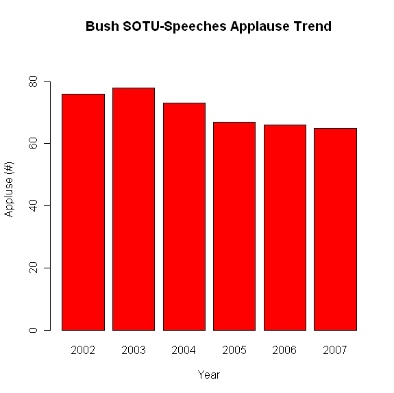
The inference that the creators of the chart want the observer to make is that the number of instances of applause from Bush’s State-of-the-Union (SOTU) speeches has, except for a spike in the immediate pre-Iraq invasion period of January 2003, been dropping, and significantly. Notice the range of the y-axis. Why did the chart creators decide to make 55 the minimum value? I have to give them the benefit of the doubt, however, as this seems to be a built-in feature of Excel (that’s why I encourage students to start using R for graphing capabilities). When I created the chart above myself in Excel, the program chose 55 as the minimum value of the y-axis. What would the chart look like if one were to make the y-axis minimum value zero? Here’s the result:

bush_sotu_zero_axis.jpeg

Now, the impression made upon the observer is that the drop in applause is not that great at all, and most likely within the range of what is called “random error”. Which chart is the correct one? Well, one way of determining the right answer to this would be to compare the SOTU applause trends of other presidents. Is every president guaranteed 40 or 50 bursts of applause no matter how lame the speech is or how unpopular the president is amongst those present? If so, then a minimum value on the y-axis of 40 or 50 would be more appropriate than zero, but I don’t know the answer off-hand.