Data Visualization #20—”Lying” with statistics

In teaching research methods courses in the past, a tool that I’ve used to help students understand the nuances of policy analysis is to ask them to assess a claim such as:

In the last 12 months, statistics show that the government of Upper Slovobia’s policy measures have contributed to limiting the infollcillation of ramakidine to 34%.

The point of this exercise is two-fold: 1) to teach them that the concepts we use in social science are almost always socially constructed, and we should first understand the concept—how it is defined, measured, and used—before moving on to the next step of policy analysis. When the concepts used—in this case, infollcillation and ramakidine—are ones nobody has every heard of (because I invented them), step 1 becomes obvious. How are we to assess whether a policy was responsible for something when we have zero idea what that something even means? Often, though, because the concept is a familar one—homelessness, polarization, violence—we often skip right past this step and focus on the next step (assessing the data).

2) The second point of the exercise is to help students understand that assessing the data (in this case, the 34% number) can not be done adequately without context. Is 34% an outcome that was expected? How does that number compare to previous years and the situation under previous governments, or the situation with similar governments in neighbouring countries? (The final step in the policy analysis would be to set up an adequate research design that would determine the extent to which the outcome was attributable to policies implemented by the South Slovobian government.)

If there is a “takeaway” message from the above, it is that whenever one hears a numerical claim being made, first ask yourself questions about the claim that fill in the context, and only then proceed to evaluate the claim.

Let’s have a look at how this works, using a real-life example. During a recent episode of Real Time, host Bill Maher used his New Rules segment to admonish the public (especially its more left-wing members) for overestimating the danger to US society of the COVID-19 virus. He punctuated his point by using the following statistical claim:

Maher not only claims that the statistical fact that 78% of COVID-19-caused fatalities in the USA have been from those who were assessed to have been “overweight” means that the virus is not nearly as dangerous to the general USA public as has been portrayed, but he also believes that political correctness run amok is the reason that raising this issue (which Americans are dying, and why) in public is verboten. We’ll leave aside the latter claim and focus on the statistic—78% of those who died from COVID-19 were overweight.

Does the fact that more than 3-in-4 COVID-19 deaths in the USA were individuals assessed to have been overweight mean that the danger to the general public from the virus has been overhyped? Maher wants you to believe that the answer to this question is an emphatic ‘yes!’ But is it?

Whenever you are presented with such a claim follow the steps above. In this case, that means 1) understand what is meant by “overweight” and 2) compare the statistical claim to some sort of baseline.

The first is relatively easy—the US CDC has a standard definition for “overweight”, which can be found here: https://www.cdc.gov/obesity/adult/defining.html. Assuming that the definition is applied consistently across the whole of the USA, we can move on to step 2. The first question you should ask yourself is “is 78% low, or high, or in-between?” Maher wants us to believe that the number is “high”, but is it really? Let’s look for some baseline data with which to compare the 78% statistic. The obvious comparison is the incidence of “overweight” in the general US population. Only when we find this data point will we be able to assess whether 78% is a high (or low) number. What do we find? Let’s go back to the US CDC website and we find this: “Percent of adults aged 20 and over with overweight, including obesity: 73.6% (2017-2018).”

So, what can we conclude? The proportion of USA adults dying from COVID-19 who are “overweight” (78%) is almost the same proportion of the USA adult population that is “overweight (73.6%).” Put another way, the likelihood of randomly selecting a USA adult who is overweight versus randomly selecting one who is not overweight is 73.6/26.4≈3.29. If one were to randomly select an adult who died from COVID-19, one would be 78/22≈3.55 times more likely to select an overweight person than a non-overweight person. Ultimately, in the USA at least, as of the end of April overweight adults are dying from COVID-19 at a rate that is about equal to their proportion in the general adult US population.

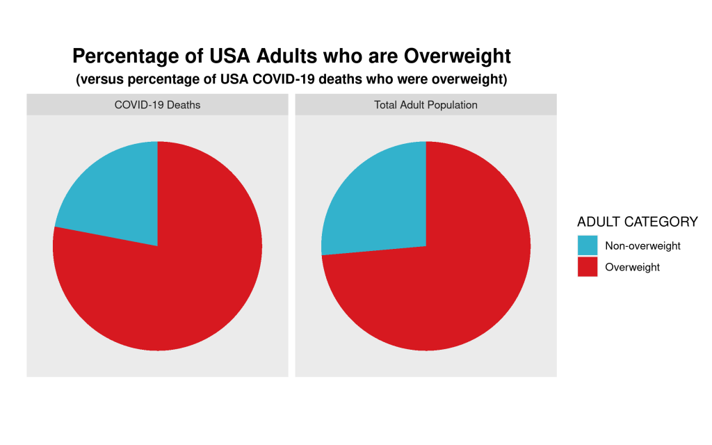
We can show this graphically via a pie chart. For many reasons, the use of pie charts is generally frowned upon. But, in this case, where there are only two categories—overweight, and non-overweight—pie charts are a useful visualization tool, which allows for easy visual comparison. Here are the pie charts, and the R code that produced them below:
Created by: Josip Dasović

We can clearly see that the proportion of COVID-19 deaths from each cohort—overweight, non-overweight—is almost the same as the proportion of each cohort in the general USA adult population. So, a bit of critical analysis of Maher’s claim shows that he is not making the strong case that he believes he is.

# Here is the required data frame
covid.df <- data.frame("ADULT"=rep(c("Overweight", "Non-overweight"),2), 
                       "Percentage"=c(0.736,0.264,0.78,0.22),
                       "Type"=rep(c("Total Adult Population","COVID-19 Deaths"),each=2))

library(ggplot2)

# Now the code for side-by-side pie charts:

ggpie.covid <- ggplot(covid.df, aes(x="", y=Percentage, group=ADULT, fill=ADULT, )) +
  geom_bar(width = 1, stat = "identity") +
  scale_fill_manual(values=c("#33B2CC","#D71920"),name ="ADULT CATEGORY") + 
  labs(x="", y="", title="Percentage of USA Adults who are Overweight",
       subtitle="(versus percentage of USA COVID-19 deaths who were overweight)") + 
  coord_polar("y", start=0) + facet_wrap(~ Type) +
  theme(axis.text = element_blank(),
        axis.ticks = element_blank(),
        panel.grid  = element_blank(),
        plot.title = element_text(hjust = 0.5, size=16, face="bold"),
        plot.subtitle = element_text(hjust=0.5, face="bold"))

ggsave(filename="covid19overweight.png", plot=ggpie.covid, height=5, width=8)


A Virtual Trip to Myanmar for my Research Methods Class

For IS240 next week, (Intro to Research Methods in International Studies) we will be discussing qualitative research methods. We’ll address components of qualitative research and review issues related to reliability and validity and use these as the basis for an in-class activity.

The activity will require students to have viewed the following short video clips, all of which introduce the viewer to contemporary Myanmar. Some of you may know already that Myanmar (Burma) has been transitioning from rule by military dictatorship to democracy. Here are three aspects of Myanmar society and politics. Please watch as we won’t have time in class to watch all three clips. The clips themselves are not long (just over 3,5,and 8 minutes long, respectively).

The first clip shows the impact of heroin on the Kachin people of northern Myanmar:

The next clip is a short interview with a Buddhist monk on social relations in contemporary Myanmar:

The final video clip is of the potential impact (good and bad) of increased international tourism to Myanmar’s most sacred sites, one of which is Bagan.

Proportional Representation versus First-Past-the-Post

As we learned in POLI 1100 today, Canada is one of small number of countries that continues to have a first-past-the-post system for national elections. What this means is that we divide the country up into 308 single-member districts (divided principally on the basis of the “representation by population” principle), from each of which exactly one individual is elected to represent that district in the House of Commons in Ottawa. In our case, a winner only has to have a plurality of the vote in that district to be elected the winner. What this does is it tends to give larger parties overrepresentation in parliament based on their actual electoral strength. It also gives regionally-concentrated parties (like the Bloc Quebecois) overrepresentation in parliament vis-a-vis parties whose electoral support is more diffuse geographically.

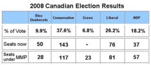
As we can see from the 2008 federal election results, the Green Party received almost 7% of the total national vote, yet because the vote was dispersed across the whole of the country, did not receive a single mandate in the House of Commons. The Bloc Quebecois, meanwhile, gained 50 seats in parliament with a slightly larger percentage of the vote than the Greens! Why? Because the BQ’s votes were geographically concentrated within a minority of ridings in the province of Quebec.

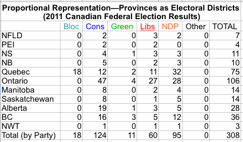
Turning now to the 2011 federal election, in which Stephen Harper’s Conservative Party won a majority in the House of Commons with 166 seats (and 39.6% of the vote). See the results below.

What if, on the other hand, Canada had a proportional representation system in which each province was its own electoral district and seats for the House of Commons were apportioned on the basis of the relative proportion of votes won by each party in each province? What would the results look like? With the help of my students, we were able to calculate the hypothesized makeup of the House of Commons were Canada to have such an electoral system.

Notice that the total number of MPs for the Conservative Party has dropped considerably such that the party no longer has a majority in the House of Commons. In fact, no single party has a majority! In order to form a relatively stable government, the Conservatives would have to find willing coalition partners. Unfortunately for them, however, other than the BQ, there is no immediately suitable coalition partner, given the respective ideological stances of the parties in parliament. Even with the BQ, the Conservatives could not get a governing majority, coming up 15 seats short. An NDP/Liberal?Green coalition, on the other hand, would work both ideologically and in terms of numbers (166 seats, exactly the same number as the Conservatives have today).

Note also how much a proportional representation system would help the Green Party–from only 1 seat in the House to 11 seats!

Which system would you prefer? Do you think that we should maintain the status quo? Should we change to PR? What are some of the advantages and disadvantages of each?

How to read tables of statistical regression results

Next week–January 21st–we’ll be looking at the debate between cultural and rationalist approaches to the analysis of political phenomena. As Whitefield and Evans note in the abstract of their 1999 article in the British Journal of Political Science:

There has been considerable disagreement among political scientists over the relative merits of political culture versus rational choice explanations of democratic and liberal norms and commitments. However, empirical tests of their relative explanatory power using quantitative evidence have been in short supply.

Their analysis of the political attitudes of Czech and Slovak residents is relatively rare in that the research is explicitly designed to assess the relative explanatory purchase of cultural and rationalist approaches to the study of political phenomena. Whitefield and Evans compile evidence (observational data) by means of a survey questionnaire given to random samples of Czech and Slovak residents. In order to assess the strengths of rationalist versus cultural accounts, Whitefield and Evans use statistical regression analysis. Some of you may be unfamiliar with statistical regression analysis, This blog post will explain what you need to know to understand the regression analysis results summarised in Tables 7 through 9 in the text.

Let’s take a look at Table 7. Here the authors are trying to “explain” the level of “democratic commitment”–that is, the level of commitment to democratic principles–of Czech and Slovak residents. Thus, democratic commitment is the dependent variable. The independent, or explanatory, variables can be found in the left-most column. These are factors that the authors hypothesize to have causal influence on the level of democratic commitment of the survey respondents. Some of these are nationality–Slovaks, Hungarians, political experience and evaluations–past and future–of the country’s and family’s well-being.

Each of the three remaining columns–Models 1 through 3–represents the results of a single statistical regression analysis (or model). Let’s take a closer look at the first model–ethnic and country dummy variables. In this model, the only independent variables analysed are one’s country and/or ethnic origin. The contrast category is Czechs, which means that the results are interpreted relative to how those of Czech residence/ethnicity answered. We see that the sign for the result of each of the two explanatory variables–Slovaks and Hungarians–is negative. What this means is that relative to Czechs, Slovaks and Hungarians demonstrated less democratic commitment. The two ** to the right of the numerical results (-0.18 and -0.07, respectively) indicate that this result is unlikely to be due to chance and is considered to be statistically significant. This would suggest that deep-seated cultural traditions–ethnicity/country or residence–have a strong causal (or correlational, at least) effect on the commitment of newly democratic citizens to democracy. Does this interpretation of the data still stand when we add other potential causal variables, as in Models 2 and 3? What do you think?

Signing up for a WordPress account

As I mentioned in lecture today, I’ve decided to allow those of you who are a little bit reticent about speaking in tutorial/lecture to supplement your participation grade via commenting on entries to this blog. In order to do so, you’ll have to sign up for a wordpress user account. To do so, go to and fill out the form. Make sure that you’re only signing up for an account rather than for a blog as well (unless, of course, you’d like to create your own blog). You can create a user name that is pseudonymous if you’re wary about publicly revealing your name. If you choose a pseudonym, make sure you e-mail me to let me know what it is.

In order to sign-up for a user name only, make sure that you click on the “sign up for just a user name” link after going to the link above. See the arrow in the diagram below. Happy commenting!!

Tips for Students on Writing Good Papers

Henry Farrell, who teaches political science at George Washington University, has posted an essay with tips for students writing political science papers. There are some important insights, such as “cut to the chase”, “organize, organize, organize”, and “avoid data dumps.” In my opinion, his most important tip (and this would also apply to examinations) is “read the requirements for the assignment.” If you’re unsure about the requirements, or there is something you don’t understand, seek clarification from your professor/instructor. The whole essay can be found here:


Forget What You Know About Good Study Habits

That is the title of a recent article in the New York Times, which, as the title suggests, takes aim at some of our most entrenched myths regarding the nature of study habits. Before reading ask yourself these questions: Is it more conducive to effective learning to i) try to study in the same place all the time, or ii) to study in different spaces/places? Should you use a single study session to i) focus on a single topic/task, or ii) study many topics/tasks?

Yet there are effective approaches to learning, at least for those who are motivated. In recent years, cognitive scientists have shown that a few simple techniques can reliably improve what matters most: how much a student learns from studying.

The findings can help anyone, from a fourth grader doing long division to a retiree taking on a new language. But they directly contradict much of the common wisdom about good study habits, and they have not caught on.

For instance, instead of sticking to one study location, simply alternating the room where a person studies improves retention. So does studying distinct but related skills or concepts in one sitting, rather than focusing intensely on a single thing…

…But individual learning is another matter, and psychologists have discovered that some of the most hallowed advice on study habits is flat wrong. For instance, many study skills courses insist that students find a specific place, a study room or a quiet corner of the library, to take their work. The research finds just the opposite. In one classic 1978 experiment, psychologists found that college students who studied a list of 40 vocabulary words in two different rooms — one windowless and cluttered, the other modern, with a view on a courtyard — did far better on a test than students who studied the words twice, in the same room. Later studies have confirmed the finding, for a variety of topics.

The brain makes subtle associations between what it is studying and the background sensations it has at the time, the authors say, regardless of whether those perceptions are conscious. It colors the terms of the Versailles Treaty with the wasted fluorescent glow of the dorm study room, say; or the elements of the Marshall Plan with the jade-curtain shade of the willow tree in the backyard. Forcing the brain to make multiple associations with the same material may, in effect, give that information more neural scaffolding.

Have a look at the whole piece, which is not only informative but may make you a better student. Good luck this semester!

Excellent blog on Chinese Politics/Political Economy

Victor Shih, currently an assistant professor of political science at Northwestern University, keeps a blog at which he addresses issues related to Chinese politics. The blog deals mainly with topics related to Chinese political economy (an increasingly important topic as the rate for your car/home/student loan is intimately connected to the amount of US Treasury bonds purchased by the Chinese Central Bank) and elite politics in China.

Are Homebuyers Rational Decision-Makers?

According to rational choice theorists, how do individuals make decisions?  Put simply, they act so as to maximize their expected utility, given their a priori preferences and some general idea of the nature of the world (by this, they mean that individuals have some idea of the probability of certain actions leading to specific outcomes).  While rational choice theory was first developed in academic disciplines such as economics, political scientists have adopted the technique and it’s use has proliferated in that discipline.  One of the criticisms of using rational choice theory to explain political phenomena is that often individuals have difficulty ordering preferences adequately.  This is because there is no single “currency” of utility in political science.  The same, however, can not be said for economics as it is much easier to order preferences when there are dollar values attached.  But what happens when time, leisure, etc., have to be taken into account.  Well, it turns out that individuals make many “mistakes” that diverge from that expected of instrumentally rational decision-makers.

Jonah Lehrer informs his readers of a fascinating series of studies done by Ap Dijksterhuis, a psychologist at Radboud University in the Netherlands.  One of these studies looks at decisions related to real estate purchases.  The studies:

look at how people shop for “complex products,” like cars, apartments, homes, etc. and how they often fall victim to what he calls a “weighting mistake”. Consider two housing options: a three bedroom apartment that is located in the middle of a city, with a ten minute commute time, or a five bedroom McMansion in the suburbs, with a forty-five minute commute. “People will think about this trade-off for a long time,” Dijksterhuis writes. “And most them will eventually choose the large house. After all, a third bathroom or extra bedroom is very important for when grandma and grandpa come over for Christmas, whereas driving two hours each day is really not that bad.” What’s interesting is that the more time people spend deliberating, the more important that extra space becomes. They’ll imagine all sorts of scenarios (a big birthday party, Thanksgiving dinner, another child) that will turn the suburban house into an absolute necessity. The lengthy commute, meanwhile, will seem less and less significant, at least when compared to the allure of an extra bathroom.

But, as Dijksterhuis points out, that reasoning process is exactly backwards: “The additional bathroom is a completely superfluous asset for at least 362 or 363 days each year, whereas a long commute does become a burden after a while.” For instance, a recent study found that, when a person travels more than one hour in each direction, they have to make forty per cent more money in order to be as “satisfied with life” as someone with a short commute. Another study, led by Daniel Kahneman and the economist Alan Krueger, surveyed nine hundred working women in Texas and found that commuting was, by far, the least pleasurable part of their day. And yet, despite these gloomy statistics, nearly 20 percent of American workers commute more than forty-five minutes each way. (More than 3.5 million Americans spend more than three hours each day traveling to and from work: they’re currently the fastest growing category of commuter. For more on commuter culture, check out this awesome New Yorker article.) According to Dijksterhuis, these people are making themselves miserable because they failed to properly “weigh” the relevant variables when they were choosing where to live. Because these deliberative homeowners tended to fixate on details like square footage or the number of bathrooms, they assumed that a bigger house in the suburbs would make them happy, even if it meant spending an extra hour in the car everyday. But they were wrong.:

Monty Python’s take on Constitutional Government

I am a huge fan of the British sketch comedy group Monty Python.  For a political science professor, this clip is like politico-comedic gold.  Here is Dennis the peasant’s views on democratic legitimacy, the proper role of popular mandates in the wielding of supreme executive power, and a sarcastic critique of socialist critiques of liberal capitalism (“oh, there you go bringing class into it again!”).  And remember, “you don’t vote for kings.”