
I have just graded and returned the second lab assignment for my introductory research methods class in International Studies (IS240). The lab required the students to answer questions using the help of the R statistical program (which, you may not know, is every pirate’s favourite statistical program).
The final homework problem asked students to find a question in the World Values Survey (WVS) that tapped into homophobic sentiment and determine which of four countries under study–Canada, Egypt, Italy, Thailand–could be considered to be the most homophobic, based only on that single question.
More than a handful of you used the code below to try and determine how the respondents in each country answered question v38. First, here is a screenshot from the WVS codebook:
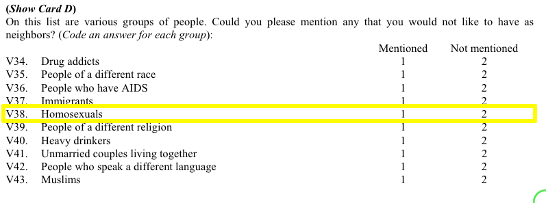 Students (rightfully, I think) argued that those who mentioned “Homosexuals” amongst the groups of people they would not want as neighbours can be considered to be more homophobic than those who didn’t mention homosexuals in their responses. (Of course, this may not be the case if there are different levels of social desirability bias across countries.) Moreover, students hypothesized that the higher the proportion of mentions of homosexuals, the more homophobic is that country.
But, when it came time to find these proportions some students made a mistake. Let’s assume that the student wanted to know the proportion of Canadian respondents who mentioned (and didn’t mention) homosexuals as persons they wouldn’t want to have as neighbours.
Here is the code they used (four.df is the data frame name, v38 is the variable in question, and country is the country variable):
prop.table(table(four.df$v38=="mentioned" | four.df$country=="canada"))

FALSE     TRUE
0.372808 0.627192
Thus, these students concluded that almost 63% of Canadian respondents mentioned homosexuals as persons they did not want to have as neighbours. That’s downright un-neighbourly of us allegedly tolerant Canadians, don’tcha think?. Indeed, when compared with the other two countries (Egyptians weren’t asked this question), Canadians come off as more homophobic than either the Italians or the Thais.
prop.table(table(four.df$v38=="mentioned" | four.df$country=="italy"))

FALSE      TRUE
0.6106025 0.3893975

prop.table(table(four.df$v38=="mentioned" | four.df$country=="thailand"))

FALSE      TRUE
0.5556995 0.4443005
So, is it true that Canadians are really more homophobic than either Italians or Thais? This may be a simple homework assignment but these kinds of mistakes do happen in the real academic world, and fame (and sometimes even fortune–yes, even in academia a precious few can make a relative fortune) is often the result as these seemingly unconventional findings often cause others to notice. There is an inherent publishing bias towards results that seem to run contrary to conventional wisdom (or bias). The finding that Canadians (widely seen as amongst the most tolerant of God’s children) are really quite homophobic (I mean, close to 2/3 of us allegedly don’t want homosexuals, or any LGBT persons, as neighbours) is radical and a researcher touting these findings would be able to locate a willing publisher in no time!
But, what is really going on here? Well, the problem is a single incorrect symbol that changes the findings dramatically. Let’s go back to the code:
prop.table(table(four.df$v38=="mentioned" | four.df$country=="canada"))
The culprit is the | (“or”) character. What these students are asking R to do is to search their data and find the proportion of all responses for which the respondent either mentioned that they wouldn’t want homosexuals as neighbours OR the respondent is from Canada. Oh, oh! They should have used the & symbol instead of the | symbol to get the proportion of Canadian who mentioned homosexuals in v38.
To understand visually what’s happening let’s take a look at the following venn diagram (see the attached video above for Ali G’s clever use of what he calls “zenn” diagrams to find the perfect target market for his “ice cream glove” idea; the code for how to create this diagram in R is at the end of this post). What we want is the intersection of the blue and red areas (the purple area). What the students’ coding has given us is the sum of (all of!) the blue and (all of!) the red areas.
To get the raw number of Canadians who answered “mentioned” to v38 we need the following code:
table(four.df$v38=="mentioned" & four.df$v2=="canada")

FALSE  TRUE
7457   304
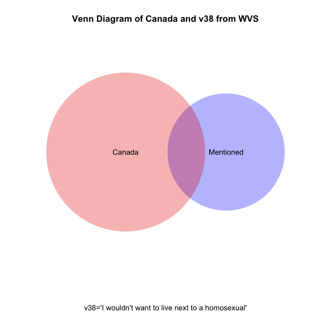
But what if you then created a proportional table out of this? You still wouldn’t get the correct answer, which should be the proportion that the purple area on the venn diagram comprises of the total red area.
prop.table(table(four.df$v38=="mentioned" & four.df$v2=="canada"))

FALSE       TRUE
0.96082979 0.03917021
Just eyeballing the venn diagram we can be sure that the proportion of homophobic Canadians is larger than 3.9%. What we need is the proportion of Canadian respondents only(!) who mentioned homosexuals in v38. The code for that is:
prop.table(table(four.df$v38[four.df$v2=="canada"]))

mentioned not mentioned
0.1404806     0.8595194
So, only about 14% of Canadians can be considered to have given a homophobic response, not the 62% our students had calculated. What are the comparative results for Italy and Thailand, respectively?
prop.table(table(four.df$v38[four.df$v2=="italy"]))

mentioned not mentioned
0.235546      0.764454

prop.table(table(four.df$v38[four.df$v2=="thailand"]))

mentioned not mentioned
0.3372781     0.6627219
The moral of the story: if you mistakenly find something in your data that runs against conventional wisdom and it gets published, but someone comes along after publication and demonstrates that you’ve made a mistake, just blame it on a poorly-paid research assistant’s coding mistake.
Here’s a way to do the above using what is called a for loop:
four<-c("canada","egypt","italy","thailand")
for (i in 1:length(four)) {
+ print(prop.table(table(four.df$v38[four.df$v2==four[i]])))
+ print(four[i])
+ }

mentioned not mentioned
0.1404806     0.8595194
[1] "canada"

mentioned not mentioned

[1] "egypt"

mentioned not mentioned
0.235546      0.764454
[1] "italy"

mentioned not mentioned
0.3372781     0.6627219
[1] "thailand"
Here’s the R code to draw the venn diagram above:
install.packages("venneuler")

library(venneuler}

v1<-venneuler(c("Mentioned"=sum(four.df$v38=="mentioned",na.rm=T),"Canada"=sum(four.df$v2=="canada",na.rm=T),"Mentioned&Canada"=sum(four.df$v2=="canada" & four.df$v38=="mentioned",na.rm=T)))

plot(v1,main="Venn Diagram of Canada and v38 from WVS", sub="v38='I wouldn't want to live next to a homosexual'", col=c("blue","red"))


You must be logged in to post a comment.