Data Visualization #17—Land Doesn’t Vote, Citizens Do

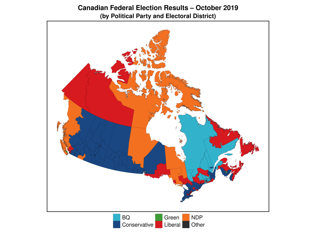
As I have noted in previous versions of this data visualization series, standard electoral-result area maps often obfuscate and mislead/misrepresent rather than clarify and illuminate. This is especially the case in electoral systems that are based on single-member electoral districts in which there is a single winner in every district (as known as ‘first-past-the-post’). Below you can see an example of a typical map used by the media (and others) to represent an electoral outcome. The map below is a representation of the results of the 2019 Canadian Federal Election, after which the incumbent Liberal Party (with Justin Trudeau as Prime Minister) was able to salvage a minority government (they had won a resounding majority government in the 2015 election).

There are two key guiding constitutional principles of representation regarding Canada’s lower house of parliament—the House of Commons: i) territorial representation, and ii) the principle of one citizen-one vote. As of the 2019 election these principles, combined with other elements of Canadian constitutionalism (like federalism) and the course of political history, have created the current situation in which the 338 federal electoral districts vary not only in land area, but also in population size, and often quite dramatically (for a concise treatment on this topic, click here).

Because a) “land doesn’t vote,” and b) we only know the winner of each electoral district (based on the colour) and not how much of the vote this candidate received) the map below misrepresents the relative political support of parties across the country. As of 2016, more than 2/3 of the Canadian population lived within 100 kilometres of the US border, a total land mass that represents only 4% of Canada’s total.

I’ve created a map that splits Canada in two—each colour represents 50% of the total Canadian population. You can see how geographically-concentrated Canada’s population really is.

The electoral ridings in red account for half of Canada’s population, while those in light grey account for the other half. Keep this in mind whenever you see traditional electoral maps of Canada’s elections.

## This is code for the first map above. This assumes you 
## have crated an sf object named can_sf, which has these 
## properties:

```
Simple feature collection with 6 features and 64 fields
Geometry type: MULTIPOLYGON
Dimension:     XY
Bounding box:  xmin: 7609465 ymin: 1890707 xmax: 9015737 ymax: 2986430
Projected CRS: PCS_Lambert_Conformal_Conic
```

library(ggplot2)
library(sf)
library(tidyverse)

gg.can <- ggplot(data = can_sf) +
  geom_sf(aes(fill = partywinner_2019), col="black", lwd=0.025) + 
  scale_fill_manual(values=c("#33B2CC","#1A4782","#3D9B35","#D71920","#F37021","#2B2D2F"),name ="Party (2019)") +
  labs(title = "Canadian Federal Election Results \u2013 October 2019",
       subtitle = "(by Political Party and Electoral District)") +
  theme_void() + 
  theme(legend.title=element_blank(),
        legend.text = element_text(size = 16),
        plot.title = element_text(hjust = 0.5, size=20, vjust=2, face="bold"),
        plot.subtitle = element_text(hjust=0.5, size=18, vjust=2, face="bold"),
        legend.position = "bottom",
        plot.margin = margin(0.5, 0.5, 0.5, 0.5, "cm"),
        legend.box.margin = margin(0,0,30,0),
        legend.key.size = unit(0.65, "cm"))

ggsave(filename="can_2019_all.png", plot=gg.can, height=10, width=13)

Here is the code for the 50/50 map above:

#### 50% population Map
gg.50 <- ggplot(data = can_sf) +
  geom_sf(aes(fill = Land.50.Pop.2016), col="black", lwd=0.035) + 
  scale_fill_manual(values=c("#d3d3d3", "red"),
        labels =c("Electoral Districts with combined 50% of Canada's Population",
                "Electoral Districts with combined other 50% of Canada's Population")) +
  labs(title = "Most of Canada's Land Mass in Uninhabited") +
  theme_void() + 
  theme(legend.title=element_blank(),
        legend.text = element_text(size = 11),
        plot.title = element_text(hjust = 0.5, size=16, vjust=2, face="bold"),
        legend.position = "bottom", #legend.spacing.x = unit(0, 'cm'),
        legend.direction = "vertical",
        plot.margin = margin(0.5, 0.5, 0.5, 0.5, "cm"),
        legend.box.margin = margin(0,0,0,0),
        legend.key.size = unit(0.5, "cm"))
#       panel.border = element_rect(colour = "black", fill=NA, size=1.5))

ggsave(filename="can_2019_50_pct_population.png", plot=gg.50, height=10, width=13)

Data Visualization #3–Cartograms as an alternative to standard area-based electoral maps

In my first post of this series I explained at length why basic geographically-based electoral maps are not very good at conveying the phenomena of interest (see that post for more detail), and alluded to the increased use of political geographers, and political scientists, of alternative methods of “mapping” the required information that were more clear about the message(s) contained in the data.

Let’s examine this further using the map above. This map shows the results of the Canadian federal (national) election of October 2019.The respective proportions of total area “won” by each political party as depicted in the map above are not easily translated into either the relative vote share of the parties, or the relative number of seats won. Someone ignorant about Canadian federal politics would see a relatively similar total amount of red, blue, and orange, and assume that these parties had relatively equal support across the country. The sizes (land mass), and populations of, federal electoral districts in Canada vary drastically and, as a result, these maps are not a good gauge of voter support for political parties.

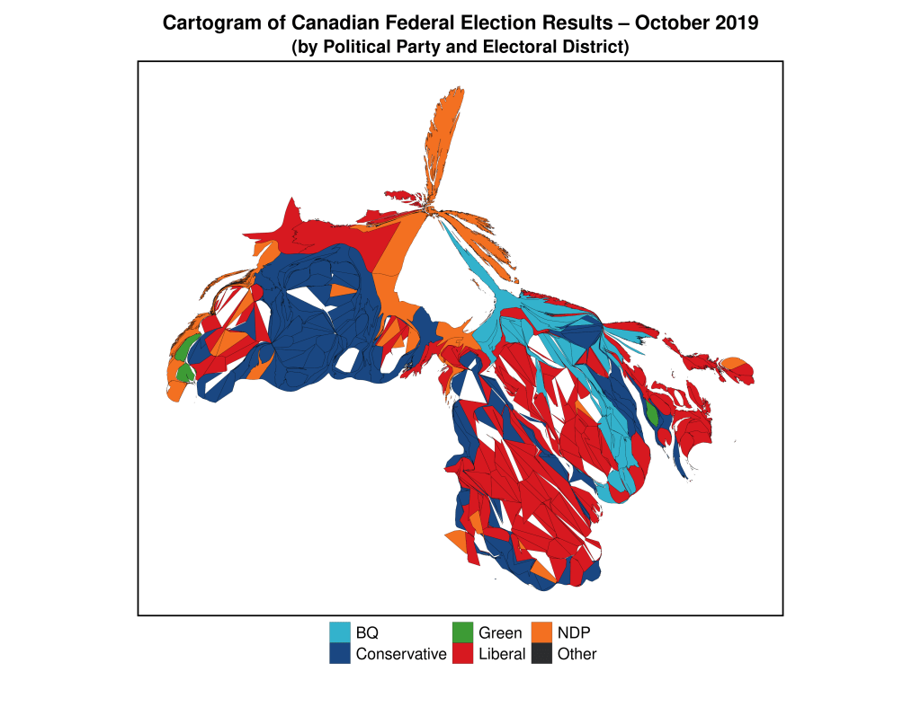
Since this problem is widespread political scientists, and political geographers, have attempted to find solutions to this problem. One increasingly-common approach has been to use what are called cartograms. Cartograms are maps in which the elements (in this case, electoral districts) are usually transformed in such as way as to maintain their connections to neighbours (contiguous cartograms), but to either increase or decrease the area of the specific electoral district in order to match it to a common variable. A variable often used in the transformation of electoral maps is population size. Thus, in a completed cartogram, the size of the electoral districts is not the actual land mass of the electoral district, but is proportional to the population of the electoral district (sometimes the number of voters, or the size of the electorate is used instead of population). It’s no surprise, then, that cartograms are also called “value-by-area” maps.

Cartograms are used by geographers and social scientists to depict a wide variety of phenomena. Here are some examples. The first one is a global cartogram for which the size of the area in each country is equivalent to total public health spending by that country. We can easily see that most of the world’s spending on public health occurs in the rich countries of the global north.

Here’s one more, depicting the global share of organic agriculture, by country.

Below, I have created a cartogram that has transformed the standard electoral map of the 2019 Canadian federal election into one in which the size of the electoral districts is mostly proportional to their populations. By “mostly” I mean that they’re not perfectly proportional, since the difference in sizes between the largest and smallest districts is so large the algorithm eventually stabilizes without creating completely equal-sized electoral districts.

This map more accurately conveys the nature of political partisan support (at least as it relates to the winning of electoral districts) across the country during the 2019 election, and provides visual evidence for the reality of an election in which the Liberal Party (red) won a plurality of the seats in the federal parliament (House of Commons). Because urban districts are much smaller than rural districts, the strength of Liberal Party support in Canada’s two largest cities–Toronto and Montreal–is obfuscated by the traditional area-based electoral map, but becomes evident in this cartogram.

The next map in this series will analyze another approach to geographically-based electoral maps–the hexagon map.

Here’s the R code for the cartogram above. Here, the original R-spatial data object–can_sf–is the base for the calculation of the cartogram data.

## Here is the code to generate the cartogram object:

library(cartogram)
can_carto_sf = cartogram_cont(can_sf, "Population_2016", itermax=50)

## Now, the map, using ggplot2
library(ggplot2)

gg.can.can.carto <- ggplot(data = can_carto_sf) +
  geom_sf(aes(fill = partywinner_2019), col="black", lwd=0.075) + 
  scale_fill_manual(values=c("#33B2CC","#1A4782","#3D9B35","#D71920","#F37021","#2B2D2F"),name ="Party (2019)") +
  labs(title = "Cartogram of Canadian Federal Election Results \u2013 October 2019",
       subtitle = "(by Political Party and Electoral District)") +
  theme_void() + 
  theme(legend.title=element_blank(),
        legend.text = element_text(size = 16),
        plot.title = element_text(hjust = 0.5, size=20, vjust=2, face="bold"),
        plot.subtitle = element_text(hjust=0.5, size=18, vjust=2, face="bold"),
        legend.position = "bottom",
        plot.margin = margin(0.5, 0.5, 0.5, 0.5, "cm"),
        legend.box.margin = margin(0,0,30,0),
        legend.key.size = unit(0.75, "cm"),
        panel.border = element_rect(colour = "black", fill=NA, size=1.5))

Independence Referendum in Southern Sudan

The most important international political event occurring this week is arguably the independence referendum in southern Sudan. Despite clashes a couple of days ago along the border separating the north and south, which left dozens dead, the New York Times reports that voting is peaceful. As The Globe and Mail’s Geoffrey York notes, while the referendum may ultimately lead to a new state being created in the south, the cost “has been horrific.”

Southern Sudan has been consumed by devastating wars for most of the past half-century. An estimated 2.5 million people have perished in those wars, with atrocities on all sides that were shocking in their cruelty.

After decades of indifference by most of the world, the irony is that Southern Sudan suddenly became a fashionable cause over the past decade. Its oil exports became lucrative, forcing the north and south to try to settle their conflict in order to protect their revenue flows. Simultaneously, there was a rapid escalation of U.S. diplomatic pressure on both sides, including the threat of sanctions – partly because evangelical Christian lobbyists had persuaded Congress that it needed to protect the south’s Christians from Muslim persecution.

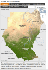
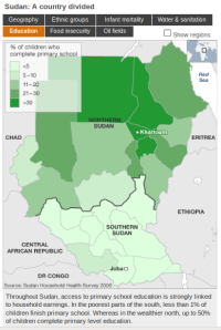
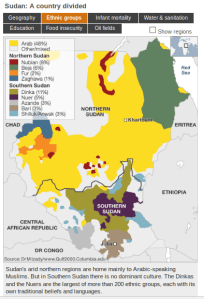
Here’s a fascinating set of maps creating by the BBC to show that the north and south of Sudan differ in more than simply ethnicity and oil wealth.

Here’s a report from Al Jazeera about some of the important issues related to the referendum:

How Big is Africa?

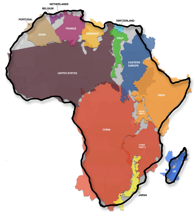
In the second half of the Comparative World Government course we’ll be analysing issues and concepts that will allow us to learn more about the many countries located on the diverse continent of Africa. In addition to being very diverse, Africa is a very large continent. Many of us have little idea about just how big the continent is. Here’s a revealing graphic by Kai Krause, that will hopefully cure us of a little bit of our immapancy–insufficient geographical knowledge. Click on the link above to view a larger picture, with more information.

Foreign Direct Investment(FDI)–an Indicator of Globalization

As we will see, globalization is a word (and phenomenon) that is analogous to a Rorschach test in that everyone seems to have his, or her, own slightly unique definition of what it actually means. There is wide agreement, however, that an important characteristic of contemporary globalization is the level of economic integration internationally. One such component of that integration is foreign direct investment (FDI). From the World Resources Institute, here is a map that shows the differing levels of FDI around the globe. The patterns should, by now, be exceedingly familiar.

world_fdi_map_450.jpg

Here is the map description:

Foreign direct investment data do not give a complete picture of international investment in an economy. Balance of payments data on foreign direct investment do not include capital raised locally, which has become an important source of financing for investment projects in some developing countries. In addition, foreign direct investment data capture only cross-border investment flows involving equity participation and thus omit nonequity cross-border transactions such as intrafirm flows of goods and services. For a detailed discussion of the data issues see the World Bank’s World Debt Tables 1993-1994 (volume 1, chapter 3). Also, cross-country comparisons may not be accurate, because of differences in the definition of what constitutes foreign direct investment.

Source: World Bank Group. 2004, World Development Indicators Online. Washington, DC:World Bank.
Available On-line at: Source Link