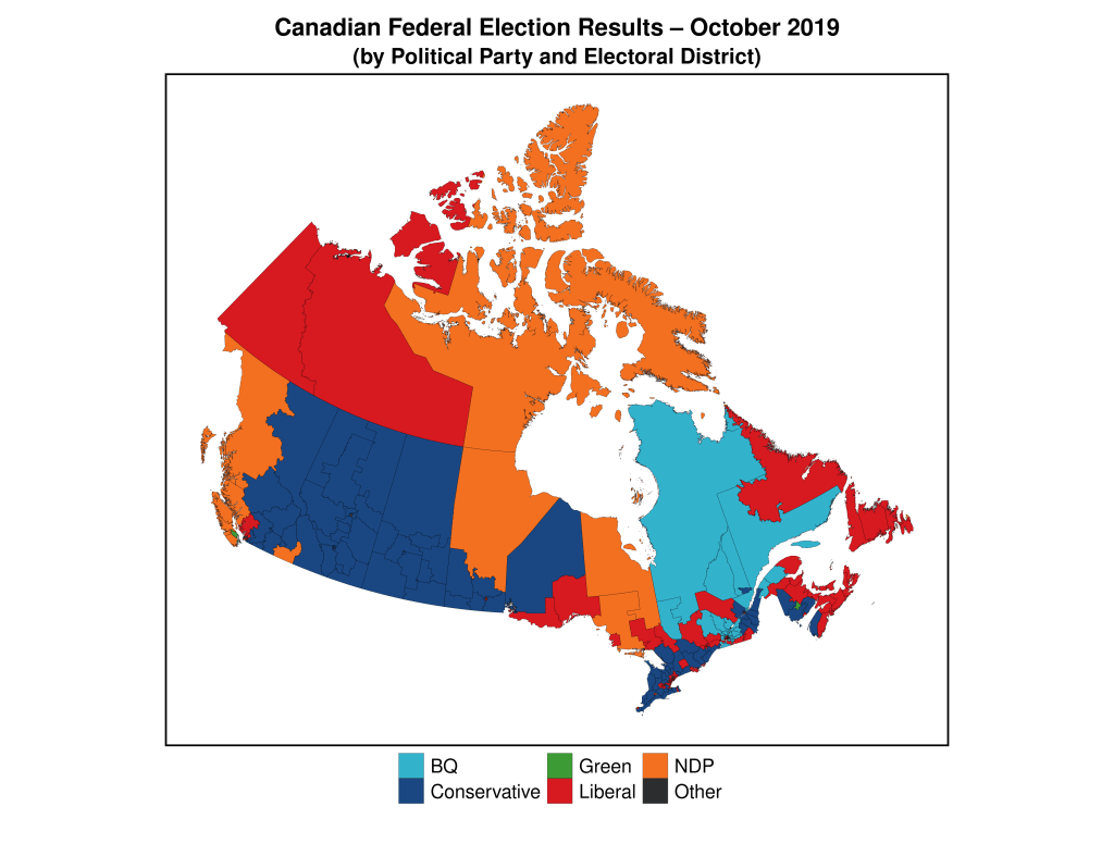
In my first post of this series I explained at length why basic geographically-based electoral maps are not very good at conveying the phenomena of interest (see that post for more detail), and alluded to the increased use of political geographers, and political scientists, of alternative methods of “mapping” the required information that were more clear about the message(s) contained in the data.

Let’s examine this further using the map above. This map shows the results of the Canadian federal (national) election of October 2019.The respective proportions of total area “won” by each political party as depicted in the map above are not easily translated into either the relative vote share of the parties, or the relative number of seats won. Someone ignorant about Canadian federal politics would see a relatively similar total amount of red, blue, and orange, and assume that these parties had relatively equal support across the country. The sizes (land mass), and populations of, federal electoral districts in Canada vary drastically and, as a result, these maps are not a good gauge of voter support for political parties.
Since this problem is widespread political scientists, and political geographers, have attempted to find solutions to this problem. One increasingly-common approach has been to use what are called cartograms. Cartograms are maps in which the elements (in this case, electoral districts) are usually transformed in such as way as to maintain their connections to neighbours (contiguous cartograms), but to either increase or decrease the area of the specific electoral district in order to match it to a common variable. A variable often used in the transformation of electoral maps is population size. Thus, in a completed cartogram, the size of the electoral districts is not the actual land mass of the electoral district, but is proportional to the population of the electoral district (sometimes the number of voters, or the size of the electorate is used instead of population). It’s no surprise, then, that cartograms are also called “value-by-area” maps.
Cartograms are used by geographers and social scientists to depict a wide variety of phenomena. Here are some examples. The first one is a global cartogram for which the size of the area in each country is equivalent to total public health spending by that country. We can easily see that most of the world’s spending on public health occurs in the rich countries of the global north.
Here’s one more, depicting the global share of organic agriculture, by country.

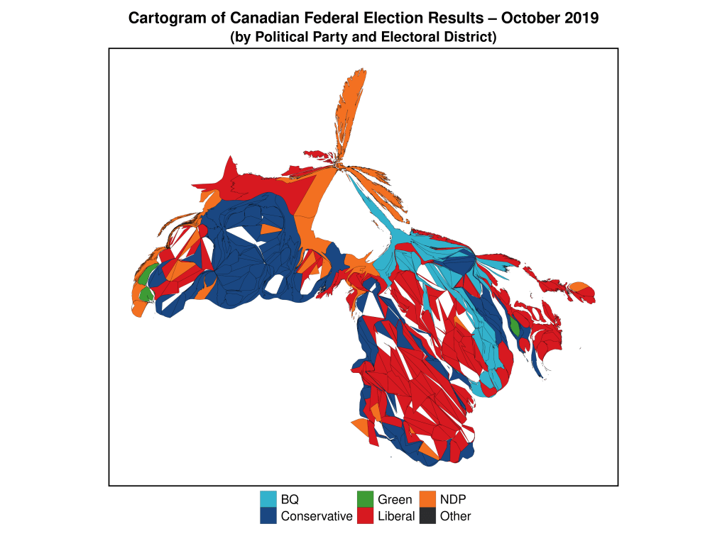
Below, I have created a cartogram that has transformed the standard electoral map of the 2019 Canadian federal election into one in which the size of the electoral districts is mostly proportional to their populations. By “mostly” I mean that they’re not perfectly proportional, since the difference in sizes between the largest and smallest districts is so large the algorithm eventually stabilizes without creating completely equal-sized electoral districts.

This map more accurately conveys the nature of political partisan support (at least as it relates to the winning of electoral districts) across the country during the 2019 election, and provides visual evidence for the reality of an election in which the Liberal Party (red) won a plurality of the seats in the federal parliament (House of Commons). Because urban districts are much smaller than rural districts, the strength of Liberal Party support in Canada’s two largest cities–Toronto and Montreal–is obfuscated by the traditional area-based electoral map, but becomes evident in this cartogram.
The next map in this series will analyze another approach to geographically-based electoral maps–the hexagon map.
Here’s the R code for the cartogram above. Here, the original R-spatial data object–can_sf–is the base for the calculation of the cartogram data.
## Here is the code to generate the cartogram object:

library(cartogram)
can_carto_sf = cartogram_cont(can_sf, "Population_2016", itermax=50)

## Now, the map, using ggplot2
library(ggplot2)

gg.can.can.carto <- ggplot(data = can_carto_sf) +
  geom_sf(aes(fill = partywinner_2019), col="black", lwd=0.075) +
  scale_fill_manual(values=c("#33B2CC","#1A4782","#3D9B35","#D71920","#F37021","#2B2D2F"),name ="Party (2019)") +
  labs(title = "Cartogram of Canadian Federal Election Results \u2013 October 2019",
       subtitle = "(by Political Party and Electoral District)") +
  theme_void() +
  theme(legend.title=element_blank(),
        legend.text = element_text(size = 16),
        plot.title = element_text(hjust = 0.5, size=20, vjust=2, face="bold"),
        plot.subtitle = element_text(hjust=0.5, size=18, vjust=2, face="bold"),
        legend.position = "bottom",
        plot.margin = margin(0.5, 0.5, 0.5, 0.5, "cm"),
        legend.box.margin = margin(0,0,30,0),
        legend.key.size = unit(0.75, "cm"),
        panel.border = element_rect(colour = "black", fill=NA, size=1.5))

You must be logged in to post a comment.