

The first entry in my 30-day (it will actually be 30 posts over about 2 months) data visualization challenge argued that geographically-based electoral maps have many drawbacks as data visualization techniques. I demonstrated by using the results from the 2017 and 2020 British Columbia (BC) provincial elections as supporting evidence.
Although there were some significant political changes over the course of the two elections, these were poorly-represented by these maps. Only when we zoomed into the population centres of southwestern BC were we able to partially convey the changes that had occurred. We could have made our effort to convey the underlying movement in political party support between 2017 and 2020 a bit more obvious by using animated maps, rather than the static ones that were used.
When it comes to representing change over time, animated graphs can be very useful (as long as they aren’t too complicated and busy) and are advantageous to static maps.
Below we can find the maps in the original animated to more clearly show the changes over time. Here’s the map of the whole province:
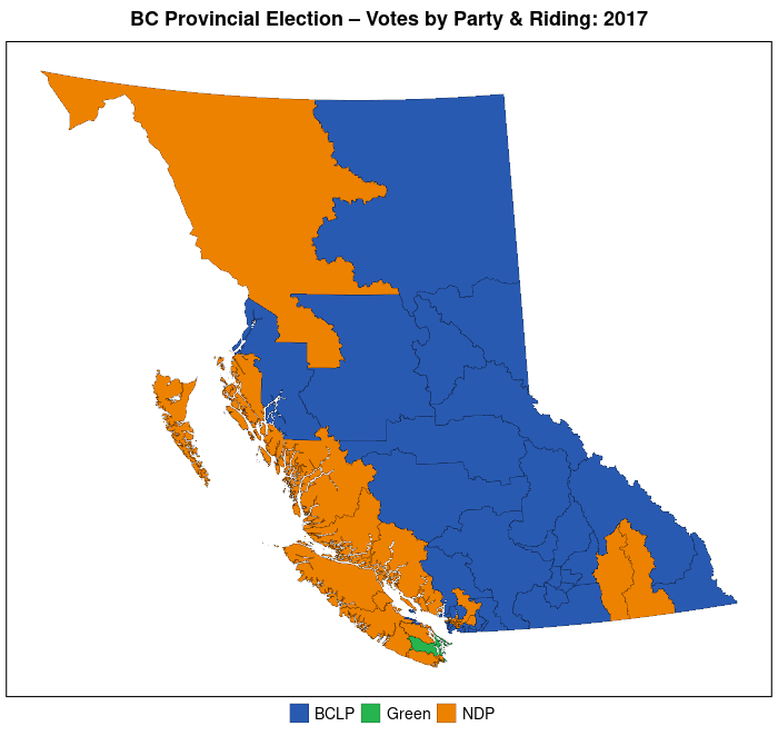
The change between 2017 and 2020 is made clear by a jarring change in the map, where a bit more NDP-orange shows up, replacing the BCLP-blue (see the previous post for descriptions of the two parties). Otherwise, there doesn’t seem to be much change in the province overall.
We know, however, that the drastic changes that took place did so in the very tiniest southwestern corner of the BC mainland. Let’s zoom in there to have a look.
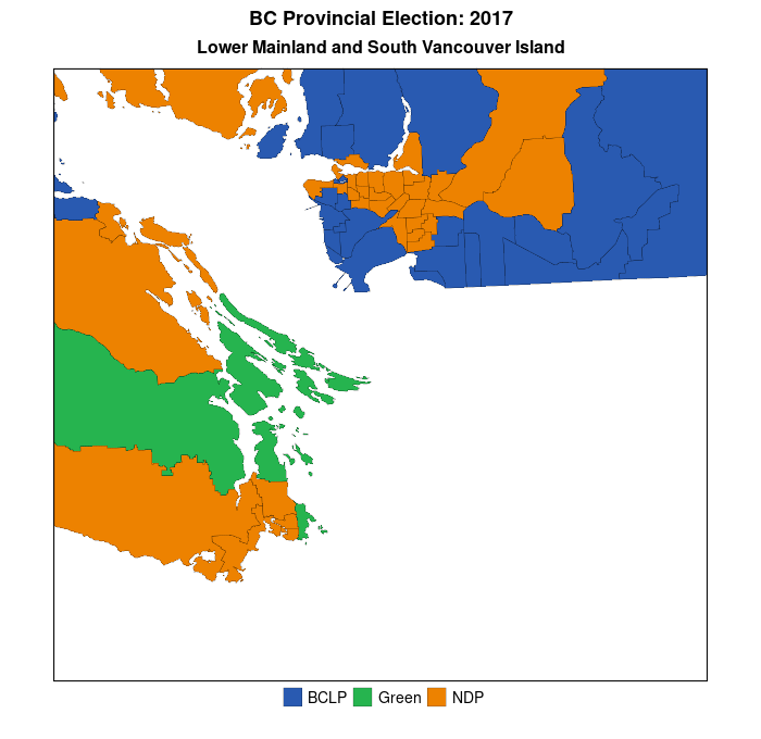
We can now more clearly see the change in results (in terms of electoral districts won) between 2017 and 2020 in this populous region. Not only did the NDP (orange) win many seats in the eastern Vancouver suburbs that had not only been won by the BCLP in 2017 but had been a bastion of support for the right-wing vote over many decades, but the NDP candidate in the Victoria-area district of Oak Bay-Gordon Head won a seat that had previously been held by the former leader of BC Green Party, Andrew Weaver (it’s the small piece of green, that changes to orange, in the eastern part of the lower orange horizontal band on the lower-left of the map) . Are these changes the harbinger of a sea-change in BC provincial politics, or are they just an anomalous blip?
Going back to my original point about these types of maps being poor representations of the underlying change in voters’ preferences, we don’t know much about the level of support for the respective parties in any of these electoral districts. All that we do know, based on the “first-past-the-post” electoral system used by BC at the provincial level, is the party whose candidate finished with the most votes in each of these electoral districts. We don’t know if a district newly-won by the NDP candidate was by one vote, or by 10,000 votes. In future posts, I’ll present graphs that will allow us to answer this question visually.
Our next posts will focus on alternatives to the basic electoral geographic maps that we’ve used in these first two posts.

You must be logged in to post a comment.