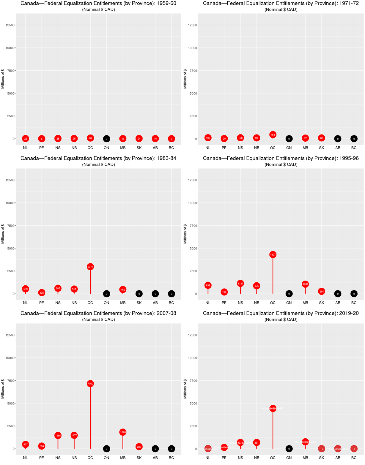
There is likely no federal-provincial political issue that stokes more anger amongst Albertans (and is so misunderstood) as equalization payments (entitlements) from the Canadian federal to the country’s 10 provinces. Although some form of equalization has always been a part of the federal government’s policy arsenal, the current equalization program was initiated in the late 1950s, with the goal of providing, or at least helping achieve an equal playing field across the country in terms of basic levels of public services. As Professor Trevor Tombe notes:
Regardless of where you live, we are committed (indeed, constitutionally committed) to ensure everyone has access to “reasonably comparable levels of public services at reasonably comparable levels of taxation.”
Finances of the Nation, Trevor Tombe
For more information about the equalization program read Tombe’s article and links he provides to other information. The most basic misunderstanding of the program is that while some provinces receive payments from the federal government (the ‘have-nots’) the other, more prosperous, provinces (the ‘haves’) are the source of these payments. You often hear the phrase “Alberta sends X $billion to Quebec every year!” That’s not the case. The funds are generated and distributed from federal revenues (mostly income tax) and disbursed from this same fund of resources. The ‘have’ provinces don’t “send money” to other provinces. The federal government collects tax revenue from all individuals and if a province has a higher proportion of high-earning workers than another, it will generally receive less back in money from the federal government than its workers send to Ottawa. (To reiterate, read Tombe for more about the particulars.)
Using data provided by the Government of Canada, I have decided to show the federal equalization outlays over time using what is called a lollipop chart. I could have used a bar chart, but I like the way the lollipop chart looks. Here’s the chart and the R code below:

The data source is here: https://open.canada.ca/data/en/dataset/4eee1558-45b7-4484-9336-e692897d393f, and I am using the table called Equalization Entitlements.
N.B.: The original data, for some reason, had Alberta abbreviated as AL, so I had to edit the my final data frame and the gif.
## You'll need these two libraries
require(ggplot2)
require(gganimate)

gg.anim.lol1 <- ggplot(melt.eq.df, aes(x=variable, y=value, label=amount)) +
  geom_point(stat='identity', size=14, aes(col=as.factor(zero.dummy))) +  #, fill="white"
  scale_color_manual(name="zero.dummy",
                     values = c("0"="#000000", "1"="red")) +
  labs(title="Canada—Federal Equalization Entitlements (by Province): {closest_state}",
       x=" ", y="Millions of nominal $ (CAD)") +
  geom_segment(aes(y = 0,
                   x = variable,
                   yend = value,
                   xend = variable),
               color = "red",
               size=1.5) +
  scale_y_continuous(breaks=seq(0,15000,2500)) +
  theme(legend.position="none",
        plot.title =element_text(hjust = 0.5, size=23),
        axis.title.x = element_text(size = 16),
        axis.title.y = element_text(size = 16),
        axis.text.y =element_text(size = 14),
        axis.text.x=element_text(vjust=0.5,size=16, colour="black")) +
  geom_text(color="white", size=4) +
    transition_states(
  Year,
  transition_length = 2,
  state_length = 8
) +
  enter_fade() +
  exit_fade()

animate(gg.anim.lol1, nframes = 630, fps = 10, width=800, height=680, renderer=gifski_renderer("equal.lollipop.gif"))

You must be logged in to post a comment.