Climate Data Visualizations

I’ll be using this website to create a catalogue of what I consider to be important data visualizations in the general knowledge area of climate change/climate science.

Here is the first visualization, which looks at the the sources of electricity production in the Canadian province of British Columbia. With the exception of a couple of provinces (Alberta and Saskatchewan, primarily), sources of Canadian electricity production are overwhelmingly fossil fuel-free. The predominant type of energy production is hydroelectric, which has traditionally been supplemented by nuclear power. In recent years, wind and solar energy sources have come online and continue to increase their output on an annual basis.
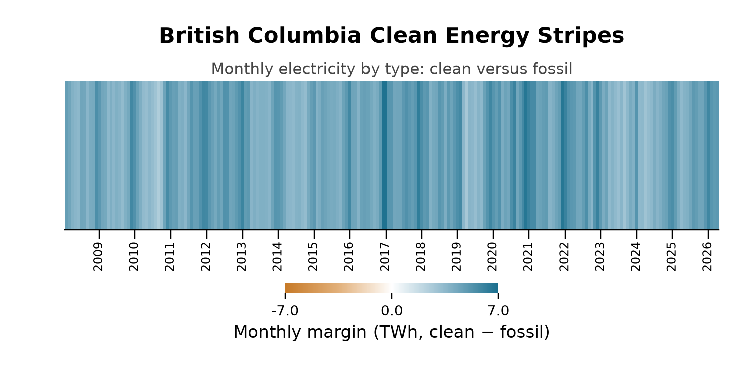
Using python code developed by John Bistline as a baseline, I have created a chart that shows the relative monthly amounts of “clean” versus “fossil fuel” electricity production in British Columbia since 2008. Bistline’s charts use daily totals, but I couldn’t find daily data for BC, so I am using monthly data.

How does one interpret this chart? The darker the blue, the greatest is the absolute difference (in TWh–terawatt-hours) between the monthly output of ‘clean’ (i.e., renewable) electricity and produced from the burning of fossil fuels. The darkest blue bars (they are monthly bars) reflect that in that particular month about 6 more TWh of clean electricity were produced than that from fossil fuels.

It’s interesting to note that there doesn’t seem to be any secular trend over time; that is, it’s not apparent that more relative electricity of either type is being produced over time. We do see some seasonal fluctuations. For example, summers seem to be marked by much lower differences in the relative output of clean-versus-fossil fuel electricity production. We can contrast this with the USA state of Texas, which clearly demonstrates a surge in the relative amount of clean electricity produced over time. Texas may be a fossil fuel energy powerhouse, but it is increasingly becoming a clean energy powerhouse as well (see chart below). We can contrast this with the situation in Alberta, which is the topic of a future chart (the chart will be mostly orange).
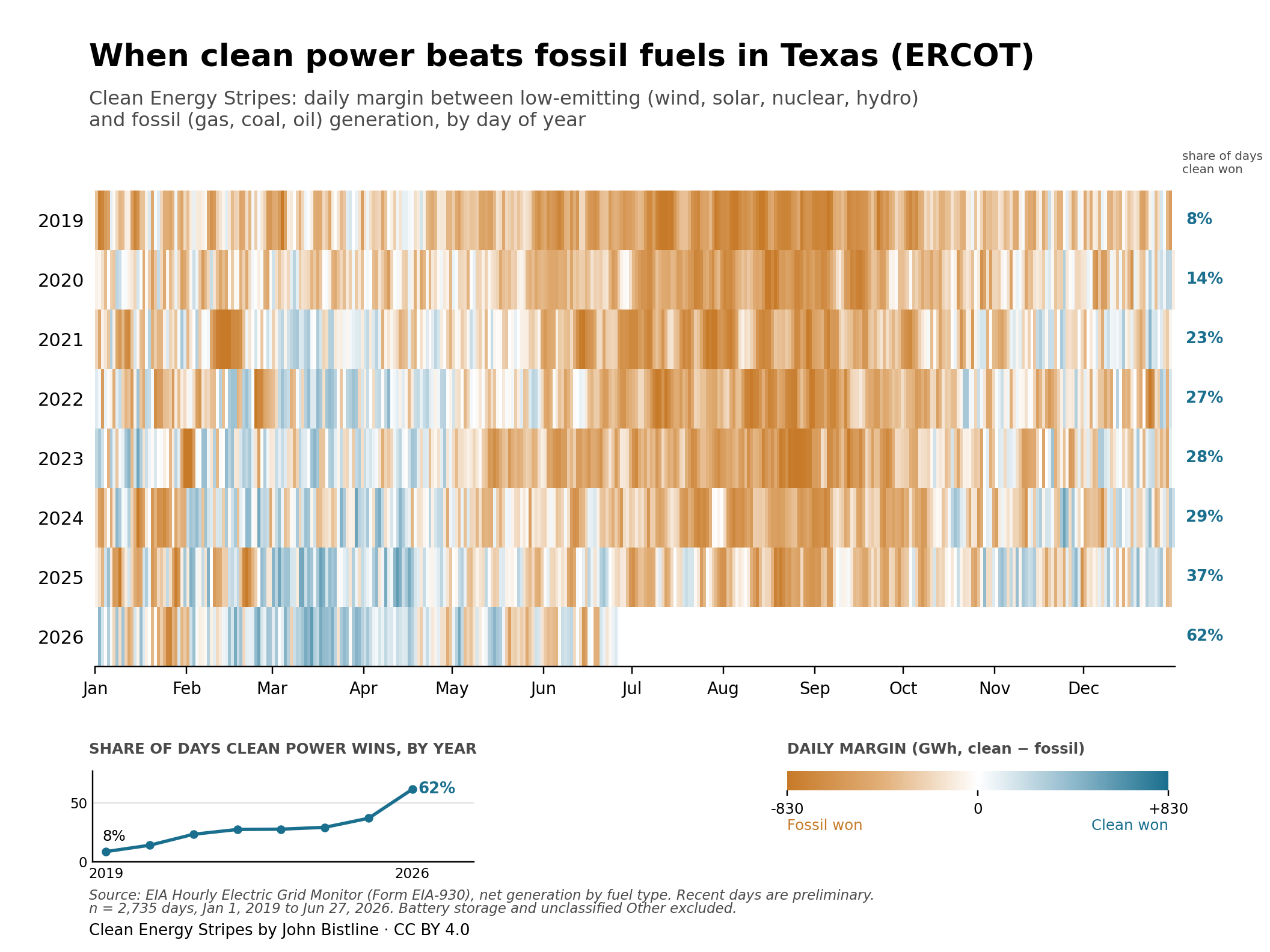
Note: these are daily data.

License & reuse

Clean Energy Stripes are released under a Creative Commons Attribution 4.0 license, in the spirit of Ed Hawkins’ original warming stripes. You are free to share and adapt them — make your own with national or subnational data, and credit “John Bistline, Clean Energy Stripes / Data: EIA-930.”

Get the code: a Python script that makes these charts for any grid (MIT licensed) is at github.com/jbws42/clean-energy-stripes.

The palette (blue #1A6F8E, orange #C77A28) is colorblind-safe by design.

Here is the python code that I used to create this chart. The data are from Statistics Canada. Table 25-10-0015-01  Electric power generation, monthly generation by type of electricity DOI: https://doi.org/10.25318/2510001501-eng

The data (bc_long_df.csv) are in long format with each row being a month-year.

import pandas as pd
import numpy as np
import matplotlib.pyplot as plt
from matplotlib.colors import LinearSegmentedColormap, TwoSlopeNorm
from matplotlib.ticker import FuncFormatter
# -------------------- load data --------------------
df = pd.read_csv("bc_long_df.csv")
df["Month"] = pd.to_datetime(df["Month"], format="%B %Y")
# -------------------- classify types --------------------
clean_types = [
"Total Renewables"
]
fossil_types = [
"Total electricity production from combustible fuels 8"
]
df = df[df["TYPE"].isin(clean_types + fossil_types)].copy()
df["group"] = np.where(df["TYPE"].isin(clean_types), "clean", "fossil")
# -------------------- monthly totals --------------------
monthly = (
df.groupby(["Month", "group"], as_index=False)["Value"]
.sum()
.pivot(index="Month", columns="group", values="Value")
.fillna(0)
.sort_index()
)
monthly["margin_twh"] = (monthly["clean"] - monthly["fossil"]) / 1_000_000
series = monthly["margin_twh"]
# -------------------- stripe grid --------------------
grid = series.values[np.newaxis, :]
# -------------------- colors --------------------
CLEAN_COLOR = "#1A6F8E"
FOSSIL_COLOR = "#C77A28"
CLEAN_MID = "#8FB9CC"
FOSSIL_MID = "#E2B07A"
BG = "#FFFFFF"
cmap = LinearSegmentedColormap.from_list(
"ces", [FOSSIL_COLOR, FOSSIL_MID, BG, CLEAN_MID, CLEAN_COLOR]
)
vmax = 6.0
norm = TwoSlopeNorm(vmin=-vmax, vcenter=0, vmax=vmax)
# -------------------- plot --------------------
width_px = 2000
height_px = 1000
dpi = 300
fig, ax = plt.subplots(
figsize=(width_px / dpi, height_px / dpi),
dpi=dpi
)
fig.patch.set_facecolor(BG)
ax.set_facecolor(BG)
im = ax.imshow(
grid,
aspect="auto",
cmap=cmap,
norm=norm,
interpolation="nearest"
)
# -------------------- x-axis labels: years only --------------------
year_positions = [i for i, d in enumerate(series.index) if d.month == 1]
year_labels = [str(d.year) for d in series.index if d.month == 1]
ax.set_xticks(year_positions)
ax.set_xticklabels(year_labels, fontsize=8, rotation=90, va="top", ha="center")
ax.tick_params(axis="x", length=6, pad=2)
plt.subplots_adjust(bottom=0.22)
plt.tight_layout()
ax.set_yticks([])
for s in ("top", "right", "left"):
ax.spines[s].set_visible(False)
# -------------------- titles --------------------
ax.text(
0.5, 1.22,
"British Columbia Clean Energy Stripes",
transform=ax.transAxes,
ha="center", va="bottom",
fontsize=14, fontweight="bold"
)
ax.text(
0.5, 1.02,
"Monthly electricity by type: clean versus fossil",
transform=ax.transAxes,
ha="center", va="bottom",
fontsize=10, color="#444444"
)
fig.subplots_adjust(top=0.80, bottom=0.20)
# -------------------- colorbar --------------------
cbar = plt.colorbar(im, ax=ax, orientation="horizontal", pad=0.25, fraction=0.05)
cbar.outline.set_visible(False)
cbar.ax.tick_params(length=4, labelsize=9)
cbar.set_ticks([-vmax, 0, vmax])
cbar.ax.xaxis.set_major_formatter(FuncFormatter(lambda x, pos: f"{x:.1f}"))
cbar.set_label("Monthly margin (TWh, clean − fossil)", fontsize=11)
# -------------------- final layout --------------------
fig.subplots_adjust(top=0.78, bottom=0.20)
fig.savefig(
"bc_clean_energy_stripes_monthly_twh.png",
dpi=220,
facecolor="white"
)
plt.show()

Data Visualization #13—Roulette and Temperature with R code

In the most recent post in my data visualization series I made an analogy between climate, weather and the spins of a roulette wheel that demonstrated that short-term randomness does not mean we can’t make accurate long-term predictions.

Towards the end of the post I appended an animation of 1000 random spins of a roulette wheel. In that post, I plotted the 1000 individual outcomes of these random spins of the roulette wheel. I chose to show only one outcome at a time as the animation cycled through all 1000 spins. In this post, I wanted to show you how to keep all of the outcomes from disappearing. Rather than having the value of each spin appear, and then disappear, I will change the code slightly to have every spin’s outcome stay on the plot, but faded so that the focus remains on the next spin value. Here’s what I mean.:

Created by Josip Dasović

Here is the R code for the image above:

## These are the packages needed to draw, and animate, the plots.
library(ggplot2)
library(gganimate)
library(dplyr)  # needed for cummean function

## Set up a data frame for the 1000 random spins of the roulette wheel

mywheel <-c(rep(0,2),1:36)  # a vector with the 38 wheel values
wheel.df<-data.frame("x"=1:1000,"y"=sample(mywheel,1000,rep=T))

## Plot, then animate the result of 1000 random spins of the wheel

## the code to plot
gg.roul.1000.point<- ggplot(wheel.df,aes(x, y, colour = "firebrick4")) + 
  geom_point(show.legend = FALSE, size=2) +
  theme_gray() + 
  labs(title = "1000 Random Spins of a Roulette Wheel", 
       x = expression("the"~n^th~"roll of the wheel"), 
       y = 'Value of a single spin') +
  theme(plot.title = element_text(hjust = 0.5, size = 14, color = "black")) +
  scale_y_continuous(expand = c(0, 0)) +
  transition_time(wheel.df$x) +
  shadow_mark(past = T, future=F, alpha=0.2)

## the code to animate
gg.roul.anim.point <- animate(gg.roul.1000.point, nframes=500, fps=25, width=500, height=280, renderer=gifski_renderer("gg_roulette_1000.gif"))  
 
## No plot and animate a line chart that depicts the cumulative mean from spin 1 to spin 1000.

gg.roul.1000.line <- ggplot(wheel.df, aes(x, y = cummean(y))) +
  geom_line(show.legend = FALSE, size=1, colour="firebrick4") +
  theme_gray() +
  ggtitle("Cumulative Mean of Roulette Wheel Spins is Stable over Time") +
  theme(plot.title = element_text(hjust = 0.5, size = 14, color = "black")) +
  labs(x = expression("the"~n^th~"roll of the wheel"), 
       y = 'Running (i.e., cumulative) Mean of all Rolls at Roll n') +
  scale_y_continuous(expand=c(0,0), limits=c(0,36)) +
  transition_reveal(wheel.df$x) +
  ease_aes('linear') 

gg.roul.anim.line <- animate(gg.roul.1000.line, nframes=500, fps=25, width=500, height=280, renderer=gifski_renderer("cummean_roulette_1000.gif"))  

## Now combine the plots into one figure, using the magick library

library(magick)

a_mgif <- image_read(gg.roul.anim.point)
b_mgif <- image_read(gg.roul.anim.line)

roul_gif <- image_append(c(a_mgif[1], b_mgif[1]),stack=TRUE)
for(i in 2:500){
  combined <- image_append(c(a_mgif[i], b_mgif[i]),stack=TRUE)
  roul_gif <- c(roul_gif, combined)
}

## Save the final file as a .gif file

image_write(roul_gif, "roulette_stacked_point_line_500.gif")

Stay tuned for a Python version of this chart.

Global Warming ‘Hiatus’ Expected to end by 2030

For this week’s seminar, we read and discussed (amongst other things) a general (i.e., non-academic) article–in The Guardian newspaper-regarding the recent so-called hiatus in global warming. (Here’s another look at the same issue from The Economist.) The issue arises from recent global surface temperature data. To wit:

BETWEEN 1998 and 2013, the Earth’s surface temperature rose at a rate of 0.04°C a decade, far slower than the 0.18°C increase in the 1990s. Meanwhile, emissions of carbon dioxide (which would be expected to push temperatures up) rose uninterruptedly. This pause in warming has raised doubts in the public mind about climate change. A few sceptics say flatly that global warming has stopped. Others argue that scientists’ understanding of the climate is so flawed that their judgments about it cannot be accepted with any confidence. (From The Economist)

As the article quoted above goes on to note, there are many compelling scientific accounts for why global surface temperatures have not risen as quickly as in the past, though the author argues that they, in combination, explain too much. To understand what that means, please read the article yourself.

We viewed a video by climate scientist Matt England, in which he explained one plausible reason for this ‘hiatus’–the changing trade winds in the Pacific Ocean.

After having viewed Professor England’s explanation–more heat than normal was being trapped in deeper layers of the western Pacific Ocean–some students wondered when that extra trapped heat might once again rise to the surface. Not being a climate scientist, I did not know the answer. I now know, however, that some scientists predict this to occur by about 2030.

The Atlantic Ocean has masked global warming this century by soaking up vast amounts of heat from the atmosphere in a shift likely to reverse from around 2030 and spur fast temperature rises, scientists said.

The theory is the latest explanation for a slowdown in the pace of warming at the Earth’s surface since about 1998 that has puzzled experts because it conflicts with rising greenhouse gas emissions, especially from emerging economies led by China.

But, if you read the linked article carefully, you’ll notice that these study and explanation cited has nothing to do with the Pacific Ocean. Indeed, the study is by a group of scientists based at the University of Washington:

“We’re pointing to the Atlantic as the driver of the hiatus,” Ka-Kit Tung, of the University of Washington in Seattle and a co-author of Thursday’s study in the journal Science, told Reuters

The study said an Atlantic current carrying water north from the tropics sped up this century and sucked more warm surface waters down to 1,500 metres (5,000 feet), part of a natural shift for the ocean that typically lasts about three decades.

It said a return to a warmer period, releasing more heat stored in the ocean, was likely to start around 2030. When it does, “another episode of accelerated global warming should ensue”, the authors wrote.

So, what do we take from these two different studies. Is the article in The Economist correct that the current warming hiatus is ‘over-explained’? Is this just another example of scientists blindly whacking away at a pinata, hoping to hit upon an explanation? Or, is this another episode of how science is done in the real world. Theory and data combine to make predictions, which may be more or less true. When anomalies occur (that is, predictions are not quite accurate), scientists go about finding new data, and developing new theories to improve upon existing theories and knowledge. Or, is this just a loosely-linked cabal of money-seeking scientists trying to make off like bandits with our tax (i.e., research) money and blithely destroying our freedom while they’re at it?

Design a site like this with WordPress.com
Get started