In the most recent post in my data visualization series I made an analogy between climate, weather and the spins of a roulette wheel that demonstrated that short-term randomness does not mean we can’t make accurate long-term predictions.
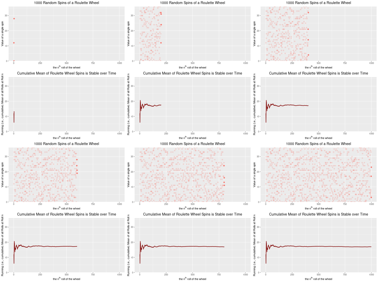
Towards the end of the post I appended an animation of 1000 random spins of a roulette wheel. In that post, I plotted the 1000 individual outcomes of these random spins of the roulette wheel. I chose to show only one outcome at a time as the animation cycled through all 1000 spins. In this post, I wanted to show you how to keep all of the outcomes from disappearing. Rather than having the value of each spin appear, and then disappear, I will change the code slightly to have every spin’s outcome stay on the plot, but faded so that the focus remains on the next spin value. Here’s what I mean.:

Here is the R code for the image above:
## These are the packages needed to draw, and animate, the plots.
library(ggplot2)
library(gganimate)
library(dplyr)  # needed for cummean function

## Set up a data frame for the 1000 random spins of the roulette wheel

mywheel <-c(rep(0,2),1:36)  # a vector with the 38 wheel values
wheel.df<-data.frame("x"=1:1000,"y"=sample(mywheel,1000,rep=T))

## Plot, then animate the result of 1000 random spins of the wheel

## the code to plot
gg.roul.1000.point<- ggplot(wheel.df,aes(x, y, colour = "firebrick4")) +
  geom_point(show.legend = FALSE, size=2) +
  theme_gray() +
  labs(title = "1000 Random Spins of a Roulette Wheel",
       x = expression("the"~n^th~"roll of the wheel"),
       y = 'Value of a single spin') +
  theme(plot.title = element_text(hjust = 0.5, size = 14, color = "black")) +
  scale_y_continuous(expand = c(0, 0)) +
  transition_time(wheel.df$x) +
  shadow_mark(past = T, future=F, alpha=0.2)

## the code to animate
gg.roul.anim.point <- animate(gg.roul.1000.point, nframes=500, fps=25, width=500, height=280, renderer=gifski_renderer("gg_roulette_1000.gif"))

## No plot and animate a line chart that depicts the cumulative mean from spin 1 to spin 1000.

gg.roul.1000.line <- ggplot(wheel.df, aes(x, y = cummean(y))) +
  geom_line(show.legend = FALSE, size=1, colour="firebrick4") +
  theme_gray() +
  ggtitle("Cumulative Mean of Roulette Wheel Spins is Stable over Time") +
  theme(plot.title = element_text(hjust = 0.5, size = 14, color = "black")) +
  labs(x = expression("the"~n^th~"roll of the wheel"),
       y = 'Running (i.e., cumulative) Mean of all Rolls at Roll n') +
  scale_y_continuous(expand=c(0,0), limits=c(0,36)) +
  transition_reveal(wheel.df$x) +
  ease_aes('linear')

gg.roul.anim.line <- animate(gg.roul.1000.line, nframes=500, fps=25, width=500, height=280, renderer=gifski_renderer("cummean_roulette_1000.gif"))

## Now combine the plots into one figure, using the magick library

library(magick)

a_mgif <- image_read(gg.roul.anim.point)
b_mgif <- image_read(gg.roul.anim.line)

roul_gif <- image_append(c(a_mgif[1], b_mgif[1]),stack=TRUE)
for(i in 2:500){
  combined <- image_append(c(a_mgif[i], b_mgif[i]),stack=TRUE)
  roul_gif <- c(roul_gif, combined)
}

## Save the final file as a .gif file

image_write(roul_gif, "roulette_stacked_point_line_500.gif")
Stay tuned for a Python version of this chart.

You must be logged in to post a comment.