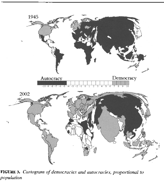
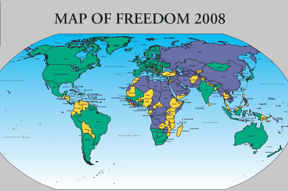
In a previous post I introduced the NGO, Freedom House, and included a world map of freedom based on the results of that organization’s analysis of the level of democracy worldwide in the last year. The map, of course, is static, and tells us nothing about the dynamics of democratization worldwide. In other words, compared to the year before, is the world more or less free? Well, the news is not good. Here are some highlights (or better yet, lowlights) from the press release:
The year 2007 was marked by a notable setback for global freedom, Freedom House reported in a worldwide survey of freedom released today.
The decline in freedom, as reported in Freedom in the World 2008, an annual survey of political rights and civil liberties worldwide, was reflected in reversals in one-fifth of the world’s countries. Most pronounced in South Asia, it also reached significant levels in the former Soviet Union, the Middle East and North Africa, and sub-Saharan Africa. A substantial number of politically important countries whose declines have broad regional and global implications—including Russia, Pakistan, Kenya, Egypt, Nigeria, and Venezuela—were affected.
Complete survey results reflect global events during 2007. A package of charts and graphs and an explanatory essay are available online.
As for specifics:
The number of countries judged by Freedom in the World as Free in 2007 stood at 90, representing 46 percent of the global population. The number of Free countries did not change from the previous year’s survey.
- The number of countries qualifying as Partly Free stood at 60, or 18 percent of the world population. The number of Partly Free countries increased by two from the previous year, as Thailand and Togo both moved from Not Free to Partly Free.
- Forty-three countries were judged Not Free, representing 36 percent of the global population. The number of Not Free countries declined by two from 2006. One territory, the Palestinian Authority, declined from Partly Free to Not Free.
- The number of electoral democracies dropped by two and totals 121. One country, Mauritania, qualified to join the world’s electoral democracies in 2007. Developments in three countries—Philippines, Bangladesh and Kenya—disqualified them from the electoral democracy list.
We’ll address electoral democracies, and other “hybrid regimes” just before the mid-term break.


You must be logged in to post a comment.