
One of the empirical facts of the post-WWII era has been the inexorable rise not only in the number of democratic states, but also in the number of the world’s denizens who reside in democracies. We’ve probably all seen the Freedom House world Maps of Freedom, which are published on an annual basis.
Freedom House World Map of Freedom 2014
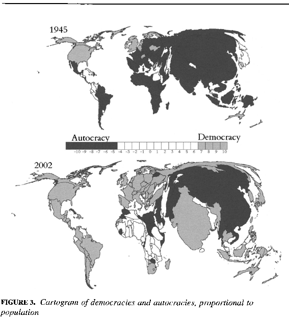
That’s great for providing a quick visual idea of how many of the world’s states have democratic regimes. But, it doesn’t tell us how many of the world’s inhabitants live in democracies. This clever cartogram by Gleditsch and Ward does this. Cartograms bend and mis-shape world maps on the basis of the values of the underlying variable–in this case, population. What do you think? The map below shows a dramatic rise since 1945 in both the number of states and the number of the world’s citizens who live in democracies. You’ll note that this map is from 2002 data, and there have been some important changes, notably Russia’s slide back toward autocracy in the last decade or so. Also, look at how massive India and China are (population-wise)!

You must be logged in to post a comment.