The first entry in my 30-day (it will actually be 30 posts over about 2 months) data visualization challenge argued that geographically-based electoral maps have many drawbacks as data visualization techniques. I demonstrated by using the results from the 2017 and 2020 British Columbia (BC) provincial elections as supporting evidence.
Although there were some significant political changes over the course of the two elections, these were poorly-represented by these maps. Only when we zoomed into the population centres of southwestern BC were we able to partially convey the changes that had occurred. We could have made our effort to convey the underlying movement in political party support between 2017 and 2020 a bit more obvious by using animated maps, rather than the static ones that were used.
When it comes to representing change over time, animated graphs can be very useful (as long as they aren’t too complicated and busy) and are advantageous to static maps.
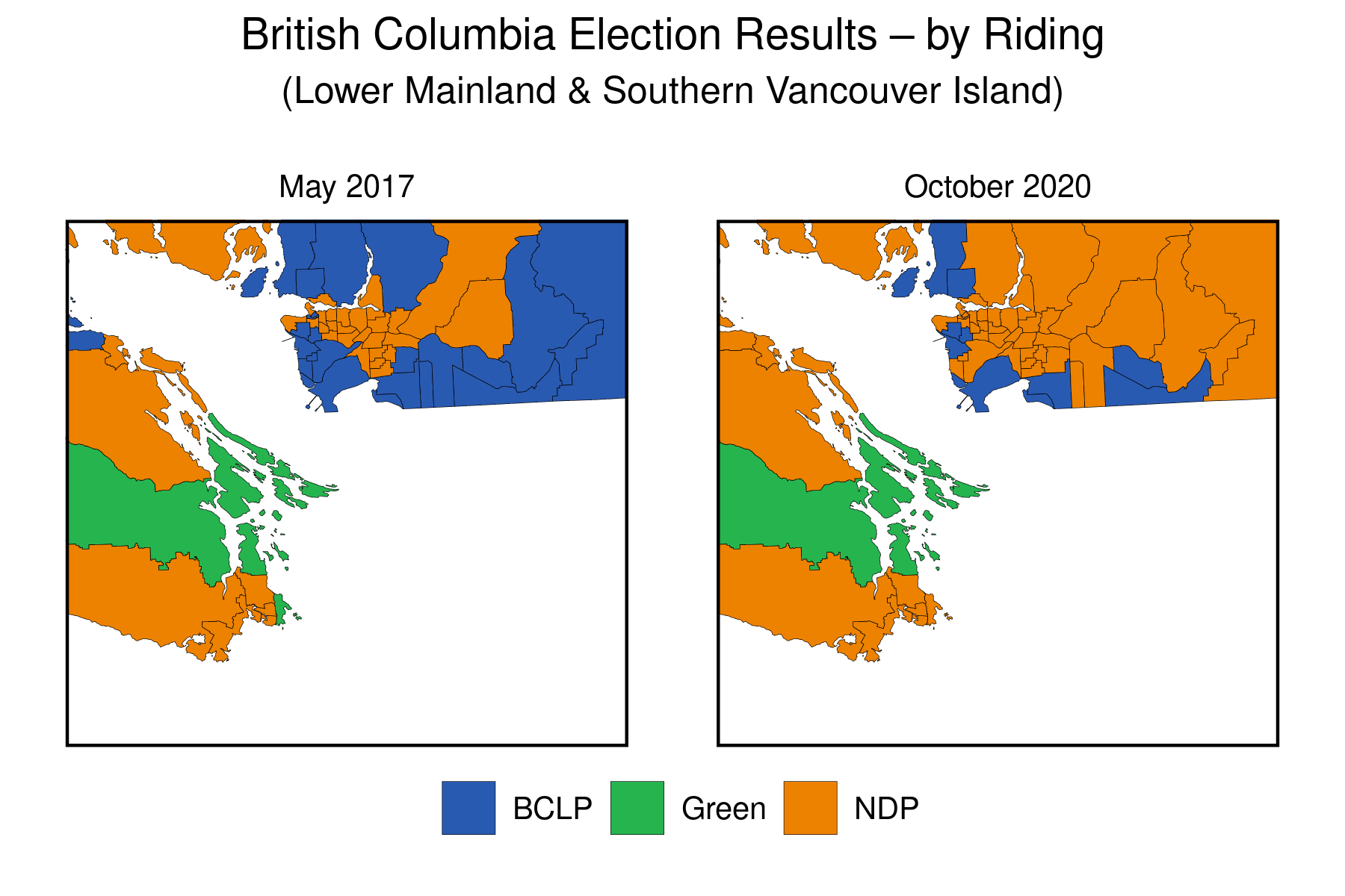
Below we can find the maps in the original animated to more clearly show the changes over time. Here’s the map of the whole province:
The change between 2017 and 2020 is made clear by a jarring change in the map, where a bit more NDP-orange shows up, replacing the BCLP-blue (see the previous post for descriptions of the two parties). Otherwise, there doesn’t seem to be much change in the province overall.
We know, however, that the drastic changes that took place did so in the very tiniest southwestern corner of the BC mainland. Let’s zoom in there to have a look.
We can now more clearly see the change in results (in terms of electoral districts won) between 2017 and 2020 in this populous region. Not only did the NDP (orange) win many seats in the eastern Vancouver suburbs that had not only been won by the BCLP in 2017 but had been a bastion of support for the right-wing vote over many decades, but the NDP candidate in the Victoria-area district of Oak Bay-Gordon Head won a seat that had previously been held by the former leader of BC Green Party, Andrew Weaver (it’s the small piece of green, that changes to orange, in the eastern part of the lower orange horizontal band on the lower-left of the map) . Are these changes the harbinger of a sea-change in BC provincial politics, or are they just an anomalous blip?
Going back to my original point about these types of maps being poor representations of the underlying change in voters’ preferences, we don’t know much about the level of support for the respective parties in any of these electoral districts. All that we do know, based on the “first-past-the-post” electoral system used by BC at the provincial level, is the party whose candidate finished with the most votes in each of these electoral districts. We don’t know if a district newly-won by the NDP candidate was by one vote, or by 10,000 votes. In future posts, I’ll present graphs that will allow us to answer this question visually.
Our next posts will focus on alternatives to the basic electoral geographic maps that we’ve used in these first two posts.
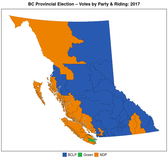
The data visualization with which I begin my 30-day challenge is a standard electoral map of the recently-completed British Columbia provincial election, the result of which is a solid (57 of 87 seats) majority government for the New Democratic Party, led by Premier John Horgan.
It’s a bit ironic that I begin with this type of map since, for a few reasons, I consider them to be poor representations of data. First, because electoral districts are mapped on the basis of territory (geography) they misrepresent and distort what they are purportedly meant to gauge–electoral support (by actual voters, not acreage) for political parties.
Though there are other pitfalls with basic electoral maps I’ll highlight what I believe to be the second major issue with them. They take what is a multinomial concept–voter support for each of a number of political parties in a specific electoral district–and summarize them into a single data point–which of the many parties in that electoral district has “won” that district. Most of these maps provide no information about either a) the relative size of the winning party’s victory in that district, or b) how many other parties competed in that district and how well each of these parties did in that district.
Although the standard electoral map provides some basic electoral information about the electoral outcome (and it is undeniable that in terms of determining who wins and runs government, it is the single most important piece of information), they are “information-poor” and in future posts I’ll show how researchers have tried to make their electoral maps more information-rich.
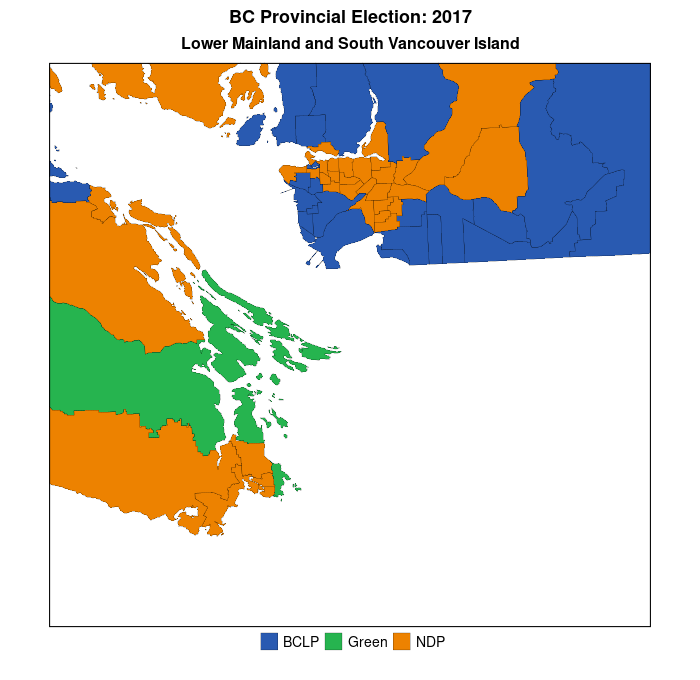
But, first, here are some standard electoral maps for the last two provincial elections in British Columbia (BC)–May 2017 and October 2020. Like many jurisdictions in North America, BC is comprised of relatively densely-populated urban areas–the Lower Mainland and southern Vancouver Island–combined with sparsely-populated hinterlands–forests, mountains, and deserts. Moreover, there is a strong partisan split between these areas–with the conservative BC Liberal Party (BCLP–the story of why the provincial Liberal Party in BC is actually the home of BC’s conservatives is too long for this post) dominating in the hinterlands while the left-centre New Democratic Party (NDP) generally runs more strongly in the urban southeast of the province. In Canada, electoral districts are often referred to as “ridings”, or “constituencies.”
If one were completely ignorant about BC’s provincial politics one would assume, simply from a quick perusal of the map above, that the “blue” party–the BC Liberal Party–was the dominant party in BC. In addition, it would seem that there was very little change in partisan support and electoral outcomes across the electoral districts over the course of the two elections. In fact, the BCLP lost 15 districts, all of which were won by the NDP. (The Green Party lost one of the districts it had won to the NDP as well, for a total NDP gain of 16 districts (seats on the provincial legislature) between 2017 and 2020. This factual story of a substantial increase in NDP seats in the legislature is poorly conveyed by the maps above because the maps match partisanship to area and not to voters.
To repeat, in future posts I will demonstrate some methods researchers have used to mitigate the problem of area-based electoral maps, but for now I’ll show that once we zoom into the southwest corner of the province (where most of the population resides) a simple electoral map does do a better job of conveying the change in electoral fortunes of the BCLP and NDP over the last two elections This is because there is a stronger link between area and population (voters) in these districts than in BC as a whole.
You can more easily see the orange NDP wave overtaking the population centres of the Lower Mainland (greater Vancouver area–upper left part of each map) and, to a lesser extent, southern Vancouver Island. Data visualization #2 will demonstrate how to create animated maps of the above, which more appropriately convey the nature of the change in each of the electoral districts over the two elections.
Here’s the R code that I used to create the two images in my post, using the ggplot2 package.
## Once you have created a sf_object in R (which I have named bc_final_sf, the following commands will create the image above.

library(ggplot2)
library(patchwork)

## First plot--2017
gg.ed.1 <- ggplot(bc_final_sf) +
  geom_sf(aes(fill = Winner_2017), col="black", lwd=0.025) +
  scale_fill_manual(values=c("#295AB1","#26B44F","#ED8200")) +
  labs(title = "May 2017") +
  theme_void() +
  theme(legend.title=element_blank(),
        plot.title = element_text(hjust = 0.5, size=12, face="bold"),
        legend.position = "none")

## Second plot--2020
gg.ed.2 <- ggplot(bc_final_final) +
  geom_sf(aes(fill = Winner_2020), col="black", lwd=0.025) +
  scale_fill_manual(values=c("#295AB1","#26B44F","#ED8200")) +
  labs(title = "October 2020") +
  theme_void() +
  theme(legend.title=element_blank(),
        plot.title = element_text(hjust = 0.5, size=12, face="bold"),
        legend.position = "bottom")

## Combine the plots and do some annotation
gg.bc.comb.map <- gg.ed.1 + gg.ed.2 & theme(legend.position = "bottom")
gg.bc.comb.map.final <- gg.bc.comb.map + plot_layout(guides = "collect") +
  plot_annotation(
  title = "British Columbia Election Results \u2013 by Riding",
  theme = theme(plot.title = element_text(size = 16, hjust=0.5, face="bold"))
  )

gg.bc.comb.map.final    # to view the first image above

## For the maps of the Lower Mainland and southern Vancouver Island, the only difference is that we add the following line to each of the individual maps:

coord_sf(xlim = c(1140000,1300000), ylim = c(350000, 500000))

## so, we get

gg.ed.lmsvi.1 <- ggplot(bc_final_final) +
  geom_sf(aes(fill = Winner_2017), col="black", lwd=0.075) +
  coord_sf(xlim = c(1140000,1300000), ylim = c(350000, 500000)) +
  scale_fill_manual(values=c("#295AB1","#26B44F","#ED8200")) +
  labs(title = "May 2017") +
  theme_void() +
  theme(legend.title=element_blank(),
        plot.title = element_text(hjust = 0.5, size=10, vjust=3),
        legend.position = "none")
Prompted by something that I read on a Twitter post, I’ve decided to embark on a 30-day challenge of my own–creating 30 different visualizations of data. The types of visualization will vary–maps, charts, graphs, etc., and I will not be completing the challenge on sequential days.
This challenge will give me a chance to put “on paper” some ideas and concepts that I’ve been thinking about for some time, all of which are broadly related to the topic of politics. So, stay tuned.
We noted today in lecture that Polity IV gives countries like the United States very high scores on the ”democraticness” variable, even during periods when a majority of the adult population–African-Americans, and women–were legally not allowed to vote. While Switzerland (1971) was the last European democracy to grant universal suffrage for women, Portugal was the last European country to do so (1976)–Portugal was run by a military dictatorship during in the early years of the 1970s.
In this era of social media abuse and bullying, it’s interesting to learn about some of the abuse hurled at the Suffragettes:
Since we all talk about political abuse on Twitter, this is really interesting on the abuse directed at the suffragettes by their opponents. Here’s a postcard sent to Emmeline Pankhurst. More here: https://t.co/j65EzWjdB3pic.twitter.com/yReqKQEBjr
In a recent working paper by Hanson and Sigman, of the Maxwell School of Citizenship and Public Affairs at Syracuse University, the authors explore the concept(s) of state capacity. The paper title–Leviathan’s Latent Dimensions: Measuring State Capacity for Comparative Political Research, complies with my tongue-in-cheek rule about the names of social scientific papers. Hanson and Sigman use statistical methods (specifically, latent variable analysis) to tease out the important dimensions of state capacity. Using a series of indexes created by a variety of scholars, organizations, and think tanks, the authors conclude that there are three distinct dimensions of state capacity, which they label i) extractive, ii) coercive, and iii) administrative state capacity.
Here is an excerpt:
The meaning of state capacity varies considerably across political science research. Further complications arise from an abundance of terms that refer to closely related attributes of states: state strength or power, state fragility or failure, infrastructural power, institutional capacity, political capacity, quality of government or governance, and the rule of law. In practice, even when there is clear distinction at the conceptual level, data limitations frequently lead researchers to use the same
empirical measures for differing concepts.
For both theoretical and practical reasons we argue that a minimalist approach to capture the essence of the concept is the most effective way to define and measure state capacity for use in a wide range of research. As a starting point, we define state capacity broadly as the ability of state institutions to effectively implement official goals (Sikkink, 1991). This definition avoids normative conceptions about what the state ought to do or how it ought to do it. Instead, we adhere to the notion that capable states may regulate economic and social life in different ways, and may achieve these goals through varying relationships with social groups…
…We thus concentrate on three dimensions of state capacity that are minimally necessary to carry out the functions of contemporary states: extractive capacity, coercive capacity, and administrative capacity. These three dimensions, described in more detail below,accord with what Skocpol identifies as providing the “general underpinnings of state capacities” (1985: 16): plentiful resources, administrative-military control of a territory, and loyal and skilled officials.
Here is a chart that measures a slew of countries on the extractive capacity dimension in
Those of you in my IS210 class may find the Polity IV data to be of use when writing your paper. Click on the image below to take you to the website, where (if you scroll down to the bottom) you can see the regime scores (between -10 and +10) for each country over many years. See the example at the bottom of this post.
Political Regime Types–Polity IV Dataset
Here’s an exampe of the history of movements in regime for El Salvador from 1946 until 2010. How many changes in regime does El Salvador seem to have experienced in the post-WWII period? What happened in the early 1980s?
The Failed State Index is created and updated by the Fund for Peace. For the most recent year (2013), the Index finds the same cast of “failed” characters as previous years. There is some movement, the “top” 10 has not changed much over the last few years.
The Top 10 of the Failed States Index for 2013
Notice the columns in the image above. Each of these columns is a different indicator of “state-failedness”. If you go to the link above, you can hover over each of the thumbnails to find out what each indicator measures. For, example, the column with what looks like a 3-member family is the score for “Mounting Demographic Pressures”, etc. What is most interesting about the individual indicator scores is how similar they are for each state. In other words, if you know Country X’s score on Mounting Demographic Pressures, you would be able to predict the scores of the other 11 indicators with high accuracy. How high? We’ll just run a simple regression analysis, which we’ll do in IS240 later this semester.
For now, though, I was curious as to how closely each indicator was correlated with the total score. Rather than run regression analyses, I chose (for now) to simply plot the associations. [To be fair, one would want to plot each indicator not against the total but against the total less that indicator, since each indicator comprises a portion (1/12, I suppose) of the total score. In the end, the general results are similar,if not exactly the same.]
So, what does this look like? See the image below (the R code is provided below, for those of you in IS240 who would like to replicate this.)
Plotting each of the Failed State Index (FSI) Indicators against the Total FSI Score
Here are two questions that you should ponder:
If you didn’t have the resources and had to choose only one indicator as a measure of “failed-stateness”, which indicator would you choose? Which would you definitely not choose?
Would you go to the trouble and expense of collecting all of these indicators? Why or why not?
R-code:
install.packages("gdata") #This package must be installed to import .xls file

library(gdata) #If you find error message--"required package missing", it means that you must install the dependent package as well, using the same procedure.

fsi.df<-read.xls("http://ffp.statesindex.org/library/cfsis1301-fsi-spreadsheet178-public-06a.xls")  #importing the data into R, and creating a data frame named fsi.df

pstack.1<-stack(fsi.df[4:15]) #Stacking the indicator variables in a single variable

pstack.df<-data.frame(fsi.df[3],pstack.1) #setting up the data correctly

names(pstack.df)<-c("Total","Score","Indicator") #Changing names of Variables for presentation

install.packages("lattice")  #to be able to create lattice plots

library(lattice) #to load the lattice package

xyplot(pstack.df$Total~pstack.df$Score|pstack.df$Indicator,  groups=pstack.df$Indicator, layout=c(4,3),xlab="FSI Individual Indicator Score", ylab="FSI Index Total")
That’s quite a comprehensive title to this post, isn’t it? A more serious social scientist would have prefaced the title with some cryptic phrase ending with a colon, and then added the information-possessing title. So, why don’t I do that. What about “Nibbling on Figs in an Octopus’ Garden: Explanation, Statistics, GDP, Democracy, and the Social Progress Index?” That sounds social ‘sciencey’ enough, I think.
Now, to get to the point of this post: one of the most important research topics in international studies is human welfare, or well-being. Before we can compare human welfare cross-nationally, we have to begin with a definition (which will guide the data-collecting process). What is human welfare? There is obviously some global consensus as to what that means, but there are differences of opinion as to how exactly human welfare should be measured. (In IS210, we’ll examine these issues right after the reading break.) For much of the last seven decades or so, social scientists have used economic data (particularly Gross Domestic Product (GDP) per capita as a measure of a country’s overall level of human welfare. But GDP measures have been supplemented by other factors over the years with the view that they leave out important components of human welfare. The UN’s Human Development Index is a noteworthy example. A more recent contribution to this endeavour is the Social Progress Index (SPI) produced by the Social Progress Imperative.
HDI–Map of the World (2013)
How much better, though, are these measures than GDP alone? Wait until my next post for answer. But, in the meantime, we’ll look at how “different” the HDI and the SPI are. First, what are the components of the HDI?
“The Human Development Index (HDI) measures the average achievements in a country in three basic dimensions of human development: a long and healthy life, access to knowledge and a decent standard of living.”
So, you can see that it goes beyond simple GDP, but don’t you have the sense that many of the indicators–such as a long and healthy life–are associated with GDP? And there’s the problem of endogeneity–what causes what?
The SPI is a recent attempt to look at human welfare even more comprehensively, Here is a screenshot showing the various components of that index:
We can see that there are some components–personal rights, equity and inclusion, access to basic knowledge, etc.,–that are absent from the HDI. Is this a better measure of human well-being than the HDI, or GDP alone? What do you think?
During our second lecture in Research Methods, when asked to provide an example of a relational statement, one student offered the following:
Playing violent video games leads to more violent inter-personal behaviour by these game-playing individuals.
That’s a great example, and we used this in class for a discussion of how we could go about testing whether this statement is true. We then surmised that watching violence on television may have similar effects, though watching is more passive than “playing”, so there may not be as great an effect.
If television viewing can cause changes in our behaviour that are not socially productive, can it also lead viewers to change their behaviour in a positive manner? There’s evidence to suggest that this may be true. In a recent study,
there is evidence to suggest that watching MTV’s 16 and Pregnant show is associated with lower rates of teen pregnancy. What do you think about the research study?
Political scientist James Fearon has an interesting blog post on the political science blog, The Monkey Cage. In it, he asks, and then gives an answer to, the question “How do states act after they get nuclear weapons?” The issue, Fearon notes, is gaining increasing attention in the United States, given the alleged quest by Iran to develop nuclear weapons. The issue also resonates in Canada, with Stephen Harper recently affirming his fear of the Iranian regime acquiring nukes. From this CBC interview with Peter Mansbridge, Harper responds in the affirmative to Mansbridge’s characterization of an interview Harper had given a couple of weeks earlier on the issue of Iran’s quest for nuclear weapons:
…in your view, they [Iran’s regime] want nuclear weapons, and they would not be shy about using them.[see the exchange below]
In opposition to views like Harper’s are the views of what Fearon calls “proliferation optimists” such as the well-known realist Kenneth Waltz, who claims that contrary to our repeated expectations about the behaviour of post-nuclear states, the opposite has turned out to be true much more often than not. What does Fearon find empirically? First, he sets up what it is, specifically, that he is measuring:
The following graph shows, for each of the nine states that acquired nuclear capability at some time between 1945 and 2001, their yearly rate of militarized disputes in years when they didn’t have nukes, and the rate for years when they did.
Here is a graph of Fearon’s finding with his summary below:
China, France, India, Israel, Pakistan, and the UK all saw declines in their total militarized dispute involvement in the years after they got nuclear weapons. A number of these are big declines. USSR/Russia and South Africa have higher rates in their nuclear versus non-nuclear periods, though it should be kept in mind that for the USSR we only have four years in the sample with no nukes, just as the Cold War is starting.


 China, France, India, Israel, Pakistan, and the UK all saw declines in their total militarized dispute involvement in the years after they got nuclear weapons. A number of these are big declines. USSR/Russia and South Africa have higher rates in their nuclear versus non-nuclear periods, though it should be kept in mind that for the USSR we only have four years in the sample with no nukes, just as the Cold War is starting.
You must be logged in to post a comment.