In my previous post I noted that I would provide python code for the chart that is in the post. The chart was created using R statistical software, and the code for the python version can be found at the end of this post.
I find python a bit less intuitive than R but that’s most likely because I’ve been using R for a very long time and python for less long. There are reasons, I suppose, to favour one over the other, but for statistical analysis and data analysis I don’t necessarily see an advantage of one over the other. That being said, it is my sense that R does a better job of standardizing across various operating systems, which can be very helpful when you are a Linux user, as am I.
import numpy as np
import matplotlib.pyplot as plt
import networkx as nx
from matplotlib.animation import FuncAnimation
plt.style.use('ggplot') # this is to make the plot look like an R ggplot

# a roulette array
roulette = np.append(np.array([0, 0]),np.arange(1, 37))
spins1000 = np.array(np.random.choice(roulette, size=(1000)))

# Define a cumulative mean function
def cum_mean(arr):
    cum_sum = np.cumsum(arr)
    return cum_sum / (np.arange(1, cum_sum.shape[0] + 1))     # as far as I can tell, matplotlib doesn't have a cumulative mean function; so I created one.


fig = plt.figure()
ax1 = fig.add_subplot(2, 1, 2)
ax2 = fig.add_subplot(2, 1, 1)
fig.tight_layout(pad=3.0)
fig.suptitle('Short-term Randomness versus Long-term Predictability', fontsize=14)
ax2.set_xlabel('$n^th$ spin of roulette wheel')
ax2.set_ylabel('Value of $n^{th}$ spin')
ax2.set_xlim(0, 1000)
ax2.set_ylim(0, 37)

ax1.set_xlabel('$n^{th}$ spin of the roulette wheel')
ax1.set_ylabel('Cumulative mean of n spins')
ax1.set_xlim(0, 1000)
ax1.set_ylim(0, 37)

line, = ax1.plot([], [], lw=1.5)
scat, = ax2.plot([], [], 'o', markersize=2)

def init():
    line.set_data([], [])
    scat.set_data([], [])
    return line, scat,

def animate(i):
    x = np.linspace(0, 250, 250)
    y1 = cum_mean(spins1000)
    y2 = spins1000
    line.set_data(x[:i], y1[:i])
    scat.set_data(x[:i], y2[:i])
    return line, scat,

anim = FuncAnimation(fig, animate, init_func=init, frames=1000, interval=10, blit=True, save_count=1000)

plt.show()

anim.save('roullete_python.mp4') # saving as .mp4 because python creates massive gif files.
In the most recent post in my data visualization series I made an analogy between climate, weather and the spins of a roulette wheel that demonstrated that short-term randomness does not mean we can’t make accurate long-term predictions.
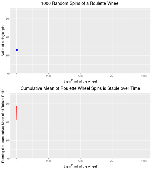
Towards the end of the post I appended an animation of 1000 random spins of a roulette wheel. In that post, I plotted the 1000 individual outcomes of these random spins of the roulette wheel. I chose to show only one outcome at a time as the animation cycled through all 1000 spins. In this post, I wanted to show you how to keep all of the outcomes from disappearing. Rather than having the value of each spin appear, and then disappear, I will change the code slightly to have every spin’s outcome stay on the plot, but faded so that the focus remains on the next spin value. Here’s what I mean.:
Created by Josip Dasović
Here is the R code for the image above:
## These are the packages needed to draw, and animate, the plots.
library(ggplot2)
library(gganimate)
library(dplyr)  # needed for cummean function

## Set up a data frame for the 1000 random spins of the roulette wheel

mywheel <-c(rep(0,2),1:36)  # a vector with the 38 wheel values
wheel.df<-data.frame("x"=1:1000,"y"=sample(mywheel,1000,rep=T))

## Plot, then animate the result of 1000 random spins of the wheel

## the code to plot
gg.roul.1000.point<- ggplot(wheel.df,aes(x, y, colour = "firebrick4")) +
  geom_point(show.legend = FALSE, size=2) +
  theme_gray() +
  labs(title = "1000 Random Spins of a Roulette Wheel",
       x = expression("the"~n^th~"roll of the wheel"),
       y = 'Value of a single spin') +
  theme(plot.title = element_text(hjust = 0.5, size = 14, color = "black")) +
  scale_y_continuous(expand = c(0, 0)) +
  transition_time(wheel.df$x) +
  shadow_mark(past = T, future=F, alpha=0.2)

## the code to animate
gg.roul.anim.point <- animate(gg.roul.1000.point, nframes=500, fps=25, width=500, height=280, renderer=gifski_renderer("gg_roulette_1000.gif"))

## No plot and animate a line chart that depicts the cumulative mean from spin 1 to spin 1000.

gg.roul.1000.line <- ggplot(wheel.df, aes(x, y = cummean(y))) +
  geom_line(show.legend = FALSE, size=1, colour="firebrick4") +
  theme_gray() +
  ggtitle("Cumulative Mean of Roulette Wheel Spins is Stable over Time") +
  theme(plot.title = element_text(hjust = 0.5, size = 14, color = "black")) +
  labs(x = expression("the"~n^th~"roll of the wheel"),
       y = 'Running (i.e., cumulative) Mean of all Rolls at Roll n') +
  scale_y_continuous(expand=c(0,0), limits=c(0,36)) +
  transition_reveal(wheel.df$x) +
  ease_aes('linear')

gg.roul.anim.line <- animate(gg.roul.1000.line, nframes=500, fps=25, width=500, height=280, renderer=gifski_renderer("cummean_roulette_1000.gif"))

## Now combine the plots into one figure, using the magick library

library(magick)

a_mgif <- image_read(gg.roul.anim.point)
b_mgif <- image_read(gg.roul.anim.line)

roul_gif <- image_append(c(a_mgif[1], b_mgif[1]),stack=TRUE)
for(i in 2:500){
  combined <- image_append(c(a_mgif[i], b_mgif[i]),stack=TRUE)
  roul_gif <- c(roul_gif, combined)
}

## Save the final file as a .gif file

image_write(roul_gif, "roulette_stacked_point_line_500.gif")
If you are at all familiar with the politics and communication surrounding the global warming issue you’ll almost certainly have come across one of the most popular talking points among those who dismiss (“deny”) contemporary anthropogenic (human-caused) climate change (I’ll call them “climate deniers” henceforth). The claim goes something like this:
“If scientists can’t predict the weather a week from now, how in the world can climate scientists predict what the ‘weather’ [sic!] is going to be like 10, 20, or 50 years from now?”
Notably, the statement does possess a prima facie (i.e., “commonsensical”) claim to plausibility–most people would agree that it is easier (other things being equal) to make predictions about things are closer in time to the present than things that happen well into the future. We have a fairly good idea of the chances that the Vancouver Canucks will win at least half of their games for the remainder of the month of March 2021. We have much less knowledge of how likely the Canucks will be to win at least half their games in February 2022, February 2025, or February 2040.
Notwithstanding the preceding, the problem with this denialist argument is that it relies on a fundamental misunderstanding of the difference between climate and weather. Here is an extended excerpt from the US NOAA:
We hear about weather and climate all of the time. Most of us check the local weather forecast to plan our days. And climate change is certainly a “hot” topic in the news. There is, however, still a lot of confusion over the difference between the two.
Think about it this way: Climate is what you expect, weather is what you get.
Weather is what you see outside on any particular day. So, for example, it may be 75° degrees and sunny or it could be 20° degrees with heavy snow. That’s the weather.
Climate is the average of that weather. For example, you can expect snow in the Northeast [USA] in January or for it to be hot and humid in the Southeast [USA] in July. This is climate. The climate record also includes extreme values such as record high temperatures or record amounts of rainfall. If you’ve ever heard your local weather person say “today we hit a record high for this day,” she is talking about climate records.
So when we are talking about climate change, we are talking about changes in long-term averages of daily weather. In most places, weather can change from minute-to-minute, hour-to-hour, day-to-day, and season-to-season. Climate, however, is the average of weather over time and space.
The important message to take from this is that while the weather can be very unpredictable, even at time-horizons of only hours, or minutes, the climate (long-term averages of weather) is remarkably stable over time (assuming the absence of important exogenous events like major volcanic eruptions, for example).
Although weather forecasting has become more accurate over time with the advance of meteorological science, there is still a massive amount of randomness that affects weather models. The difference between a major snowstorm, or clear blue skies with sun, could literally be a slight difference in air pressure, or wind direction/speed, etc. But, once these daily, or hourly, deviations from the expected are averaged out over the course of a year, the global mean annual temperature is remarkably stable from year-to-year. And it is an unprecedentedly rapid increase in mean annual global temperatures over the last 250 years or so that is the source of climate scientists’ claims that the earth’s temperature is rising and, indeed, is currently higher than at any point since the beginning of human civilization some 10,000 years ago.
Although the temperature at any point and place on earth in a typical year can vary from as high as the mid-50s degrees Celsius to as low as the -80s degrees Celsius (a range of some 130 degrees Celsius) the difference in the global mean annual temperature between 2018 and 2019 was only 0.14 degrees Celsius. That incorporates all of the polar vortexes, droughts, etc., over the course of a year. That is remarkably stable. And it’s not a surprise that global mean annual temperatures tend to be stable, given the nature of the earth’s energy system, and the concept of earth’s energy budget.
In the same way that earth’s mean annual temperatures tend to be very stable (accompanied by dramatic inter-temporal and inter-spatial variation), we can see that the collective result of many repeated spins of a roulette wheel is analogously stable (with similarly dramatic between-spin variation).
A roulette wheel has 38 numbered slots–36 of which are split evenly between red slots and black slots–numbered from 1 through 36–and (in North America) two green slots which are numbered 0, and 00. It is impossible to determine with any level of accuracy the precise number that will turn up on any given spin of the roulette wheel. But, we know that for a standard North American roulette wheel, over time the number of black slots that turn up will be equal to the number of red slots that turn up, with the green slots turning up about 1/9 as often as either red or black. Thus, while we have no way of knowing exactly what the next spin of the roulette wheel will be (which is a good thing for the casino’s owners), we can accurately predict the “mean outcome” of thousands of spins, and get quite close to the actual results (which is also a good thing for the casino owners and the reason that they continue to offer the game to their clients).
Below are two plots–the upper plot is an animated plot of each of 1000 simulated random spins of a roulette wheel. We can see that the value of each of the individual spins varies considerably–from a low of 0 to a high of 36. It is impossible to predict what the value of the next spin will be.
The lower plot, on the other hand is an animated plot, the line of which represents the cumulative (i.e. “running”) mean of 1000 random spins of a roulette wheel. We see that for the first few random rolls of the roulette wheel the cumulative mean is relatively unstable, but as the number of rolls increases the cumulative mean eventually settles down to a value that is very close to the ‘expected value’ (on a North Amercian roulette wheel) of 17.526. The expected value* is simply the sum of all of the individual values 0,0, 1 through 36 divided by the total number of slots, which is 38. Over time, as we spin and spin the roulette wheel, the values from spin-to-spin may be dramatically different. Over time, though, the mean value of these spins will converge on the expected value of 17.526. From the chart below, we see that this is the case.
Created by Josip Dasović
Completing the analogy to weather (and climate) prediction, on any given spin our ability to predict what the next spin of the roulette wheel will be is very low. [The analogy isn’t perfect because we are a bit more confident in our weather predictions given that the process is not completely random–it will be more likely to be cold and to snow in the winter, for example.] But, over time, we can predict with a high degree of accuracy that the mean of all spins will be very close to 17.526. So, our inability to predict short-term events accurately does not mean that we are not able to predict long-term events accurately. We can, and we do. In roulette, and for the climate as well.
TLDR: Just because a science can’t predict something short-term does not mean that it isn’t a science. Google quantum physics and randomness and you’ll understand what Einstein was referring to when he quipped that “God does not play dice.” Maybe she’s a roulette player instead?
Note: This is not the same as the expected dollar value of a bet given that casinos generate pay-off matrixes that are advantageous to themselves.
If you sit down for a minute and think about it, an x-ray is the culmination of a data generating, and visualization, process. What we see on the screen is a representation (or a model) of the body part being x-rayed. Over a month ago (hence the disruption to my blogging routine) I unexpectedly had knee replacement surgery (yay for cancellation lists!). Here is an x-ray of my new right knee (airport scanners, here I come!):
The parts showing very white are new and will hopefully allow me to hike and bike pain-free from this point on. It’s been a painful, but ultimately productive, healing and rehabilitation process and I’ll be continuing my data visualization challenge beginning next week. See you soon!
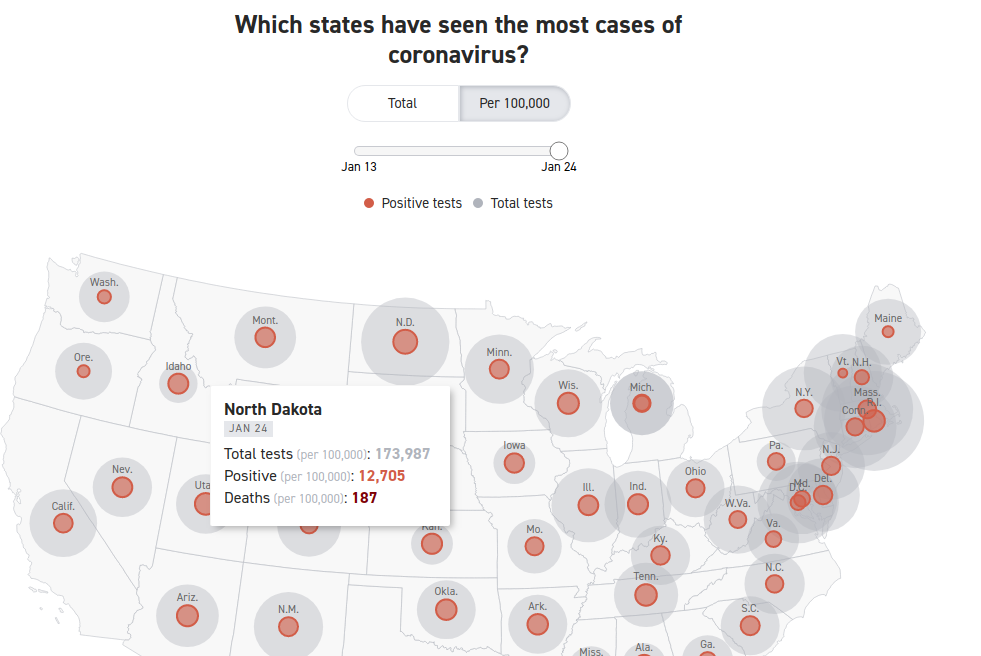
Researchers and analysts use data visualizations mostly to describe phenomena of interest. That is, they are used mostly to answer “who”, “what”, “where”, and “when” questions. Sometimes, however, data visualizations are meant to explain a phenomenon of interest. In social science, when we “explain” we are answering “how” and/or “why” questions. In essence, we are discussing causality. While social scientists are taught that a simple data visualization is never enough to settle claims of causality, in the real world, we often see simple charts passed off as evidence of the existence of a causal relationship between our phenomena of interest. Here’s an example that I’ve seen on social media that has been used to argue that government policies regarding the wearing of face masks and limiting the operations of businesses have no impact on the spread of the COVID-19 virus. Here’s the chart:
What are we meant to infer from the data contained in this chart? In two (of the 50 + DC) US states, the trajectory of infections seems to be very similar over the past 10 months or so, despite the fact that in one of the states–South Dakota–there have been no restrictions on businesses and no mask mandates, while these have both been part of the policy repertoire in neighbouring North Dakota. While this chart may seem compelling, it can not be used to argue that mask mandates and business restrictions have no effect on the spread of COVID-19.
The main problem with these types of charts is that they depict simple bivariate (two variables) relationships. In this case, we presumably see “data” (I’ll address the quality of this data in the next paragraph) on mask and business policies, and on infection rates. We are then encouraged to causally link these two variables. Unfortunately, that’s not at all how social science (or any science) is done. The social world is complex and rarely is it the case that one thing is caused only by one other thing, and nothing else. This is what we call the ceteris paribus (all other things being equal) criterion. In other words,. there may be a host of factors that contribute to COVID-19 infection rates other than mask and business policies. How do we know that one, or more, of these other things is not having an impact on the infection rates? Based on this chart, we don’t. That being said, by comparing two very similar states, the creators of this chart are seemingly aware of the ceteris paribus condition. In other words, choosing states with similar demographic, economic, geographic, etc., profiles (as is often done in comparative analysis) does indeed mitigate to some extent the need to “control for” the many other factors (beside mask and business policy) that are known to affect COVID-19 infection rates. But, we still can’t be sure that something else is actually causing the variation in infection rates that we see in the chart.
There are many other issues with the chart, but I will briefly address one more before closing with what I view as the most problematic issue.
First, we address the “operationalization” of the main explanatory (or independent) variable–the mask and business policies. In the chart, these are operationalized dichotomously–that is, each state is deemed to either have them (green checks) or not have them (red crosses). But it should be blindingly obvious that this is a far from adequate measure. Here are just a couple of questions that come up: 1) How many regulations have been put in place? 2) How have they been enforced? 3) When were they enacted (this is a key issue)? 4) Are residents obeying the regulations? (There is ample evidence to suggest that even where there are mask mandates, these are not being enforced, for example).
Now we deal with what, in this case, I believe to be the major issue. The measurement of the dependent variable–the rate of infection. Unless we know that we have measured this variable correctly, any further analysis is useless. And there is strong evidence to suggest that the measurement of this variable is biased, thereby undermining the analysis.
The incidence rate used here is a measure of the number of positive tests divided by the population of each state. It should be obvious that the number of positive tests is affected to a large extent by the number of overall tests. Unless the testing rate across the two states is similar, we can’t use the number of positive tests as an indicator of the infection rate in the two states. And, lo and behold, the testing rate is far from similar: Indeed, South Dakota is testing at a far lower rate than is North Dakota.
Here we see that the rate of COVID-19 positives in the population seems to be very similar–about 12,000 per 100,000 population. However, North Dakota has conducted four times as many tests as has South Dakota. Assuming the incidence of COVID-19 positivity is the similar across all of the tested population, the data are severely undercounting the incidence rate of COVID-19 in South Dakota. Indeed, had South Dakota tested as many residents as has North Dakota, the measured COVID-19 infection rate in South Dakota would be considerably higher. If the positivity rate for the whole of the state is similar to the first 44,903 tested, there would be a total of more than 46,000 positive tests, which would equate to a infection rate of 46930/(173987/100000), or about 27,000 per 100,000 population, which is more than double the rate in North Dakota. Not only can we not prove (based on the data that is in the chart above) whether masks and businesses policies are having an effect on the dependent variable–the positive rate of COVID-19–we can see that the measurement of the dependent variable is flawed. We have to first account (or “control”) for the number of COVID-19 tests given in each state, before calculating the positivity rate per 100,000 residents. Once we do that we see that the implied premise of the first chart (that the Dakotas have relatively similar infection rates) does not stand. The infection rate in South Dakota is at least 2X the infection rate in North Dakota.
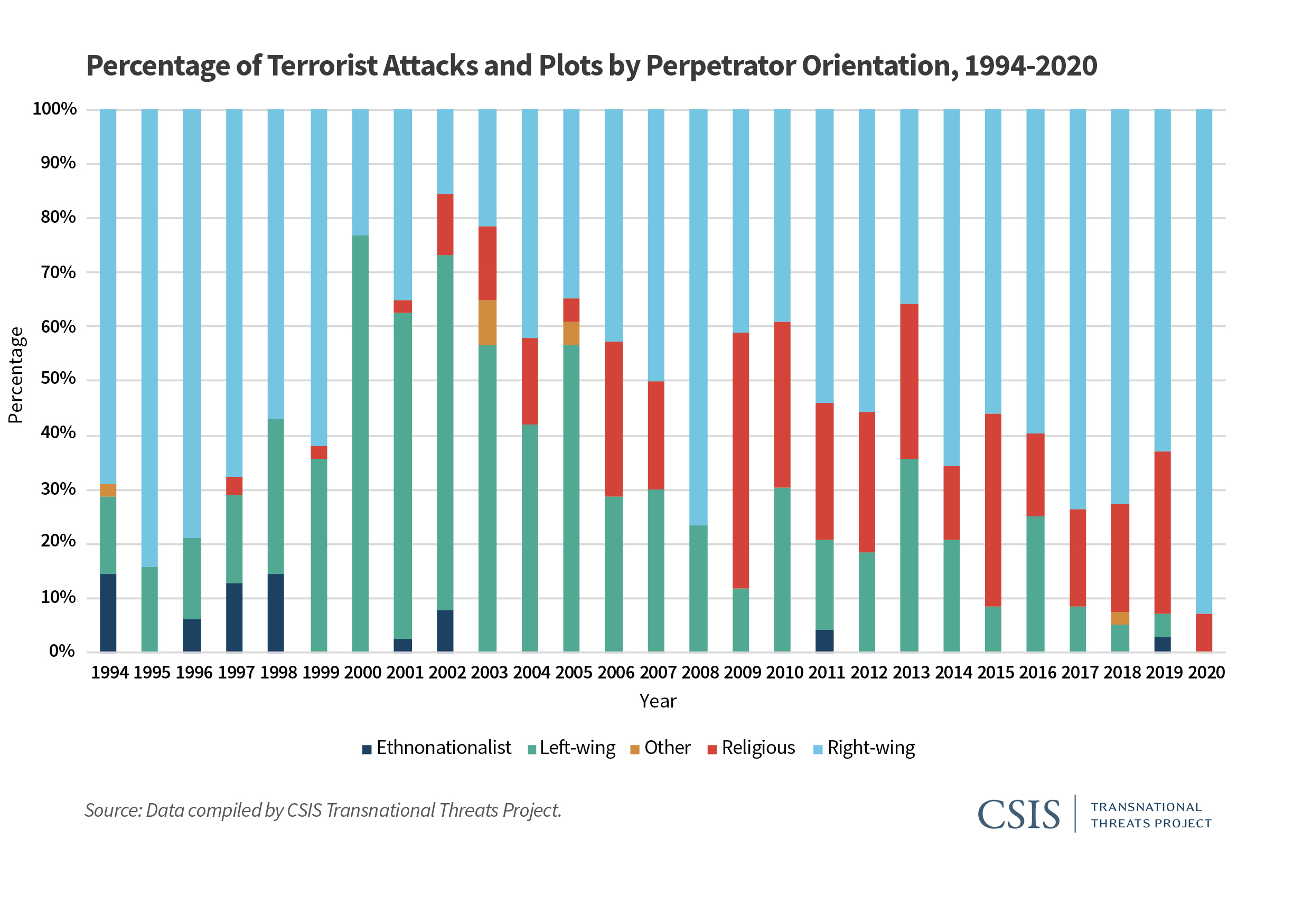
Stacked bar plots (charts) are a very useful data visualization type…when used correctly. In an otherwise excellent report on the “Escalating Terrorism Problem in the United States” from the Center for Strategic and International Studies, there is a problematic stacked bar chart (actually, a stacked percentage chart) that should have been replaced by a grouped bar chart (or something else). Here is the, in my opinion, problematic chart:
The reason I believe this chart is problematic is because the chart could potentially obscure the nature (and trend) of the underlying data. The chart above is consistent with any number of underlying data patterns. Just as an example, let’s look at 2019 and 2020. We have the following percentage breakdown over the two years:
Type of Violence
2019
2020
Ethnonationalist
3%
0%
Left-wing
4%
0%
Other
0%
0%
Religious
30%
7%
Right-wing
63%
93%
While it is obvious that ethnonationalist, and left-wing, violence have decreased (they are 0% in 2020), it is not clear whether right-wing and religious violence have increased, or decreased absolutely. Does right-wing violence in 2020 comprise 93% of 14 acts of terrorist violence? Or is it 93% of 200 acts of terrorist violence? We don’t know. To be fair to the authors of the report, they do provide a breakdown in absolute numbers later in the report. Still, I believe that a more appropriate use of a stacked bar/percentage chart is when the absolute number of instances is (relatively) static over the time/area of comparison.
Here’s an example from college football. The Pacific-12 conference has two divisions–North, and South. Every year each of the 6 teams in each division plays against 4 of the teams in the other division, for a total of 24 inter-divisional games every year. In addition, there is a PAC12 Championship Game, which pits the winner of each of the two divisions against each other at the end of the year. Therefore, there are 25 total inter-divisional PAC12 football games every year. A stacked percentage chart can be used to gauge the relative winning percentages of the two divisions against each other since the establishment of the PAC12 conference in 2011 (when Utah and Colorado were added).
Created by Josip Dasović
Here, each of the years refers to a total of 25 inter-divisional games. We can easily see the nature of the quality of the respective divisions by comparing the percentage of games won by each (over the other) between the years 2011 and 2019. We see that the North (which, by the way produced 8 of the 9 PAC12 champions during this period) has generally been stronger. In 6 of the 9 years, the North won a greater percentage of the inter-divisional games than did the South. And even in those years where the South won a greater percentage of the inter-divisional games, it wasn’t a much greater percentage.
So, use stacked percentage charts only when it is appropriate.
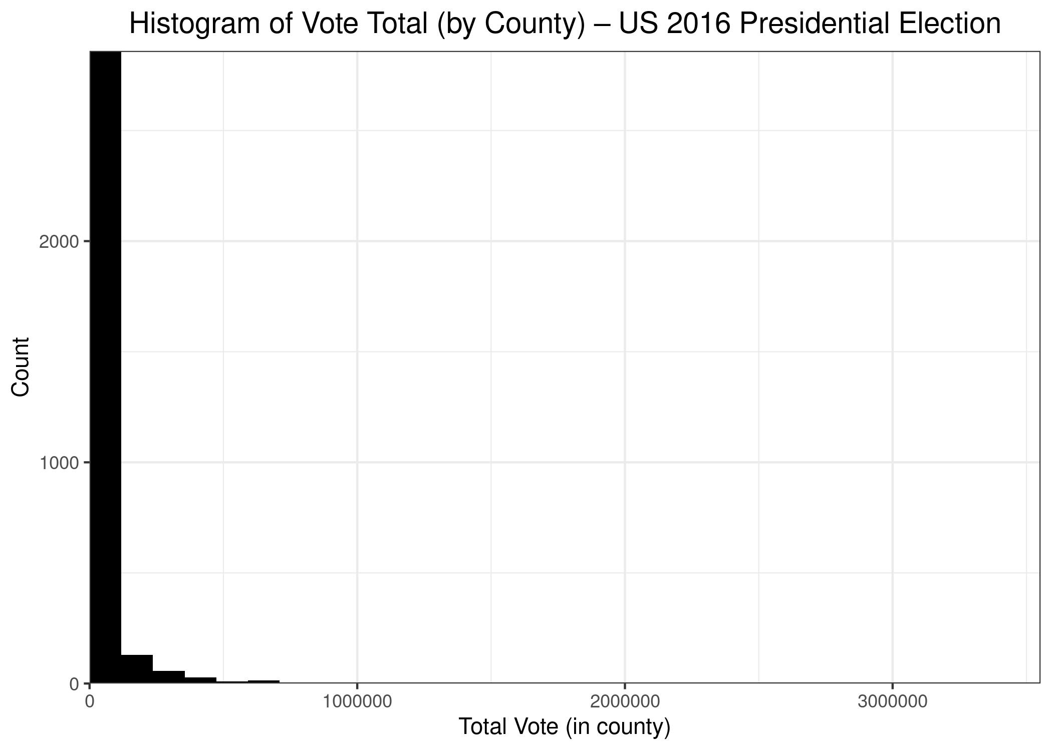
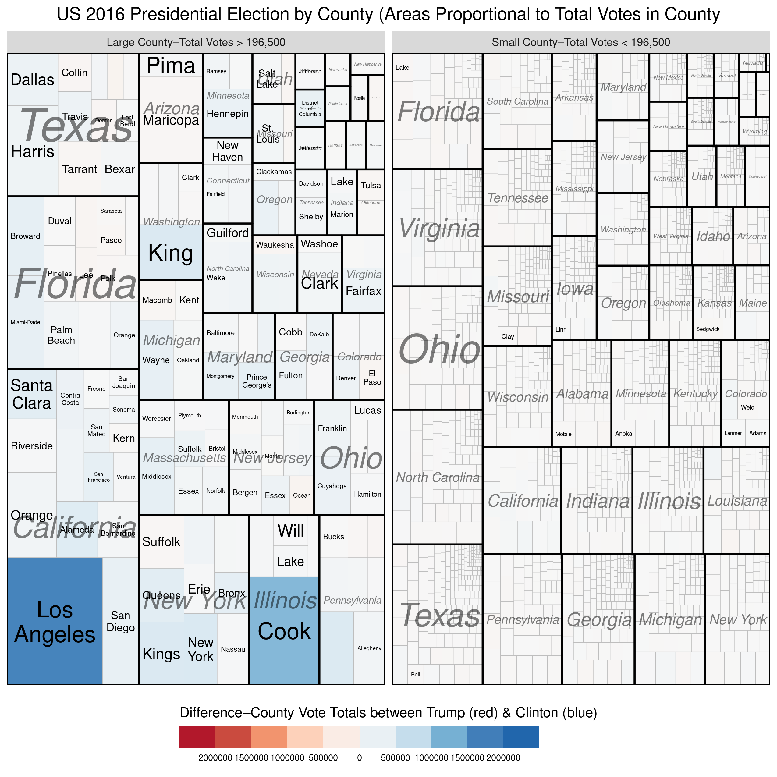
A quick addendum to my last post using treemaps to begin the new year. As a reminder, I drew a couple of treemaps that showed the distribution of votes across US counties during the 2016 Presidential Election(s). There are more than 3,200 counties in the USA, and the vast majority of them have low populations. In fact, under 200 counties (or less than 7%) contain more than half of the population. That means that the other 3,000 counties comprise about 50% of the population. In short,, the distribution of people (and, therefore, of voters) is highly skewed. In fact, here’s a bonus chart–a histogram of US counties by population.
As we can see, the vast majority of counties have small populations, while a few counties have very large populations, including Los Angeles County, in which almost 3.5 million persons voted. The counties with large populations are so few in number that we can’t even see them on the chart. A count of 1 on the chart (y-axis) is a vertical distance that isn’t even 1 pixel in size, so it doesn’t show up on the graph.
I’ve updated one of the treemaps from my previous post slightly to help reinforce the disparity in population size between the largest counties and the rest. In the treemap below, I’ve divided the counties into two groups–the largest counties versus the rest so that each group comprises 50% of the total votes cast. We see again, that a small number of counties (154 to be exact) combined to produce as many votes as the remaining ~3000 counties. Once again, we see that the counties won by Trump were, on average, so small that they there is not even a hint of red on the map. Here’s the treemap, with the R code below:
While we’re still waiting on the availability of official county-level results 2020 the 2020 US Presidential Elections*, I thought I’d create a treemap of the county-level results from the 2016 election. You may be thinking to yourself, “What is a treemap?”
Treemaps are ideal for displaying large amounts of hierarchically structured (tree-structured) data. The space in the visualization is split up into rectangles that are sized and ordered by a quantitative variable.
Treemaps, therefore, can help us visualize the relationships within our quantitative data in a unique, visually-pleasing, and meaningfully effective manner. Let’s see how with the example of the US 2016 Presidential Election.
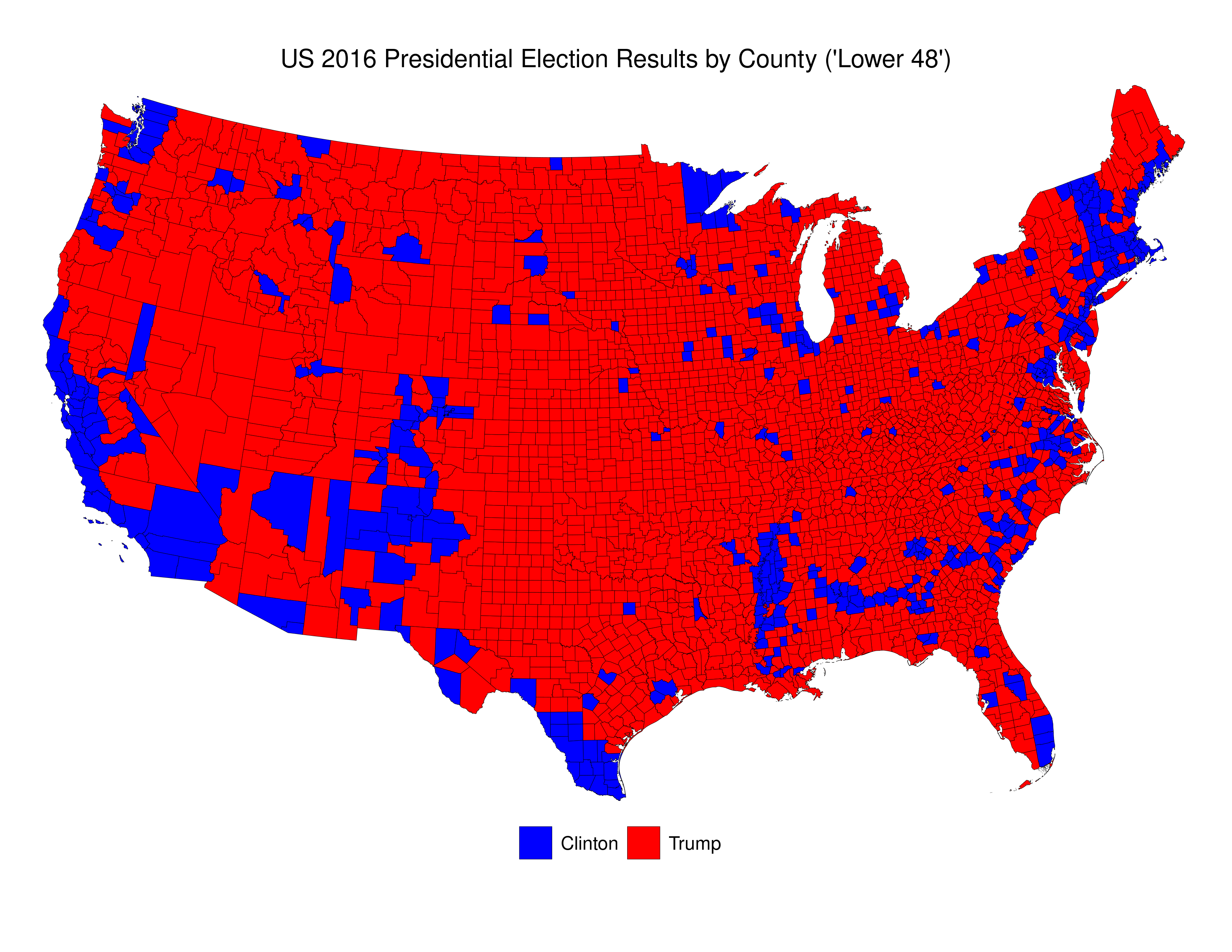
Here’s a picture of then newly-elected President Donald Trump looking at a map given to him by his advisers depicting the results of the 2016 election. This specific depiction of the results overstates the extent of the support across the USA for Trump in the 2016 election. As those in the know often say “land mass does not vote.” Indeed, if one were ignorant about US politics, and US political demography, looking at that map one would be most likely be perplexed were one told that the “blue” candidate actually won 3 million more votes than did the “red” candidate.
Here is my reproduction of these data\2013using publicly-available data from MIT Election Data and Science Lab, 2018, “County Presidential Election Returns 2000-2016”, https://doi.org/10.7910/DVN/VOQCHQ, Harvard Dataverse, V6, UNF:6:ZZe1xuZ5H2l4NUiSRcRf8Q== [fileUNF]. I’ve added the R-code at the end of this post.
We can see that the vast majority of counties are small, and that voters in these counties were more likely to have voted for Trump than for Clinton. Indeed, Clinton win fewer than 16% of all counties.
The problem with this map is that it essentially dichotomizes quantitative data into qualitative data. To be precise, the decision whether to colour a county blue or red is made simply on the basis of whether, of those who voted, more voted for Trump, or for Clinton. If a county voted 51-50 for Trump, it gets a red colour. If a county voted 1,000,000-100,000 for Clinton it gets coloured blue. And, to make things even more confusing, the total of red that each county receives is related ONLY to country land area, and doesn’t take account of the number of voters.
As is the case in many parts of the world today, the US is increasingly split demographically\u2013with those living in rural areas (and suburbs/exurbs) voting for the conservative parties (Republican) and those in the urban areas voting for liberal parties (Democratic). We see this clearly in the map above. The problem with US counties is that they are not uniform either in terms of their land area, or their population. There are apartment buildings in New York City and Los Angeles that have more residents than some counties.
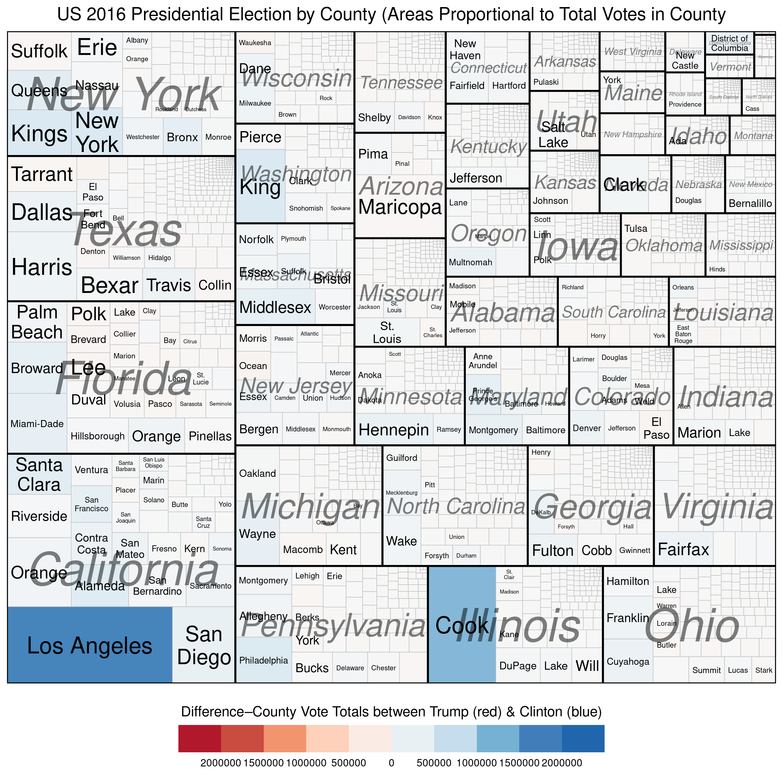
We can use treemaps to more “accurately” depict electoral outcomes. By accurately, I mean that the visual representation of the data more closely reflects how many voted for each candidate (party).
The first example below represents the vote at the county level and describes two quantitative variables. The size of each rectangle represents the total number of voters in each county\u2013the larger the rectangle the greater the numbers of voters in that county. The second variable, which is mapped using the colour scale, represents the difference\u2013in raw vote totals between the two candidates. Reddish shades denote a county that was won by Trump, while bluish shades represent counties won by Clinton.
There are a couple of things to notice. First, the wide disparity in the total number of voters across the counties. Second, we see that most of the counties have shades that are only very lightly blue (or red) and look mostly white. This is because the range on the variable must be so expansive in order to include outliers like Los Angeles and Cook Counties. Thus, in the vast majority of US counties the raw vote total differences between Trump’s totals and Clinton’s totals are in the 1000s range. This is why Trump was able to win more than 84% of US counties and still lose the popular vote by more than 3 million.
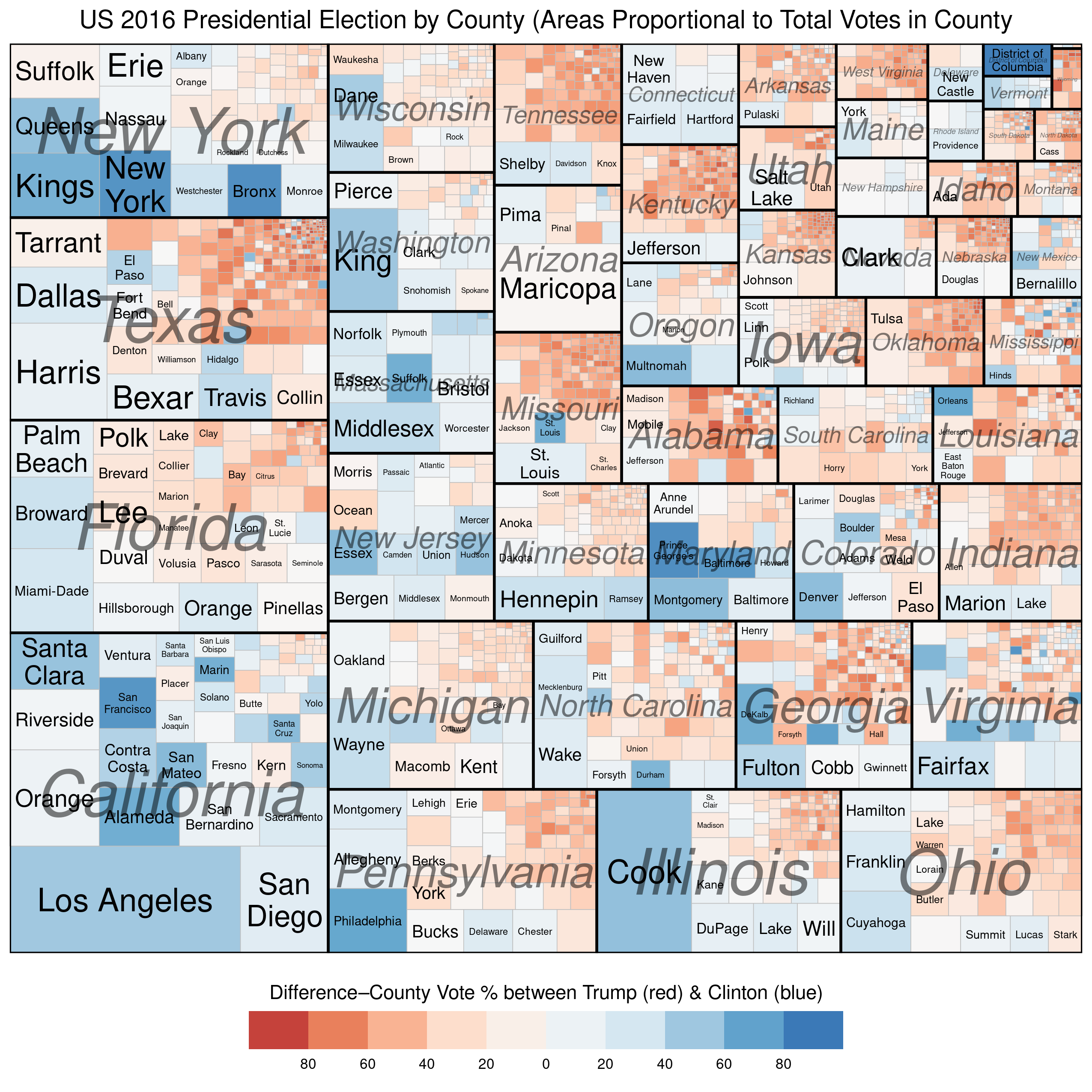
Our next (and final) treemap is similar to the one above except that the scale for the colouring is not the raw vote difference between Trump and Clinton in each county, but the percentage-point differential in vote between the two candidates.
We see much more red and blue in this map because the scale is confined to 100% Trump win to 100% Clinton win. Notice the striking disparity in where the blue and red colours, respectively, are found. The reddish shades dominate in small-population counties (in the top-right corner of each state subgroup), while the bluish shades dominate in large-population counties (in the bottom-left corners of each state subgroup). Finally, the larger (greater population) counties tend be be much smaller geographically than the less-populous counties, which is why the map on Trump’s desk looks like it does.
R Code for treemaps: (this is vote the “total vote” variable. Replace that variable with a “percentage-vote” variable–with appropriate limits and breaks (-100,100) because you are now working with percentages).
* The electoral process that determines who becomes president of the United States is complicated. In effect, it is a series of elections that are run by individual states, and not a single federally-run election like it is in most presidential systems.
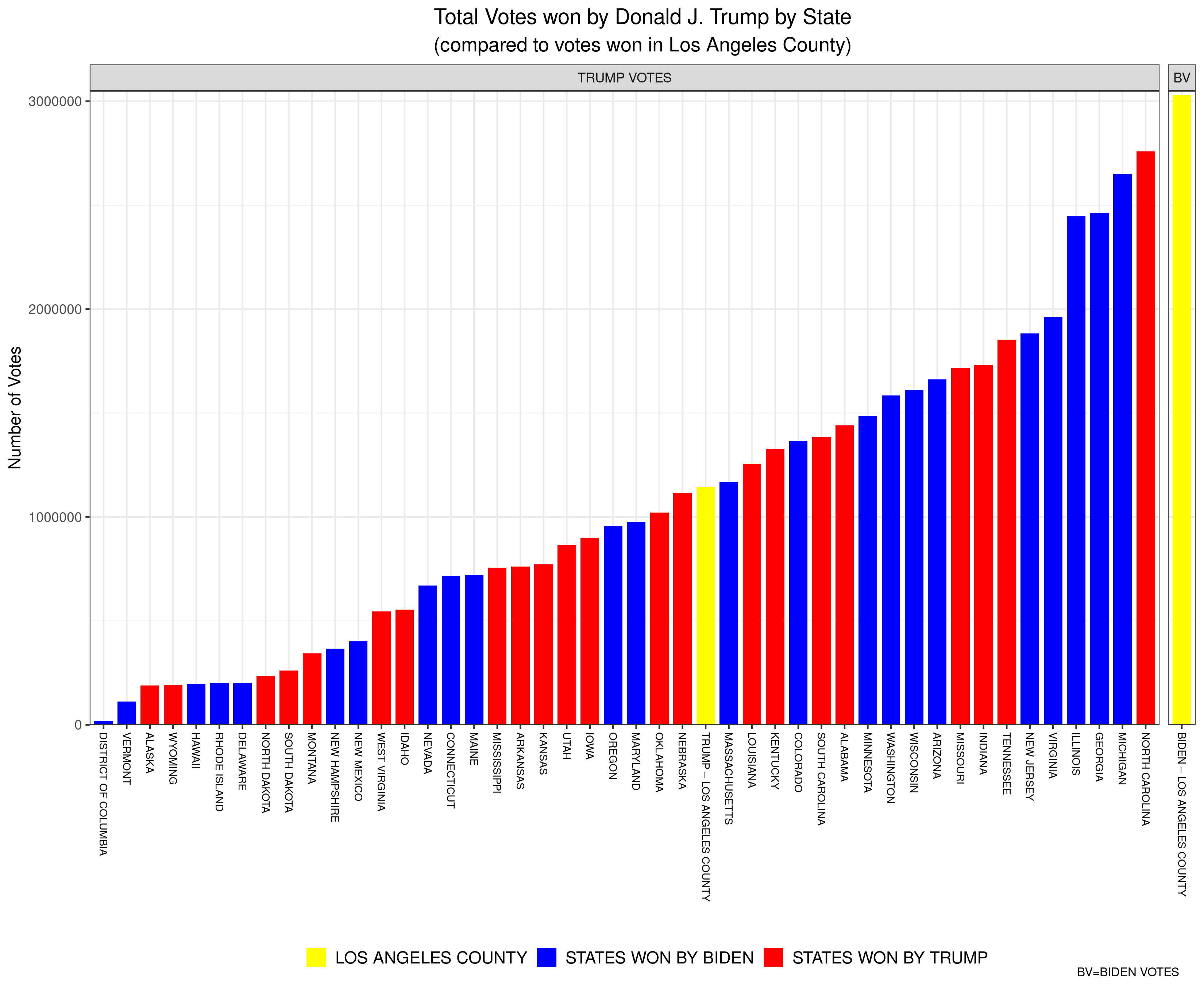
The inspiration (so to speak) for this latest instalment of my Data Visualization series is a meme that I have been seeing spread across social media in the wake of the recent US Presidential Election. The meme, in essence, notes that numer of US counties (there are over 3000) that were “won” by the incumbent, Donald J. Trump. Indeed, it seems as though the challenger, Joe Biden, ironically won the most votes of any US Presidential candidate in US history while simultaneously having “won” the lowest percentage of counties (about 17%) of any winner of the Presidency ever.
Why did I place “won” in quotation marks? Two reasons: first, I am assuming that the authors of this meme suggest that Trump “won” these counties by having won (at least) a plurality of the vote in each. Which, I suppose, is true. The more important reason that I put “won” in quotation marks above is because US counties are effectively meaningless when it comes to determining who wins the US Presidency. They are only important insofar as receiving more votes than one’s opponent in any individual county helps increase the odds of winning what is important–a plurality of the vote in any individual state (or in Congressional Districts in the cases of Nebraska and Maine). Counties have no official weight when determining electoral college votes, and it doesn’t matter how many counties a candidate wins, as long as they reach at least 270 electoral votes. Counties in the USA vary in population from fewer than 100 (Kalawao County in Hawaii) to over 10,000,000 (Los Angeles County in California). So, discussing who “won” more counties is essentially meaningless.
Here’s an example of how absurd referring to counties won becomes. The aforementioned Los Angeles County is a county that Joe Biden handily “won” in November, by a margin of 72.5% to 27.5% for Donald Trump. In short, Trump was walloped by Biden in LA County. Yet, when you compare Trump’s vote in LA County (about 1.15 million) to his total vote in all of the states (and DC) it might shock you to learn that Trump won more votes in LA County than he won in 25 individual states (and in DC). For example, Trump won more total votes in LA County (which, remember, he lost 72.5%-27.5%) than he won in the state of Oklahoma, where he won all 6 Electoral College votes. Moreover, Biden won more votes in LA County alone than Donald Trump won in each of all but three states–Florida, Texas, and Ohio. To be clear, for example, Biden won more total votes in LA County (which, alone, didn’t win him a single Electoral College vote) than Trump won in North Carolina (for which Trump won 15 Electoral College votes).
Here is a bar plot that I’ve created to visualize these data (click on the image to open a larger version). The yellow bar at the far-right represents the number of votes won by Biden in LA County (just over 3 million). The other yellow bar represents the votes won by Trump in LA Country (just over 1 million). Every other bar is the number of votes won by Trump in each of the states (and DC) listed below (Texas, Ohio, and Florida are missing because Trump won more votes in each of those states than Biden won in LA County). The red bars are states won by Trump, while the blue bars represent states won by Biden. Remember, each of the bars (except for the one on the far-right) represent the number of votes Donald Trump won in that state (and LA County).
At the end of Data Visualization # 4 I promised to look at a couple of alternative solutions to the problem of outliers in our data. I’ll have to do so in my next data visualization (#6) because I’d like to take some time to chart some data that I have been interested in for a while and was made more topical by some comments unearthed a few days ago that were made by the leader of Canada’s federal Conservative Party, Erin O’Toole on the issue of the history of residential schools in Canada. These schools were created for the various peoples of the Canada First Nations’ and have a long and sordid history. If you are interested in learning more, here is the final report of Canada’s Truth and Reconciliation Commission.
I wanted to use a chart that is in the PDF version of that report as the basis for plotting the chart described above. Here is the original.
I was unable to find the raw data, so I had to do some work in R to extract the data from the line in the image. There are some great R packages (magick, and tidyverse) that can be used to help you with this task should the need arise. See here for an example.
Using the following code, I was able to reproduce fairly accurately the line i the graph above.
library(tidyverse)
library(magick)

im <- image_read("residential_schools_new.jpg")

## This saturates the pic to highlight the darkest lines
im_proc <- im %>% image_channel("saturation")


## This gets rid of things that are far enough away from black--play around with the %

im_proc2 <- im_proc %>% image_threshold("white", "80%")

## Finally, invert (negate) the image so that what we want to keep is white.

im_proc3 <- im_proc2 %>% image_negate()

## Now to extract the data.

dat <- image_data(im_proc3)[1,,] %>%
  as.data.frame() %>%
  mutate(Row = 1:nrow(.)) %>%
  select(Row, everything()) %>%
  mutate_all(as.character) %>%
  gather(key = Column, value = value, 2:ncol(.)) %>%
  mutate(Column = as.numeric(gsub("V", "", Column)),
         Row = as.numeric(Row),
         value = ifelse(value == "00", NA, 1)) %>%
  filter(!is.na(value))

# Eliminate duplicate rows.

dat <- subset(dat, !duplicated(Row))  # Get rid of duplicate rows
Here’s the initial result, using the ggplot2 package.
It’s a fairly accurate re-creation of the chart above, don’t you think? After some cleaning up of the data and adding data on Primer Ministerial terms during Canada’s history since 1867, we get the completed result (with R code below).
We can see that there was an initial period of Canada’s history during which the number of schools operating increased. This period stopped with the First World War. Then there was a period of relative stabilization thereafter (some increase, then decrease through the 1940s and early 1950s, and then there was about a 10-year increase that began with Liberal Prime Minister Louis St. Laurent, and continued under Conservative Prime Minister John Diefenbaker and Liberal Prime Minister Lester B. Pearson, during whose time in power the number of residential schools topped out. Upon the ascension to power of Liberal Prime Minister Pierre Elliot Trudeau, the number of residential schools began a drastic decline, which continued under subsequent Prime Ministers.
EDIT: After reading the initial report more closely, it looks like the end point of the original chart is meant to be 1998, not 1999, so I’ve recreated the chart with that updated piece of information. Nothing changed, although it seems like the peak in the number of schools operating at any point in time was in about 1964, not a couple of years later as it had seemed. Here’s an excerpt from the report, in a section heading entitled Expansion and Decline:
From the 1880s onwards, residential school enrolment climbed annually. According to federal government annual reports, the peak enrolment of 11,539 was reached in the 1956–57 school year.144 (For trends, see Graph 1.) Most of the residential schools were located in the northern and western regions of the country. With the exception of Mount Elgin and the Mohawk Institute, the Ontario schools were all in northern or northwestern Ontario. The only school in the Maritimes did not open until 1930.145 Roman Catholic and Anglican missionaries opened the first two schools in Québec in the early 1930s.146 It was not until later in that decade that the federal government began funding these schools.147
From the 1880s onwards, residential school enrolment climbed annually. According to federal government annual reports, the peak enrolment of 11,539 was reached in the 1956–57 school year.144 (For trends, see Graph 1.) Most of the residential schools were located in the northern and western regions of the country. With the exception of Mount Elgin and the Mohawk Institute, the Ontario schools were all in northern or northwestern Ontario. The only school in the Maritimes did not open until 1930.145 Roman Catholic and Anglican missionaries opened the first two schools in Québec in the early 1930s.146 It was not until later in that decade that the federal government began funding these schools.147
The number of schools began to decline in the 1940s. Between 1940 and 1950, for example, ten school buildings were destroyed by fire.148 As Graph 2 illustrates, this decrease was reversed in the mid-1950s, when the federal department of Northern Affairs and National Resources dramatically expanded the school system in the Northwest Territories and northern Québec. Prior to that time, residential schooling in the North was largely restricted to the Yukon and the Mackenzie Valley in the Northwest Territories. Large residences were built in communities such as Inuvik, Yellowknife, Whitehorse, Churchill, and eventually Iqaluit (formerly Frobisher Bay). This expansion was undertaken despite reports that recommended against the establishment of residential schools, since they would not provide children with the skills necessary to live in the North, skills they otherwise would have acquired in their home communities.149 The creation of the large hostels was accompanied by the opening of what were termed “small hostels” in the smaller and more remote communities of the eastern Arctic and the western Northwest Territories.
Honouring the Truth, Reconciling for the Future: Summary of the Final Report of the Truth and Reconciliation Commission of Canada https://web-trc.ca/
A couple of final notes: one can easily see (visualize) from this chart the domination of Liberal Party rule during the 20th century. Second, how many of you knew that there had been a couple of coalition governments in the early 20th century?


You must be logged in to post a comment.