At the end of Data Visualization # 4 I promised to look at a couple of alternative solutions to the problem of outliers in our data. I’ll have to do so in my next data visualization (#6) because I’d like to take some time to chart some data that I have been interested in for a while and was made more topical by some comments unearthed a few days ago that were made by the leader of Canada’s federal Conservative Party, Erin O’Toole on the issue of the history of residential schools in Canada. These schools were created for the various peoples of the Canada First Nations’ and have a long and sordid history. If you are interested in learning more, here is the final report of Canada’s Truth and Reconciliation Commission.
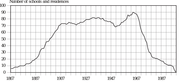
I wanted to use a chart that is in the PDF version of that report as the basis for plotting the chart described above. Here is the original.
I was unable to find the raw data, so I had to do some work in R to extract the data from the line in the image. There are some great R packages (magick, and tidyverse) that can be used to help you with this task should the need arise. See here for an example.
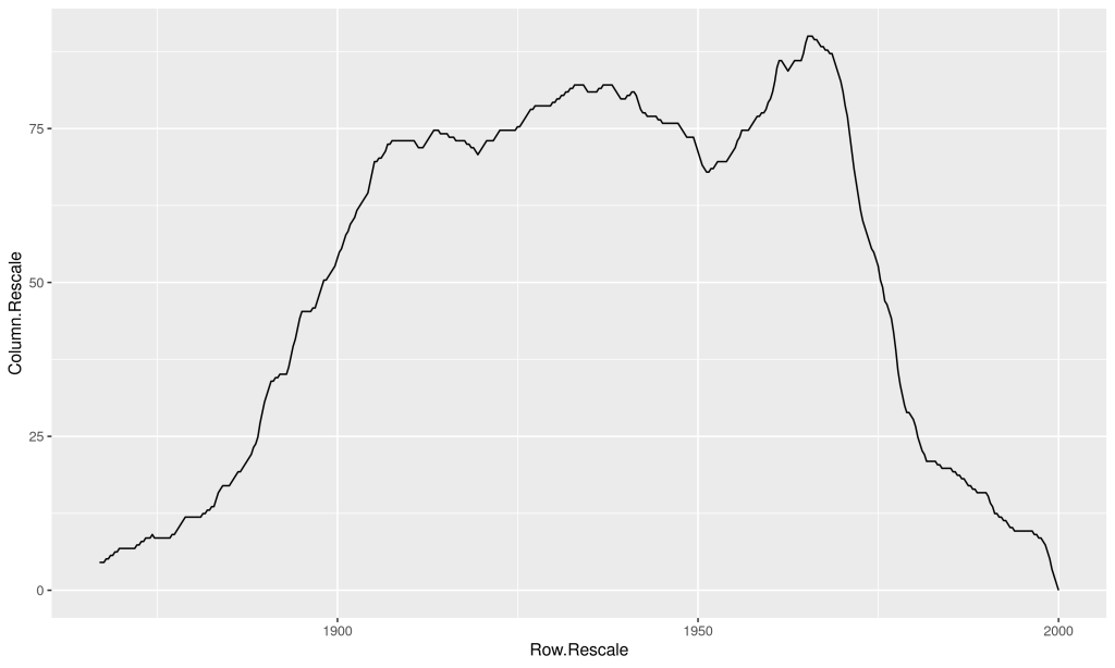
Using the following code, I was able to reproduce fairly accurately the line i the graph above.
library(tidyverse)
library(magick)

im <- image_read("residential_schools_new.jpg")

## This saturates the pic to highlight the darkest lines
im_proc <- im %>% image_channel("saturation")


## This gets rid of things that are far enough away from black--play around with the %

im_proc2 <- im_proc %>% image_threshold("white", "80%")

## Finally, invert (negate) the image so that what we want to keep is white.

im_proc3 <- im_proc2 %>% image_negate()

## Now to extract the data.

dat <- image_data(im_proc3)[1,,] %>%
  as.data.frame() %>%
  mutate(Row = 1:nrow(.)) %>%
  select(Row, everything()) %>%
  mutate_all(as.character) %>%
  gather(key = Column, value = value, 2:ncol(.)) %>%
  mutate(Column = as.numeric(gsub("V", "", Column)),
         Row = as.numeric(Row),
         value = ifelse(value == "00", NA, 1)) %>%
  filter(!is.na(value))

# Eliminate duplicate rows.

dat <- subset(dat, !duplicated(Row))  # Get rid of duplicate rows
Here’s the initial result, using the ggplot2 package.
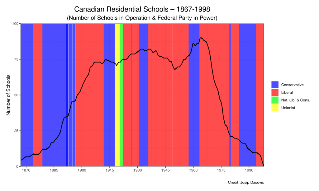
It’s a fairly accurate re-creation of the chart above, don’t you think? After some cleaning up of the data and adding data on Primer Ministerial terms during Canada’s history since 1867, we get the completed result (with R code below).
We can see that there was an initial period of Canada’s history during which the number of schools operating increased. This period stopped with the First World War. Then there was a period of relative stabilization thereafter (some increase, then decrease through the 1940s and early 1950s, and then there was about a 10-year increase that began with Liberal Prime Minister Louis St. Laurent, and continued under Conservative Prime Minister John Diefenbaker and Liberal Prime Minister Lester B. Pearson, during whose time in power the number of residential schools topped out. Upon the ascension to power of Liberal Prime Minister Pierre Elliot Trudeau, the number of residential schools began a drastic decline, which continued under subsequent Prime Ministers.
EDIT: After reading the initial report more closely, it looks like the end point of the original chart is meant to be 1998, not 1999, so I’ve recreated the chart with that updated piece of information. Nothing changed, although it seems like the peak in the number of schools operating at any point in time was in about 1964, not a couple of years later as it had seemed. Here’s an excerpt from the report, in a section heading entitled Expansion and Decline:
From the 1880s onwards, residential school enrolment climbed annually. According to federal government annual reports, the peak enrolment of 11,539 was reached in the 1956–57 school year.144 (For trends, see Graph 1.) Most of the residential schools were located in the northern and western regions of the country. With the exception of Mount Elgin and the Mohawk Institute, the Ontario schools were all in northern or northwestern Ontario. The only school in the Maritimes did not open until 1930.145 Roman Catholic and Anglican missionaries opened the first two schools in Québec in the early 1930s.146 It was not until later in that decade that the federal government began funding these schools.147
From the 1880s onwards, residential school enrolment climbed annually. According to federal government annual reports, the peak enrolment of 11,539 was reached in the 1956–57 school year.144 (For trends, see Graph 1.) Most of the residential schools were located in the northern and western regions of the country. With the exception of Mount Elgin and the Mohawk Institute, the Ontario schools were all in northern or northwestern Ontario. The only school in the Maritimes did not open until 1930.145 Roman Catholic and Anglican missionaries opened the first two schools in Québec in the early 1930s.146 It was not until later in that decade that the federal government began funding these schools.147
The number of schools began to decline in the 1940s. Between 1940 and 1950, for example, ten school buildings were destroyed by fire.148 As Graph 2 illustrates, this decrease was reversed in the mid-1950s, when the federal department of Northern Affairs and National Resources dramatically expanded the school system in the Northwest Territories and northern Québec. Prior to that time, residential schooling in the North was largely restricted to the Yukon and the Mackenzie Valley in the Northwest Territories. Large residences were built in communities such as Inuvik, Yellowknife, Whitehorse, Churchill, and eventually Iqaluit (formerly Frobisher Bay). This expansion was undertaken despite reports that recommended against the establishment of residential schools, since they would not provide children with the skills necessary to live in the North, skills they otherwise would have acquired in their home communities.149 The creation of the large hostels was accompanied by the opening of what were termed “small hostels” in the smaller and more remote communities of the eastern Arctic and the western Northwest Territories.
Honouring the Truth, Reconciling for the Future:
Summary of the Final Report of the Truth and Reconciliation Commission of Canada https://web-trc.ca/
A couple of final notes: one can easily see (visualize) from this chart the domination of Liberal Party rule during the 20th century. Second, how many of you knew that there had been a couple of coalition governments in the early 20th century?
Here is the R code for the final chart:
gg.res.schools <- ggplot(data=dat) +
  labs(title = "Canadian Residential Schools \u2013 1867-1999",
       subtitle="(Number of Schools in Operation & Federal Party in Power)",
       y = ("Number of Schools"), x = " ") +
  geom_line(aes(x=Row.Rescale, y=Column.Rescale), color='black', lwd=0.75)  +
  scale_y_continuous(expand = c(0,0), limits=c(0,100)) +
  scale_x_continuous(limits=c(1866,2000)) +
  geom_rect(data=pm.df,
            mapping=aes(xmin=Date_Begin.1, xmax=Date_End.1,
                        ymin=rep(0,25), ymax=rep(100,25), fill=Government)) +
              scale_fill_manual(values = alpha(c("blue", "red", "green", "yellow"), .6)) +
  theme_bw() +
  theme(legend.title=element_blank(),
        plot.title = element_text(hjust = 0.5, size=16),
        plot.subtitle = element_text(hjust= 0.5, size=13),
        axis.text.y = element_text(size = 8))

gg.res.final.plot <- gg.res.schools + geom_line(aes(x=Row.Rescale, y=Column.Rescale), color='black', lwd=0.75, data=dat)


You must be logged in to post a comment.