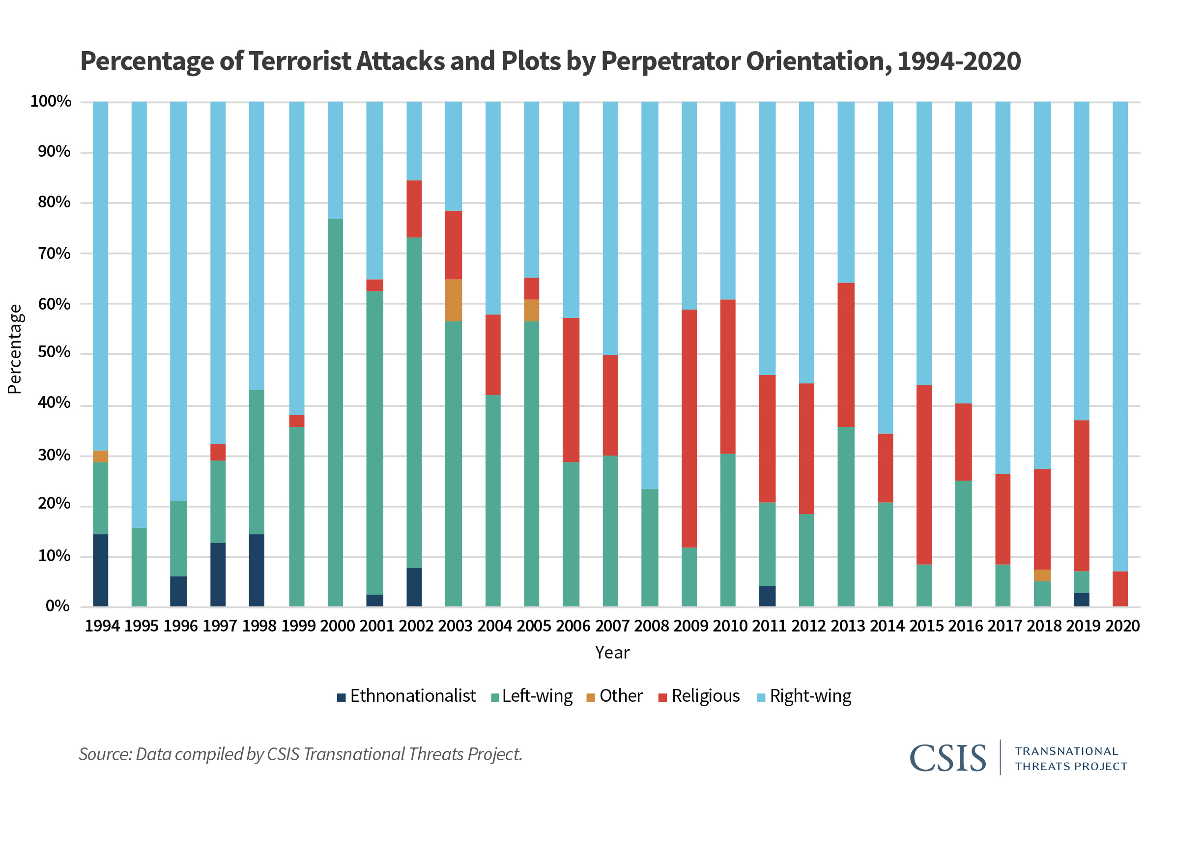
Stacked bar plots (charts) are a very useful data visualization type…when used correctly. In an otherwise excellent report on the “Escalating Terrorism Problem in the United States” from the Center for Strategic and International Studies, there is a problematic stacked bar chart (actually, a stacked percentage chart) that should have been replaced by a grouped bar chart (or something else). Here is the, in my opinion, problematic chart:
The reason I believe this chart is problematic is because the chart could potentially obscure the nature (and trend) of the underlying data. The chart above is consistent with any number of underlying data patterns. Just as an example, let’s look at 2019 and 2020. We have the following percentage breakdown over the two years:
Type of Violence
2019
2020
Ethnonationalist
3%
0%
Left-wing
4%
0%
Other
0%
0%
Religious
30%
7%
Right-wing
63%
93%
While it is obvious that ethnonationalist, and left-wing, violence have decreased (they are 0% in 2020), it is not clear whether right-wing and religious violence have increased, or decreased absolutely. Does right-wing violence in 2020 comprise 93% of 14 acts of terrorist violence? Or is it 93% of 200 acts of terrorist violence? We don’t know. To be fair to the authors of the report, they do provide a breakdown in absolute numbers later in the report. Still, I believe that a more appropriate use of a stacked bar/percentage chart is when the absolute number of instances is (relatively) static over the time/area of comparison.
Here’s an example from college football. The Pacific-12 conference has two divisions–North, and South. Every year each of the 6 teams in each division plays against 4 of the teams in the other division, for a total of 24 inter-divisional games every year. In addition, there is a PAC12 Championship Game, which pits the winner of each of the two divisions against each other at the end of the year. Therefore, there are 25 total inter-divisional PAC12 football games every year. A stacked percentage chart can be used to gauge the relative winning percentages of the two divisions against each other since the establishment of the PAC12 conference in 2011 (when Utah and Colorado were added).
Created by Josip Dasović
Here, each of the years refers to a total of 25 inter-divisional games. We can easily see the nature of the quality of the respective divisions by comparing the percentage of games won by each (over the other) between the years 2011 and 2019. We see that the North (which, by the way produced 8 of the 9 PAC12 champions during this period) has generally been stronger. In 6 of the 9 years, the North won a greater percentage of the inter-divisional games than did the South. And even in those years where the South won a greater percentage of the inter-divisional games, it wasn’t a much greater percentage.
So, use stacked percentage charts only when it is appropriate.
While we’re still waiting on the availability of official county-level results 2020 the 2020 US Presidential Elections*, I thought I’d create a treemap of the county-level results from the 2016 election. You may be thinking to yourself, “What is a treemap?”
Treemaps are ideal for displaying large amounts of hierarchically structured (tree-structured) data. The space in the visualization is split up into rectangles that are sized and ordered by a quantitative variable.
Treemaps, therefore, can help us visualize the relationships within our quantitative data in a unique, visually-pleasing, and meaningfully effective manner. Let’s see how with the example of the US 2016 Presidential Election.
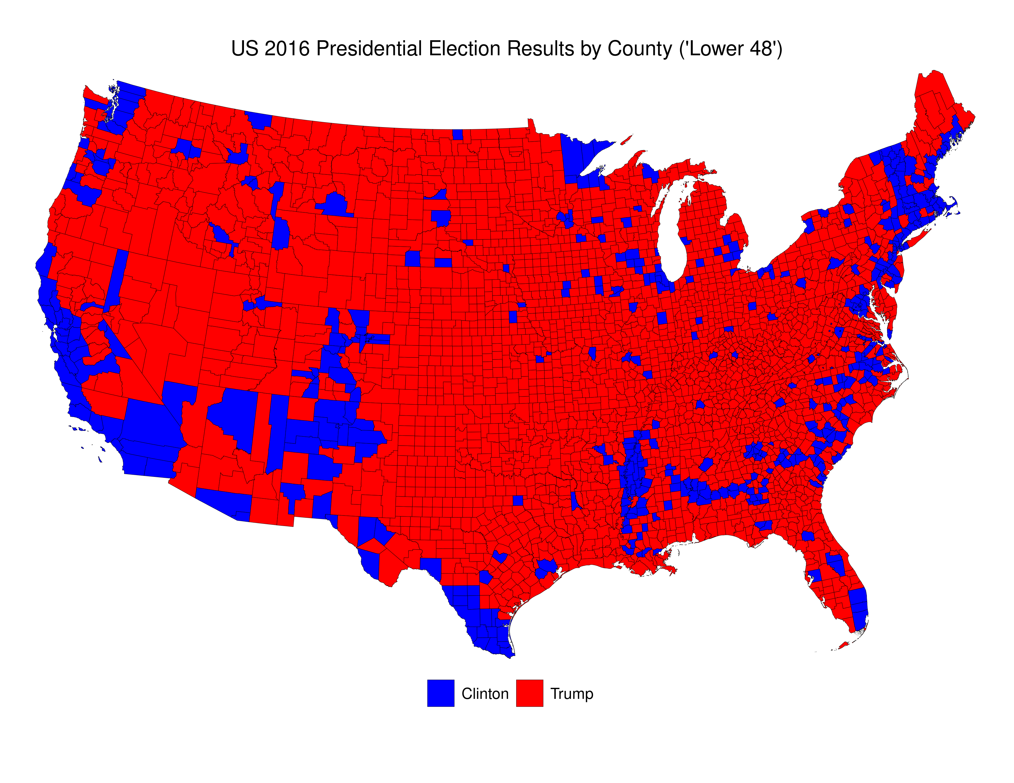
Here’s a picture of then newly-elected President Donald Trump looking at a map given to him by his advisers depicting the results of the 2016 election. This specific depiction of the results overstates the extent of the support across the USA for Trump in the 2016 election. As those in the know often say “land mass does not vote.” Indeed, if one were ignorant about US politics, and US political demography, looking at that map one would be most likely be perplexed were one told that the “blue” candidate actually won 3 million more votes than did the “red” candidate.
Here is my reproduction of these data\2013using publicly-available data from MIT Election Data and Science Lab, 2018, “County Presidential Election Returns 2000-2016”, https://doi.org/10.7910/DVN/VOQCHQ, Harvard Dataverse, V6, UNF:6:ZZe1xuZ5H2l4NUiSRcRf8Q== [fileUNF]. I’ve added the R-code at the end of this post.
We can see that the vast majority of counties are small, and that voters in these counties were more likely to have voted for Trump than for Clinton. Indeed, Clinton win fewer than 16% of all counties.
The problem with this map is that it essentially dichotomizes quantitative data into qualitative data. To be precise, the decision whether to colour a county blue or red is made simply on the basis of whether, of those who voted, more voted for Trump, or for Clinton. If a county voted 51-50 for Trump, it gets a red colour. If a county voted 1,000,000-100,000 for Clinton it gets coloured blue. And, to make things even more confusing, the total of red that each county receives is related ONLY to country land area, and doesn’t take account of the number of voters.
As is the case in many parts of the world today, the US is increasingly split demographically\u2013with those living in rural areas (and suburbs/exurbs) voting for the conservative parties (Republican) and those in the urban areas voting for liberal parties (Democratic). We see this clearly in the map above. The problem with US counties is that they are not uniform either in terms of their land area, or their population. There are apartment buildings in New York City and Los Angeles that have more residents than some counties.
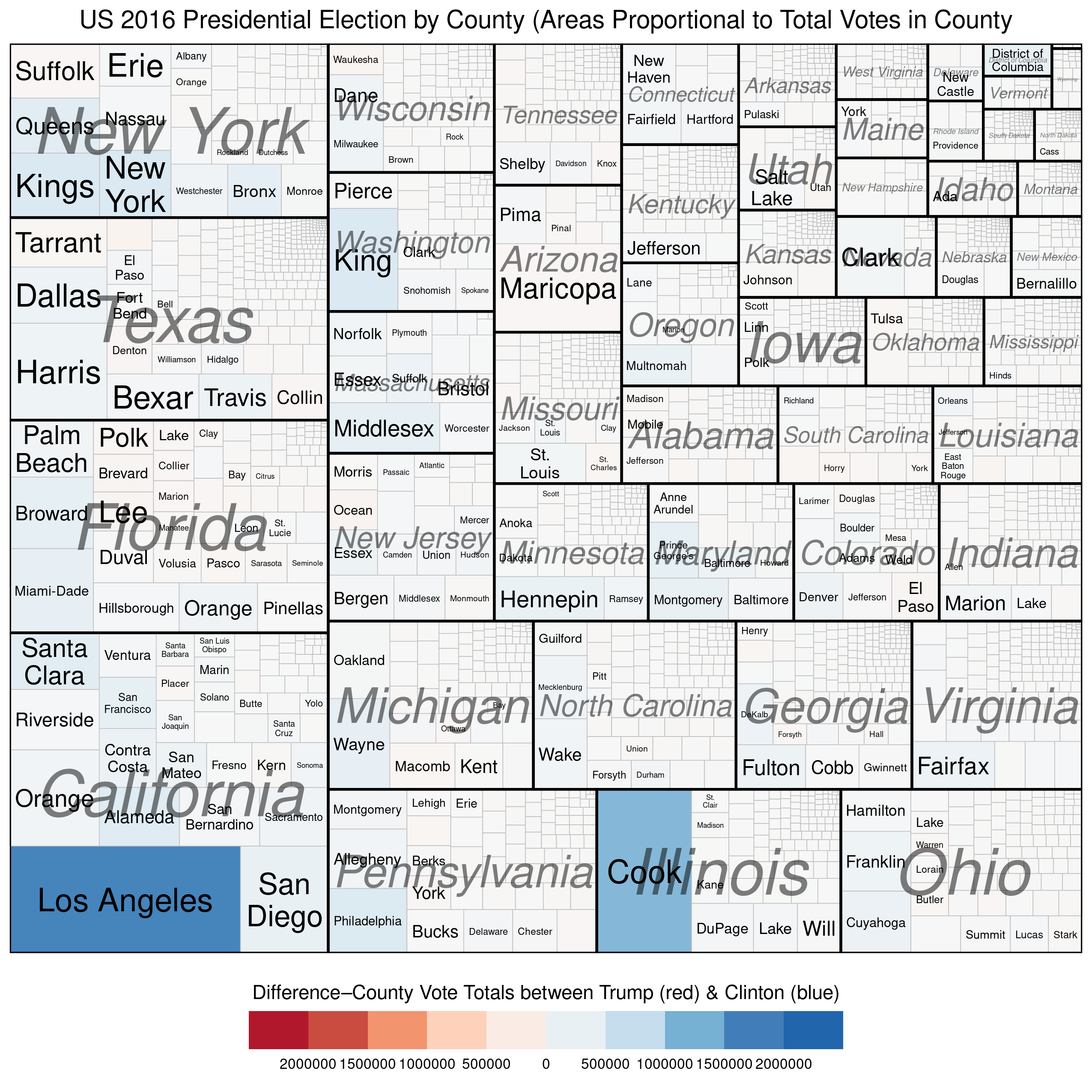
We can use treemaps to more “accurately” depict electoral outcomes. By accurately, I mean that the visual representation of the data more closely reflects how many voted for each candidate (party).
The first example below represents the vote at the county level and describes two quantitative variables. The size of each rectangle represents the total number of voters in each county\u2013the larger the rectangle the greater the numbers of voters in that county. The second variable, which is mapped using the colour scale, represents the difference\u2013in raw vote totals between the two candidates. Reddish shades denote a county that was won by Trump, while bluish shades represent counties won by Clinton.
There are a couple of things to notice. First, the wide disparity in the total number of voters across the counties. Second, we see that most of the counties have shades that are only very lightly blue (or red) and look mostly white. This is because the range on the variable must be so expansive in order to include outliers like Los Angeles and Cook Counties. Thus, in the vast majority of US counties the raw vote total differences between Trump’s totals and Clinton’s totals are in the 1000s range. This is why Trump was able to win more than 84% of US counties and still lose the popular vote by more than 3 million.
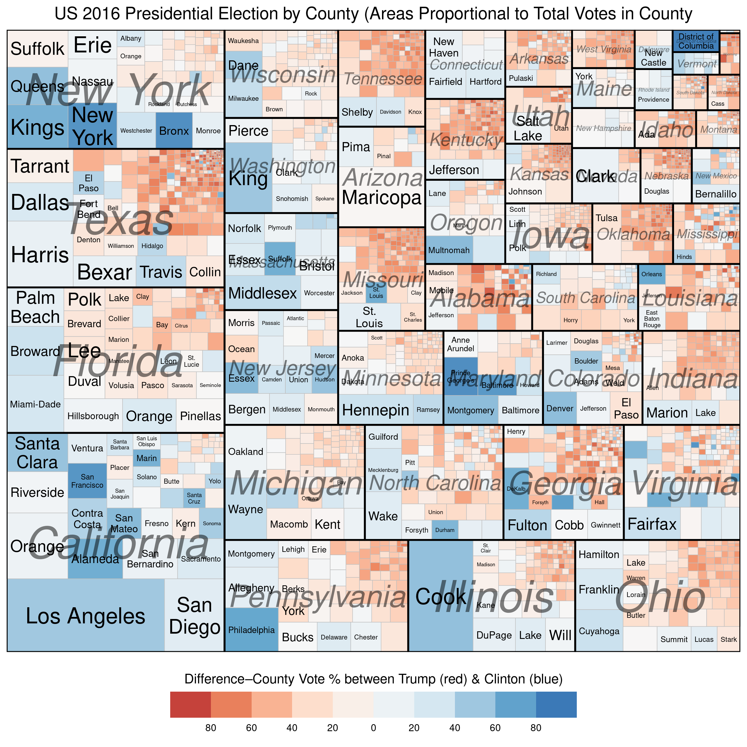
Our next (and final) treemap is similar to the one above except that the scale for the colouring is not the raw vote difference between Trump and Clinton in each county, but the percentage-point differential in vote between the two candidates.
We see much more red and blue in this map because the scale is confined to 100% Trump win to 100% Clinton win. Notice the striking disparity in where the blue and red colours, respectively, are found. The reddish shades dominate in small-population counties (in the top-right corner of each state subgroup), while the bluish shades dominate in large-population counties (in the bottom-left corners of each state subgroup). Finally, the larger (greater population) counties tend be be much smaller geographically than the less-populous counties, which is why the map on Trump’s desk looks like it does.
R Code for treemaps: (this is vote the “total vote” variable. Replace that variable with a “percentage-vote” variable–with appropriate limits and breaks (-100,100) because you are now working with percentages).
* The electoral process that determines who becomes president of the United States is complicated. In effect, it is a series of elections that are run by individual states, and not a single federally-run election like it is in most presidential systems.
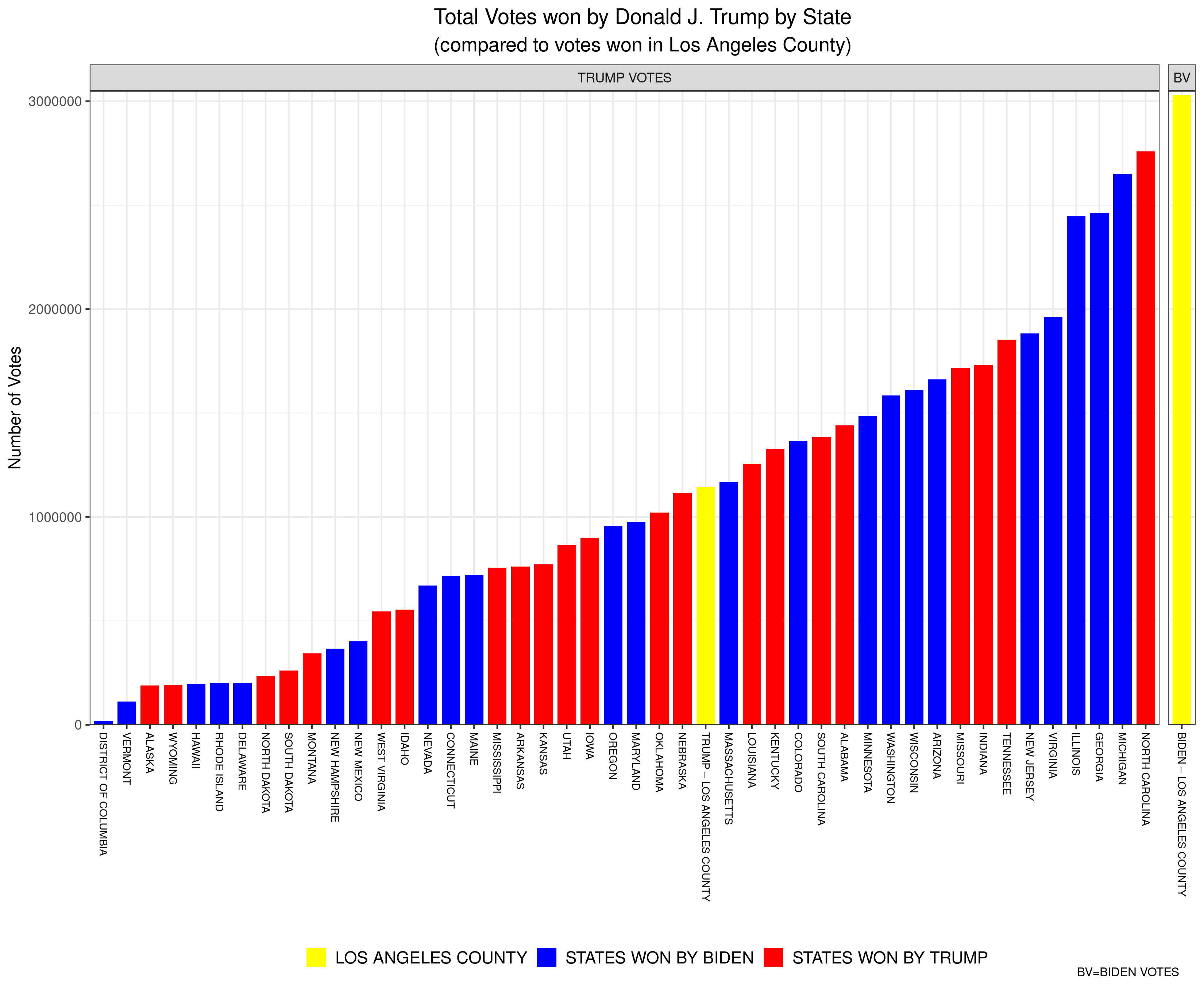
The inspiration (so to speak) for this latest instalment of my Data Visualization series is a meme that I have been seeing spread across social media in the wake of the recent US Presidential Election. The meme, in essence, notes that numer of US counties (there are over 3000) that were “won” by the incumbent, Donald J. Trump. Indeed, it seems as though the challenger, Joe Biden, ironically won the most votes of any US Presidential candidate in US history while simultaneously having “won” the lowest percentage of counties (about 17%) of any winner of the Presidency ever.
Why did I place “won” in quotation marks? Two reasons: first, I am assuming that the authors of this meme suggest that Trump “won” these counties by having won (at least) a plurality of the vote in each. Which, I suppose, is true. The more important reason that I put “won” in quotation marks above is because US counties are effectively meaningless when it comes to determining who wins the US Presidency. They are only important insofar as receiving more votes than one’s opponent in any individual county helps increase the odds of winning what is important–a plurality of the vote in any individual state (or in Congressional Districts in the cases of Nebraska and Maine). Counties have no official weight when determining electoral college votes, and it doesn’t matter how many counties a candidate wins, as long as they reach at least 270 electoral votes. Counties in the USA vary in population from fewer than 100 (Kalawao County in Hawaii) to over 10,000,000 (Los Angeles County in California). So, discussing who “won” more counties is essentially meaningless.
Here’s an example of how absurd referring to counties won becomes. The aforementioned Los Angeles County is a county that Joe Biden handily “won” in November, by a margin of 72.5% to 27.5% for Donald Trump. In short, Trump was walloped by Biden in LA County. Yet, when you compare Trump’s vote in LA County (about 1.15 million) to his total vote in all of the states (and DC) it might shock you to learn that Trump won more votes in LA County than he won in 25 individual states (and in DC). For example, Trump won more total votes in LA County (which, remember, he lost 72.5%-27.5%) than he won in the state of Oklahoma, where he won all 6 Electoral College votes. Moreover, Biden won more votes in LA County alone than Donald Trump won in each of all but three states–Florida, Texas, and Ohio. To be clear, for example, Biden won more total votes in LA County (which, alone, didn’t win him a single Electoral College vote) than Trump won in North Carolina (for which Trump won 15 Electoral College votes).
Here is a bar plot that I’ve created to visualize these data (click on the image to open a larger version). The yellow bar at the far-right represents the number of votes won by Biden in LA County (just over 3 million). The other yellow bar represents the votes won by Trump in LA Country (just over 1 million). Every other bar is the number of votes won by Trump in each of the states (and DC) listed below (Texas, Ohio, and Florida are missing because Trump won more votes in each of those states than Biden won in LA County). The red bars are states won by Trump, while the blue bars represent states won by Biden. Remember, each of the bars (except for the one on the far-right) represent the number of votes Donald Trump won in that state (and LA County).
A common issue when trying to plot numerical data is the problem of outliers. When working with data the term outliers is often used in the statistical sense, referring to data certain data values that are “far way” from the rest of the data (in statistics, this usually means data values that are a number of standard deviations away from the rest of the data). This can be especially problematic when using common bar plots, especially when the minimum and maximum values are so far apart that it leads to difficulty representing all of the values visually.
For an example of this in real life, let’s have go back to our British Columbia provincial electoral map data. As I demonstrated in my first data visualization, area-based (rather than population-, or voter-based) maps are often misleading. The primary reason for this is that the electoral districts are not nearly the same size and don’t have the same numbers of residents. In British Columbia, a large province, (almost one million square kilometres in area) this is not a surprise, especially because of the manner in which the relatively small population (just over five million) is haphazardly-dispersed across the province.
We can easily calculate the population density of each of BC’s 87 provincial electoral districts, using data about district population size and calculating the area of each district from geographic we used to create the maps in the first data visualization post.
Here is a summary of the data (the variable is Pop.Den.km2):
(s1<-summary(bc_final_final$Pop.Den.km2))
     Min.   1st Qu.    Median      Mean   3rd Qu.      Max.
    0.101     9.402   355.269  1587.483  2375.926 12616.797
The “Min.” and “Max.” are the minimum, and maximum value, respectively, of the population density (persons per square kilometre) of BC’s 87 provincial electoral districts. We see a dramatic difference between the maximum and minimum values. In fact,
paste("The most densely-populated district is ", round(s1[6]/s1[1],0), "times as dense as the least densely-populated district.")

[1] "The most densely-populated district is 124551 times as dense as the least densely-populated district."
That is astounding, and if one were to simply plot these values on a bar chart, one would immediately recognize the difficulty with representing these data accurately. Let’s use a horizontal bar chart to demonstrate:
Here, we see that the larger numbers and so large, and the smaller numbers so comparatively small, that the lowest two dozen, or so, districts do not even seem to register. (When I first plotted this, I thought that I had made some sort of mistake and that the values at the bottom were missing. It turns out that the value represented by a single pixel was larger than the values of the districts at the bottom of the bar plot.)
This is obviously an issue–we don’t want to lose valuable information. There are alternative plots we could use, but we want to keep the information (political party) embodied in the various colours of the bar plot, so we’d like to find a bar plot solution. We’ll describe and assess two potential solutions in the next post in the series.
In my first post of this series I explained at length why basic geographically-based electoral maps are not very good at conveying the phenomena of interest (see that post for more detail), and alluded to the increased use of political geographers, and political scientists, of alternative methods of “mapping” the required information that were more clear about the message(s) contained in the data.
Let’s examine this further using the map above. This map shows the results of the Canadian federal (national) election of October 2019.The respective proportions of total area “won” by each political party as depicted in the map above are not easily translated into either the relative vote share of the parties, or the relative number of seats won. Someone ignorant about Canadian federal politics would see a relatively similar total amount of red, blue, and orange, and assume that these parties had relatively equal support across the country. The sizes (land mass), and populations of, federal electoral districts in Canada vary drastically and, as a result, these maps are not a good gauge of voter support for political parties.
Since this problem is widespread political scientists, and political geographers, have attempted to find solutions to this problem. One increasingly-common approach has been to use what are called cartograms. Cartograms are maps in which the elements (in this case, electoral districts) are usually transformed in such as way as to maintain their connections to neighbours (contiguous cartograms), but to either increase or decrease the area of the specific electoral district in order to match it to a common variable. A variable often used in the transformation of electoral maps is population size. Thus, in a completed cartogram, the size of the electoral districts is not the actual land mass of the electoral district, but is proportional to the population of the electoral district (sometimes the number of voters, or the size of the electorate is used instead of population). It’s no surprise, then, that cartograms are also called “value-by-area” maps.
Cartograms are used by geographers and social scientists to depict a wide variety of phenomena. Here are some examples. The first one is a global cartogram for which the size of the area in each country is equivalent to total public health spending by that country. We can easily see that most of the world’s spending on public health occurs in the rich countries of the global north.
Here’s one more, depicting the global share of organic agriculture, by country.
Below, I have created a cartogram that has transformed the standard electoral map of the 2019 Canadian federal election into one in which the size of the electoral districts is mostly proportional to their populations. By “mostly” I mean that they’re not perfectly proportional, since the difference in sizes between the largest and smallest districts is so large the algorithm eventually stabilizes without creating completely equal-sized electoral districts.
This map more accurately conveys the nature of political partisan support (at least as it relates to the winning of electoral districts) across the country during the 2019 election, and provides visual evidence for the reality of an election in which the Liberal Party (red) won a plurality of the seats in the federal parliament (House of Commons). Because urban districts are much smaller than rural districts, the strength of Liberal Party support in Canada’s two largest cities–Toronto and Montreal–is obfuscated by the traditional area-based electoral map, but becomes evident in this cartogram.
The next map in this series will analyze another approach to geographically-based electoral maps–the hexagon map.
Here’s the R code for the cartogram above. Here, the original R-spatial data object–can_sf–is the base for the calculation of the cartogram data.
## Here is the code to generate the cartogram object:

library(cartogram)
can_carto_sf = cartogram_cont(can_sf, "Population_2016", itermax=50)

## Now, the map, using ggplot2
library(ggplot2)

gg.can.can.carto <- ggplot(data = can_carto_sf) +
  geom_sf(aes(fill = partywinner_2019), col="black", lwd=0.075) +
  scale_fill_manual(values=c("#33B2CC","#1A4782","#3D9B35","#D71920","#F37021","#2B2D2F"),name ="Party (2019)") +
  labs(title = "Cartogram of Canadian Federal Election Results \u2013 October 2019",
       subtitle = "(by Political Party and Electoral District)") +
  theme_void() +
  theme(legend.title=element_blank(),
        legend.text = element_text(size = 16),
        plot.title = element_text(hjust = 0.5, size=20, vjust=2, face="bold"),
        plot.subtitle = element_text(hjust=0.5, size=18, vjust=2, face="bold"),
        legend.position = "bottom",
        plot.margin = margin(0.5, 0.5, 0.5, 0.5, "cm"),
        legend.box.margin = margin(0,0,30,0),
        legend.key.size = unit(0.75, "cm"),
        panel.border = element_rect(colour = "black", fill=NA, size=1.5))
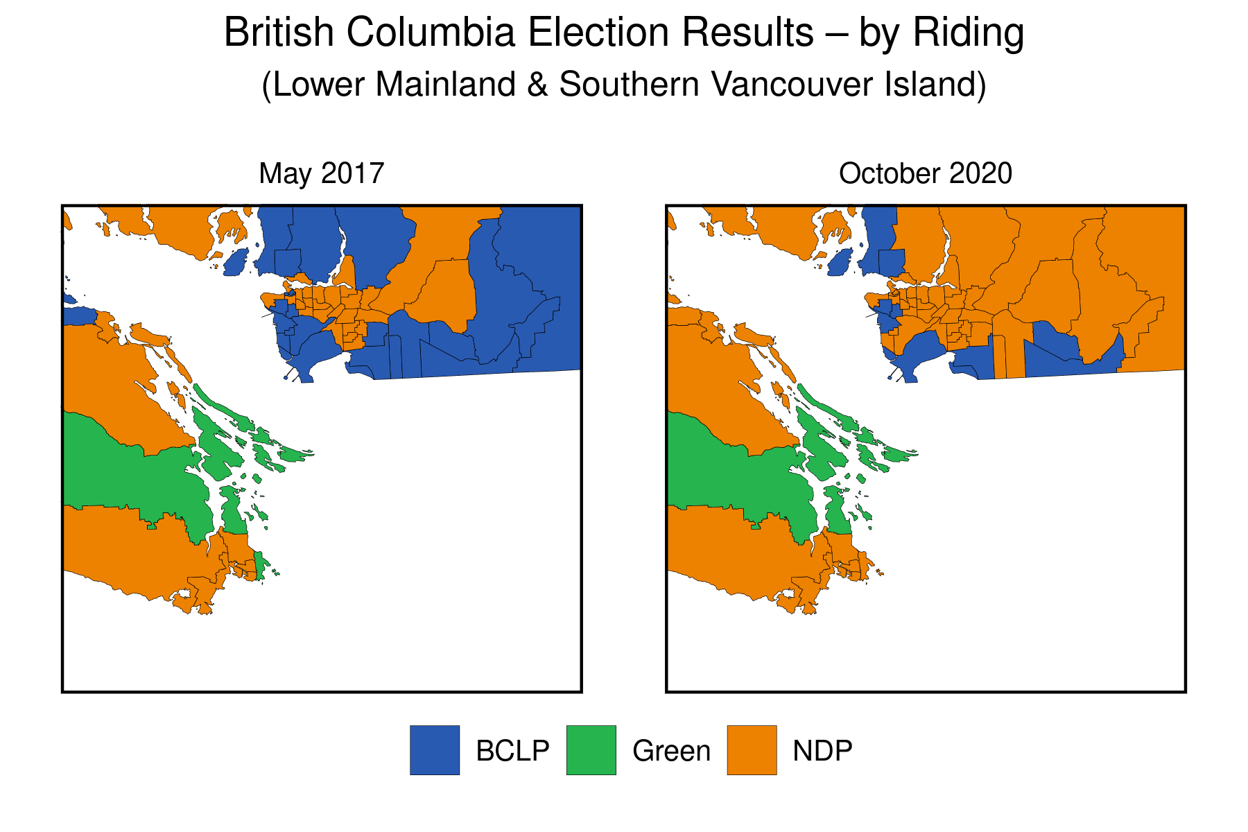
The first entry in my 30-day (it will actually be 30 posts over about 2 months) data visualization challenge argued that geographically-based electoral maps have many drawbacks as data visualization techniques. I demonstrated by using the results from the 2017 and 2020 British Columbia (BC) provincial elections as supporting evidence.
Although there were some significant political changes over the course of the two elections, these were poorly-represented by these maps. Only when we zoomed into the population centres of southwestern BC were we able to partially convey the changes that had occurred. We could have made our effort to convey the underlying movement in political party support between 2017 and 2020 a bit more obvious by using animated maps, rather than the static ones that were used.
When it comes to representing change over time, animated graphs can be very useful (as long as they aren’t too complicated and busy) and are advantageous to static maps.
Below we can find the maps in the original animated to more clearly show the changes over time. Here’s the map of the whole province:
The change between 2017 and 2020 is made clear by a jarring change in the map, where a bit more NDP-orange shows up, replacing the BCLP-blue (see the previous post for descriptions of the two parties). Otherwise, there doesn’t seem to be much change in the province overall.
We know, however, that the drastic changes that took place did so in the very tiniest southwestern corner of the BC mainland. Let’s zoom in there to have a look.
We can now more clearly see the change in results (in terms of electoral districts won) between 2017 and 2020 in this populous region. Not only did the NDP (orange) win many seats in the eastern Vancouver suburbs that had not only been won by the BCLP in 2017 but had been a bastion of support for the right-wing vote over many decades, but the NDP candidate in the Victoria-area district of Oak Bay-Gordon Head won a seat that had previously been held by the former leader of BC Green Party, Andrew Weaver (it’s the small piece of green, that changes to orange, in the eastern part of the lower orange horizontal band on the lower-left of the map) . Are these changes the harbinger of a sea-change in BC provincial politics, or are they just an anomalous blip?
Going back to my original point about these types of maps being poor representations of the underlying change in voters’ preferences, we don’t know much about the level of support for the respective parties in any of these electoral districts. All that we do know, based on the “first-past-the-post” electoral system used by BC at the provincial level, is the party whose candidate finished with the most votes in each of these electoral districts. We don’t know if a district newly-won by the NDP candidate was by one vote, or by 10,000 votes. In future posts, I’ll present graphs that will allow us to answer this question visually.
Our next posts will focus on alternatives to the basic electoral geographic maps that we’ve used in these first two posts.
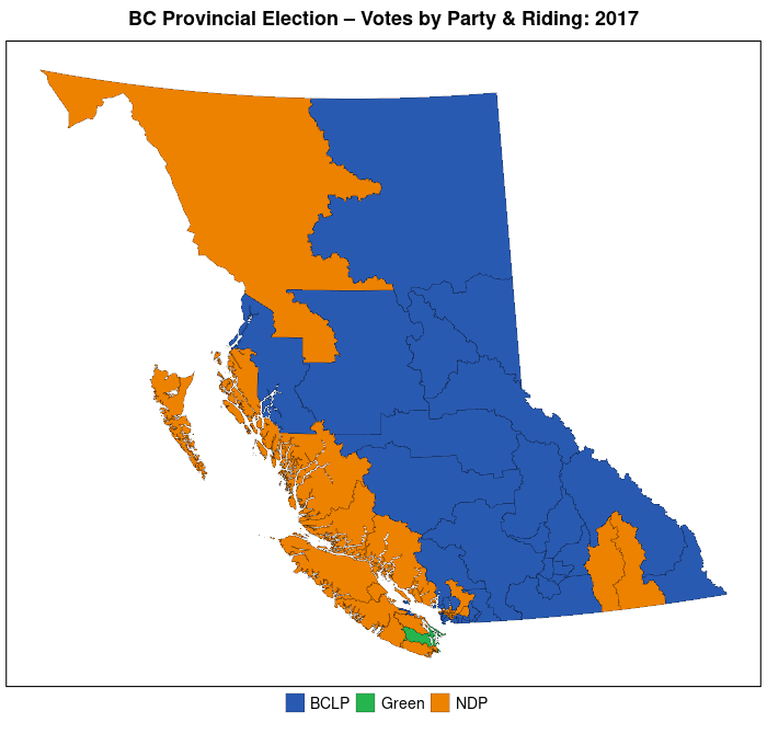
The data visualization with which I begin my 30-day challenge is a standard electoral map of the recently-completed British Columbia provincial election, the result of which is a solid (57 of 87 seats) majority government for the New Democratic Party, led by Premier John Horgan.
It’s a bit ironic that I begin with this type of map since, for a few reasons, I consider them to be poor representations of data. First, because electoral districts are mapped on the basis of territory (geography) they misrepresent and distort what they are purportedly meant to gauge–electoral support (by actual voters, not acreage) for political parties.
Though there are other pitfalls with basic electoral maps I’ll highlight what I believe to be the second major issue with them. They take what is a multinomial concept–voter support for each of a number of political parties in a specific electoral district–and summarize them into a single data point–which of the many parties in that electoral district has “won” that district. Most of these maps provide no information about either a) the relative size of the winning party’s victory in that district, or b) how many other parties competed in that district and how well each of these parties did in that district.
Although the standard electoral map provides some basic electoral information about the electoral outcome (and it is undeniable that in terms of determining who wins and runs government, it is the single most important piece of information), they are “information-poor” and in future posts I’ll show how researchers have tried to make their electoral maps more information-rich.
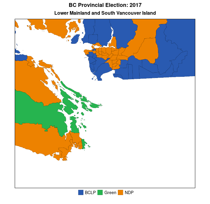
But, first, here are some standard electoral maps for the last two provincial elections in British Columbia (BC)–May 2017 and October 2020. Like many jurisdictions in North America, BC is comprised of relatively densely-populated urban areas–the Lower Mainland and southern Vancouver Island–combined with sparsely-populated hinterlands–forests, mountains, and deserts. Moreover, there is a strong partisan split between these areas–with the conservative BC Liberal Party (BCLP–the story of why the provincial Liberal Party in BC is actually the home of BC’s conservatives is too long for this post) dominating in the hinterlands while the left-centre New Democratic Party (NDP) generally runs more strongly in the urban southeast of the province. In Canada, electoral districts are often referred to as “ridings”, or “constituencies.”
If one were completely ignorant about BC’s provincial politics one would assume, simply from a quick perusal of the map above, that the “blue” party–the BC Liberal Party–was the dominant party in BC. In addition, it would seem that there was very little change in partisan support and electoral outcomes across the electoral districts over the course of the two elections. In fact, the BCLP lost 15 districts, all of which were won by the NDP. (The Green Party lost one of the districts it had won to the NDP as well, for a total NDP gain of 16 districts (seats on the provincial legislature) between 2017 and 2020. This factual story of a substantial increase in NDP seats in the legislature is poorly conveyed by the maps above because the maps match partisanship to area and not to voters.
To repeat, in future posts I will demonstrate some methods researchers have used to mitigate the problem of area-based electoral maps, but for now I’ll show that once we zoom into the southwest corner of the province (where most of the population resides) a simple electoral map does do a better job of conveying the change in electoral fortunes of the BCLP and NDP over the last two elections This is because there is a stronger link between area and population (voters) in these districts than in BC as a whole.
You can more easily see the orange NDP wave overtaking the population centres of the Lower Mainland (greater Vancouver area–upper left part of each map) and, to a lesser extent, southern Vancouver Island. Data visualization #2 will demonstrate how to create animated maps of the above, which more appropriately convey the nature of the change in each of the electoral districts over the two elections.
Here’s the R code that I used to create the two images in my post, using the ggplot2 package.
## Once you have created a sf_object in R (which I have named bc_final_sf, the following commands will create the image above.

library(ggplot2)
library(patchwork)

## First plot--2017
gg.ed.1 <- ggplot(bc_final_sf) +
  geom_sf(aes(fill = Winner_2017), col="black", lwd=0.025) +
  scale_fill_manual(values=c("#295AB1","#26B44F","#ED8200")) +
  labs(title = "May 2017") +
  theme_void() +
  theme(legend.title=element_blank(),
        plot.title = element_text(hjust = 0.5, size=12, face="bold"),
        legend.position = "none")

## Second plot--2020
gg.ed.2 <- ggplot(bc_final_final) +
  geom_sf(aes(fill = Winner_2020), col="black", lwd=0.025) +
  scale_fill_manual(values=c("#295AB1","#26B44F","#ED8200")) +
  labs(title = "October 2020") +
  theme_void() +
  theme(legend.title=element_blank(),
        plot.title = element_text(hjust = 0.5, size=12, face="bold"),
        legend.position = "bottom")

## Combine the plots and do some annotation
gg.bc.comb.map <- gg.ed.1 + gg.ed.2 & theme(legend.position = "bottom")
gg.bc.comb.map.final <- gg.bc.comb.map + plot_layout(guides = "collect") +
  plot_annotation(
  title = "British Columbia Election Results \u2013 by Riding",
  theme = theme(plot.title = element_text(size = 16, hjust=0.5, face="bold"))
  )

gg.bc.comb.map.final    # to view the first image above

## For the maps of the Lower Mainland and southern Vancouver Island, the only difference is that we add the following line to each of the individual maps:

coord_sf(xlim = c(1140000,1300000), ylim = c(350000, 500000))

## so, we get

gg.ed.lmsvi.1 <- ggplot(bc_final_final) +
  geom_sf(aes(fill = Winner_2017), col="black", lwd=0.075) +
  coord_sf(xlim = c(1140000,1300000), ylim = c(350000, 500000)) +
  scale_fill_manual(values=c("#295AB1","#26B44F","#ED8200")) +
  labs(title = "May 2017") +
  theme_void() +
  theme(legend.title=element_blank(),
        plot.title = element_text(hjust = 0.5, size=10, vjust=3),
        legend.position = "none")
As we’ve learned (ad nauseum) basing causal claims on a simple bivariate relationship is fraught with potential roadblocks. Even though there may be a strong, and statistically significant, relationship between an independent and dependent variable, if we haven’t controlled for potentially confounding variables, we can not state with any measure of confidence that the putative relationship between the IV and DV is causal. We should always statistically control for any (and all) potentially confounding variables.
Additionally, it is often desirable to dig deeper into the data and find out if the units-of-analysis are fundamentally different on the basis of some other variable. Below you may find two plots–each of which shows the relationship between margin of victory and electoral turnout (by electoral district) for the 2017 British Columbia provincial election. The first graph plots a simple bivariate relationship, while the second plot breaks that initial relationship down by political party (which party won the electoral district). It could conceivably be the case that the relationship between turnout and margin of victory varies across the values of political party. That is, the relationship may hold in those electoral districts where party A won, but not hold in those in which party B won.
We can see here that there is little evidence to suggest a difference in the relationship based on which party won the electoral district. Can you think of another `third’ variable that may cause the relationship between turnout and margin of victory to be systematically different across different values of that variable? What about rural-versus-urban electoral districts?
Upon discussing the NHL game results file, I mentioned to a few of you that I have used R to generate an NHL draft lottery simulator. It’s quite simple, although you do have to install the XML package, which allows us to use R to ‘scrape’ websites. We use this functionality in order to create the lottery simulator dynamically, depending on the previous evening’s (afternoon’s) game results.
Here’s the code: (remember to un-comment the install.packages(“XML”) command the first time you run the simulator). Copy and paste this code into your R console, or save it as an R script file and run it as source.
# R code to simulate the NHL Draft Lottery
# The current draft order of teams obviously changes on a
# game-to-game basis. We have to create a vector of teams in order
# from 31st to 17th place that can be updated on a game-by-game
# (or dynamic) basis.

# To do this, we can use R's ability to interrogate, scrape,
# and parse web pages.

#install.packages("XML") # NOTE: Uncomment and install this
#                                package before running this
#                                script the first time.

require(XML) # We need this for parsing of the html code

url <- ("http://nhllotterysimulator.com/") #retrieve the web page we are using as the data source
doc <- htmlParse(url) #parse the page to extract info we'll need.

# From investigation of the web page's source code, we see that the
# team names can be found in the element [td class="text-left"]
# and the odds of each team winning the lottery are in the
# element [td class="text-right"]. Without this
# information, we wouldn't know where to tell R to find the elements
# of data that we'd like to extract from the web page.
# Now we can use xml to extract the data values we need.

result.teams <- unlist(xpathApply(doc, "//td[contains(@class,'text-left')]",xmlValue)) #unlist used to create vector
result.odds <- unlist(xpathApply(doc, "//td[contains(@class,'text-right')]",xmlValue))

# The teams elements are returned as strings (character), which is
# appropriate. Also only non-playoff teams are included, which makes
# it easier for us. The odds elements are returned as strings as
# well (and percentages), which is problematic.
# First, we have 31 elements (the values of 16 of which--the playoff
# teams --are returned as missing). We only want 15 (the non-playoff
# teams).
# Second, in these remaining # 15 elements we have to remove the
# "%" character from each.
# Third, we have to convert the character format to numeric.
# The code below does the clean-up.

result.odds <- result.odds[1:15]
result.odds <- as.numeric(gsub("%"," ",result.odds)) #remove % symbol
teamodds.df <- data.frame("teams"=result.teams[1:15],"odds"=result.odds, stringsAsFactors=FALSE) #Create data frame for easier display

# Let's print a nice table of the teams, with up-to-date
# corresponding odds.

print(teamodds.df) # odds are out of 100

#Now, let's finally 'run' the lottery, and print the winner's name.

cat("The winner of the 2018 NHL Draft Lottery is the:", sample(teamodds.df$team,1,prob=teamodds.df$odds),sep="")
I have just graded and returned the second lab assignment for my introductory research methods class in International Studies (IS240). The lab required the students to answer questions using the help of the R statistical program (which, you may not know, is every pirate’s favourite statistical program).
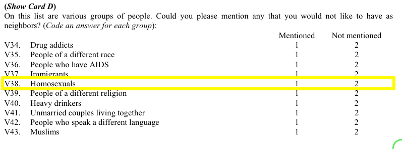
The final homework problem asked students to find a question in the World Values Survey (WVS) that tapped into homophobic sentiment and determine which of four countries under study–Canada, Egypt, Italy, Thailand–could be considered to be the most homophobic, based only on that single question.
More than a handful of you used the code below to try and determine how the respondents in each country answered question v38. First, here is a screenshot from the WVS codebook:
Students (rightfully, I think) argued that those who mentioned “Homosexuals” amongst the groups of people they would not want as neighbours can be considered to be more homophobic than those who didn’t mention homosexuals in their responses. (Of course, this may not be the case if there are different levels of social desirability bias across countries.) Moreover, students hypothesized that the higher the proportion of mentions of homosexuals, the more homophobic is that country.
But, when it came time to find these proportions some students made a mistake. Let’s assume that the student wanted to know the proportion of Canadian respondents who mentioned (and didn’t mention) homosexuals as persons they wouldn’t want to have as neighbours.
Here is the code they used (four.df is the data frame name, v38 is the variable in question, and country is the country variable):
Thus, these students concluded that almost 63% of Canadian respondents mentioned homosexuals as persons they did not want to have as neighbours. That’s downright un-neighbourly of us allegedly tolerant Canadians, don’tcha think?. Indeed, when compared with the other two countries (Egyptians weren’t asked this question), Canadians come off as more homophobic than either the Italians or the Thais.
So, is it true that Canadians are really more homophobic than either Italians or Thais? This may be a simple homework assignment but these kinds of mistakes do happen in the real academic world, and fame (and sometimes even fortune–yes, even in academia a precious few can make a relative fortune) is often the result as these seemingly unconventional findings often cause others to notice. There is an inherent publishing bias towards results that seem to run contrary to conventional wisdom (or bias). The finding that Canadians (widely seen as amongst the most tolerant of God’s children) are really quite homophobic (I mean, close to 2/3 of us allegedly don’t want homosexuals, or any LGBT persons, as neighbours) is radical and a researcher touting these findings would be able to locate a willing publisher in no time!
But, what is really going on here? Well, the problem is a single incorrect symbol that changes the findings dramatically. Let’s go back to the code:
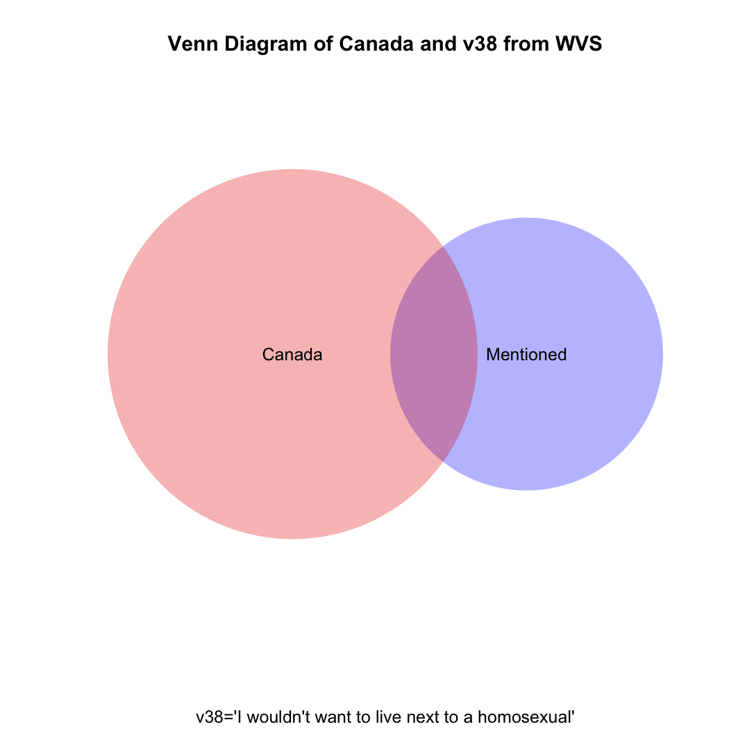
The culprit is the | (“or”) character. What these students are asking R to do is to search their data and find the proportion of all responses for which the respondent either mentioned that they wouldn’t want homosexuals as neighbours OR the respondent is from Canada. Oh, oh! They should have used the & symbol instead of the | symbol to get the proportion of Canadian who mentioned homosexuals in v38.
To understand visually what’s happening let’s take a look at the following venn diagram (see the attached video above for Ali G’s clever use of what he calls “zenn” diagrams to find the perfect target market for his “ice cream glove” idea; the code for how to create this diagram in R is at the end of this post). What we want is the intersection of the blue and red areas (the purple area). What the students’ coding has given us is the sum of (all of!) the blue and (all of!) the red areas.
To get the raw number of Canadians who answered “mentioned” to v38 we need the following code:
But what if you then created a proportional table out of this? You still wouldn’t get the correct answer, which should be the proportion that the purple area on the venn diagram comprises of the total red area.
Just eyeballing the venn diagram we can be sure that the proportion of homophobic Canadians is larger than 3.9%. What we need is the proportion of Canadian respondents only(!) who mentioned homosexuals in v38. The code for that is:
prop.table(table(four.df$v38[four.df$v2=="canada"]))

mentioned not mentioned
0.1404806     0.8595194
So, only about 14% of Canadians can be considered to have given a homophobic response, not the 62% our students had calculated. What are the comparative results for Italy and Thailand, respectively?
prop.table(table(four.df$v38[four.df$v2=="italy"]))

mentioned not mentioned
0.235546      0.764454

prop.table(table(four.df$v38[four.df$v2=="thailand"]))

mentioned not mentioned
0.3372781     0.6627219
The moral of the story: if you mistakenly find something in your data that runs against conventional wisdom and it gets published, but someone comes along after publication and demonstrates that you’ve made a mistake, just blame it on a poorly-paid research assistant’s coding mistake.
Here’s a way to do the above using what is called a for loop:
four<-c("canada","egypt","italy","thailand")
for (i in 1:length(four)) {
+ print(prop.table(table(four.df$v38[four.df$v2==four[i]])))
+ print(four[i])
+ }

mentioned not mentioned
0.1404806     0.8595194
[1] "canada"

mentioned not mentioned

[1] "egypt"

mentioned not mentioned
0.235546      0.764454
[1] "italy"

mentioned not mentioned
0.3372781     0.6627219
[1] "thailand"
Here’s the R code to draw the venn diagram above:
install.packages("venneuler")

library(venneuler}

v1<-venneuler(c("Mentioned"=sum(four.df$v38=="mentioned",na.rm=T),"Canada"=sum(four.df$v2=="canada",na.rm=T),"Mentioned&Canada"=sum(four.df$v2=="canada" & four.df$v38=="mentioned",na.rm=T)))

plot(v1,main="Venn Diagram of Canada and v38 from WVS", sub="v38='I wouldn't want to live next to a homosexual'", col=c("blue","red"))


You must be logged in to post a comment.