Data Visualization #4–Bar plots with widely-dispersed data

A common issue when trying to plot numerical data is the problem of outliers. When working with data the term outliers is often used in the statistical sense, referring to data certain data values that are “far way” from the rest of the data (in statistics, this usually means data values that are a number of standard deviations away from the rest of the data). This can be especially problematic when using common bar plots, especially when the minimum and maximum values are so far apart that it leads to difficulty representing all of the values visually.

For an example of this in real life, let’s have go back to our British Columbia provincial electoral map data. As I demonstrated in my first data visualization, area-based (rather than population-, or voter-based) maps are often misleading. The primary reason for this is that the electoral districts are not nearly the same size and don’t have the same numbers of residents. In British Columbia, a large province, (almost one million square kilometres in area) this is not a surprise, especially because of the manner in which the relatively small population (just over five million) is haphazardly-dispersed across the province.

We can easily calculate the population density of each of BC’s 87 provincial electoral districts, using data about district population size and calculating the area of each district from geographic we used to create the maps in the first data visualization post.

Here is a summary of the data (the variable is Pop.Den.km2):

(s1<-summary(bc_final_final$Pop.Den.km2))
     Min.   1st Qu.    Median      Mean   3rd Qu.      Max. 
    0.101     9.402   355.269  1587.483  2375.926 12616.797 

The “Min.” and “Max.” are the minimum, and maximum value, respectively, of the population density (persons per square kilometre) of BC’s 87 provincial electoral districts. We see a dramatic difference between the maximum and minimum values. In fact,

paste("The most densely-populated district is ", round(s1[6]/s1[1],0), "times as dense as the least densely-populated district.")

[1] "The most densely-populated district is 124551 times as dense as the least densely-populated district."

That is astounding, and if one were to simply plot these values on a bar chart, one would immediately recognize the difficulty with representing these data accurately. Let’s use a horizontal bar chart to demonstrate:
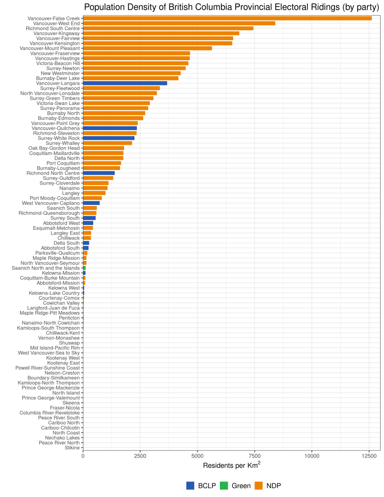
Here, we see that the larger numbers and so large, and the smaller numbers so comparatively small, that the lowest two dozen, or so, districts do not even seem to register. (When I first plotted this, I thought that I had made some sort of mistake and that the values at the bottom were missing. It turns out that the value represented by a single pixel was larger than the values of the districts at the bottom of the bar plot.)


This is obviously an issue–we don’t want to lose valuable information. There are alternative plots we could use, but we want to keep the information (political party) embodied in the various colours of the bar plot, so we’d like to find a bar plot solution. We’ll describe and assess two potential solutions in the next post in the series.

Using R to help simulate the NHL Draft Lottery

Upon discussing the NHL game results file, I mentioned to a few of you that I have used R to generate an NHL draft lottery simulator. It’s quite simple, although you do have to install the XML package, which allows us to use R to ‘scrape’ websites. We use this functionality in order to create the lottery simulator dynamically, depending on the previous evening’s (afternoon’s) game results.

Here’s the code: (remember to un-comment the install.packages(“XML”) command the first time you run the simulator). Copy and paste this code into your R console, or save it as an R script file and run it as source.

# R code to simulate the NHL Draft Lottery
# The current draft order of teams obviously changes on a
# game-to-game basis. We have to create a vector of teams in order
# from 31st to 17th place that can be updated on a game-by-game
# (or dynamic) basis.

# To do this, we can use R's ability to interrogate, scrape,
# and parse web pages.

#install.packages("XML") # NOTE: Uncomment and install this
#                                package before running this
#                                script the first time.

require(XML) # We need this for parsing of the html code

url <- ("http://nhllotterysimulator.com/") #retrieve the web page we are using as the data source
doc <- htmlParse(url) #parse the page to extract info we'll need.

# From investigation of the web page's source code, we see that the
# team names can be found in the element [td class="text-left"]
# and the odds of each team winning the lottery are in the
# element [td class="text-right"]. Without this
# information, we wouldn't know where to tell R to find the elements
# of data that we'd like to extract from the web page.
# Now we can use xml to extract the data values we need.

result.teams <- unlist(xpathApply(doc, "//td[contains(@class,'text-left')]",xmlValue)) #unlist used to create vector
result.odds <- unlist(xpathApply(doc, "//td[contains(@class,'text-right')]",xmlValue))

# The teams elements are returned as strings (character), which is
# appropriate. Also only non-playoff teams are included, which makes
# it easier for us. The odds elements are returned as strings as
# well (and percentages), which is problematic.
# First, we have 31 elements (the values of 16 of which--the playoff
# teams --are returned as missing). We only want 15 (the non-playoff
# teams).
# Second, in these remaining # 15 elements we have to remove the
# "%" character from each.
# Third, we have to convert the character format to numeric.
# The code below does the clean-up. 

result.odds <- result.odds[1:15]
result.odds <- as.numeric(gsub("%"," ",result.odds)) #remove % symbol
teamodds.df <- data.frame("teams"=result.teams[1:15],"odds"=result.odds, stringsAsFactors=FALSE) #Create data frame for easier display 

# Let's print a nice table of the teams, with up-to-date
# corresponding odds. 

print(teamodds.df) # odds are out of 100 

#Now, let's finally 'run' the lottery, and print the winner's name.

cat("The winner of the 2018 NHL Draft Lottery is the:", sample(teamodds.df$team,1,prob=teamodds.df$odds),sep="") 


Domestic Emissions Targets for Greenhouse Gases and China

This week, we begin to address the politics of climate change. In the chapter from the Stevenson text, the author addresses the rise of two international norms that are related to mitigating the impact of global warming: 1) common but differentiated responsibilities (CBRD) and, 2) mitigation in the form of domestic emissions’ targets.

Stevenson argues that international negotiations regarding mitigation have slowly transitioned from a focus on domestic to global emissions’ targets. Correspondingly, the institutional framework for implementing these goals has moved from regulatory (domestic governments) to market-oriented.  China and the United States have been the main promoters (and would also be the main beneficiaries of ) the market-oriented approach to GHG mitigation. We’ll discuss why during this week’s seminar, but in short, high level emitters can use carbon trading schemes to offload their emissions to low-emitting countries, resulting in no drop in emissions of GHGs globally.

In an interesting story on China’s setting up of a domestic carbon market, which is set to begin trading in 2016, we find something interesting. First, here’s a description of the proposed Chines carbon market:

China plans to roll out its national market for carbon permit trading in 2016, an official said Sunday, adding that the government is close to finalising rules for what will be the world’s biggest emissions trading scheme.

The world’s biggest-emitting nation, accounting for nearly 30 percent of global greenhouse gas emissions, plans to use the market to slow its rapid growth in climate-changing emissions.

What caught my eye, however, was the next line:

China has pledged to reduce the amount of carbon it emits per unit of GDP to 40-45 percent below 2005 levels by 2020.

In an informal (convenience sample) survey of some friends and acquaintances, it is obvious that the impression (almost unanimously shared) of the reader was that China would be cutting its GHG emissions dramatically by 2020. Unfortunately, that is not the case.

The key words in the excerpt quoted above are “per unit of GDP.” Because China’s GDP is expected to at least double by 2020 (based on the base year 2005), China could conceivably meet their target of a 40-45-per cent cut in emissions per unit of GDP even with as much as a doubling of actual (absolute) GHG emissions!

Obstacles to Democratization in North Africa and the Middle East

In conjunction with this week’s readings on democracy and democratization, here is an informative video of a lecture given by Ellen Lust of Yale University. In her lecture, Professor Lust discuses new research that comparative analyzes the respective obstacles to democratization of Libya, Tunisia, and Egypt. For those of you in my IS240 class, it will demonstrate to you how survey analysis can help scholars find answers to the questions they seek. For those in IS210, this is a useful demonstration in comparing across countries. [If the “start at” command wasn’t successful, you should forward the video to the 9:00 mark; that’s where Lust begins her lecture.]

A new Measure of State Capacity

In a recent working paper by Hanson and Sigman, of the Maxwell School of Citizenship and Public Affairs at Syracuse University, the authors explore the concept(s) of state capacity. The paper title–Leviathan’s Latent Dimensions: Measuring State Capacity for Comparative Political Research, complies with my tongue-in-cheek rule about the names of social scientific papers. Hanson and Sigman use statistical methods (specifically, latent variable analysis) to tease out the important dimensions of state capacity. Using a series of indexes created by a variety of scholars, organizations, and think tanks, the authors conclude that there are three distinct dimensions of state capacity, which they label i) extractive, ii) coercive, and iii) administrative state capacity.

Here is an excerpt:

The meaning of state capacity varies considerably across political science research. Further complications arise from an abundance of terms that refer to closely related attributes of states: state strength or power, state fragility or failure, infrastructural power, institutional capacity, political capacity, quality of government or governance, and the rule of law. In practice, even when there is clear distinction at the conceptual level, data limitations frequently lead researchers to use the same
empirical measures for differing concepts.

For both theoretical and practical reasons we argue that a minimalist approach to capture the essence of the concept is the most effective way to define and measure state capacity for use in a wide range of research. As a starting point, we define state capacity broadly as the ability of state institutions to effectively implement official goals (Sikkink, 1991). This definition avoids normative conceptions about what the state ought to do or how it ought to do it. Instead, we adhere to the notion that capable states may regulate economic and social life in different ways, and may achieve these goals through varying relationships with social groups…

…We thus concentrate on three dimensions of state capacity that are minimally necessary to carry out the functions of contemporary states: extractive capacity, coercive capacity, and administrative capacity. These three dimensions, described in more detail below,accord with what Skocpol identifies as providing the “general underpinnings of state capacities” (1985: 16): plentiful resources, administrative-military control of a territory, and loyal and skilled officials.

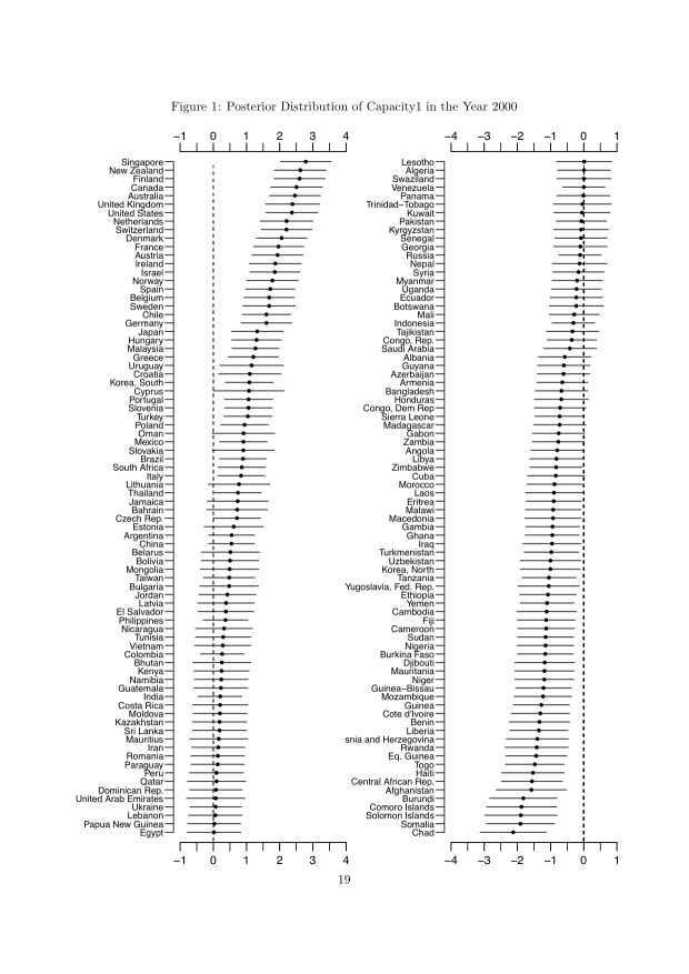
Here is a chart that measures a slew of countries on the extractive capacity dimension in extractive_capacity