Nomothetic Explanations and Fear of Unfamiliar Things

Bringing two concepts together, in Research Methods today we discussed the MTV show 16 and Pregnant as part of our effort to look at cause-and-effect relationships in the social sciences. The authors of a new study on the aforementioned television program demonstrate a strong link between viewership and pregnancy awareness (including declining pregnancy rates) amongst teenagers.

We used this information, along with a hypothesized link between playing video games and violent behaviour. I then asked students to think about another putatively causal relationship that was similar to these two, from which we could derive a more general, law-like hypothesis or theory.

The computer lab presented us with another opportunity to think about moving from more specific and contextual causal claims to more general ones. Upon completion of the lab, one of the students remarked that learning how to use the R statistical program wasn’t too painful and that he had feared having to learn it. “I guess I’m afraid of technology,” he remarked. Then he corrected himself to say that this wasn’t true, since he didn’t fear the iphone, or his Mac laptop, etc. So, we agreed that he only feared technology with which he was unfamiliar. I then prodded him and others to use this observation to make a broader claim about social life. And the claim was “we fear that with which we are unfamiliar.” That is generalizing beyond the data that we’ve just used to extrapolate to other areas of social life.

Our finishing hypothesis, then, was extended to include not only technology, but people, countries, foods, etc.

P.S. Apropos of the attached TED talk, do we fear cannibals because we are unfamiliar with them?

Television makes us do crazy things…or does it?

During our second lecture in Research Methods, when asked to provide an example of a relational statement, one student offered the following:

Playing violent video games leads to more violent inter-personal behaviour by these game-playing individuals.

That’s a great example, and we used this in class for a discussion of how we could go about testing whether this statement is true. We then surmised that watching violence on television may have similar effects, though watching is more passive than “playing”, so there may not be as great an effect.

If television viewing can cause changes in our behaviour that are not socially productive, can it also lead viewers to change their behaviour in a positive manner? There’s evidence to suggest that this may be true. In a recent study, 

there is evidence to suggest that watching MTV’s 16 and Pregnant show is associated with lower rates of teen pregnancy. What do you think about the research study?

More on Milgram’s Methods of Research

In a previous post, I introduced Stanley Milgram’s experiments on obedience and authority. We watched a short video clip in class and students responded to questions about Milgram’s research methods. Upon realizing that the unwitting test subjects were all males, one student wondered whether that would have biased the results in a particular direction. The students hypothesized that women may have been much less likely to defer to authority and continue to inflict increasing doses of pain on the test-takers. While there are good reasons to believe either that women would be more or less deferential than are men, what I wanted to emphasize is the broader point about evidence and theory as it relates to research method and research ethics.

The 'sophisticated' machinery of the Milgram Obedience Experiment
The ‘sophisticated’ machinery of the Milgram Obedience Experiment

In the video clip, Milgram states candidly that his inspiration for his famous experiments was the Nazi regime’s treatment of Europe’s Jews, both before and during World War II. He wanted to understand (explain) why seemingly decent people in their everyday lives could have committed and/or allowed such atrocities to occur. Are we all capable of being perpetrators of, or passive accomplices to, severe brutality towards our fellow human beings?

Milgram’s answer to this question is obviously “yes!” But Milgram’s methods of research, his way of collecting the evidence to test his hypothesis, was biased in favour of confirming his predetermined position on the matter. His choice of lab participants is but one example. This is not good social science, however. The philosopher of science, Carl Hempel, long ago (1966) laid out the correct approach to  producing good (social) science:

  1. Have a clear model (of the phenomenon under study), or process, that one hypothesizes to be at work.
  2. Test out the deductive implications of that model, looking at particularly the implications that seem to be least plausible,
  3. Test these least plausible implications against empirical reality.

If even these least plausible implications turn out to be confirmed by the model, then you have srong evidence to suggest that you’ve got a good model of the phenomenon/phenomena of interest. As the physicist Richard Feynman (1965) once wrote,

…[through our experiments] we are trying to prove ourselves wrong as quickly as possible, because only in that way can we find progress.

Did the manner in which Milgram set up his experiment give him the best chance to “prove himself wrong as quickly as possible” or did he stack the deck in favour of finding evidence that would confirm his hypothesis?

How to read tables of statistical regression results

Next week–January 21st–we’ll be looking at the debate between cultural and rationalist approaches to the analysis of political phenomena. As Whitefield and Evans note in the abstract of their 1999 article in the British Journal of Political Science:

There has been considerable disagreement among political scientists over the relative merits of political culture versus rational choice explanations of democratic and liberal norms and commitments. However, empirical tests of their relative explanatory power using quantitative evidence have been in short supply.

Their analysis of the political attitudes of Czech and Slovak residents is relatively rare in that the research is explicitly designed to assess the relative explanatory purchase of cultural and rationalist approaches to the study of political phenomena. Whitefield and Evans compile evidence (observational data) by means of a survey questionnaire given to random samples of Czech and Slovak residents. In order to assess the strengths of rationalist versus cultural accounts, Whitefield and Evans use statistical regression analysis. Some of you may be unfamiliar with statistical regression analysis, This blog post will explain what you need to know to understand the regression analysis results summarised in Tables 7 through 9 in the text.

Let’s take a look at Table 7. Here the authors are trying to “explain” the level of “democratic commitment”–that is, the level of commitment to democratic principles–of Czech and Slovak residents. Thus, democratic commitment is the dependent variable. The independent, or explanatory, variables can be found in the left-most column. These are factors that the authors hypothesize to have causal influence on the level of democratic commitment of the survey respondents. Some of these are nationality–Slovaks, Hungarians, political experience and evaluations–past and future–of the country’s and family’s well-being.

Each of the three remaining columns–Models 1 through 3–represents the results of a single statistical regression analysis (or model). Let’s take a closer look at the first model–ethnic and country dummy variables. In this model, the only independent variables analysed are one’s country and/or ethnic origin. The contrast category is Czechs, which means that the results are interpreted relative to how those of Czech residence/ethnicity answered. We see that the sign for the result of each of the two explanatory variables–Slovaks and Hungarians–is negative. What this means is that relative to Czechs, Slovaks and Hungarians demonstrated less democratic commitment. The two ** to the right of the numerical results (-0.18 and -0.07, respectively) indicate that this result is unlikely to be due to chance and is considered to be statistically significant. This would suggest that deep-seated cultural traditions–ethnicity/country or residence–have a strong causal (or correlational, at least) effect on the commitment of newly democratic citizens to democracy. Does this interpretation of the data still stand when we add other potential causal variables, as in Models 2 and 3? What do you think?

India–an “exceptional” Country with Democratic Deficit

In comparative politics, there are two countries that are truly exceptional–the USA and India.  By “exceptional”, I mean just that; they are both exceptions to general rules that have solid support, empirically and theoretically.  For example, when looking cross-nationally there is a strong negative relationship between religiosity and economic development.  That is, the richer a country, the less religious (ceteris paribus) are its residents.  Except for the United States.  The USA is exceptional in many regards; i.e., it doesn’t behave like all other advanced industrial democracies.

India is also exceptional, but in different ways from the US.  For example, there is strong support for hypotheses about democracy and social (ethnic/religious) heteroeneity, which suggest that there is no way that India should still be (after more than 60 years) a fairly well functioning democracy.  Many observers keep waiting for the other shoe to drop as India’s democracy has lurched from crisis-to-crisis, and has to contend with endemic levels of corruption, particularly in its judiciary (as we see in this excerpted report–written by the Asian Human Rights Commission and which I found at the Human Security Gateway, a great source for information about security issues in world politics).  Somehow, though, India’s democracy hangs on.

By recommending the impeachment of a High Court judge, the Chief Justice of India has revived a dead debate concerning the Indian judiciary. On August 2, 2008 in a letter addressed to the Prime Minister, the Chief Justice recommended the impeachment of judge Soumitra Sen of Calcutta High Court. Judge Sen is accused of having been involved in financial misappropriation before he was appointed as a judge. It is reported that in 1984 while judge Sen was practising as a lawyer he was appointed as the receiver in a dispute concerning the Steel Authority of India. It is alleged that in the capacity of the receiver he misappropriated a sum of INR 2,500,000 [USD 59523], which judge Sen reportedly paid back on orders from the court. Later, he was appointed a judge at the Calcutta High Court in 2003. A judge accused of corruption facing impeachment, a process by which a sitting judge could be removed from service in India, is nothing special. A corrupt public servant is not worthy of continuing in service and is least desirable to serve as a judge in a court of law, a public office that demands scrupulous impartiality and untainted personality. Anyone accused of a crime must be prosecuted and the crime investigated into. The fact that the accused is a judge must not provide the person with any immunity. Judge Sen being the first person recommended for impeachment by a Chief Justice of India does not mean that the judiciary is immune from corruption and other vicious practices. There are similar allegations against some judges in India. But not a single judicial officer was impeached so far. The only exception was the case of judge V. Ramaswami who faced impeachment in 1991, an attempt that failed due to the absence of a political consensus. It is expected that history will not be repeated. If it is repeated it would be a shame upon the Indian judiciary and its accountability. The accountability of judges, particularly in the context of increasing allegations of malpractices resorted to by judges is a grave concern in India. As of now there is no open process for the selection, promotion and if required the dismissal of High Court or Supreme Court judges in the country. The entire process is retained within the whims of the Supreme Court. All attempts so far to enforce accountability on the judiciary were vetoed by the judiciary itself. There is also the absence of a political consensus over this issue.

Are Homebuyers Rational Decision-Makers?

According to rational choice theorists, how do individuals make decisions?  Put simply, they act so as to maximize their expected utility, given their a priori preferences and some general idea of the nature of the world (by this, they mean that individuals have some idea of the probability of certain actions leading to specific outcomes).  While rational choice theory was first developed in academic disciplines such as economics, political scientists have adopted the technique and it’s use has proliferated in that discipline.  One of the criticisms of using rational choice theory to explain political phenomena is that often individuals have difficulty ordering preferences adequately.  This is because there is no single “currency” of utility in political science.  The same, however, can not be said for economics as it is much easier to order preferences when there are dollar values attached.  But what happens when time, leisure, etc., have to be taken into account.  Well, it turns out that individuals make many “mistakes” that diverge from that expected of instrumentally rational decision-makers.

Jonah Lehrer informs his readers of a fascinating series of studies done by Ap Dijksterhuis, a psychologist at Radboud University in the Netherlands.  One of these studies looks at decisions related to real estate purchases.  The studies:

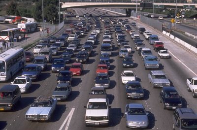
look at how people shop for “complex products,” like cars, apartments, homes, etc. and how they often fall victim to what he calls a “weighting mistake”. Consider two housing options: a three bedroom apartment that is located in the middle of a city, with a ten minute commute time, or a five bedroom McMansion in the suburbs, with a forty-five minute commute. “People will think about this trade-off for a long time,” Dijksterhuis writes. “And most them will eventually choose the large house. After all, a third bathroom or extra bedroom is very important for when grandma and grandpa come over for Christmas, whereas driving two hours each day is really not that bad.” What’s interesting is that the more time people spend deliberating, the more important that extra space becomes. They’ll imagine all sorts of scenarios (a big birthday party, Thanksgiving dinner, another child) that will turn the suburban house into an absolute necessity. The lengthy commute, meanwhile, will seem less and less significant, at least when compared to the allure of an extra bathroom.

But, as Dijksterhuis points out, that reasoning process is exactly backwards: “The additional bathroom is a completely superfluous asset for at least 362 or 363 days each year, whereas a long commute does become a burden after a while.” For instance, a recent study found that, when a person travels more than one hour in each direction, they have to make forty per cent more money in order to be as “satisfied with life” as someone with a short commute. Another study, led by Daniel Kahneman and the economist Alan Krueger, surveyed nine hundred working women in Texas and found that commuting was, by far, the least pleasurable part of their day. And yet, despite these gloomy statistics, nearly 20 percent of American workers commute more than forty-five minutes each way. (More than 3.5 million Americans spend more than three hours each day traveling to and from work: they’re currently the fastest growing category of commuter. For more on commuter culture, check out this awesome New Yorker article.) According to Dijksterhuis, these people are making themselves miserable because they failed to properly “weigh” the relevant variables when they were choosing where to live. Because these deliberative homeowners tended to fixate on details like square footage or the number of bathrooms, they assumed that a bigger house in the suburbs would make them happy, even if it meant spending an extra hour in the car everyday. But they were wrong.:

Risk, Uncertainty–From Governor Weld to the Modern Financial System

Canadian academic Thomas Homer-Dixon (we will read one of his papers this semester in Intro to IR) has written a piece for Canada’s “paper of record”–the Globe and Mail, which is titled “From Risk to Uncertainty.”  Those of you in my intro to comparative politics class will surely recognize immediately the difference between the tho concepts.

Remember when we read the first two chapter of Shepsle and Bonchek on instrumental rationality, the authors used the example of then-Massachusetts Governor Weld.  Weld had to decide whether to run for Governor again, or to commit to challenging Democratic Senator Ted Kennedy’s Senate seat.  A win there would have given him a nice platform for an eventual presidential run.  Weld, as we know, was operating in a world or risk rather than uncertainty when making his decision, given that there were public opinion polls published that estimated his chances of winning in either election.

What is the difference between risk and uncertainty and how does it apply to the contemporary global financial system (which, by the way, for those of you not paying attention is precariously teetering on the edge of meltdown–you heard it here first!)?

So the rules of the game have now fundamentally changed. Our global financial system has become so staggeringly complex and opaque that we’ve moved from a world of risk to a world of uncertainty. In a world of risk, we can judge dangers and opportunities by using the best evidence at hand [what Shepsle and Bonchek call beliefs] to estimate the probability of a particular outcome. But in a world of uncertainty, we can’t estimate probabilities, because we don’t have any clear basis for making such a judgment. In fact, we might not even know what the possible outcomes are. Surprises keep coming out of the blue, because we’re fundamentally ignorant of our own ignorance. We’re surrounded by unknown unknowns.

Cuba’s Human Welfare Indicators

Recent news regarding Fidel Castro’s plans to step aside in favor of his brother have returned Cuba to the news headlines here in the United States.  It has prompted some to take stock of Castro’s tenure as Cuba’s leader of nearly five decades.  Unfortunately, much of what we are likely to read will be ideologically-driven and devoid of much empirical substance.  For a comparative look at Castro’s and Batista’s regimes, we turn to Cal-Berkeley economist Brad DeLong:

ist2_64313_vintage_1950s_cars_in_havana_cuba.jpgThe hideously depressing thing is that Cuba under Battista [sic]–Cuba in 1957–was a developed country. Cuba in 1957 had lower infant mortality than France, Belgium, West Germany, Israel, Japan, Austria, Italy, Spain, and Portugal. Cuba in 1957 had doctors and nurses: as many doctors and nurses per capita as the Netherlands, and more than Britain or Finland. Cuba in 1957 had as many vehicles per capita as Uruguay, Italy, or Portugal. Cuba in 1957 had 45 TVs per 1000 people–fifth highest in the world. Cuba today has fewer telephones per capita than it had TVs in 1957.

You take a look at the standard Human Development Indicator variables–GDP per capita, infant mortality, education–and you try to throw together an HDI for Cuba in the late 1950s, and you come out in the range of Japan, Ireland, Italy, Spain, Israel. Today? Today the UN puts Cuba’s HDI in the range of Lithuania, Trinidad, and Mexico. (And Carmelo Mesa-Lago thinks the UN’s calculations are seriously flawed: that Cuba’s right HDI peers today are places like China, Tunisia, Iran, and South Africa.)

Thus I don’t understand lefties who talk about the achievements of the Cuban Revolution: “…to have better health care, housing, education, and general social relations than virtually all other comparably developed countries.” Yes, Cuba today has a GDP per capita level roughly that of–is “comparably developed”–Bolivia or Honduras or Zimbabwe, but given where Cuba was in 1957 we ought to be talking about how it is as developed as Italy or Spain.

This week in intro to comparative, we’ll discuss various indicators of well-being and welfare, such as GDP per capita and the HDI, comparing the indicators themselves and comparing different countries.

Presenting Data Graphically to Increase Understanding and Impact

Jonathan P. Kastellec and Eduardo L. Leoni have written an article, published in a recent issue of Perspectives on Politics, in which they encourage academics to make much more frequent use of graphs to present data that is more commonly presented in tabular form. From the abstract:

When political scientists present empirical results, they are much more likely to use tables than graphs, despite the fact that graphs greatly increases the clarity of presentation and makes it easier for a reader to understand the data being used and to draw clear and correct inferences.

Here is one of their examples, and they are absolutely right; graphical data facilitates the making of almost instantaneous inferences regarding the results (or maybe I’m just a visual learner?).

When presenting data in your papers, think about what you want to say with the data and use the best format available to facilitate that end.

graphs_tables.jpg

Kastellec and Leoni have crated a website that provides the code necessary to replicate these graphs in the R statistical program (which is a fantastic program that is free to download and use). Here is a link to the code for replicating the graph above.

Lies, Damned Lies, and Excel Charts!

I provide links to many sources that collect data on various political phenomena because I think that describing and measuring are extremely useful tools in helping us understand politics. As Mark Twain was well aware, and as I mentioned in PLSC240 today, often-times researchers (and especially!) politicians use data and statistics to obfuscate reality rather than to illuminate. No sooner had I returned to my office than I saw the following chart on the web (courtesy of democrats.org). Here is a typical example of “massaging” the data to promote a preferred interpretation of political reality. Here’s the original chart:

sotu_speeches_11.jpg

The inference that the creators of the chart want the observer to make is that the number of instances of applause from Bush’s State-of-the-Union (SOTU) speeches has, except for a spike in the immediate pre-Iraq invasion period of January 2003, been dropping, and significantly. Notice the range of the y-axis. Why did the chart creators decide to make 55 the minimum value? I have to give them the benefit of the doubt, however, as this seems to be a built-in feature of Excel (that’s why I encourage students to start using R for graphing capabilities). When I created the chart above myself in Excel, the program chose 55 as the minimum value of the y-axis. What would the chart look like if one were to make the y-axis minimum value zero? Here’s the result:

bush_sotu_zero_axis.jpeg

Now, the impression made upon the observer is that the drop in applause is not that great at all, and most likely within the range of what is called “random error”. Which chart is the correct one? Well, one way of determining the right answer to this would be to compare the SOTU applause trends of other presidents. Is every president guaranteed 40 or 50 bursts of applause no matter how lame the speech is or how unpopular the president is amongst those present? If so, then a minimum value on the y-axis of 40 or 50 would be more appropriate than zero, but I don’t know the answer off-hand.

Design a site like this with WordPress.com
Get started