What does the HDI measure?

This post is prompted by an e-mail from one of the students in my Comparative World Government class. Here’s the e-mail message:

I’m just studying and going through my notes, and had a quick question. In topic 4 when you were talking about GDPs and the Gini Index you said that there actually was a correlation between countries with a high GDP and a low Gini index, but isn’t GDP used in calculating the gini index? So wouldn’t it kind of skew the data, forcing the gini index to be more likely to follow the same pattern as the GDP?

Just curious

Here is my response:

Thanks for the question. I’m almost certain that I didn’t say that, since there’s generally no correlation between the Gini Index and the GDP. Some rich countries have relatively high equality (Sweden, for example) and some have high inequality (USA). Conversely, some poor countries have high levels of equality (India), while some poor countries have very high levels of inequality (Central African Republic).

What I most likely said was that there was a very high correlation between a country’s GDP and is score on the Human Development Index (HDI). Just a bit of research…turns up this interesting bit of analysis by Justin Wolfers at the NY Times Freakonomics blog, showing a correlation of 0.95 between a country’s HDI rank and GDP rank (2006). That’s an exceptionally high correlation, suggesting that the HDI isn’t measuring much more than the country’s level of GDP.

Wolfers created a graph using the 2006 data for GDP rank and HDI rank, while I provide for your viewing pleasure below.

Cuba’s Human Welfare Indicators

Recent news regarding Fidel Castro’s plans to step aside in favor of his brother have returned Cuba to the news headlines here in the United States.  It has prompted some to take stock of Castro’s tenure as Cuba’s leader of nearly five decades.  Unfortunately, much of what we are likely to read will be ideologically-driven and devoid of much empirical substance.  For a comparative look at Castro’s and Batista’s regimes, we turn to Cal-Berkeley economist Brad DeLong:

ist2_64313_vintage_1950s_cars_in_havana_cuba.jpgThe hideously depressing thing is that Cuba under Battista [sic]–Cuba in 1957–was a developed country. Cuba in 1957 had lower infant mortality than France, Belgium, West Germany, Israel, Japan, Austria, Italy, Spain, and Portugal. Cuba in 1957 had doctors and nurses: as many doctors and nurses per capita as the Netherlands, and more than Britain or Finland. Cuba in 1957 had as many vehicles per capita as Uruguay, Italy, or Portugal. Cuba in 1957 had 45 TVs per 1000 people–fifth highest in the world. Cuba today has fewer telephones per capita than it had TVs in 1957.
You take a look at the standard Human Development Indicator variables–GDP per capita, infant mortality, education–and you try to throw together an HDI for Cuba in the late 1950s, and you come out in the range of Japan, Ireland, Italy, Spain, Israel. Today? Today the UN puts Cuba’s HDI in the range of Lithuania, Trinidad, and Mexico. (And Carmelo Mesa-Lago thinks the UN’s calculations are seriously flawed: that Cuba’s right HDI peers today are places like China, Tunisia, Iran, and South Africa.)

Thus I don’t understand lefties who talk about the achievements of the Cuban Revolution: “…to have better health care, housing, education, and general social relations than virtually all other comparably developed countries.” Yes, Cuba today has a GDP per capita level roughly that of–is “comparably developed”–Bolivia or Honduras or Zimbabwe, but given where Cuba was in 1957 we ought to be talking about how it is as developed as Italy or Spain.

This week in intro to comparative, we’ll discuss various indicators of well-being and welfare, such as GDP per capita and the HDI, comparing the indicators themselves and comparing different countries.

The Relationship Between Wealth and Health

The BBC reports on fascinating new research, which concludes that “economic growth does not necessarily translate into improvements in child mortality.” There are two points I wish to make about this: First, it illustrates an important trend in the development literature regarding the correct metric to use to determine, and compare, levels of well-being worldwide. Historically, well-being has been captured by the crude instrument of Gross National Product (GDP) per capita, but the realization that, for many reasons, the measure was too crude to be a satisfactory indicator of well-being development led to the introduction of other measures, the most useful of which is the Human Development Index (HDI) put out by the United Nations Development Program (UNDP). (Why might GDP per capita be a misleading indicator of well-being?)

The second point follows from the first; one’s policy prescriptions vis-a-vis issues of development are to a large extent determined by just which indicator of well-being one believes best captures the essential nature of that elusive concept. As such, IGOs such as the World Bank, have focused attention on overall economic growth, while scholars such as Amartya Sen (who champions the “capabilities approach”) do not view growth tout court as a magical anti-poverty elixir.

From the BBC article:

Ten million children still die every year before their fifth birthday, 99% of them in the developing world, according to Save the Children.

A study comparing economic performance with child mortality reveals that some countries have not translated wealth into improvements across society.

Survival is too often just a “lottery”, said Save the Children’s David Mepham.

He said that even the poorest countries can cut child mortality by following simple policies, but at the moment “a child’s chance of making it to its fifth birthday depends on the country or community it is born into”.

Lagging behind

Angola comes at the bottom of a new “Wealth and Survival” league table drawn up by the UN Development Programme (UNDP).

The figures for child mortality in India are shocking
Shireen Miller
Save the children India

There are few countries in the world where there are such stark wealth contrasts as there are between the wealth of oil-rich coastal strip around the Angolan capital Luanda, and the war-ravaged interior.

UNDP statisticians calculate that more than half of the babies who die in Angola could be saved were the country to spread its wealth more fairly.

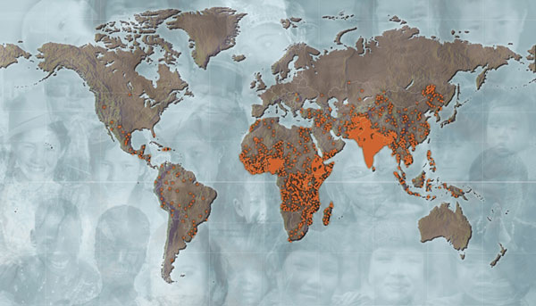
child_mortality_map.jpg

Click on the map to be taken to the Johns Hopkins Bloomberg School of Public Health’s Magazine for an article on child mortality.

[Each orange dot is equivalent to 5,000 child deaths.]


Percentage of the World’s Denizens who Live on Less than $2/day

Using data from the United Nations’ Human Development Index, I put together this table of the thirty states in the world with the highest percentage of residents living on less than two dollars per day. After we have covered (international) political economy later this semester, you’ll know to ask whether the two dollar a day statistic is PPP-adjusted or not. The HDI rank is the Human Development Index rank (out of 177 countries ranked in 2007).

Using Country Watch (you can find a link to it at the course’s page at the library’s website, or click here), we see that Nigeria’s 2006 estimated (ethnic tensions in Africa’s most populous state prevent it from ever completing a census that is acceptable for all interested parties) population is approximately 132 million, meaning that fully 122 million persons in Nigeria survive on less than two dollars per day.

[UPDATE: “A world where some live in comfort and plenty, while half of the human race lives on less than $2 a day, is neither just nor stable. Including all of the world’s poor in a expanding circle of development–and opportunity–is a moral imperative and one of the top priorities of U.S. international policy.

-President George W. Bush, The National Security Strategy of the U.S.A. 2002]

Country

Below 2$/day (%)

HDI Rank

Nigeria

92.4

158

Tanzania (United Republic of)

89.9

159

Rwanda

87.8

161

Burundi

87.6

167

Zambia

87.2

165

Niger

85.8

174

Madagascar

85.1

143

Bangladesh

84

140

Central African Republic

84

171

Zimbabwe

83

151

Gambia

82.9

155

India

80.4

128

Nicaragua

79.9

110

Ghana

78.5

135

Haiti

78

146

Swaziland

77.8

141

Ethiopia

77.8

169

Cambodia

77.7

131

Sierra Leone

74.5

177

Lao P.D.R.

74.1

130

Mozambique

74.1

172

Benin

73.7

163

Pakistan

73.6

136

Mali

72.1

173

Burkina Faso

71.8

176

Nepal

68.5

142

Mauritania

63.1

137

Malawi

62.9

164

Kenya

58.3

148

Data Sources on Development, Poverty, Economics, Environment, etc.

For your edification, but also to help you with your assignments, papers, and blogs, here are some data sources that will allow you to compare levels of development and poverty across the globe. The United Nations Development Programme’s Human Development Report is an excellent source of information on indicators related to development. Click here if you would like to look up data and/or statistics. You can search for statistics by country, indicator, or table.

Another excellent data source is the World Bank Development Indicators collected by the World Bank. This link provides access to the Education, Gender, Health & Nutrition & Population, and Poverty databases as well as Country Statistical Information, and Development Gateway Data and Statistics.

Finally, the United Nations maintains a statistical division, whose website can be found here, and which collects a wide range of data from social and demographic statistics, through economic, environmental and energy statistics, to statistics related to Millennium goal indicators.