The State and Democratization

The Polity IV data set code book, has a section entitled Indicators of Democracy and Autocracy (Composite Indicators), the authors write about the development of the state and the evolution of political participation as a corollary.  If you read it in tandem with this post on Max Weber’s view of the state and state legitimacy, you’ll begin to understand the nature of the state and why it has become the dominant contemporary form of political organization.

Three broad processes have reshaped the global landscape of state structures during the last two centuries One is an extraordinary expansion in the absolute and relative power of the state, a process that began i Europe. The new states created by the American and French revolutions marked the threshold between political world dominated by monarchies, whose claims to absolutism were belied by the fact that most social and economic life was autonomous from state control or extraction, and a political world in which state power was based on ever-widening control and mobilization of human and material resources exchange for broadened rights of popular participation. An integral part of this process was the development of bureaucracies with high capacities to regulate, tax, and mobilize people in the service of state policy. 

The second process was the transformation of the structures of political participation and legitimation. This transformation followed one of two paths, toward plural democracy or mass-party autocracy. The popular side of the bargain by which most West European rulers built state power in the nineteenth century was to acknowledge the right of widespread participation in policy making.  That right was given institutional expression in elected assemblies which could review, and sometimes initiate, public policy; in elections direct or indirect, of chief ministers; and in recognition of citizens’ rights to voice and act on political opinions. The concept of bargain is a metaphor for sequences of political crises and reforms in which these rulers granted rights for participation, however limited, to all significant social classes and groups, while simultaneously extending the state’s right and capacity to regulate, tax, and mobilize the human and material bases of state power. 

The process of political democratization had its own logic and dynamic which, in most of Western Europe, eroded all but a few symbolic vestiges of traditional autocracy (see for example Bendix 1978). Nonetheless, pressures to extend democratization have always contended with the self-interested desire of rulers to preserve and enhance their autonomy from political constraints. Theempires of Central and Eastern Europe–Germany, Russia, Austro-Hungary–implemented thetrappings but not the substance of effective democratic participation in the late nineteenth and early

Cross-National Comparisons in Alcohol Consumption amongst Adults

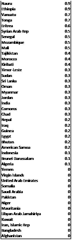
In response to a short assignment on the process of modeling social phenomena, one of my students (thanks, EE!) has chosen to try to understand why the residents of some countries consume (on average) more alcohol per capita than the residents of other countries. She argued that it may have something to do with the cultural acceptance of drinking alcohol as children. That’s seems to be a plausible hypothesis. You can find data on annual drinking rates from the EarthTrends website (which I’ve used on many previous occasions; it’s a fantastic resource!). Here is a link to 2003 data (the most recent year for which they have data) and here is a table, which I have created from the data. What do you think accounts for the difference in consumption across these countries?

Thomas Friedman’s First Law of Petropolitics

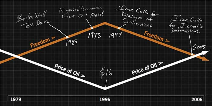
New York Times columnist wrote a fairly interesting article in Foreign Policy magazine a couple of years entitled “The First Law of Politics.” Here are some excerpts:

When I heard the president of Iran, Mahmoud Ahmadinejad, declare that the Holocaust was a “myth,” I couldn’t help asking myself: “I wonder if the president of Iran would be talking this way if the price of oil were $20 a barrel today rather than $60 a barrel.” When I heard Venezuela’s President Hugo Chávez telling British Prime Minister Tony Blair to “go right to hell” and telling his supporters that the U.S.-sponsored Free Trade Area of the Americas “can go to hell,” too, I couldn’t help saying to myself, “I wonder if the president of Venezuela would be saying all these things if the price of oil today were $20 a barrel rather than $60 a barrel, and his country had to make a living by empowering its own entrepreneurs, not just drilling wells.”

As I followed events in the Persian Gulf during the past few years, I noticed that the first Arab Gulf state to hold a free and fair election, in which women could run and vote, and the first Arab Gulf state to undertake a total overhaul of its labor laws to make its own people more employable and less dependent on imported labor, was Bahrain. Bahrain happened to be the first Arab Gulf state expected to run out of oil. It was also the first in the region to sign a free trade agreement with the United States. I couldn’t help asking myself: “Could that all just be a coincidence? Finally, when I looked across the Arab world, and watched the popular democracy activists in Lebanon pushing Syrian troops out of their country, I couldn’t help saying to myself: “Is it an accident that the Arab world’s first and only real democracy happens not to have a drop of oil?”

The more I pondered these questions, the more it seemed obvious to me that there must be a correlation—a literal correlation that could be measured and graphed—between the price of oil and the pace, scope, and sustainability of political freedoms and economic reforms in certain countries.

Wall Street Journal Reports on Rise in Food Prices, Riots

The WSJ has published a report on the outcome of last week’s annual meetings of the World Bank and the IMF and how leaders there proposed to deal with the very real problem of rapidly rising food prices worldwide. For a variety of reasons, there has been a dramatic surge in the prices of all commodities, including primary agricultural products, like rice and wheat. This has already led to rioting in Haiti and Egypt (see a previous blog post here) and could lead to even more social and political unrest in developing countries around the world, where large majorities rely on rice and wheat as staple foods. Here are some excerpts from the WSJ article:

WASHINGTON — Finance ministers gathered this weekend to grapple with the global financial crisis also struggled with a problem that has plagued the world periodically since before the time of the Pharaohs: food shortages.

Surging commodity prices have pushed up global food prices 83% in the past three years, according to the World Bank — putting huge stress on some of the world’s poorest nations. Even as the ministers met, Haiti’s Prime Minister Jacques Edouard Alexis was resigning after a week in which that tiny country’s capital was racked by rioting over higher prices for staples like rice and beans.

Rioting in response to soaring food prices recently has broken out in Egypt, Cameroon, Ivory Coast, Senegal and Ethiopia. In Pakistan and Thailand, army troops have been deployed to deter food theft from fields and warehouses. World Bank President Robert Zoellick warned in a recent speech that 33 countries are at risk of social upheaval because of rising food prices. Those could include Indonesia, Yemen, Ghana, Uzbekistan and the Philippines. In countries where buying food requires half to three-quarters of a poor person’s income, “there is no margin for survival,” he said.

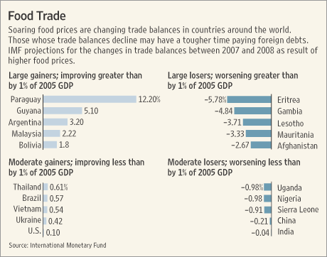
I encourage you to read the whole article, which is free on the WSJ web site. Here is a chart demonstrating how rising food prices have affected balance of payments accounts in select countries around the world. As the graphic states, worsening balance of payments figures will make it much more difficult for some countries to pay off foreign debt and provide the infrastructure necessary for further economic and social development.

Happy Tax Day–April 15th

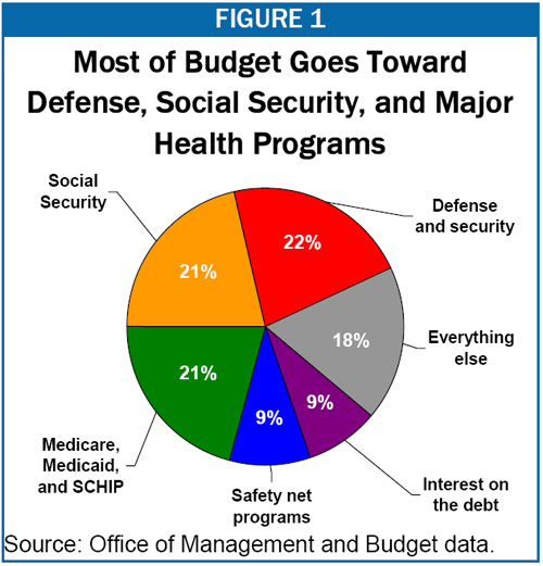
Well, today is tax filing day and I’ve often wondered just where my taxes go.  I’ve often thought that given the extant technological capabilities, and the normative desire for more direct forms of democracy, that each and every taxpaying citizen should be given the opportunity not only to file her taxes electronically, but to be able to specifically allocate her tax dollars to the uses that she sees fit.  How would you choose to allocate your tax dollars?  How does the federal government choose to allocate its tax dollars?  Look at the figure below–from the Office of Management and Budget–to see what the Federal government spends its money on.  This graph goes a long way to undermining the demagoguery of politicians when talking about taxes and spending.  When a politician tells you that he is going to cut taxes and does not mention spending cuts, then he is playing politics (unless, of course, he thinks that budget deficits are a non-issue).

The fact is that discretionary spending is a small minority (18%) of total spending.  In order to put a real dent in the budget deficit and the federal debt (two different–but related–concepts), you must cut entitlements, cut defense spending, raise taxes, or a combination of the three.

Happy Tax Day!

H/T Andrew Sullivan

Resource Dependent Regimes in Sub-Saharan Africa

Jensen and Wantchekon (2000) have created an index of resource dependence and determined the level of the same for the states of sub-Sarahan Africa.  The scores range from 1 (no resource dependence) to 4 (extreme resource dependence).  They use this as an important independent variable in determining democratic transition, consolidation, and government effectiveness.  How much of an effect does resource dependence have on each of these dependent variables?  You’ll have to read the paper to find out, or attend my class in intro to comparative tomorrow.

resource_dependence_scores.jpg

Cross-National Comparisons in Incarceration Rates

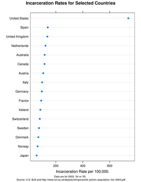
Every time I hear or read about a numerical fact, I always ask myself “is this high, low, average” for this particular phenomenon.  In order to answer this question, I’m required to make at least an implicit comparison.  So when I read today that for the first time ever, 1 in 100 American adults is incarcerated, I wondered how that compared to other countries.  The information is not hard to find.  Here’s a chart for your perusal.  What do you think accounts for the variation in incarceration rates across countries?

Here are some snippets from ABC News:

incarceration-oecd.jpg For the first time in U.S. history, more than one of every 100 adults is in jail or prison, according to a new report documenting America’s rank as the world’s No. 1 incarcerator. It urges states to curtail corrections spending by placing fewer low-risk offenders behind bars.

Using state-by-state data, the report says 2,319,258 Americans were in jail or prison at the start of 2008 one out of every 99.1 adults. Whether per capita or in raw numbers, it’s more than any other nation.

The report, released Thursday by the Pew Center on the States, said the 50 states spent more than $49 billion on corrections last year, up from less than $11 billion 20 years earlier. The rate of increase for prison costs was six times greater than for higher education spending, the report said.

The steadily growing inmate population “is saddling cash-strapped states with soaring costs they can ill afford and failing to have a clear impact either on recidivism or overall crime,” the report said.

Susan Urahn, managing director of the Pew Center on the States, said budget woes are pressuring many states to consider new, cost-saving corrections policies that might have been shunned in the recent past for fear of appearing soft on crime.

Who Speaks for Islam–a New Book by the Gallup Poll

The Gallup Polling outfit has a new book out based on a massive (over 50,000 respondents) recent poll on attitudes amongst the world’s approximately 1.3 billion Muslims. Let us allow the publishers to describe the content themselves:

islamwld.jpgGallup’s largest study of Muslim populations worldwide challenges conventional wisdom and the inevitability of a global conflict as the wars in Iraq and Afghanistan continue. Despite widespread media coverage of global terrorism from America and Europe to the Middle East and Asia, little is known about what majorities of the world’s Muslims really think and feel. What do Muslims say about violence and terrorist attacks? What do they say about democracy, women, and relations with the West? What are their values, goals, and religious beliefs?

Who Speaks for Islam? What a Billion Muslims Really Think by John L. Esposito and Dalia Mogahed (Gallup Press; March 2008; hardcover) sheds new light into the “increasing hostility” that Archbishop Tutu characterizes.

In the wake of the terrorist attacks on 9/11, U.S. public officials seemed to have no idea whether or not many Muslims supported the bombings. This troubled Gallup Chairman and CEO Jim Clifton, who felt that “no one in Washington had any idea what 1.3 billion Muslims were thinking, and yet we were working on intricate strategies that were going to change the world for all time.” Clifton commissioned his company to undertake the enormous job.

The result is Who Speaks for Islam? What a Billion Muslims Really Think, based on six years of research and more than 50,000 interviews representing 1.3 billion Muslims who reside in more than 35 nations that are predominantly Muslim or have sizable Muslim populations.

Some of the more intriguing findins?

  • Muslims and Americans are equally likely to reject attacks on civilians as morally unjustifiable.
  • Large majorities of Muslims would guarantee free speech if it were up to them to write a new constitution AND they say religious leaders should have no direct role in drafting that constitution.
  • Muslims around the world say that what they LEAST admire about the West is its perceived moral decay and breakdown of traditional values — the same answers that Americans themselves give when asked this question.
  • When asked about their dreams for the future, Muslims say they want better jobs and security, not conflict and violence.
  • Muslims say the most important thing Westerners can do to improve relations with their societies is to change their negative views toward Muslims and respect Islam.

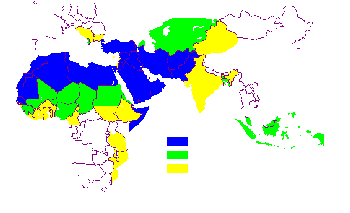
Note: the map above is from Professor Juan Cole.  The colors refer to the percentage of inhabitants of each state who are Muslims.

Playing the Dominant Strategy in a Prisoner’s Dilemma Situation

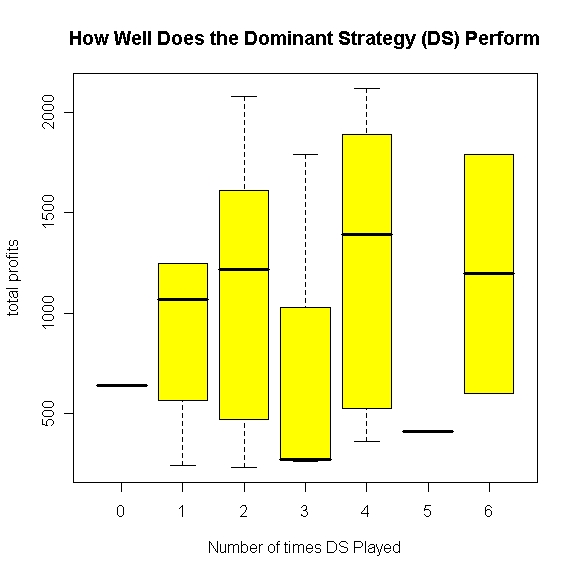
As you’ll see in lecture tomorrow, instrumentally rational players will also choose to “defect” in a priosoner’s dilemma type situation even though they could be much better off absolutely if they and their opponents could learn to cooperate.  The chart below has been created using data from the simulation of yesterday.  What is take-home message from the chart?  Why is the relationship between the phenomena displayed not completely linear?  Think about the nature (i.e., the specific rules) of the oil game we played yesterday. (The plot below is a box plot, which is a way of summarizing the means, range, and certain percentiles of the values of a single variable based on another variable.)

oil_game_dominant_strategy.jpeg

Presenting Data Graphically to Increase Understanding and Impact

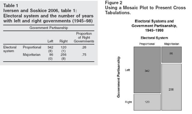
Jonathan P. Kastellec and Eduardo L. Leoni have written an article, published in a recent issue of Perspectives on Politics, in which they encourage academics to make much more frequent use of graphs to present data that is more commonly presented in tabular form. From the abstract:

When political scientists present empirical results, they are much more likely to use tables than graphs, despite the fact that graphs greatly increases the clarity of presentation and makes it easier for a reader to understand the data being used and to draw clear and correct inferences.

Here is one of their examples, and they are absolutely right; graphical data facilitates the making of almost instantaneous inferences regarding the results (or maybe I’m just a visual learner?).

When presenting data in your papers, think about what you want to say with the data and use the best format available to facilitate that end.

graphs_tables.jpg

Kastellec and Leoni have crated a website that provides the code necessary to replicate these graphs in the R statistical program (which is a fantastic program that is free to download and use). Here is a link to the code for replicating the graph above.

Design a site like this with WordPress.com
Get started