Life, Liberty, and the Pursuit of Happiness

We hold these truths to be self-evident, that all men are created equal, that they are endowed by their Creator with certain unalienable Rights, that among these are Life, Liberty and the pursuit of Happiness.

All of us immediately recognize these powerful sentences as being part of the Declaration of Independence of the United States of America. Happiness is an important concept and has been the object of increased study in political science and comparative politics. Ronald Inglehart (he of World Values Survey fame) argues that there is a strong relationship between happiness and democracy across countries. Inglehart writes:

Correlation is not causation, and this linkage could reflect any of the following things: (1) living under democratic institutions makes people much happier than living under authoritarian institutions; or (2) high levels of subjective well-being are conducive to democratic institutions; or (3) the correlation could be spurious, due to the fact that both subjective well-being and democracy are strongly correlated with some other variable such as high levels of economic development.

Solving this puzzle has far-reaching implications. If the linkage is not spurious and democracy makes people happy, this provides a strong additional argument on behalf of democracy; while if high levels of happiness are conducive to democracy, this can lead to a better understanding of how democracy emerges and flourishes. Using World Values Survey data on happiness levels from 1981 to 2006, and the Freedom House measures of democracy levels from 1972 to 2005, this paper analyzes the relationships between happiness and democracy in order to determine what is causing what.

How happy are Americans? How happy are Germans, Chinese, or Brazilians, for that matter? Who are the happiest people on earth? According to the new World Database of Happiness, it’s the Danes, Swiss and Maltese. Is this a political cultural trait, as Inglehart assumes, or are there structural and institutional factors at work? All three countries are rather small, and European. (Malta and Denmark are, additionally, amongst the most homogeneous states in the world, and this could be having an effect, given new research by Robert Putnam on the potential socially, politically, and economically detrimental effects of ethnic diversity.) Americans, by the way, are ranked #25 in level of happiness.
Do national cultures exist? Do supra-national cultures exist?

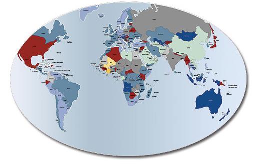
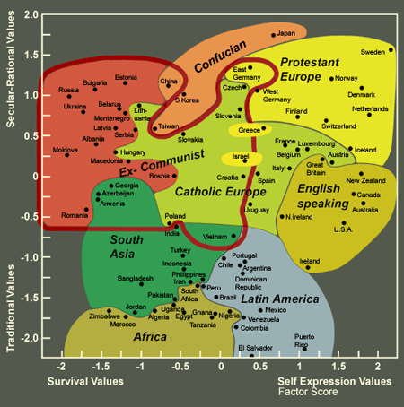
Here is a map from Ronald Inglehart’s World Values Survey organization web site. The site allows users to analyze data collected by the World Values Survey in dozens of countries around the world. We are reading Inglehart’s The Renaissance of Political Culture this week and will analyze the importance of political culture for understanding political outcomes, such as democracy and economic development. Are some cultures more compatible with democracy and economic growth than others? Is culture a more compelling framework for testing political phenomena than is rational choice?

Inglehart-Welzel Cultural Map of the World

This map reflects the fact that a large number of basic values are closely correlated; they can be depicted in just major two dimensions of cross-cultural variation

inglehart_weltzel_value_map.gif

Military Spending and Private Industry

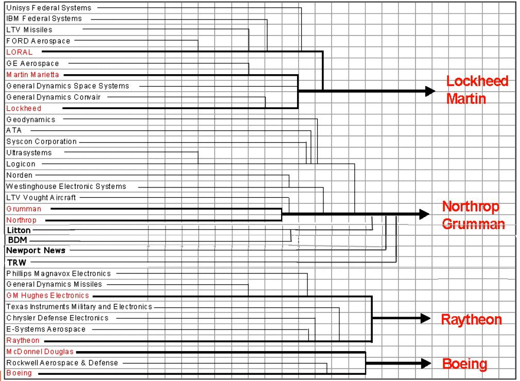
Here is a fascinating chart from globalsecurity.org, which shows the consolidation of firms in the defense contracting industry over the course of a few decades.  Whereas approximately thirty companies were producing weaponry and other weapons systems for the federal government decades ago, now there are only four.  Is this a good or a bad thing, or does it even matter?

military_contractorsmergers.jpg

Comparative Welfare States in Advanced Industrial Economies

In a couple of weeks, we–in PLSC240–will address the topic of political economy.  We’ll compare states around the world with respect to institutions such as tax regimes, openness of borders to goods and services imported from abroad, and also with respect to welfare state spending.  Andrew Gelman has posted on his blog a review–which will be published in Political Science Quarterly–of a new book by Clem Brooks and Jeff Manza, titled Why Welfare States Persist.  Not surprisingly, the answer is that they are publicly popular.  What is more interesting, though, is why the size of the welfare state differs amongst countries with relatively similar income levels.  Can you can think a cultural explanation?  Institutional?  Rational Choice?

Rich capitalist democracies around the world differ widely in their welfare states—their systems of government-provided social support–despite having comparable income levels. Brooks and Manza report that welfare state spending constituted 27% of GDP in “social democratic countries” such as Sweden and 26% of GDP in “Christian democratic countries” such as Germany, but only 17% in “liberal democracies” such as the United States and Japan. These differences are correlated with differences in income inequality and poverty rates between countries.

In their book, Brooks and Manza study how countries with different levels of the welfare state differ in their average policy preferences, as measured by a cross-national survey that asks whether respondents think the government should (a) provide a job to everyone who wants one, and (b) reduce income differences between rich and poor. Brooks and Manza find that countries where government jobs policies and redistribution are more popular are the places where the welfare state is larger, and this pattern remains after controlling for time trends, per-capita GDP of the country, immigration, women’s labor force participation, political institutions, and whether the ruling party is religious or on the left.

Next week, you will have a chance to test this hypothesis when we comparatively analyze public opinion attitudes around the world using the World Values Survey.   Is this relationship real?  Does it apply to states that are not advanced industrial economies?  We’ll find out next week.

The Federal Budget and Military Defense Spending

When we address Chapter 5 of Mingst, we’ll learn about the various sources of power. One of the most important, obviously, is military power. Given President Bush’s latest $3.1 trillion budget proposal, I began to wonder how much of that is apportioned to spending on the military and defense? Fred Kaplan from Slate.com has done the research and has concluded the following:

As usual, it’s about $200 billion more than most news stories are reporting. For the proposed fiscal year 2009 budget, which President Bush released today, the real size is not, as many news stories have reported, $515.4 billion—itself a staggering sum—but, rather, $713.1 billion.

Is that a lot? Is it “staggering”, as Kaplan suggests? Should we be concerned with how much we spend militarily? I think the answer is yes, but in the manner of a discriminating consumer. In other words, what is our “rate of return” on that spending? Is the spending efficient and non-wasteful? Could we be just as safe and powerful if we spent 75%, or 50% of that total? A couple of data points suggest that US military spending does not give us a good rate of return and if national defense were a private industry, we’d be looking for a different supplier. First, how does US military spending compare to how much China, Russia (two potential rivals) or the European Union, or Canada, are spending on defending their states? Here’s an estimate, from the Washington-based think tank GlobalSecurity. org (which has a lot of great data related to security issues):

World Wide Military Expenditures

Country

Military expenditures (US$)

Budget Period

World

$1100 billion

2004 est. [see Note 4]

Rest-of-World [all but USA]

$500 billion

2004 est. [see Note 4]

United States

$623 billion

FY08 budget [see Note 6]

China

$65.0 billion

2004 [see Note 1]

Russia

$50.0 billion

[see Note 5]

France

$45.0 billion

2005

United Kingdom

$42.8 billion

2005 est.

Japan

$41.75 billion

2007

Germany

$35.1 billion

2003

Italy

$28.2 billion

2003

South Korea

$21.1 billion

2003 est.

India

$19.0 billion

2005 est.

Saudi Arabia

$18.0 billion

2005 est.

Australia

$16.9 billion

2006

Turkey

$12.2 billion

2003

Brazil

$9.9 billion

2005 est.

Spain

$9.9 billion

2003

Canada

$9.8 billion

2003

Israel

$9.4 billion

FY06 [see Note 7]

Kaplan observes something even more interesting than the relative amount that the United States is spending–the apportionment of that spending amongst the different military services:

The “Overview” section of the Pentagon’s budget document contains a section called “Program Terminations.” It reads, in its entirety: “The FY 2009 budget does not propose any major program terminations.”

Is it remotely conceivable that the Defense Department is the one federal bureaucracy that has not designed, developed, or produced a single expendable program? The question answers itself.

There is another way to probe this question. Look at the budget share distributed to each of the three branches of the armed services. The Army gets 33 percent, the Air Force gets 33 percent, and the Navy gets 34 percent.

As I have noted before (and, I’m sure, will again), the budget has been divvied up this way, plus or minus 2 percent, each and every year since the 1960s [author’s emphasis]. Is it remotely conceivable that our national-security needs coincide so precisely—and so consistently over the span of nearly a half-century—with the bureaucratic imperatives of giving the Army, Air Force, and Navy an even share of the money? Again, the question answers itself. As the Army’s budget goes up to meet the demands of Iraq and Afghanistan, the Air Force’s and Navy’s budgets have to go up by roughly the same share, as well. It would be a miracle if this didn’t sire a lot of waste and extravagance.

Congress exposes this budget to virtually no scrutiny, fearing that any major cuts—any serious questions—will incite charges of being “soft on terror” and “soft on defense.” But $536 billion of this budget—the Pentagon’s base line plus the discretionary items for the Department of Energy and other agencies—has nothing to do with the war on terror. And it’s safe to assume that a fair amount has little to do with defense. How much it does and doesn’t is a matter of debate. Right now, nobody’s even debating.

defense_budget_2008_2009.jpg

Source for chart: Department of Defense

Lies, Damned Lies, and Excel Charts!

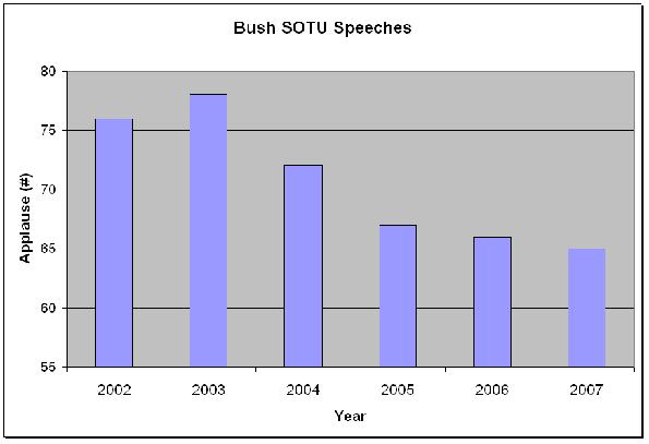
I provide links to many sources that collect data on various political phenomena because I think that describing and measuring are extremely useful tools in helping us understand politics. As Mark Twain was well aware, and as I mentioned in PLSC240 today, often-times researchers (and especially!) politicians use data and statistics to obfuscate reality rather than to illuminate. No sooner had I returned to my office than I saw the following chart on the web (courtesy of democrats.org). Here is a typical example of “massaging” the data to promote a preferred interpretation of political reality. Here’s the original chart:

sotu_speeches_11.jpg

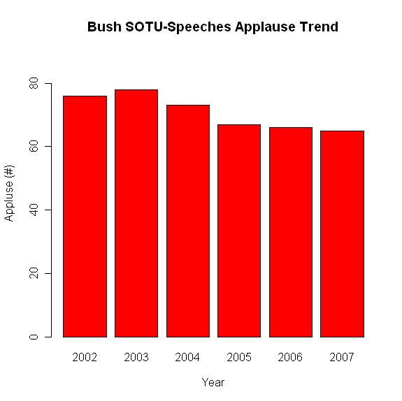
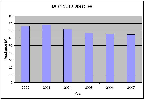
The inference that the creators of the chart want the observer to make is that the number of instances of applause from Bush’s State-of-the-Union (SOTU) speeches has, except for a spike in the immediate pre-Iraq invasion period of January 2003, been dropping, and significantly. Notice the range of the y-axis. Why did the chart creators decide to make 55 the minimum value? I have to give them the benefit of the doubt, however, as this seems to be a built-in feature of Excel (that’s why I encourage students to start using R for graphing capabilities). When I created the chart above myself in Excel, the program chose 55 as the minimum value of the y-axis. What would the chart look like if one were to make the y-axis minimum value zero? Here’s the result:

bush_sotu_zero_axis.jpeg

Now, the impression made upon the observer is that the drop in applause is not that great at all, and most likely within the range of what is called “random error”. Which chart is the correct one? Well, one way of determining the right answer to this would be to compare the SOTU applause trends of other presidents. Is every president guaranteed 40 or 50 bursts of applause no matter how lame the speech is or how unpopular the president is amongst those present? If so, then a minimum value on the y-axis of 40 or 50 would be more appropriate than zero, but I don’t know the answer off-hand.

UCDP/PRIO Armed Conflict Dataset


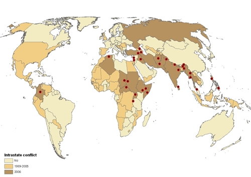
konfliktkart_8908.jpg

The Centre for the Study of Civil War at the International Peace Research Institute, Oslo (PRIO) and Uppsala Conflict Data Program (UCDP) at the Department of Peace and Conflict Research, Uppsala University, are the home for the Armed Conflict Dataset.  The dataset allows users access to information on such variables as name of conflict, antagonists, whether/not there was third-party intervention, etc., for all global conflicts between 1946 and 2002.  The website also has other data sources and illuminating charts and graphs, an example of which is reproduced below.

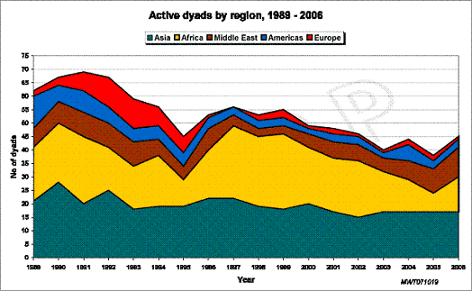
dyads_year_reg1.gif

This chart shows the number of conflicts in various regions of the world over time.

Gapminder–How has the World Changed over time?

Gapminder is a fantastic resource that provides a fascinating glimpse of a myriad of different indicators of income and development across the world. One of the true virtues of Gapminder is that it allows the user, from her computer, to visualize trends across the world and over time.  The user can find information such as clean water levels, GDP, poverty, education, health, etc. Below is a video that shows some of the capabilities of Gapminder, analyzing income and poverty levels worldwide over the last few decades.

Modeling Social Processes–Abortion in Cross-national Comparison

Thanks to a post by Zoe and Geoff, I decided to use the social fact of variation in abortion rates from country to country as the inspiration for class discussion today on the modeling process in social sciences. First, the data* (listing only the top and bottom 10–the US is 30th (out of 90 countries with data available) with a rate of 23.9% in 2003):

Country

Year

%

Russia

2005

52.5

Greenland

2004

50.2

Bosnia and Herzegovina

1988

48.9

Estonia

2004

47.4

Romania

2004

46.9

Belarus

2004

44.6

Hungary

2004

42.0

Guadeloupe

2005

41.4

Ukraine

2004

40.4

Bulgaria

2004

40.3

Suriname

1994

3.0

Puerto Rico

2001

2.2

Malta

2004

1.7

Qatar

2004

1.3

Portugal

2005

0.8

Venezuela

1968

0.8

Mexico

2003

0.2

Poland

2004

0.06

Panama

2000

0.02

Chile

1991

0.02

Now, according to Lave and March, the next step in the model-building process is to consider a social process that would lead to this outcome. There were three potential answers given in class, which correspond to three categories of explanation that we will address throughout the course:

1) Cultural–it would seem that religion is very important to individuals in the countries with the lowest rates. Most of these countries are strongly Catholic and the Church’s official policies are strongly anti-abortion (pro-life). Thus, individuals in these societies are inculcated with a strong view of what to do in the case of an unwanted pregnancy.

2) Rational Choice–one of the groups argued that the decision to abort (or not) a fetus was made on the basis of strategic calculations of self-interest. The countries at the bottom, these students argued, were agricultural and poorer, and children are needed as a source of labor for the household, as a future hedge against retirement for parents who live in societies with a poorly developed social welfare state, with little hope of receiving retirement funds from the government.

3) Institutional–rules, laws, regulations. Some students argued that some countries (like Chile) have laws making abortion illegal, thus either lowering the number overall, or decreasing the incentive for those having illegal abortions to report them to the official authorities.

That was great work; give yourselves a pat on the back or a round of applause.

The third step in the modeling process is, then, to tease out further implications of your preferred hypothesis above. Let’s go back to the cultural explanation. If it’s true that the Catholic Church has a tremendous impact on people’s views of what is right and wrong then, as one student asked, “wouldn’t it also be the case that divorce levels in these countries should be lower than divorce levels in the countries at the top of the list (since the Catholic Church also frowns upon divorce) ?

Continue reading “Modeling Social Processes–Abortion in Cross-national Comparison”

Voter Turnout Across the World

O’Neil (in Chapter 6) argues that democracies are institutionalized through the institutions of participation, competition, and liberty.  The most common form of participation in democracies is voting in elections.  Yet, the general sense seems to be that voters are turning out to vote in ever smaller numbers over the years.  Do the data bear that out?

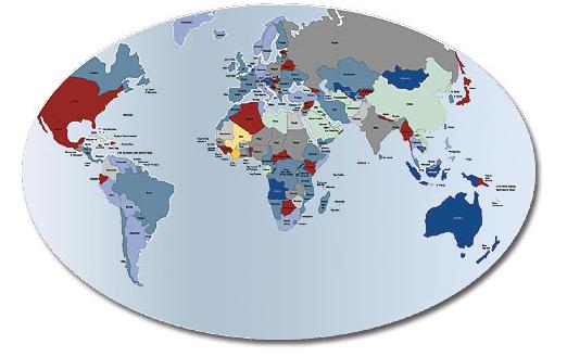
The IGO IDEA–The International Institute for Democracy and Electoral Assistance–has a fantastic website dedicated to, amongst other things, tracking voter turnout levels in elections around the world. Referring to the map below, we see that voter turnout levels differ from country to country. Why might this be the case? This observation could be used as the first step in demonstrating Lave and March’s four-step process of modeling social and political phenomena. Thus, step one (“observe a social fact”) is voter turnout levels are higher in some countries and lower in others. Step two, then, requires us to consider a social process that could have accounted for this variation in outcomes. Can you think of a social process that can account for the findings on the map below?

world_voter_turnout1.jpg

Here are some important findings from IDEA’s report on world voter turnout trends.  For a complete list of data for each respective country, go here.

  • High turnout is not solely the property of established democracies in the West. Of the top 10 countries in the 1990s only three were Western European democracies.
  • Turnout across the globe rose steadily between 1945 and 1990 – increasing from 61% in the 1940s to 68% in the 1980s. But post-1990 the average has dipped back to 64%.
  • Since 1945 Western Europe has maintained the highest average turnout (77%), and Latin America the lowest (53%), but turnout need not necessarily reflect regional wealth. North America and the Caribbean have the third lowest turnout rate, while Oceania and the former Soviet states of the Commonwealth of Independent States (CIS) and Central Eastern Europe are respectively second and third highest in the regional league table over this period.
  • The overall average turnout in the post-war period for established democracies is 73%, which contrasts with an average of 58% for all other countries. However, turnout rates in both established and non-established democracies have been converging over time.
  • Out of the 81 countries which had first and subsequent elections between 1945 and 1997, the average turnout in first elections (61%) is actually lower than the average for subsequent elections (62%). This represents a mixed pattern backed up by the fact that turnout in 41 countries dropped between the first and second elections but turnout actually rose in another 40 countries.
Design a site like this with WordPress.com
Get started