Results from a Prisoner’s Dilemma Simulation–The Oil Game

Today in class, you competed in groups to maximize total profits in a simulation called “the Oil Game.” You represented one of two competing oil producers–Iraz and Sabia–trying to maximize profits selling oil to a net importer of oil–ESYUVI (the names were created using a random letter-generator–I swear!). Most of you recognized very quickly, if not immediately, that the simulation was a modified Prisoner’s Dilemma situation. As I’ll discuss on Friday, in a Prisoner’s Dilemma situation, players acting in an instrumentally rational manner will always choose not to cooperate (i.e., “defect”), because it is a dominant strategy. What makes the situation a dilemma is that the players could do much better were they able to cooperate and trust one another.

oil_game_results.jpeg

The compelling logic of the prisoner’s dilemma, along with some strong empirical evidence, is used by realists to support their arguments regarding the nature of interaction in the international world. Liberals, on the other hand, argue that there is much more cooperation in the world than realists would predict. Thus, despite the structure of the prisoner’s dilemma, players are able to cooperate in international politics. What factors do you think make cooperation more likely? Less likely? Why?

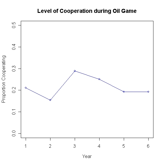
The results from our simulation today are in graphical form above. You’ll note that communication was not allowed for Years 1, 2, and 4; communication was allowed for Year 3, and communication (to decide what to do for Years 5 and 6) was allowed prior to Year 5. The results from this class are consistent with the expectations. I would note the relatively low level of cooperation throughout, rising only initially after the first episode of communication.

Condoleeza Rice, International Relations Theory and the Bush Administration

In class today, I tried to convince you that understanding IR from a theoretical perspective was not simply some abstract, pedantic pursuit, but that the theoretical lens through which we view international relations does have real-world implications, many of which are dramatic.

I noted the role of Condoleeza Rice as the chief National Security Advisor to President Bush during his first term and also noted that Rice has long held a realist view of international relations. As you must know by now (I think I’ve mentioned it about 503 times since the beginning of the semester), realists view the state as the only prominent actor in international affairs. This was Rice’s view upon assuming her new position and this was manifested in the security objectives of the incoming administration, which did not believe, initially, that a non-state actor like Al Qaeda was a grave threat to the security of the United States.

Here are excerpts from Rice’s article in Foreign Affairs magazine in the midst of the 2000 presidential election campaign:

Summary: With no Soviet threat, America has found it exceedingly difficult to define its “national interest.” Foreign policy in a Republican administration should refocus the country on key priorities: building a military ready to ensure American power, coping with rogue regimes, and managing Beijing and Moscow. Above all, the next president must be comfortable with America’s special role as the world’s leader…

Continue reading “Condoleeza Rice, International Relations Theory and the Bush Administration”

Comparative Welfare States in Advanced Industrial Economies

In a couple of weeks, we–in PLSC240–will address the topic of political economy.  We’ll compare states around the world with respect to institutions such as tax regimes, openness of borders to goods and services imported from abroad, and also with respect to welfare state spending.  Andrew Gelman has posted on his blog a review–which will be published in Political Science Quarterly–of a new book by Clem Brooks and Jeff Manza, titled Why Welfare States Persist.  Not surprisingly, the answer is that they are publicly popular.  What is more interesting, though, is why the size of the welfare state differs amongst countries with relatively similar income levels.  Can you can think a cultural explanation?  Institutional?  Rational Choice?

Rich capitalist democracies around the world differ widely in their welfare states—their systems of government-provided social support–despite having comparable income levels. Brooks and Manza report that welfare state spending constituted 27% of GDP in “social democratic countries” such as Sweden and 26% of GDP in “Christian democratic countries” such as Germany, but only 17% in “liberal democracies” such as the United States and Japan. These differences are correlated with differences in income inequality and poverty rates between countries.

In their book, Brooks and Manza study how countries with different levels of the welfare state differ in their average policy preferences, as measured by a cross-national survey that asks whether respondents think the government should (a) provide a job to everyone who wants one, and (b) reduce income differences between rich and poor. Brooks and Manza find that countries where government jobs policies and redistribution are more popular are the places where the welfare state is larger, and this pattern remains after controlling for time trends, per-capita GDP of the country, immigration, women’s labor force participation, political institutions, and whether the ruling party is religious or on the left.

Next week, you will have a chance to test this hypothesis when we comparatively analyze public opinion attitudes around the world using the World Values Survey.   Is this relationship real?  Does it apply to states that are not advanced industrial economies?  We’ll find out next week.

Using Powerpoint-type Presentations in Class

latex.jpg

The rise in the ubiquity of use of Powerpoint-type (and I use the phrase Powerpoint-type since Powerpoint is but one–although the most popular–type of software used for electronic lecture presentations; I use the Beamer package add-on for the type-setting software LaTeX) presentations has led to a spirited debate in the field of academia. Some argue that the presentations are self-defeating and do not advance any sane pedagogical objective, while others swear by the benefits.

I see both advantages and disadvantages to their use but believe that ultimately, like with most tools, there is no inherent value in the tool itself, but that the value of the tool (for better or worse) comes in its application. Thus, I think that Powerpoint-type lectures can be used to enhance the educational experience and one’s pedagogical objectives. The issue, then, revolves around determining just what the best use of Powerpoint is.

Thankfully, there has been some research on the subject. From the blog “Thinking about College Teaching“, here is a snippet from a post explaining the best use of Powerpoint in classs:

I found a research study that compared student learning for four ways of combining PowerPoint presentations with distribution to students. (I no longer have a citation for that study.) One group of students did not receive any handouts, a second group received complete handouts prior to discussion, a third group received complete handouts after discussion, and a fourth group received skeletal handouts prior to the discussion and complete handouts after the discussion. Learning was greatest in the last group, and that was the model I followed…

…I went through that file and deleted most content except for slide headings. I made that file available to students on the Blackboard site for my course prior to class, and those who wanted it could download it and bring a printed copy to class. After I completed the class discussion, I made the [complete] file available. The most enterprising students brought the outline version to class, took notes on it, and later compared their notes to my complete version. In any case, I did not spend the school’s money to duplicate materials that only some students wanted. Students were satsified with that arrangement when I explained that they would learn the most that way.

This is what I will do for the remainder of the semester. When I am using Powerpoints, which will be about every second or third session, I’ll post the Powerpoint lecture outlines on Blackboard, the post the complete version there after I have completed the lecture. If it takes more than one session to finish a lecture, the completed version will be posted after the lecture has been completed in full.

Lies, Damned Lies, and Excel Charts!

I provide links to many sources that collect data on various political phenomena because I think that describing and measuring are extremely useful tools in helping us understand politics. As Mark Twain was well aware, and as I mentioned in PLSC240 today, often-times researchers (and especially!) politicians use data and statistics to obfuscate reality rather than to illuminate. No sooner had I returned to my office than I saw the following chart on the web (courtesy of democrats.org). Here is a typical example of “massaging” the data to promote a preferred interpretation of political reality. Here’s the original chart:

sotu_speeches_11.jpg

The inference that the creators of the chart want the observer to make is that the number of instances of applause from Bush’s State-of-the-Union (SOTU) speeches has, except for a spike in the immediate pre-Iraq invasion period of January 2003, been dropping, and significantly. Notice the range of the y-axis. Why did the chart creators decide to make 55 the minimum value? I have to give them the benefit of the doubt, however, as this seems to be a built-in feature of Excel (that’s why I encourage students to start using R for graphing capabilities). When I created the chart above myself in Excel, the program chose 55 as the minimum value of the y-axis. What would the chart look like if one were to make the y-axis minimum value zero? Here’s the result:

bush_sotu_zero_axis.jpeg

Now, the impression made upon the observer is that the drop in applause is not that great at all, and most likely within the range of what is called “random error”. Which chart is the correct one? Well, one way of determining the right answer to this would be to compare the SOTU applause trends of other presidents. Is every president guaranteed 40 or 50 bursts of applause no matter how lame the speech is or how unpopular the president is amongst those present? If so, then a minimum value on the y-axis of 40 or 50 would be more appropriate than zero, but I don’t know the answer off-hand.

The USA’s Place in the World in 2016?

I posted earlier some excerpts from Daniel Drezner’s article envisioning what a post-Bush administration American foreign policy may look like, In a similar vein, here are some snippets from a piece in the New York Times Magazine written by Parag Khanna* that try to predict the nature of US power and authority at the end of 2016. The article is entitled “Waving Goodbye to Hegemony.” Do you think that the United States will lose its hegemonic status by 2016? What about the challenges from an integrated Europe and a rising China? I encourage you to read the whole article. If we have time, we will read this at the end of the semester.

But the distribution of power in the world has fundamentally altered over the two presidential terms of George W. Bush, both because of his policies and, more significant, despite them. Maybe the best way to understand how quickly history happens is to look just a bit ahead.

It is 2016, and the Hillary Clinton or John McCain or Barack Obama administration is nearing the end of its second term. America has pulled out of Iraq but has about 20,000 troops in the independent state of Kurdistan, as well as warships anchored at Bahrain and an Air Force presence in Qatar. Afghanistan is stable; Iran is nuclear. China has absorbed Taiwan and is steadily increasing its naval presence around the Pacific Rim and, from the Pakistani port of Gwadar, on the Arabian Sea. The European Union has expanded to well over 30 members and has secure oil and gas flows from 27world3-450.jpgNorth Africa, Russia and the Caspian Sea, as well as substantial nuclear energy. America’s standing in the world remains in steady decline.

Why? Weren’t we supposed to reconnect with the United Nations and reaffirm to the world that America can, and should, lead it to collective security and prosperity? Indeed, improvements to America’s image may or may not occur, but either way, they mean little. Condoleezza Rice has said America has no “permanent enemies,” but it has no permanent friends either. Many saw the invasions of Afghanistan and Iraq as the symbols of a global American imperialism; in fact, they were signs of imperial overstretch. Every expenditure has weakened America’s armed forces, and each assertion of power has awakened resistance in the form of terrorist networks, insurgent groups and “asymmetric” weapons like suicide bombers. America’s unipolar moment has inspired diplomatic and financial countermovements to block American bullying and construct an alternate world order. That new global order has arrived, and there is precious little Clinton or McCain or Obama could do to resist its growth.

Remember that when I post snippets from articles, that in no way suggests that I agree with what the author is saying. I alert you to them mostly because they introduce or mention concepts, theories and ideas that we discuss in class and also to show you get you to think critically about claims and assertions made by the author(s). To which theory of international relations do you think the author is an adherent? Why? What evidence in this article can you find to support your assertion?

*Parag Khanna is a senior research fellow in the American Strategy Program of the New America Foundation. This essay is adapted from his book, “The Second World: Empires and Influence in the New Global Order,” to be published by Random House in March.

Blog Assignment PLSC240 Introduction to Comparative Politics

The function of your blog will be to select, research, analyze, and contribute knowledge and information on a topic of interest to you (the group will select one topic only) in comparative politics. As we address the theories and principles of comparative politics over the course of the semester, you will post to your blog analyzing how these theories, principles, and ideas apply to your chosen topic. In addition, since this course is called “comparative” politics, I would like you to analyze at least two (and up to four) different countries, one of which should be a developing country. The goal is for the members of your group to learn more about that topic than we could ever hope to cover in class over the course of a single semester. You will have to post your topic of choice (with potential countries), and a brief description, by midnight, Wednesday, January 30th.

My goal is to allow you to be as resourceful, self-initiated and creative as possible. These are your blogs and you will ultimately be responsible for the nature of the posts. I will guide you, but will allow much latitude in what you decide to post and how you use this assignment to express yourself and demonstrate to me how much you are learning about a particular topic. I want us to build a learning environment and community together, which means that we will all be involved in this enterprise. To make an analogy, it would be as if I were to instruct you to build an apartment building with X number of units on a particular plot of land, and pretty much let you loose to create your vision. I will guide you along the way, for certain, but will let you be the ultimate owner of the finished product. So your first step is to select a topic.

As you may have noticed we have already addressed some topics in comparative politics that may be of interest to you. To help you begin to narrow down your choice of topic, use some of the resources that you already have available to you. First, go to my blog and search for PLSC240, and you’ll see a series of posts with potential topics/ideas. Another immediate source is the textbook. For example, browse the entries in the index of O’Neil’s Essentials.

Continue reading “Blog Assignment PLSC240 Introduction to Comparative Politics”

Pew Global Attitudes Project

In the past, while talking with students, listening to discussion in class or grading papers, I’ve often heard unsubstantiated claims such as “the world is not with President Bush”, or “even the Europeans hate us”, etc.  Noting that these claims are unsubstantiated does not mean they are not true.  What it does mean is that I need further proof of the veracity of the claims than simply the student’s recitation of that claim.  Similarly, you should be skeptical in class if I try to claim something without providing evidence to support that claim.  With respect to statements such as the ones I referenced above, the Pew Global Attitudes Project is a fantastic resource.  This organization polls publics around the world on a host of issues related to international politics, international affairs, and the domestic ramifications of international events and issues.

So just how do people around the world view the United States, and how has that opinion changed since 2000?  Well, look no further than this report here:


favorable_opinions_of_the_us.gif

Now, if a student were to write, according to widely available survey evidence, Europeans  (at least in Great Britain, France, Spain, and Germany) hold a much less favorable view of the US in 2006 than they did in 2000 (Pew Global 2006), then that would be more compelling.

Design a site like this with WordPress.com
Get started