Alberta’s re-commitment to fossil fuels

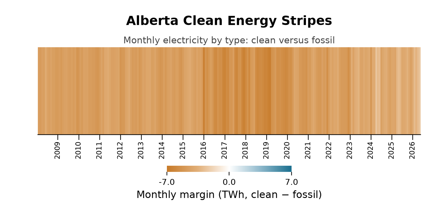
Alberta is often described as Canada’s Texas. And the description fits in many ways. One policy area in which the two have diverged is in the adoption of renewable energy for electricity production. Whereas Texas has become (seemingly overnight) a renewable energy powerhouse, Alberta (under its UCP Premier, Danielle Smith) has decided to double-down on fossil fuels. The charts below visually represent this divergence in policy. See my previous post to understand how to interpret these charts.

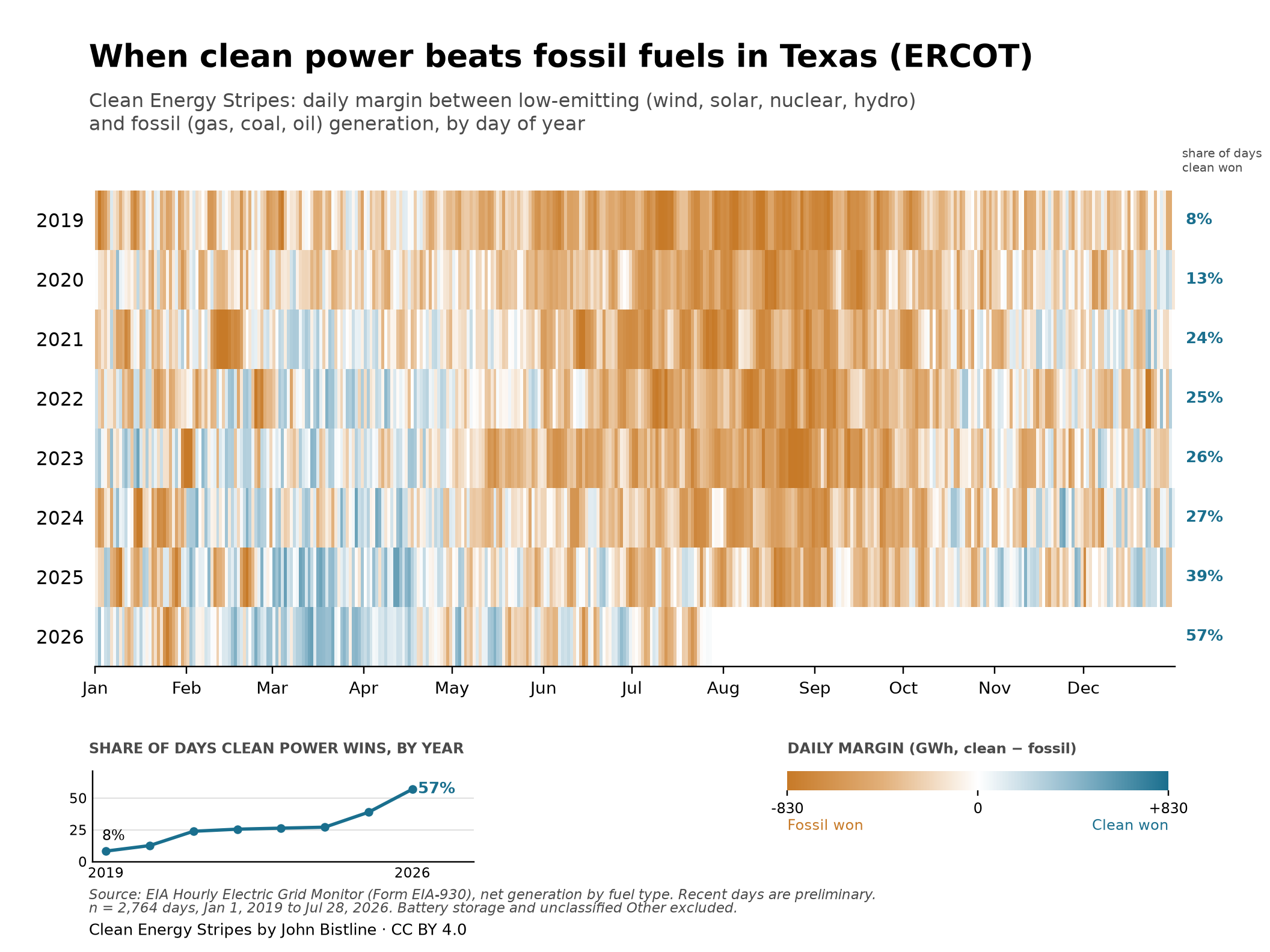
A quick reminder: the more dark orange is the vertical stripe for that particular month (Alberta) or day (Texas), the greater is the difference in the amount of electricity produced by fossil fuels versus renewable (“clean”) energy. We can see that Alberta’s mix of electricity production is still dominated by fossil fuels (although the stripes are trending less orange over time). Contrast that to Texas, where renewables (“clean”) are producing a majority of electricity each day over the last year or so. The question, though, is: “who is taking the road less traveled?”
Note that to the point in 2026 when the Texas chart was created, renewables had “won the day” in terms of producing more electricity than fossil fuels, 57% of the time. That’s impressive in a state that has traditionally tethered its electricity production to the its massive repository of fossil fuel.
Climate Data Visualizations

I’ll be using this website to create a catalogue of what I consider to be important data visualizations in the general knowledge area of climate change/climate science.

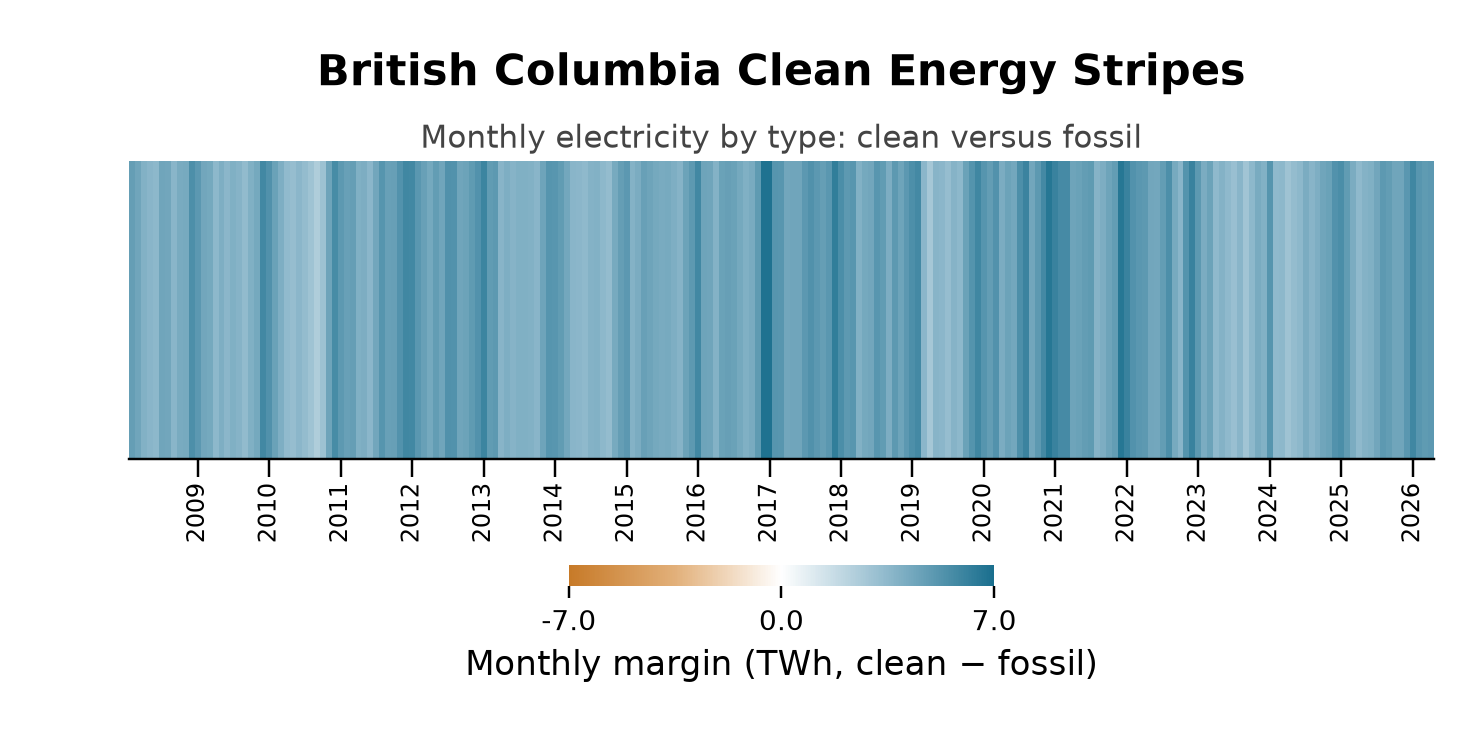
Here is the first visualization, which looks at the the sources of electricity production in the Canadian province of British Columbia. With the exception of a couple of provinces (Alberta and Saskatchewan, primarily), sources of Canadian electricity production are overwhelmingly fossil fuel-free. The predominant type of energy production is hydroelectric, which has traditionally been supplemented by nuclear power. In recent years, wind and solar energy sources have come online and continue to increase their output on an annual basis.

Using python code developed by John Bistline as a baseline, I have created a chart that shows the relative monthly amounts of “clean” versus “fossil fuel” electricity production in British Columbia since 2008. Bistline’s charts use daily totals, but I couldn’t find daily data for BC, so I am using monthly data.

How does one interpret this chart? The darker the blue, the greatest is the absolute difference (in TWh–terawatt-hours) between the monthly output of ‘clean’ (i.e., renewable) electricity and produced from the burning of fossil fuels. The darkest blue bars (they are monthly bars) reflect that in that particular month about 6 more TWh of clean electricity were produced than that from fossil fuels.

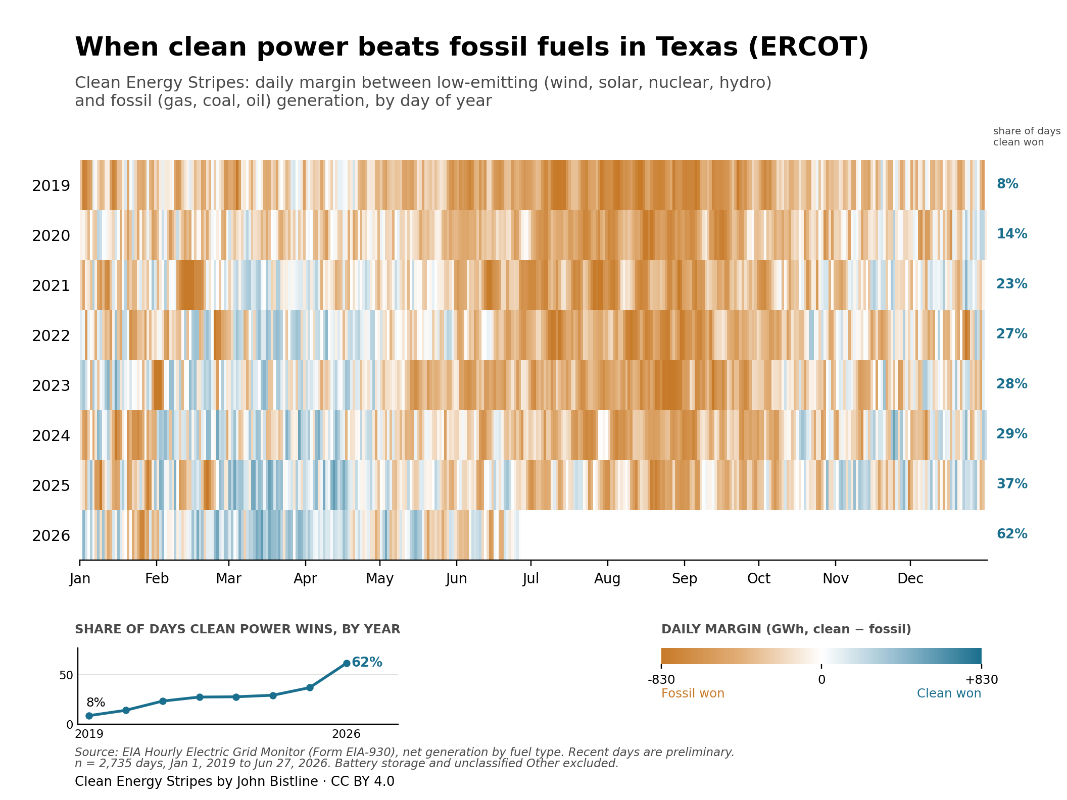
It’s interesting to note that there doesn’t seem to be any secular trend over time; that is, it’s not apparent that more relative electricity of either type is being produced over time. We do see some seasonal fluctuations. For example, summers seem to be marked by much lower differences in the relative output of clean-versus-fossil fuel electricity production. We can contrast this with the USA state of Texas, which clearly demonstrates a surge in the relative amount of clean electricity produced over time. Texas may be a fossil fuel energy powerhouse, but it is increasingly becoming a clean energy powerhouse as well (see chart below). We can contrast this with the situation in Alberta, which is the topic of a future chart (the chart will be mostly orange).

Note: these are daily data.

License & reuse

Clean Energy Stripes are released under a Creative Commons Attribution 4.0 license, in the spirit of Ed Hawkins’ original warming stripes. You are free to share and adapt them — make your own with national or subnational data, and credit “John Bistline, Clean Energy Stripes / Data: EIA-930.”

Get the code: a Python script that makes these charts for any grid (MIT licensed) is at github.com/jbws42/clean-energy-stripes.

The palette (blue #1A6F8E, orange #C77A28) is colorblind-safe by design.

Here is the python code that I used to create this chart. The data are from Statistics Canada. Table 25-10-0015-01  Electric power generation, monthly generation by type of electricity DOI: https://doi.org/10.25318/2510001501-eng

The data (bc_long_df.csv) are in long format with each row being a month-year.

import pandas as pd
import numpy as np
import matplotlib.pyplot as plt
from matplotlib.colors import LinearSegmentedColormap, TwoSlopeNorm
from matplotlib.ticker import FuncFormatter
# -------------------- load data --------------------
df = pd.read_csv("bc_long_df.csv")
df["Month"] = pd.to_datetime(df["Month"], format="%B %Y")
# -------------------- classify types --------------------
clean_types = [
"Total Renewables"
]
fossil_types = [
"Total electricity production from combustible fuels 8"
]
df = df[df["TYPE"].isin(clean_types + fossil_types)].copy()
df["group"] = np.where(df["TYPE"].isin(clean_types), "clean", "fossil")
# -------------------- monthly totals --------------------
monthly = (
df.groupby(["Month", "group"], as_index=False)["Value"]
.sum()
.pivot(index="Month", columns="group", values="Value")
.fillna(0)
.sort_index()
)
monthly["margin_twh"] = (monthly["clean"] - monthly["fossil"]) / 1_000_000
series = monthly["margin_twh"]
# -------------------- stripe grid --------------------
grid = series.values[np.newaxis, :]
# -------------------- colors --------------------
CLEAN_COLOR = "#1A6F8E"
FOSSIL_COLOR = "#C77A28"
CLEAN_MID = "#8FB9CC"
FOSSIL_MID = "#E2B07A"
BG = "#FFFFFF"
cmap = LinearSegmentedColormap.from_list(
"ces", [FOSSIL_COLOR, FOSSIL_MID, BG, CLEAN_MID, CLEAN_COLOR]
)
vmax = 6.0
norm = TwoSlopeNorm(vmin=-vmax, vcenter=0, vmax=vmax)
# -------------------- plot --------------------
width_px = 2000
height_px = 1000
dpi = 300
fig, ax = plt.subplots(
figsize=(width_px / dpi, height_px / dpi),
dpi=dpi
)
fig.patch.set_facecolor(BG)
ax.set_facecolor(BG)
im = ax.imshow(
grid,
aspect="auto",
cmap=cmap,
norm=norm,
interpolation="nearest"
)
# -------------------- x-axis labels: years only --------------------
year_positions = [i for i, d in enumerate(series.index) if d.month == 1]
year_labels = [str(d.year) for d in series.index if d.month == 1]
ax.set_xticks(year_positions)
ax.set_xticklabels(year_labels, fontsize=8, rotation=90, va="top", ha="center")
ax.tick_params(axis="x", length=6, pad=2)
plt.subplots_adjust(bottom=0.22)
plt.tight_layout()
ax.set_yticks([])
for s in ("top", "right", "left"):
ax.spines[s].set_visible(False)
# -------------------- titles --------------------
ax.text(
0.5, 1.22,
"British Columbia Clean Energy Stripes",
transform=ax.transAxes,
ha="center", va="bottom",
fontsize=14, fontweight="bold"
)
ax.text(
0.5, 1.02,
"Monthly electricity by type: clean versus fossil",
transform=ax.transAxes,
ha="center", va="bottom",
fontsize=10, color="#444444"
)
fig.subplots_adjust(top=0.80, bottom=0.20)
# -------------------- colorbar --------------------
cbar = plt.colorbar(im, ax=ax, orientation="horizontal", pad=0.25, fraction=0.05)
cbar.outline.set_visible(False)
cbar.ax.tick_params(length=4, labelsize=9)
cbar.set_ticks([-vmax, 0, vmax])
cbar.ax.xaxis.set_major_formatter(FuncFormatter(lambda x, pos: f"{x:.1f}"))
cbar.set_label("Monthly margin (TWh, clean − fossil)", fontsize=11)
# -------------------- final layout --------------------
fig.subplots_adjust(top=0.78, bottom=0.20)
fig.savefig(
"bc_clean_energy_stripes_monthly_twh.png",
dpi=220,
facecolor="white"
)
plt.show()

Design a site like this with WordPress.com
Get started